Samsung Galaxy Note 8.0 review: The roadster
The roadster
Android as usual
The latest tablet from Samsung runs TouchWiz-skinned Android 4.1.2 Jelly Bean, the same combo you'll see on the Note II, complete with additional S-Pen support.
You can see our usual user interface video here:
We have been repeatedly impressed by what S-pen-enabled devices from Samsung can do and the Note 8.0 is no exception. Custom features and options literally spring from every nook and cranny, so you better get comfortable.
Keep in mind that because this is the WiFi-only version, options and settings related to calling will understandably be absent.
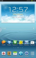
The lockscreen is a standard "tap and drag in any direction to unlock" deal and there're ripples accompanied by water-drop sound as you drag your finger. Five customizable shortcuts are available at the bottom of the screen - drag one up to launch the app without going through the homescreen.
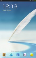

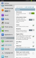
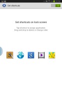
The lockscreen packs a ton of new functionality
There are several options for the unlock screen. You can enable a news ticker at the bottom of the lockscreen, which is a great way to stay up to date on current events. The ticker can be expanded to view all news items.
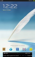
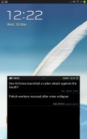
The news ticker keeps you up to date with current events
There are alternative unlock routines as well - Face unlock, Face and voice unlock, unlock by touching the screen and tilting the phone and starting the camera from the lockscreen by touching the screen and rotating the phone horizontally.
There are voice-based wakeup commands that can just start S Voice or launch a preselected app. You can also enable a second clock on the lockscreen, which shows up when you're roaming. Most of these features can be switched off too.
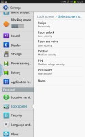
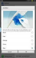
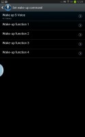
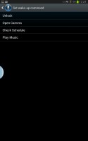
Different lock screen types • Voice wake-up commands
Once you make it past the lockscreen, you'll notice that the dock at the bottom of the screen now fits six shortcuts or folders. The rightmost one opens the app drawer as usual, but you can change the other five to any shortcut you like or even folders.
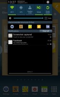
The notification area looks familiar, but there are a few new things that make good use of the big screen. On top is a clock with the date and a Settings shortcut. Below that are the usual toggles - Wi-Fi, GPS, Reading mode, Vibrate and Screen rotation. There are five more toggles just off screen - Bluetooth, Power saving, Blocking mode (we'll get to that later), Sync and Multi window.
Further down we get the Brightness slider with an Auto checkbox. It allows you to adjust the brightness even in auto mode - the backlight strength is still adjusted according to ambient lighting conditions, but you can tweak it to your liking.
The notifications are one of the big changes in Jelly Bean. Notifications can now take more than a single row to display more information and they can also have more advanced controls on them (e.g. a reply button). The top notification is expanded by default and you can expand/collapse notifications with a two finger swipe up or down (not all notifications can be expanded though, only those that support it).
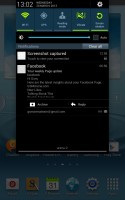
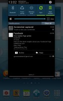
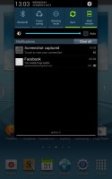
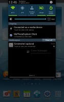
The notification area has more toggles • expanding and minimizing an application
Finally, at the very bottom of the screen you get a line for connected WiFi network, which turns into "No internet connection" when there isn't a network available.
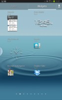
Following convention from stock Android, the app drawer has a tab that lets you easily pull out widgets to the homescreen. Unlike the stock app drawer, you cannot move between tabs by swiping through the pages - you have to explicitly hit the tab. There's a download shortcut on the right, which brings you to a screen with only the downloaded apps.
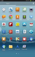
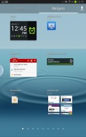
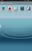
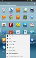
The app drawer houses both app shortcuts and widgets
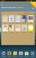
The app drawer has two view modes - Customizable grid (where you can freely rearrange icons) and Alphabetical grid (if you think you can find apps quicker if they're alphabetized).
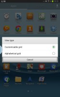
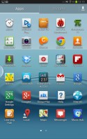

The available view modes for the app drawer • a zoomed out look at the app drawer pages
The app drawer has a zoomed-out overview that lets you rearrange pages, but you can't create blanks. Hitting the menu key reveals some more options, including hiding apps or enabling 'tap to uninstall' mode.
Once you get several apps running, you can use the task switcher to go back and forth between them. It's a vertical list with a screenshot and a name for each app. Swiping an app sideways removes it from the list.
In addition to the task manager, the Note 8.0 comes with Multi-window, which you can access using the small tab on the left side of the interface. This lets you run two apps side by side on the screen. You can adjust the division line giving one app more space than the other. Only compatible apps can be used with Multi-window, for now that means mostly the ones that come preinstalled on the phone.
There are a few Samsung-made tweaks here - a button at the bottom of the list to bring out the home-brewed task manager, a button to end all apps at once and a shortcut to Google Now. By the way, you can also bring up Google Now by pressing and holding the Menu key.
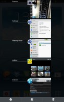
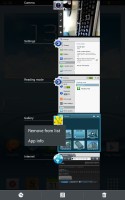
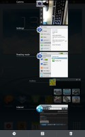
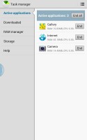
The task switcher has two custom buttons courtesy of Samsung
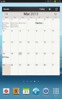
Let's go back to the homescreen and widgets. Jelly Bean comes with plenty of them and Samsung has added more still. With Android 4.1, the widgets will move out of the way if you try and put something over them, which makes reorganizing the homescreen so much easier. Some widgets are resizable too.
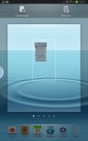
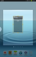
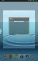
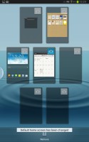
As usual, you can pinch to zoom out and easily manage homescreen panes - add, delete (but you can't have more than seven) or just reorder them. You can have 7 panes at most, which are enough to fit plenty of content even if you use full-screen widgets. One of these panes is marked "default" and that will be the one you're taken to when you press the Home button.
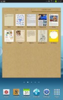
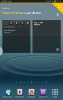
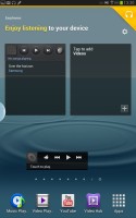
Besides the regular homescreen panes, there are also dedicated panes, which Samsung calls Page Buddy - for the S Pen, for earphones, for a dock etc. You can enable and disable these pages individually and each page gets launched automatically triggered by its corresponding accessory (e.g. pulling out the S Pen or plugging in a headset).
Regular homescreen panes are indicated by dots but the dedicated pages get a special pictogram (e.g. a pen for the S Pen, headphones for the Earphone page and so on). You can put whatever widgets you like here (and they are resizable as usual). For example, the S Pen page has the S Note widget by default, while the Earphone page has music and video player control widgets.
And that's not all either. While one of these pages is active (e.g. the S Pen is out) you get a row of recommended shortcuts in the notification area and the dock at the bottom of the screen mirrors those shortcuts (our only complaint here is that the shortcuts cannot be customized).
Live wallpapers are a great way to decorate your homescreen, but also make it useful too. The News wall creates an attractive slideshow of headlines, while Stock wall does the same for quotes. Photo wall creates a collage of photos from your Gallery.


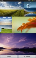
Three of the live wallpapers in action
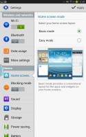
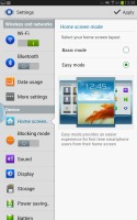
There is a setting called Mode change - basically, it gives you two separate homescreen setups, Standard and Easy. Samsung's idea is to give you big, easy to use widgets that cover most of the functionality with Easy mode.
There's nothing stopping you from adding back the regular widgets in Easy mode, so you can use Mode change to toggle between personal and work widget setups. You can't rename the modes or have more than two, but it's a potentially useful feature if your precious few homescreens are usually cluttered with widgets you use for work and so on, and you want personal widgets instead.
Reader comments
- Zwei
- 03 Jul 2022
- 7Xd
Ive had this as a kid and i found the old box today. Somehow Theres brand new unused samsung earphones in it still working lmao, Anyways, I remember play alot of minecraft on this thing and absolutely made my childhood, apperently i lost the pen and ...
- Ravn
- 16 Dec 2019
- IWR
The battery time has dropped a little but it works like when it was bought. I still use it regularly.
- since 2013
- 24 Apr 2019
- Iwj
bought a galaxy note 5 phone and this note tab 8.0 and heres the thing, replaced the tab's battery once but its not good either, cheap ebay replacement batt. lil slow compared to 2019 tabs but the Note5 phone is actually better than my 3 month old P...
