Samsung Galaxy Note Edge review: The other side
The other side
TouchWiz with Edge screen
The Samsung Galaxy Note Edge runs on the latest available Android 4.4.4 KitKat customized by the most recent incarnation of TouchWiz for smartphones. Every custom feature the Note 4 has the Note Edge gets as well, but where the two differ significantly is how the S Pen is involved.
Here's a quick video to get things started.
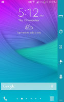
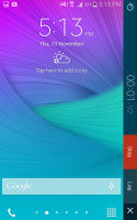
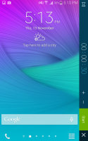
The Edge screen comes into play as early as the lockscreen. The Express me panel is fully customizable with images and text, you can have multiple presets ready. A swipe on the Edge screen lets you switch between the other panels available when the screen is unlocked. We'll get to the full features in a bit.
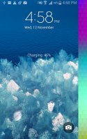
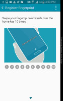
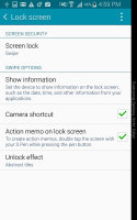
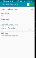
The lockscreen with fingerprint lock
The Galaxy Note Edge features the fingerprint reading Home key of other Samsung flagships that can be used to secure the lockscreen. The scanner is of the swipe variety, which isn't very comfortable while holding a device of this size (you have to bend your thumb at an odd angle and you have to swipe it just right).
The main homescreen is familiar with widgets and shortcuts, but there's no app dock - just dialer and app drawer shortcuts. The Edge screen is where the shortcuts are, eight of them always visible.
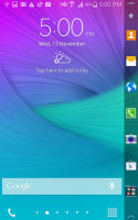
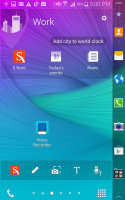
The shortcut dock on the homescreen has moved to the Edge screen
You can move homescreens around, place widgets and choose a transition effect. You can also enable and disable Flipboard's Briefing, which replaces the left-most My Magazine pane.
On by default, the Briefing pane differs from the My Magazine pane by name only. Both are powered by Flipboard and the categories (e.g. News, Business, Facebook) are displayed as tiles, each showing its top article. You can reorder and hide the tiles. Once inside an article, you can browse more articles in that category with the familiar Flipboard effect.
The notification area is similar to what we've seen on recent Galaxy devices with a line of quick toggles and then a brightness slider. The S Finder and Quick Connect buttons are below the slider - neither the keys, nor the slider can be disabled. Another change is that the Recommended apps row is gone.
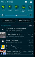
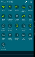
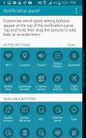
Customizable notification area
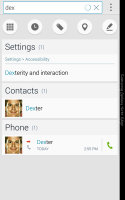
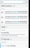
S Finder can search the phone's memory for just about everything. At the very end of the search you'll get the option to search Google but we feel usability has suffered here - it would've been much better if S Finder listed the top Google Search results as a default instead of forcing one more step upon us.
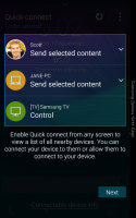
Quick Connect allows you to connect to devices through Wi-Fi Direct and Bluetooth and mirror your screen or share media.
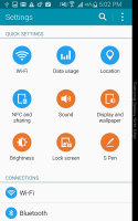
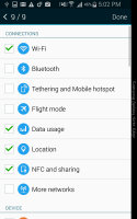
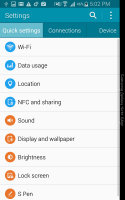
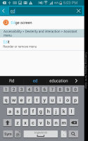
The settings menu is a vertical list of apps divided into categories. At the top you can place a list of favorite apps as Quick settings and use the search function to find anything else. You can alternatively choose the old tabbed settings menu.
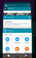
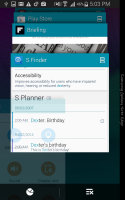
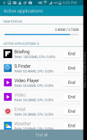
The app switcher has adopted the Lollipop look, even before the actual update. The apps are ordered in a 3D rolodex, similar to how Chrome tab switcher works. The Kill all and Task manager buttons are still available.
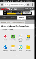
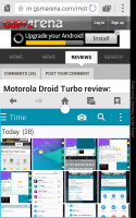
A proprietary change to this interface is that you can press and hold on an app and it will detach into a free-floating pop-up window. Apps can be minimized to a small, circular icon or maximized back to full screen. A drag and drop mode lets you move content between pop-up apps - like dragging an image from the web browser into the Messages app.
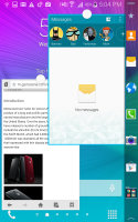
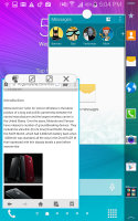
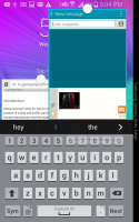
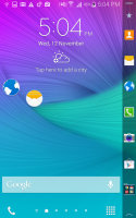
Pop-up screen • moving content between apps • minimized pop-up apps
As you scroll through the App switcher, you'll notice some apps have a button on the right - two boxes stacked on top of each other. Tapping that activates Multi-window and positions the app on one half of the screen. The other half shows a list of all other apps that support Multi-window.
If you instead go back into the App switcher and tap the button of another app, it will replace the first one, instead of taking the second slot, which we found a bit counterintuitive.
Still, this is the best multitasking implementation we've seen on Android or any other smart device. The old panel from which you drag out Multi-window apps is still available but, honestly, we much prefer using the App switcher.
Samsung recognizes users can't always operate the Galaxy Note Edge one-handed so there's an option to shrink the entire UI to a window with an adjustable position and size (very much like a pop-up app). You can turn on one-handed mode via a quick swipe in and out from the side of the phone but it will not work with the S Pen (or when it's out of its holster).
In one-handed mode you get on-screen buttons so you don't have to reach down for the hardware ones. Alternatively, you can enable the Side key panel in normal, full-screen mode, it puts movable on-screen buttons on the side of the screen.
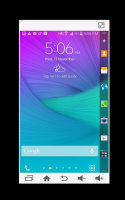
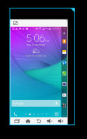
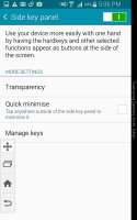
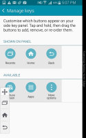
One-handed mode • Side key panel
Samsung has reduced the number of features you get in the TouchWiz UI. We prefer this approach as it makes TouchWiz more focused on the content, but Samsung's software remains probably the most feature-packed Android OS incarnation around.
Edge screen
The Edge screen offers a number of panels with different functionality. You can enable and disable panels as needed and swipe through the active ones. Some panels have their own setting screens for extra customization. You can download additional panels from the Galaxy Apps store, but the package available out of the box is pretty rich.
One panel just shows eight shortcuts to your favorite apps, folders are supported too. This panel is good for multitasking as you can switch between apps with a single tap, just like on a desktop. A downloadable Edge Task Manager panel shows the running apps instead of pre-defined shortcuts, which makes it even better for multitasking.
A similar panel is available for contact shortcuts.
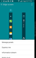
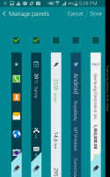
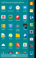
Configuring the Edge screen • pre-installed and downloadable panels
The Briefing panel shows notifications from selected apps and weather info. Another panel shows steps, distance traveled and calories burned - all pulled from the S health app. Twitter and Yahoo panels show tweets, stock info, sports scores and so on.
The last item of the pre-installed panels is a memory match game - not very useful, but it tries to break the mold.
More useful panels are available in the download section - the S planner widget shows your agenda, while the S Note panel offers shortcuts for the app.

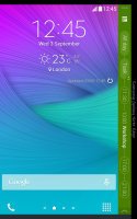
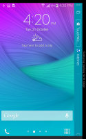
Editing a panel • Agenda, Task Manager and S Note panels
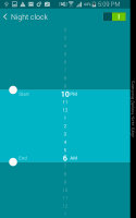
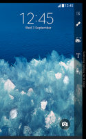
Technically not a panel, but one of the most useful features of the Edge screen, is the Night clock. You set a start and end times and the Galaxy Note Edge will display the time and date while the main screen is off. The display is very dim and won't annoy you in the dark and Super AMOLED makes sure this is very power efficient (still, you can't have it active for more than 12 hours a day).
The final option is to leave a personal message on the Edge screen, which is visible when other panels are inactive.
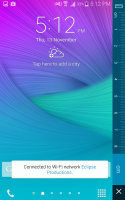
There are a set of tools that are always available, even on the lockscreen. Those include a ruler (yes, really, it goes up to 8cm or 3.5in), stopwatch and timer shortcuts, an LED light toggle and a voice recorder.
Reader comments
- Anonymous
- 30 Mar 2022
- 3Hh
Don't say samsung is shit
- DPJ shina
- 17 Oct 2021
- fsV
Please make some games possible to danload for the sake of everyone
- Apple user
- 14 Oct 2021
- iid
That’s the only phone from Samsung that i love.. otherwise Samsung phones are shit


