Samsung Galaxy Note Pro 12.2 review: By the dozen
By the dozen
Android 4.4 KitKat and TouchWiz UI is all you need
The Samsung Galaxy Note Pro 12.2 runs on the latest available Android 4.4.2 KitKat, with lots of premium features courtesy of Samsung's own TouchWiz UI. Samsung has included many must-have options on such a big screen, including a new version of the Multi-window multitasking.
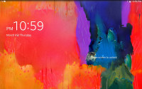
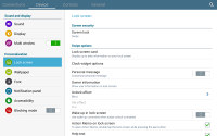
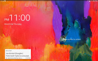
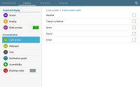
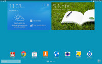
Instead of widgets, the lockscreen has something called "Lock screen cards." Those can show you weather info, upcoming events, news, email and social networking updates. You can pick and choose which of these features you want active.
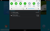
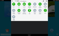
The notification area is similar to what we've seen on other Pro tablets - it's narrow and has a flat design with circular icons. The toggles work as usual and below them are two sliders, one for brightness and one for volume. The brightness slider has an Auto toggle. The sliders can be hidden to save space.
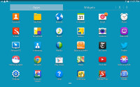
In the app drawer, icons are presented as a customizable or alphabetized grid and you can also view only the ones apps you've downloaded yourself. You can also disable some of the pre-installed apps so they won't take any RAM or appear in the app drawer, but not all apps can be hidden this way as the hide shortcuts feature has gone missing.
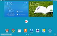
The homescreen has been updated as well and features Magazine UI. This adds a second type of homescreen alongside the traditional TouchWiz panes.
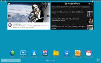
Magazine UI is a fully functional replacement for you homescreen that does way more than just feed you news and social updates. A Magazine pane would hold up to six widgets, but those widgets always occupy the entire screen - there is no background or docked shortcuts, even the status bar is hidden. You have to tap the top of the screen to bring it back, which means basics like the time and signal strength are not always visible.
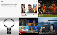
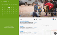
Magazine UI feels like Windows 8
The Magazine's widgets are completely different from what you have seen so far on Android. They use flat looks a la Windows Phone, they can be easily resized and rearranged. A Change Layout button automatically cycles through preset layouts so you don't even have to tap and drag (but you can if you want to).
The available set of widgets is what really makes the Galaxy Note Pro 12.2 and its Magazine UI so feature-rich. Note that only Samsung-made widgets go here, the widgets used on the TouchWiz homescreen panes are not available.
Anyway, the Magazine widgets are a mixture of various content aggregators (news, social services, multimedia), powerful mini versions of system apps and just nicely designed shortcuts.
The content aggregators support news from a lot of categories (business, design, movies, food, music, sports, politics, travel, tech, etc.) and social services (500px, Facebook, Twitter). You can choose the specific topics for each Magazine widget. Some widgets are scrollable so they hold more content even if it's not immediately obvious. You have to swipe at them to see if they'll scroll.
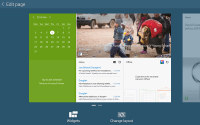
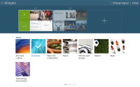
Magazine widgets can be resized and rearranged • adding new widgets
The aggregators aside, the rest of the widgets give you quick access to the most used apps: gallery, office, hubs, calendar, weather and multimedia players. Finally, you have two different widgets that hold your Favorite and Frequently used apps.
You can have up to three Magazine homescreen panes. We guess this is partly due to hardware limitations, because those Magazine widgets probably consume a lot of resources. Also, since only special widgets are allowed, you can't fill much more anyway.
The Galaxy Note Pro 12.2 has an App Switcher button that calls up a custom switcher UI. The only real difference is that it takes up only the bottom part of the screen rather than overlay it. Samsung's Task Manager is also on board for more advanced options.
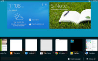
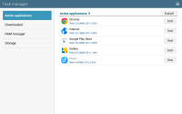
The app switcher and task manager
The Galaxy Note Pro 12.2 comes with the Multi-window multitasking feature, and it has been improved to now support up to four apps at a time (two and three apps is also easily doable). The apps are tiled (so no app overlays another) and you can control the divide by dragging the center dot.
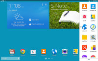
The new tray for Multi Window apps
You can replace apps in each slot and then use the additional app switching feature to bring back apps that were previously in each slot. You can even create pairings off apps, which get a dedicated shortcut that opens all the apps and splits the screen as it was at the time the pairing was created. This can be very convenient for apps that go well together.
Copying stuff across the opened apps is enabled and is done in just three taps. Note that only a few apps work with Multi-window but more can be found in the Play Store.
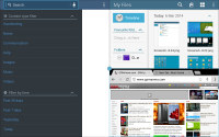
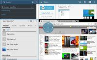
Multi window can run 2, 3 or 4 apps simultaneously
You can also run apps that do overlay other apps using the Pen Window feature of S Pen. You draw a rectangle and the tablet will create a window roughly that size to run the selected app in. The size of these apps can be reduced to just the app icon, if you need to get them out of the way. Even fewer apps support Pen Window than Multi-window.
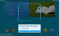
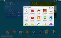
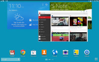
A Pen Window app • the app minimized
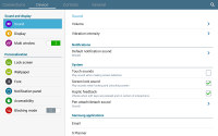
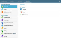
The settings menu has a tabbed interface. On top you get four tabs - Connection, Device, Controls and General and you can find the relative features in their corresponding place - display, for instance, is in the Device tab.
Since the Galaxy Note Pro 12.2 has the same screen resolution as the Galaxy Note 10.1 (2014), the interface looks mostly the same except upscaled by about 20%. Samsung gives you the option to control font size, which does help.
We really like the new Multi-window feature that essentially gives you four 6.1" WXGA (1280 x 800) screens to work with. We do wish the notification area was more sensible though, at the moment it's the same as one on a 4" phone.
Reader comments
- AnonD-610007
- 14 Nov 2016
- r3H
I need to know the prize of the screen for my galaxy note pro 12.2LTE
- AnonD-610007
- 14 Nov 2016
- r3H
I got one but the screen is bad now, how can I get a new screen and how much can I get it? Plz its urgent. ......any help.
- Tintin
- 03 Apr 2015
- fjR
I leave in south Africa, i can only afford the note 12.2 pro on contract but all the carriers have discontinued it, are these the sign that an upgrade is coming or what, love this tablet
