Samsung Galaxy S10 review
Design and 360-degree view
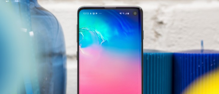
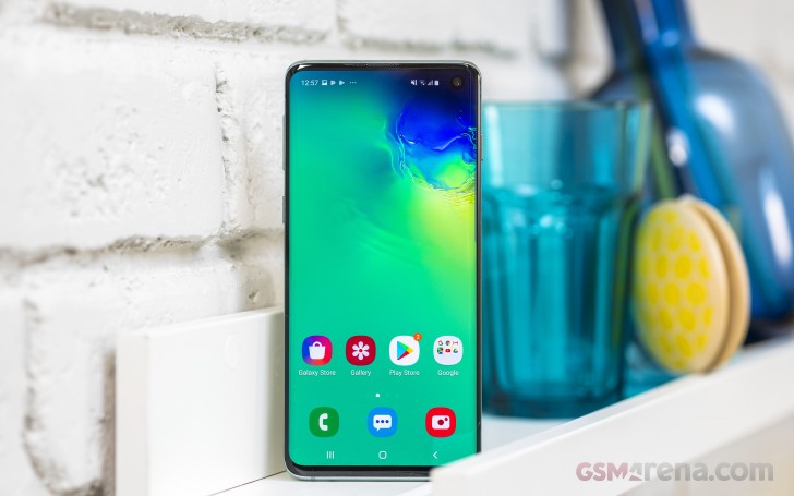
We asked a hundred people what's the single most-striking design feature of the Galaxy S10 and 93 said it's the punch hole camera in the display. Okay, we really didn't, but we assume the results would have been in that ballpark.
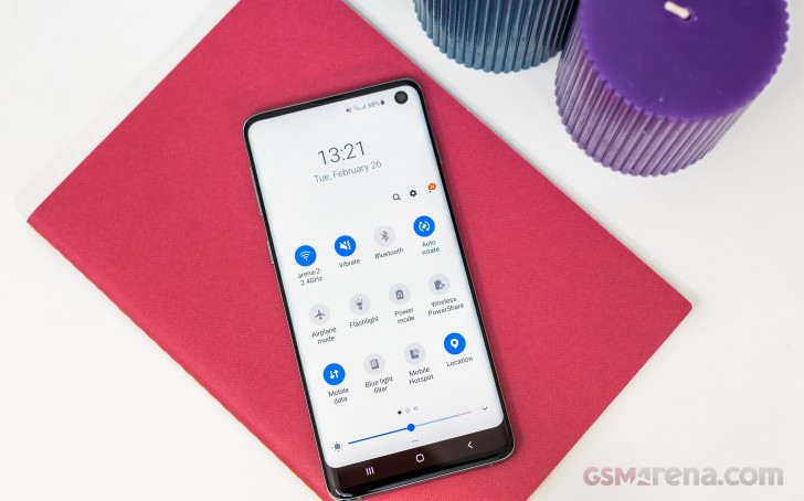
That's not to say all of these people would be loving the cutout - on the contrary, we've heard polar opposite opinions with some folks at the office insisting that the punch hole effectively robs you of more screen estate than the more conventional notches, under some use cases.
No matter where you stand, the punch hole is Samsung's solution for fitting a selfie camera on an all-screen flagship phone, and that's how it's going to be until a less offensive one comes along. For what it's worth, after we moved past the stage of examining the S10 to actually using it, the punch hole pretty much disappeared. Like most notches, for that matter.

Now, if it still bothers you, you can hide it entirely in settings by toggling the 'Hide camera' option on. What that will do is basically erase the the top portion of screen and the phone will treat it like it isn't there. It's not the most elegant solution as you'll get a huge forehead on an otherwise very thin-bezelled phone, but also you'll be wasting usable screen area - the S10 won't use the black bar for status icons or notifications.
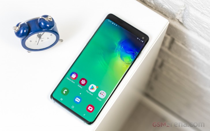
So, embrace the punch hole you should - Samsung's done it. They may have taken it a step too far by naming their displays Infinity-O, but we're definitely enjoying the 'Infinity' part - the Galaxy S10 offers perhaps the most screen you can get in a phone this compact.
That has still left room for a conventional earpiece above - no piezo trickery here. Meanwhile, the proximity and ambient light sensors have been moved underneath the display, to the left of the camera and slightly lower - you can't see them, but they're there. Sadly, the notification LED has been axed this generation.
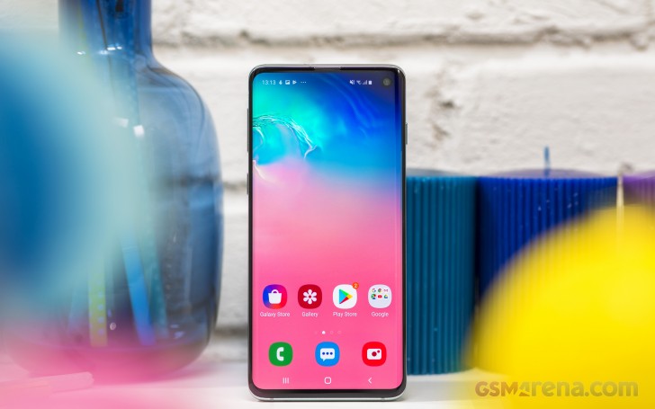
The phone measures 149.9x70.4x7.8mm - 6.3mm taller and half a mil narrower than an iPhone XS for roughly 10% more nominal display area (without accounting for notches/punch holes), and 4.3mm taller and 2.2mm wider than a Pixel 3, while offering more than 20% extra screen than the Google phone. The S10 is also a tangible 20g lighter than the iPhone, though 9g heavier than the Pixel.
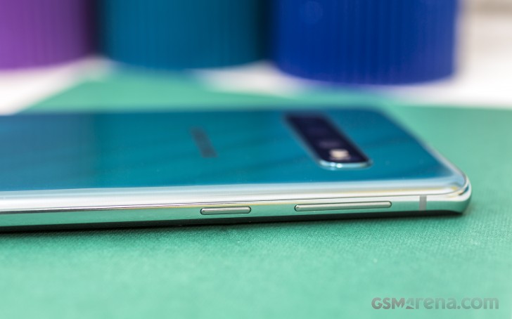
For all its compactness, the S10 has one very real usability flaw, and that has to do with the power button placement. It's way too high on the right side of the frame and doesn't fall where you'd naturally have your thumb if you're a right-hand user. It's even less convenient for the left-hand folk. That said, simply because the S10 is a smaller phone, reaching the power button is slightly less problematic than on the S10+.

The rest of the controls are laid out in a familiar fashion with the volume rocker and Bixby key on the left. The Bixby is now partially remappable - you can assign a single click to the Samsung assistant, and a double click to another app, or the other way around, but not fully disable it.
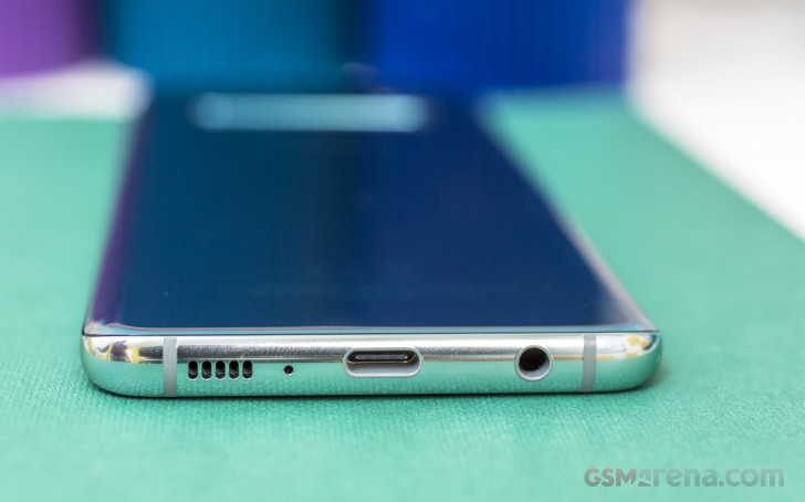
Down on the bottom, there's the usual stuff you'd find on a Samsung phone of recent years - a USB-C port in the middle, headphone jack to one side, and a loudspeaker and microphone to the other.
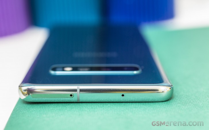
Up top there's another mic pinhole and the card slot which will take a nano SIM and a microSD on single SIM versions of the phone. Dual SIM variants have the second slot shared between a nano SIM and a microSD - the hybrid slot variety.
The frame on Samsung's high-end phones has been made of aluminum since the S6 days, and the S10's is as well. It's polished to a shine and with a pale tint in the general direction of the back color. Colors include the Prism Green of our review unit and a handful of other 'Prism' options that will vary by market, but there are no ceramic versions like you can have on the S10+. Colors aside, the S10 has Gorilla Glass 5 on the back (GG6 on the display), and is IP68-rated.
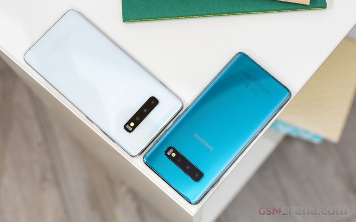 Galaxy S10 in Prism Green and S10+ in Prism White
The back of the S10 features the same camera/flash/sensor array behind a shared window that S10+ has. It's a remarkably clean look for the amount of stuff that's gone in there - three cameras, LED flash, heart rate and SpO2 sensors.
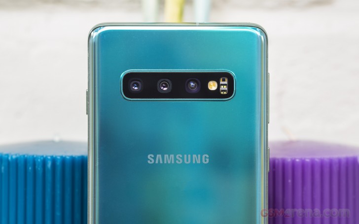
That minimalist back design is in no small part helped by not having to fit a fingerprint reader in there - it's on the front, under the display, instead. It's the ultrasonic type - it emits high frequency sound waves through the display layer and recreates a 3D map of your fingertips. You can read more on our experience with it in the software section, but let's just say here that it's good, not great.
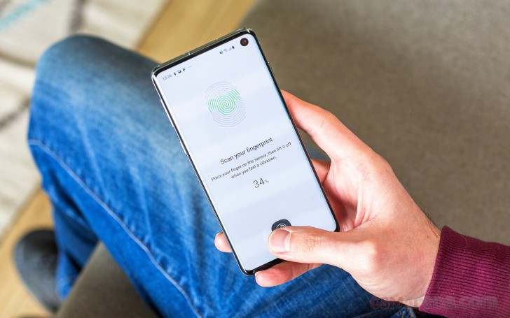
The punch hole aside, the Galaxy S10's design can be summed up as evolutionary, and in a good way. Samsung's been pushing towards bezelless phones since the Note Edge in 2014 and while the display curves have been getting more subtle, the non-display bits on the front have been shrinking. The end result is one sexy looking phone.
Reader comments
- Anonymous
- 15 Mar 2025
- fu%
Yessir
- Anonymous
- 13 Feb 2025
- xjH
Please can Samsung s10 play efootball 25
- Hemzy
- 28 Jan 2025
- r3a
It is a good phone but just the battery not lasting longer