Samsung Galaxy S10 Lite review
Design and ergonomics
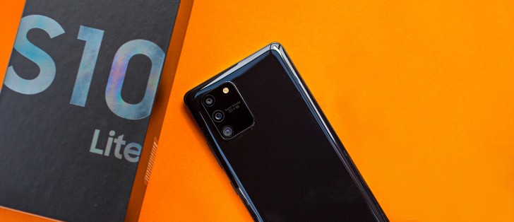
In terms of design, the Galaxy S10 Lite departs from the rest of the S10 family. The back is easily distinguishable due to the camera module design while the front looks a lot like the Galaxy Note10-series with the Infinity-O display design.
Anyway, the build is nothing short of premium. We've got the usual glass sandwich chassis but it's not exactly glass. Samsung calls it Glasstic and it sure does feel like glass but it's not the real deal. Maybe that's the reason why it's so lightweight.
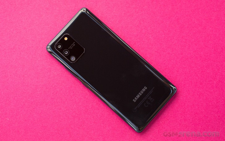
Either way, the handset feels nice in the hand. There are no sharp or protruding edges, the screen is ever so slightly curved to sides to seamlessly transition into the frame - most of you would love the idea of a Samsung flagship with a flat screen - and the same goes for the back panel. Still, the handset is pretty slippery like every other glass phone but at least the fingerprints and smudges aren't as visible on the black version we got.
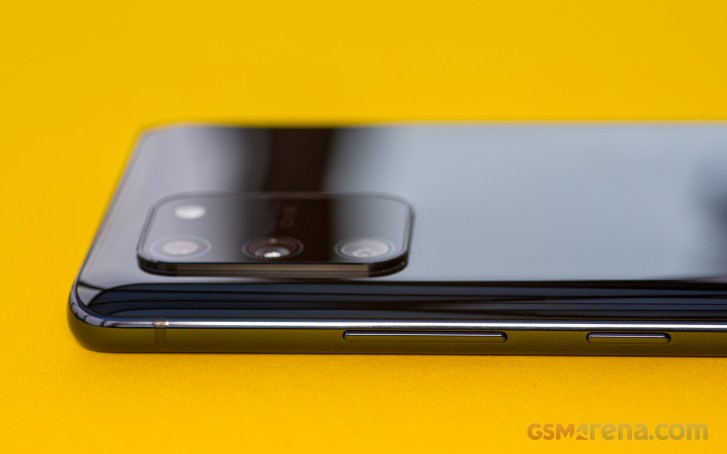
While we are still on the back design, we can't miss addressing the elephant in the room - the oval-shaped rectangle. It does give the phone that distinct look but it's also hard to argue with the fact that the bump doesn't have to be that big. There's a second column on the right reserved just for the LED flash and the Super Steady OIS inscription. But we guess, once the S20 series is out, this would make the S10 Lite appear more in line with the latest flagships.
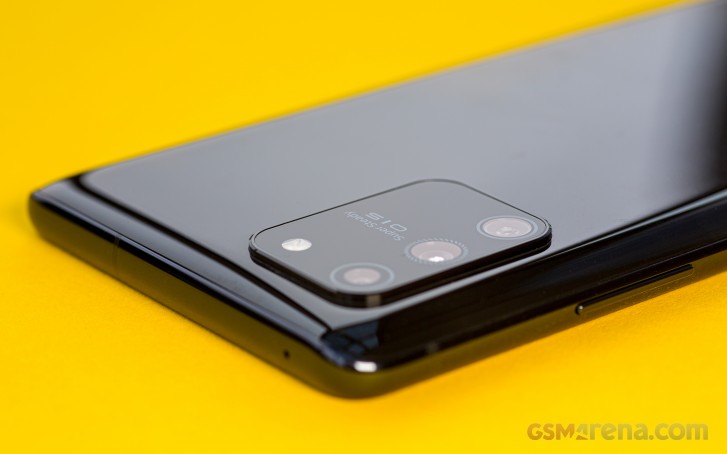
Luckily, the camera bump isn't as big as one would expect. It protrudes just a little and due to its design, it doesn't cause the phone to wobble as much when placed flat on the table.
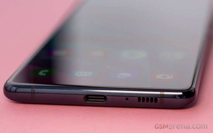
The side frame is made of metal with a glossy finish perfectly blending with the rest of the handset. On the left you will find the SIM card tray, the right side houses the power button and the volume rocker while the bottom makes room for the USB-C connector and the loudspeaker grille. The 3.5mm audio jack isn't there, though.
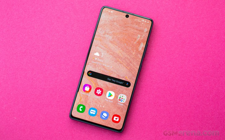
As we already pointed out, the front of the phone looks a lot like a Galaxy Note10+ without the curved side edges. The frame is super thin from all sides except for the bottom bezel. It's still impressively thin but it's a tad thicker than the rest of the bezels.
The punch-hole for the front-facing camera in the center is also quite small and it's close enough to the top border so it doesn't eat away too much of the screen real estate. We find it less obtrusive than a standard or a minimalist notch and most probably won't be an issue for most of you too.
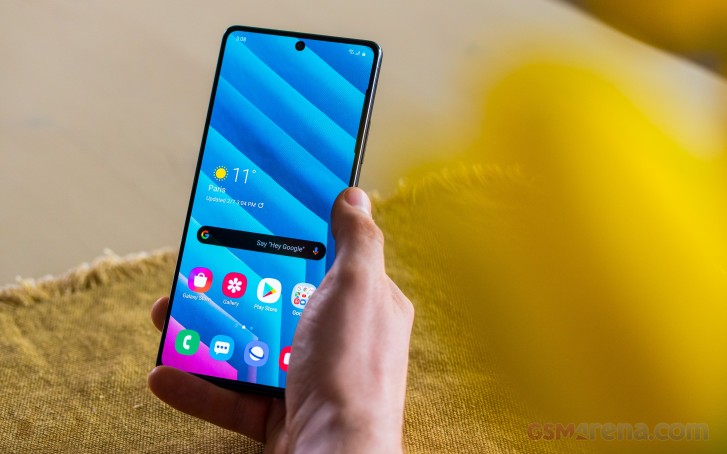
And as far as handling goes, the S10 Lite is an unwieldy phone with a tall 6.7-inch screen, it's really hard to use with just one hand. It also tends to be top-heavy meaning that when you hold the phone, it will tend to lean forward. Interestingly enough, the overall weight of the handset is 186g, which is surprisingly light for a big-screen phone with a huge 4,500 mAh battery. To put things into perspective, the Note10+ and the OnePlus 7T Pro have roughly the same screen diagonal, smaller batteries but weigh around the 200g mark.
Reader comments
- Anonymous
- 17 Nov 2023
- rAS
Yes
- Anonymous
- 16 Dec 2021
- ucy
I know this is a bit late, but it's pretty much the same strategy as the S20 FE series, just an earlier version of it. Since the hype of the S series are dying down, Samsung knows that there is still a market to be picked up before the launch of...
- YUKI93
- 29 Jul 2021
- K1x
I can't even fathom why Samsung would bother to launch this phone in the first place. It was supposed to be the A90 5G replacement since it was called the A91 during the development process. But when comparing this phone and the A90 5G side-by-s...