Samsung Galaxy S10+ review
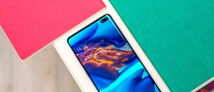
Design and 360-degree spin
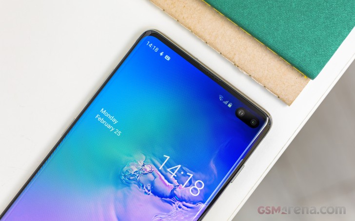
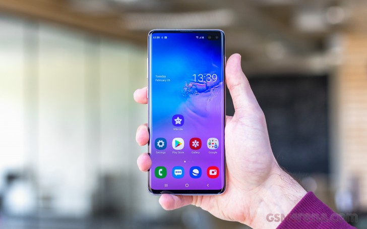
We could pretend it's not there, but it wouldn't make it magically disappear, so let's address it. It's the pill-shaped cutout in the top right corner of the display, an extension to the punch hole style solution to what is perhaps the most pressing issue in the industry - where to fit the selfie cam in the absence of a top bezel.
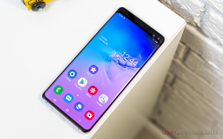 You can hide the camera in settings, resulting in an unused black bar on top.
We haven't heard a single person say they specifically like punch hole selfie cameras, in isolation - at best, people will say a punch hole is a little less objectionable than a full-on iPhone X style notch, but even that opinion isn't universal. And with the influx of sleeker dewdrop notches, the notch-hating has become less violent.
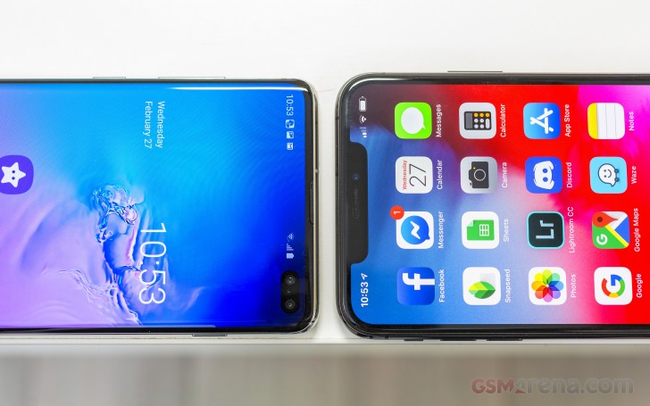
Samsung avoided the notch for its flagship phones last year to make sure Galaxies stood out in a crowd of notches, but for the S10 generation it decided to adopt the punch hole and make a name for itself that way. It's even branded its displays after it - the Galaxy S10+ has an Infinity-O display. The thing is, we may be getting too hung up on the 'O' bit and missing the 'Infinity'.

And the Galaxy S10+ is indeed about as close as we've gotten to an infinity display - one that stretches from edge to edge. We're not entirely there yet, there's still a few millimeters worth of chin and some bezel on top and to the sides, but the S10+ is an impressive feat of industrial design, nonetheless.
The way they've done it has left enough enough room for a conventional earpiece ported on the front - no need for piezo speakers and vibrating the display. The ambient light and proximity sensors are actually underneath the display, in the area below the signal icons, but there's no notification/status LED anymore, sadly.
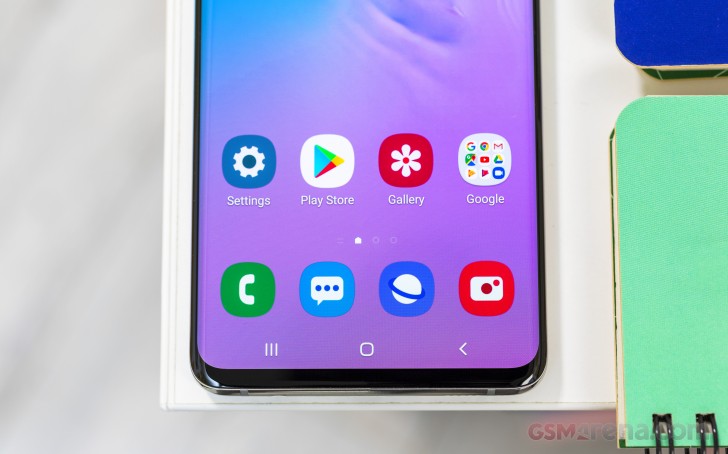
The curved edge displays have been a Samsung signature for a few years now, and the S10+ has one too. After the proof-of-concept Note Edge of 2014, the curves have been getting subtler and they're barely there this generation, as function fights for a better balance with form.
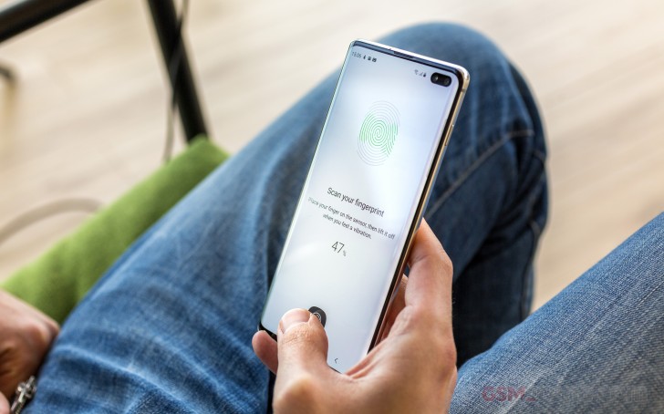
We're debating on which side of that scale to put the under-display ultrasonic fingerprint scanner. It is very futuristic, there's no doubt about that, to place your finger on the display and have the device recognize you and unlock itself. Plus, being on the front, you could use it with the phone lying on a table.
However, it's not quite without flaws in terms of reliability (more on that in the software section), while conventional rear mounted sensors have gotten close to perfect and we're wondering if we're getting the right trade-offs here.
Being our usual positive selves, we'll point out that the lack of a fingerprint sensor on the back has allowed for a more streamlined, minimalist look. Well, to the extent that a triple camera setup can be made to look minimalist, that is.
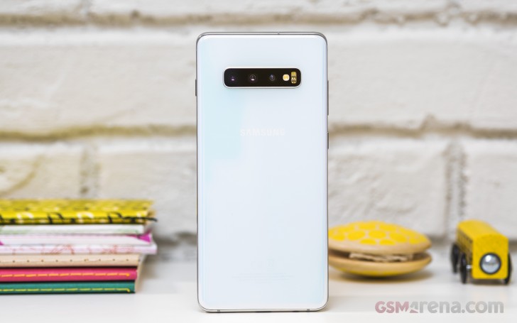
The three modules share a common window with the flash, heart rate sensor and SpO2, and somehow all of that doesn't look cluttered. Now imagine there was a fingerprint reader to spoil things - nah, under the display it belongs.
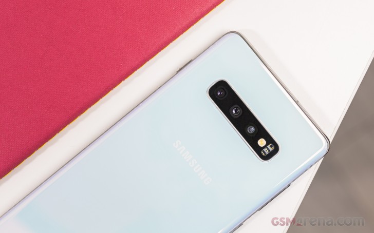
Our Galaxy S10+ review unit is in the Prism White color which has a pearlescent effect and looks all shades of pale pink and blue under different light. A few other Prism color schemes are available, and we'd struggle to pick just one favorite - even the black we wouldn't straight up dismiss as too incognito, as it's got a peculiar depth effect than we're liking. We couldn't get to see the ceramic versions, sadly.
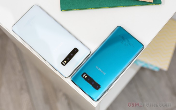
Those should be more scratch resistant than the Gorilla Glass 5-clad Prism backs but that comes at the expense of added weight - a ceramic Galaxy S10+ weighs in at 198g, 3g short of the current Note9 and 9g more than the hefty S9+.
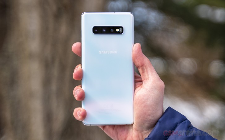
Chances are, you'll be getting one of the regular S10+s and those are a pleasant surprise when it comes to weight - just 175g, compared to the 189g of the S9+. The difference is immediately felt when switching between the two, and the weight loss is much appreciated. It's also made all the more impressive by the fact that the S10+ packs a larger battery than the S9+. Not only that, but the S10+ is also thinner than the phone it replaces by 0.7mm.
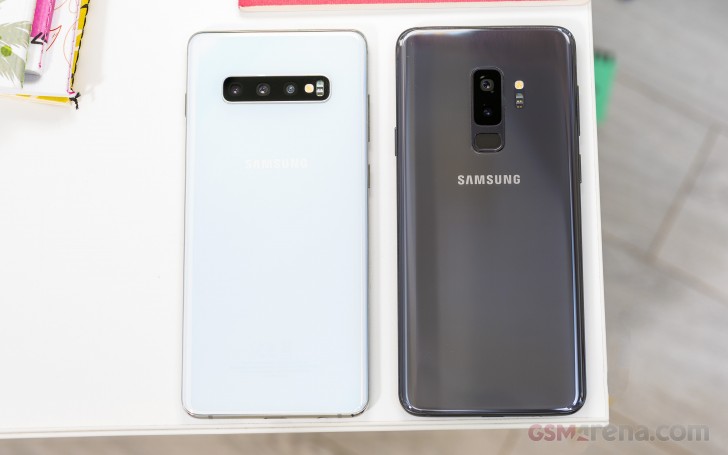 You can't tell from the photo, but the new one feels much lighter.
The Galaxy S10+ measures 157.6x74.1x7.8mm making it half a mil shorter and 0.3mm wider than the S9+, and 4.2mm shorter and 2.3mm narrower than the Note9. It feels more compact than either of those, largely thanks to the slimmer profile.
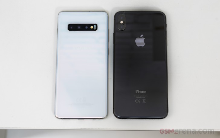
The Mate 20 Pro is also thicker (8.6mm) and heavier (189g) than the S10+, but is close to 2mm narrower and you may very well be able to feel the difference when having to stretch across the displays. Then there's the iPhone XS Max which is actually one of few current large-size flagships that are thinner than the S10+ (only marginally, at 7.7mm, but still). It is, however, significantly heavier (208g) and wider (77.4mm).
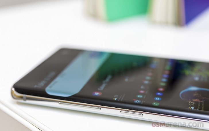
For all its (relative) compactness, the Galaxy S10+ has one big issue when it comes to handling - the power button is placed so high on the right side that it requires more than the usual finger/palm gymnastics to reach, regardless of which is your preferred hand. We can only speculate as to the reason why it's there - internal components location or to make it more in line with the S10e's power button/fingerprint sensor? - but rarely have we had such consensus at the office as we do on hating its position.
The volume rocker and the Bixby key are on the left, pretty much where you'd expect them to be. All buttons click nicely and have adequate size and shape, though a larger power button couldn't have hurt. Then again, a lower-placed power button couldn't have hurt either, yet here we are.
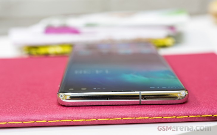
The card tray slides in on top and on dual SIM models it'll have one nanoSIM slot and one that's shared between a second nanoSIM and a microSD card - shared, as in one or the other. Dedicated slots are much better, just saying.
Down on the bottom there are no changes from the outgoing model - a USB-C port is in the middle, with a 3.5mm headphone jack to the left and the mic and loudspeaker on the right.
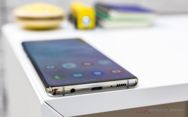
Oh, by the way, as was the case with the last generation, the frame is made of aluminum and polished almost glossy with just the slightest hint of the back color added into the mix. Of course, the Galaxy S10+ is IP68-rated for dust and water protection.
Reader comments
- Anonymous
- 02 Dec 2024
- CGY
Great phone
- Envy
- 25 Oct 2024
- K3q
Recently bought a sealed box S10+ Cardinal Red, love this phone alot. Most time I get almost 10hrs of heavy use on a full charge. I have it for 23 days now and can't go wrong. Planned to keep it for the next 5 years if all goes well.