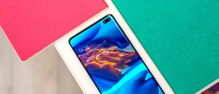
Samsung Galaxy S10+ review
Android Pie with One UI
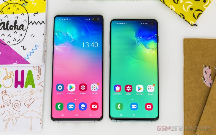
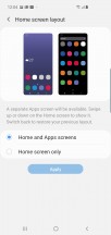
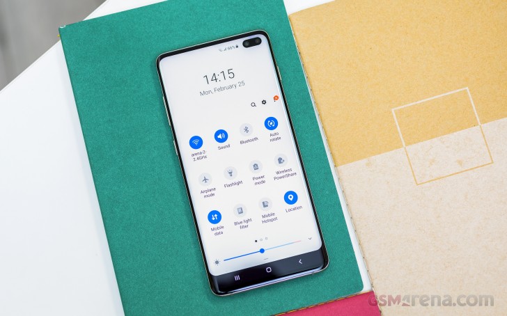
The Galaxy S10 family comes with yet another new Samsung take on user interface after the much hated TouchWiz morphed into Grace and later became simply Samsung UX. The latest iteration is called One UI and we're somewhat familiar with it from the Pie update to the S9 and Note9, but the S10s are the first phones to ship with it. It's characterized by its rounded menus and buttons, focus on single-handed use, and a colorful iconography.
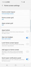
There's an always on display, of course, and with One UI it can also be not-so-always-on - now you can have it displayed only when you double tap on the screen, in addition to being able to setup a daily schedule as before. You can, of course, you know, keep it always on. The clock faces are mostly the same as the ones we found on the S9.
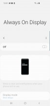
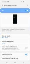

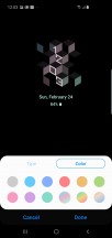
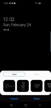
Always on display settings
The locksreen has the usual camera and dialer shortcuts, which you can reassign to any app. Interestingly enough, the notification cards that were introduced with Nougat and can be found on most droids since, are gone on One UI, in its default state. Instead, you're getting just the icons, clumped together next to a clock. Double tapping them pulls down the notification shade where the familiar cards are. However, if you go into settings, you can revert to the classic view.
You're also seeing the fingerprint reader icon on the lockscreen, indicating where to press to unlock, if you've setup fingerprint unlock. If you've got face unlock running, the outline of the camera will light up, indicating it's looking for your mug. Iris recognition is gone - there's no room for an IR emitter and an extra camera.
Let's point out that Samsung's promised a software update that will arrive in the coming days, bringing significant improvements to the fingerprint reader performance. Seeing as how the phone isn't available for sale yet, there's no reason for complaints about that. We'll be sure to update you on the FP behavior post said update.


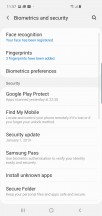
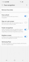
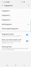
Lockscreen • FP reader ripple effect • Security settings • Face recognition • Fingerprint settings
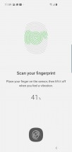
The setup process is a bit lengthy, requiring a lot of taps, but that's generally a good thing - it should theoretically mean more reliable recognition later on.
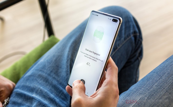
However, in its current state on our review unit, it's anything but flawless, often refusing to unlock after three or four tries and eventually blocking FP recognition due to too many failed attempts. We found pressing and holding to work better than briefly tapping, the finger pointing upwards instead of funny angles helps, and a hint where actually to press is a good idea. As it is, one only shows up if you tap on the screen.
Update, June 18: While testing out the Galaxy's newly introduced Night mode, we also revisited the fingerprint reader situation. We're happy to report that the experience has changed dramatically since our initial encounter with the S10+ and the sensor now works every time, at odd angles too. It's still not the fastest unlock procedure, with optical under-display sensors on the OnePlus 7 Pro and the Huawei P30 Pro offering perceptibly quicker access to the homescreen, but at least now we have the confidence we'll actually get to the homescreen on every attempt.
One UI's new default icons are large and colorful and a departure from the more subdued and minimalist look of the previous generation. Some will love them, most won't care. If for some reason you'd like a landscape view of your homescreen, you can enable the rotation in settings.
One thing Samsung could have finally changed for the better, is opening folders in a more compact window next to the folder icon. Instead, just as before, they open full screen sending the apps up and away from immediate reach.

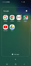
Homescreen • Folder view • Homescreen settings • App drawer • ...or no app drawer
The notification shade is one of the more heavily redesigned UI elements. Upon first pull it's a row of toggles and notifications - business as usual. Pull again and the upper third of the screen shows just a clock while the toggles are brought down much lower, making them easier to reach. Mind you, there's a setting that lets you pull the shade from any empty area of the screen, not just the top, so flipping your toggles is no longer a two-hand task.
Samsung has managed, on the other hand, to ruin its task switcher, thanks in no small part to Google's own native Pie solution. And while the new task switcher is bearable, less so is the fact that One UI adopts Android 9's roundabout way of going into multi-window by tapping the app icon and selecting split screen from the menu. And then, after you're already into split screen, gone are all the options you used to have for swapping the apps, going into popup view, snap window and app pairs. Bummer.
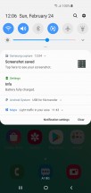
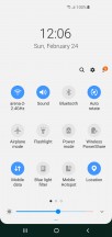
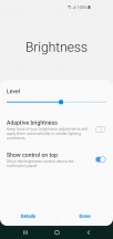
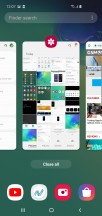

Notifications • Toggles • Brightness • Task switcher • Menu to go into multi window • Multi window
Edge panels remain, fret not, though it's debatable if anyone's using those at all. Introduced with the S6 Edge, they're a set of panes that slides in from the side with shortcuts to contacts, apps, tasks, tools or whatnot. Edge lighting is also here with customizations options for color, width, transparency, and a few effects.
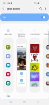

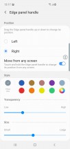
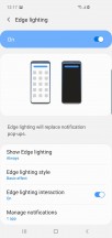
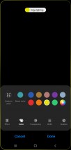
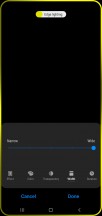
Edge panels • Edge lighting
The edge functions go way back, but the option for gesture navigation is brand new - another party that Samsung joins rather late. You can replace the actions on the classic navigation bar with swipes from the bottom up that do the same. You swipe up from the center to go home, swipe up on the right to go back and swipe up on the left to open the task switcher. A swipe up and hold from the center will launch Google Assistant. You can choose to show or hide the bars that indicate where the swipes should be done and if you're going the gesture route, it does make more sense to hide them altogether.
We feel that Samsung's implementation of gesture navigation is a bit half-baked and doesn't do much to speed up interaction or make it any more natural than taps do. It does free up screen estate by removing the nav bar, so there's that.
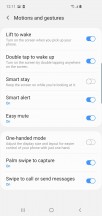
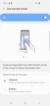
A bunch of familiar gestures and the likes are available on the S10+ as well. You can go into a shrunken-down one-handed mode (either triple press home, or swipe in from a bottom corner), and you can launch the camera with a double press of the power button. Meanwhile, Smart Stay will use the front camera to determine whether you're looking at the phone so it won't go to standby if you're staring blankly at the screen for a long time. All of these can be switched off.
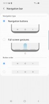


Navigation options • Nav bar removed • Hints removed too * Gestures
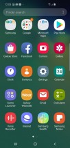
Secure folder, Game launcher, Bixby - the usual suspects are all here as well. Secure folder lets you keep files, memos, and apps away from prying eyes. Game launcher groups all your games in one place and makes sure your gaming sessions remain as uninterrupted as possible.
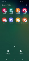

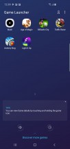

Secure folder • Game launcher
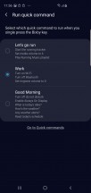
Bixby is the same assistant no one asked for, but now you can assign the button to launch another app or carry out a whole routine of actions, quick commands Samsung calls them. You have to choose whether a single press will launch Bixby and a double press will run the app, or the other way around - you can't disable Bixby entirely. Still, we very much appreciate the change.


Bixby
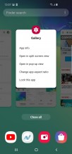
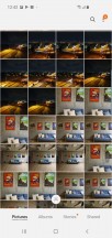
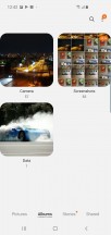
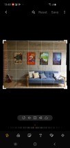
Samsung's Gallery has stood the test of time and still makes it to every new Galaxy. Makes you wonder who uses the Stories - shareable, collaborative albums where your friends can add their own photos from the party or just a Story on a shared theme (e.g. sunsets). The Albums pane gives you a sorted view of your images by origin (camera, screenshots, downloaded images) while the Pictures pane is effectively a timeline - it aggregates all of your images and arranges them chronologically. Several image editing tools are available - from basic cropping, to collage making, to a more capable editor (which supports image correction, effects and drawing).
Unlike the in-house Gallery, music playback is left in the hands of Google's own Play Music. The player and service is ubiquitous and it can play your local files, as well as stream music from the cloud. Samsung's extensive sound enhancements do come as standard, and they include the SoundAlive equalizer and our favorite - Adapt Sound that tunes the EQ to your hearing and your particular pair of ears and headphones by playing multiple frequencies and asking how well you hear them.


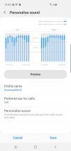
Gallery • Google Play Music • Adapt Sound
Reader comments
- Anonymous
- 02 Dec 2024
- CGY
Great phone
- Envy
- 25 Oct 2024
- K3q
Recently bought a sealed box S10+ Cardinal Red, love this phone alot. Most time I get almost 10hrs of heavy use on a full charge. I have it for 23 days now and can't go wrong. Planned to keep it for the next 5 years if all goes well.