Samsung Galaxy S10+ long-term review
Design
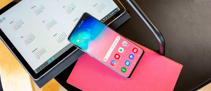
After a Galaxy S9 family that, on the front, looked so eerily similar to the S8 models that most people would have trouble telling them apart, this year Samsung went with a design revamp. It's big enough that you'll notice, but not so big that you'd have trouble figuring out that this is a Samsung phone you're holding.
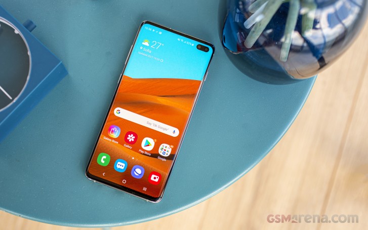
The new Infinity Display branded Super AMOLED screen is still curved and while the bezels have been trimmed, the bottom one is noticeably bigger than the top bezel, which makes for an asymmetrical look that is excusable in a mid-range device but less so at this price point. After all, if you're going to go head-to-head with Apple on pricing, perhaps such details should also be taken care of - especially seeing as how both Samsung Electronics and Apple use the same supplier for their AMOLED panels, and that is Samsung Display.
The sides are unsurprisingly metal, shiny in our white review unit, while the back is still glass. The prevailing trend when it comes to back glass design in the smartphone world ever since last year has been gradient finishes, and Samsung is cautiously approaching this with less conservative colors on the rear. It's still not going all-in with the gradients, perhaps thinking they may already be associated in the public's mind with competitors such as Huawei.
The white model has a pearlescent effect so depending on how light hits it you will see some interesting (mostly orange-ish) reflections, but, unlike some of Huawei's models, you won't have any trouble identifying what its main hue is. The finish is slippery, of course, being glass and all, but surprisingly less so than we expected. For most people a case is still the way to go to protect the thousand-dollar investment, but if you want to use the S10+ without one, it's definitely not impossible like with certain other phones (some of Sony's recent flagships come to mind).
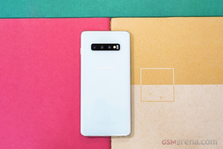
On the white model, fingerprints are practically invisible, and this is an additional factor that might make you decide to use it without a case. With some other glass devices, fingerprints are so visible on the back even after a few minutes of usage, that if you don't like to see them you're pretty much going to have to carry a microfiber cloth with you at all times.
The camera island on the rear of the S10+ has more shooters than its predecessor's, but it's also much more of an eyesore. It's just big. And wide. And it protrudes quite a bit. Interestingly, its enormous width has a couple of upsides: the phone doesn't wobble if you use it while it's resting on its back on a hard surface, and it won't slowly slip off your couch.
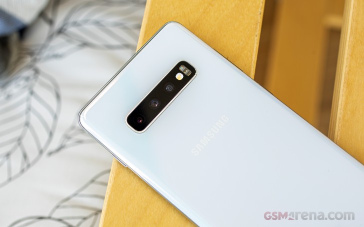
The fingerprint sensor is gone from the rear because it's under the display now, yet the Samsung logo is still inexplicably crowding the top half of the phone's back, supposedly to make room for the regulatory labels that are barely visible in the bottom part, laser etched onto the glass. Then again, a vertically centered logo would have still been a better idea, symmetry-wise, but alas, Samsung doesn't seem to care about that a lot - with a notable exception being the way the glass sheets curve into the metal frame from both the front and the back.
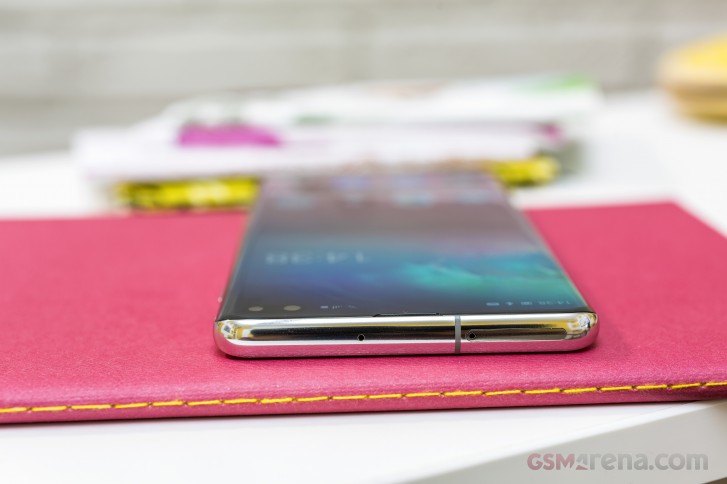
The stereo speakers are quite impressive, and will serve you well when you want to enjoy the occasional video on the device. The bottom speaker is still rather easy to accidentally cover with your hand, though, because of its placement, but this is clearly the best we're going to get in a world that seems intent on killing screen bezels. If you listen to music the speakers are still good, but with the usual caveat having to do with lack of bass coming from such small enclosures. Volume is plentiful for everything but the most noisy environments.
While the Bixby key lives on, it's actually not the worst button on a Samsung flagship anymore. That honor goes to the power key this time, which is weirdly placed way too high up on the right side. This means that, if you're right handed, it's never quite within the reach of your thumb when you normally hold the device. Finger gymnastics will thus be required every time you need to press it.
Handling, build quality
While its 6.4" screen might suggest otherwise, the Galaxy S10+ is still easily usable with one hand, especially if you have bigger mitts. We find that phones around or under 75mm wide are probably at the limit of what most people would call usable with one hand, this device included. The S10+ is ever so slightly top-heavy, but not enough that it will become annoying to hold, even for longer periods of time.
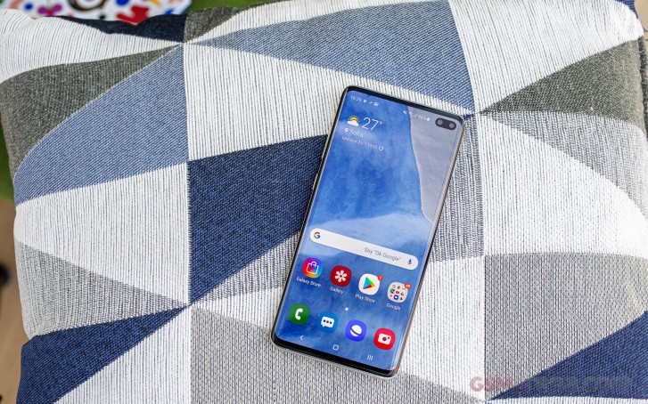
The build quality is as premium as it has to be to even remotely justify that launch price tag, and it goes without saying that there are no creaks whatsoever and the entire construction feels incredibly sturdy. There's even a 3.5mm headphone jack at the bottom, although if rumors are to be believed this may be the last Samsung flagship to offer that port. The S10+ has held up very well after prolonged usage, showing no signs of wear and tear whatsoever - and keep in mind that we didn't slap a case on it.
The design is fresh but still very recognizable, and Samsung has chosen to not directly copy everything its Android competitors have been doing, instead carving its own way from this point of view. Handling the S10+ is great, and the build quality is fantastic, so you will never doubt that you purchased a premium smartphone.
Reader comments
- Shyam suthar
- 01 Oct 2024
- upi
In my s10+ have green line center of the display without hit and damage any solution of this problem
- Anonymous
- 24 Sep 2024
- Kxe
used since May 1, 2019. I just replaced the battery this year (test results at the Samsung center for battery capacity remaining 70-80%)
- Bobby
- 09 Sep 2024
- 4ra
Am planning to buys one, is it a good choice though? Can it run car x street and latest versions of game properly?