Samsung Galaxy S10+ long-term review
Software
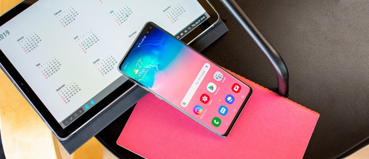
One UI is a huge departure from the Samsung Experience and TouchWiz of years gone by. It's a welcome refresh of Samsung's UI design language, and it brings a much improved user experience. In terms of looks, it's way cleaner and less cartoonish, and some ideas it incorporates are genuinely helpful in a world now dominated by smartphones with huge displays - such as using only the bottom half of the UI to show actionable items. This significantly cuts down on the finger gymnastics you need to perform while operating the phone with one hand, at least when you are in Settings or the built-in Samsung apps.
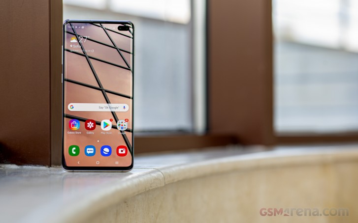
This design philosophy is unfortunately pretty far removed from what Google is doing with its apps, not to mention third-party developers. So, as usual, you buy a Samsung flagship and you have to get used to the lack of continuity, design and UX-wise, between its own apps and those from Google or other companies. This situation is unlikely to ever change, because Samsung is unlikely to ever fully incorporate Google's design language into its devices, as that would make it lose a big differentiating point in the heavily competitive smartphone market.
While a lot of people used to hate TouchWiz and Samsung Experience based on looks alone, we find that One UI is a lot harder to diss on that account. It's modern and unique, which is a great bifecta - you won't confuse it with anything else on the market, but you won't be put off by its visuals either.
Night mode, Edge screen
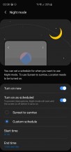
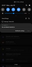
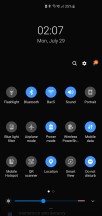
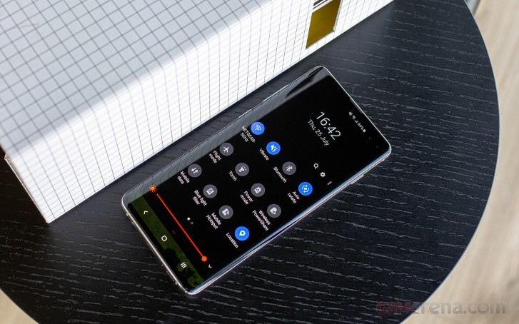
One UI has Night mode, a full-blown system-wide dark theme that you can enable, and even schedule to automatically turn on and off at set times, which is very handy. We find its name quite confusing though, as "Night mode" is an entirely different thing in the Camera app, and also what some other companies call their blue light filter.
Name aside, it works very well, turning the entire OS dark, including Samsung's built-in apps. It doesn't do anything for third-party apps, however, including Google's, and it's unclear if Samsung's Night mode implementation will ever be able to automatically switch Google's apps to their dark versions once the search giant has finished adding such themes to all of its apps.
It will be even more interesting to see what path Samsung takes with regard to Night mode once Android 10 Q hits the S10+, since one of the main new aspects in the upcoming OS version is the fact that it comes with a built-in dark theme. Hopefully we won't see competing implementations here like we did with split-screen multitasking in the past, but we're not holding our collective breaths.
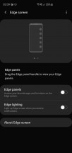
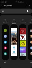
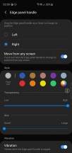
Since the S10+ has a dual-curved display, it packs Edge screen features. Some people really like Edge panels, which let you quickly jump to a preselected list of apps or actions or contact the people you're closest to, but if, like us, you are already put off by how palm rejection doesn't always work accurately you'll probably want to turn this off. When it's on, you might find the panels come into view a lot of times when you didn't intend them to. That was our experience, but once again your mileage may vary, and if you use a case this is less likely to happen.
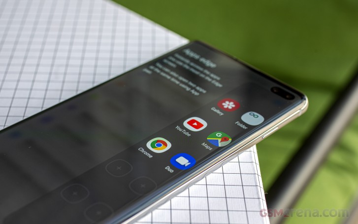
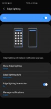
Edge lighting may or may not make up for the lack of a dedicated notification LED in the S10+, that's up for you to decide. This feature lights up the edges of the screen when you get a notification, and will replace notification pop-ups. If you're used to a notification light of any sort, then this may be a life saver, otherwise it could be classified as a neat gimmick and nothing more.
Settings
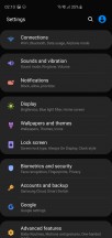
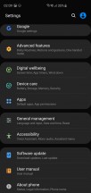
Samsung has always catered to the people who love having an option for everything. If you like things to just work and not have to think about a million different settings and options, then you'll probably be served better by another device. In Samsung's world, you can control everything. Okay, this is an obvious exaggeration, but there are still so many customization options that simply going through all of them is likely to take an extreme amount of time.
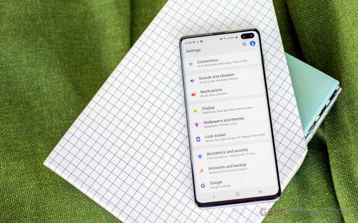
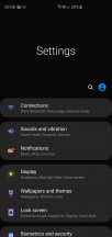
The Settings menu has been toned down, but it still houses an incredible amount of things. And while a lot of the options Samsung gives you will be welcome to a lot of people, there's also something to be said about how its philosophy might quickly lead you to decision fatigue. While most people, when asked, would prefer having more options than less, actually being faced with a huge number of choices one after another can be quite psychologically taxing. And this is what you'll have to deal with if you go take a deep dive into Settings.
Sure, you could just never touch the Settings menu and leave all the defaults as they are, thus avoiding any semblance of decision fatigue. But then you may find yourself on a call, with another call waiting, so you slide the green blob to answer the new one, start talking, only to realize a few seconds later that you're not actually talking to the new person because the phone hasn't switched between conversations. Why? Well, because it popped up a 'helpful' question asking you what you want to do with the call you were initially on - put it on hold or hang up.
This is a classic example of needlessly overcomplicating things in the name of choice. In 99% of the cases for 99% of people automatically putting the initial call on hold will be a much better outcome, because that's the action that most would choose to take anyway. But despite all the talk of AI this and AI that in the mobile world recently, with Samsung you still need to manually pick between things, adding decision after decision to your life where other manufacturers simply auto-employ what should be the default and call it a day.
Because the entire Settings menu has been revamped, and things moved around, Samsung has added suggestions to the bottom part of all sub-menus - and these are very well thought through. So if you were expecting to find the settings for the Video enhancer or the Always On Display in the Display sub-section, if you scroll all the way down you will get offered the chance to jump to those even if they're not there.
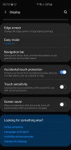
Suggestions at the bottom of Settings sub-menus
This is a smart system and it works very well but it makes an amusing point about how Samsung must have been aware of the fact that people would instinctively look in some places for some things - but then decided not to put them there. The new locations may adhere better to Samsung's internal logic, but if they don't match up with users' instincts, this may just be a pointless exercise in playing musical chairs.
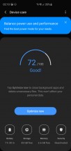
Whether a specific feature is highly important or a mere gimmick depends on the person using a phone, but the security scanning software built into the Device care section of Settings could undoubtedly be called the latter by everyone who isn't installing apps from shady places. There's zero need for something like this on a smartphone otherwise. The same can be said about having a manual "Optimize now" button you can push to feel better about yourself from time to time. It's 2019. "AI" is the buzzword you hear everywhere, and yet you still have to manually "Optimize" your phone? Why can't it just do that by itself?
Samsung seems to have decided that people like such gimmicks because most of its Chinese competitors ship them on their handsets, but the story of why those got there in the first place is a bit more complicated and has to do with the lack of the Play Store in China, which is replaced by dozens of options, ranging from barely okay to incredibly shady. In that case the security scanner and optimizer and whatnot are pretty much essential to the use of a smartphone, but for markets outside of China, where most people install apps from the Play Store, this is all very much unnecessary.
Duplicate apps
Duplicate apps are a given right now for any Android smartphone that isn't made by Google. The search giant forces a few pre-installs on every manufacturer that wants to use the Play Store, so you're stuck with those. And then every Android maker under the sun also likes to create a few apps of its own to pre-install. Samsung is no different, of course, and it used to be one of the worst offenders in the duplicate apps game. It's still going to be forcing a bunch of stuff on you, but at least it's apps that adhere to its new One UI design language, so using those and not Google's means there's some continuity in looks across your user experience.
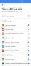
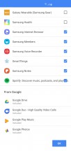
Apps you can choose not to preload upon the initial setup
The duplicate app store, however (now called Galaxy Store after who knows how many rebrandings), is just an exercise in pointless differentiation. There's really no need for two different app stores on one device, but alas Samsung still delivers this.
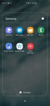
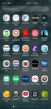
Samsung, Microsoft, and Google apps
To add to the confusion, as before, some pre-installed Samsung apps update through the Play Store while others update through the Galaxy Store. Owning a Samsung smartphone has always meant finding a way to come to grips with this situation, and that hasn't changed. If you're a Samsung veteran you're probably used to things being this way, but newcomers to the brand might find it a bit disorienting.
Bixby
First off, yes, Bixby still exists. And it still has its dedicated key on the left side of the phone, though if rumors are correct it will be the last flagship to rock it. Samsung isn't quite ready to give up on its Bixby experiment yet, it seems, even though Bixby Voice (the voice assistant part of the software) is still inferior to Google Assistant in almost every way - and it's especially bad at recognizing what you want from it.
Bixby Voice actually feels like it belongs in the "duplicate apps" section of this review, because there's not a lot that it brings to the table that makes it unique enough to live on a device alongside Google's Assistant. Bixby has lower-level access to phone functions, but that's about it. For any query that has to do with finding stuff online, it's just not a contest - the Google Assistant always wins, and the experience of using it is miles better too.
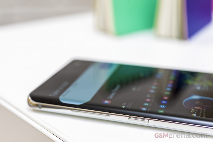
Bixby Home is the panel that lives to the left of the leftmost home screen in Samsung's default launcher, and it serves as the Korean company's response to Google's Feed (or whatever that is being called this week). It's not necessarily not useful, this, but it's so slow to load that you'll probably end up avoiding it even if you don't turn it off - which, thankfully, you can do.
It's not just slow to load when you reach it, it's also slow to scroll through because of the pointlessly exaggerated animations that bring the different panels into view. You can add a lot of stuff here, and you may find it useful. We're still intrigued by how a lot of Android device makers have taken to using this space for panel or card-based vertically scrolling UIs in their launchers - OnePlus has the Shelf, Xiaomi has the App Vault, and Samsung has Bixby Home.
Bixby Vision is still present too, with the pitch being that you simply point your phone at something and it will identify what that is, giving you more details about it and even showing you a purchase link if it can. The concept here is a direct copy of Google Lens, and unfortunately neither work well enough every single time to be as trustworthy as they should in order to make accessing them something you instinctively want to do. There's room for improvement in the future, though, and with all the advancements in machine learning both of these services could one day be amazing. They're just not there yet.
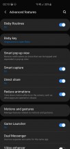
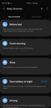
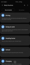
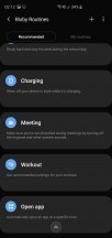
With the latest version of One UI, Bixby Routines have been introduced, and this might just be by far the most useful part of Bixby - at least if you like the concept of macros. Like the third party app IFTTT, Bixby Routines work on an if this, then that philosophy that might be quite hard to grasp at first, but which a lot of people like.
Samsung helpfully has some predetermined routines you can enable or customize to your heart's content, so here's a quick and easy one: if you leave a certain location (say, home), then Wi-Fi will turn off. Or, if you arrive at a location, it will turn on. There are pretty much endless possibilities here, and unlike all the others, this is one Bixby feature that we used every single day - and by "used" we mean we set up some routines once, and then they automagically worked when the set conditions were met.
Gestures
Like every other Android maker out there, Samsung now offers a gesture navigation system that frees up the screen space used by the three-button navigation bar. It's not on by default, so you can still go with the bar if you like it. We on the other hand find it very hard to go back to that method after having been spoiled by numerous implementations of gestural navigation in the past year or so.
That is to say, we enabled the gestures as soon as we started using the S10+ as our daily driver. The mere presence of gestures as an option is good in our book, and one of the rare cases where Samsung isn't wrong to offer a choice - but that's mostly because the gestures still need some work. They're fine for the most part, but swiping from the bottom right area to go back fails around one in twenty times (the accompanying vibration is there but the action simply isn't performed), and when you swipe from the bottom left to bring up the multitasking view the animation is incredibly janky every single time.
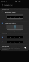

Gesture settings, Recents view
Initially we were sad to find that Samsung's system doesn't include a quick way to jump to the previous app, but the company has actually thought of a workaround - when the multitasking menu shows up, the app that's in front of you in it will be the last one you used. So if you want to jump to it you then just need to tap, no more swiping necessary.
That's an interesting solution in theory, except that what actually happens is this: you swipe up from the bottom left, the multitasking menu shows up with your current app in view, and then this automatically 'scrolls' to the right side, bringing the previous app in view. This process is also janky and it might throw you off if all you wanted to do was dismiss the current app by swiping it up. We're not sure why Samsung thought it would be a good idea to make you wait half a second or so for the current app to be taken to the right and out of view - if this was intended as a true workaround for jumping to the previous app then that could just show up from the start.
At the bottom of the Recents view you get the icons for four suggested apps, which the phone thinks you might want to open, and we found the algorithm powering this feature to work very well. Very rarely was the app we wanted to go to not among those four.
Updates
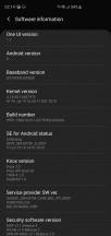
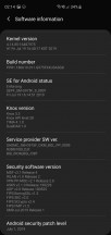
Samsung has been issuing monthly security updates for the Galaxy S10+ ever since it came out, which is refreshing to see, as a lot of manufacturers tend to skip a few beats in this regard. While the Korean company hasn't been quite as timely with getting these updates out as Google itself or Essential, they have so far arrived by the end of the month. So every month there could be a few weeks during which your Galaxy S10+ is on the previous security patch level, but nothing too extreme.
While its behavior relating to security updates is commendable, what remains to be seen is how Samsung is going to handle the update to Android 10 Q. As usual, Google should release the new version in August, and with Pie it took Samsung until late December last year to get the ball rolling for the Galaxy S9+, and the rollout was completed many weeks later, well into 2019.
Despite the fact that we want to be optimistic and say we're hoping it won't take as long this time around, we feel like it's best to set your expectations to a similar timeline for Android Q coming to the S10+ - if you're lucky maybe it will make it before New Year's Eve, otherwise expect to see it in early 2020. Of course, with Samsung's heavy UI customizations, you aren't likely to benefit from any of Google's additions in this regard, so the Q release will primarily bring under the hood improvements for Samsung handsets.
Reader comments
- Shyam suthar
- 01 Oct 2024
- upi
In my s10+ have green line center of the display without hit and damage any solution of this problem
- Anonymous
- 24 Sep 2024
- Kxe
used since May 1, 2019. I just replaced the battery this year (test results at the Samsung center for battery capacity remaining 70-80%)
- Bobby
- 09 Sep 2024
- 4ra
Am planning to buys one, is it a good choice though? Can it run car x street and latest versions of game properly?
