Samsung Galaxy S10, S10+, S10e, S10 5G handson review
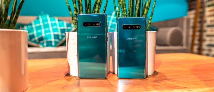
Samsung Galaxy S10 and Galaxy S10+ hands-on
Let's look at these two together, shall we - they're very much the same phone, only different sizes of it. If you're searching for opinions on a shoe on the internet, you're not looking for your size 9 in particular, are you? That's more or less the case with the Galaxy S10 and S10+.
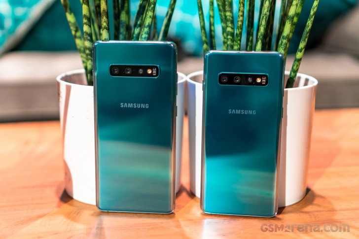
They certainly are some very fine specimens of modern industrial design. Samsung's been making displays that spill towards the edges for a few generations now, largely eliminating the side bezels. This year they've all but done away with what remained of them above and below the display too, getting us closer to the bezelless handset of sci-fi movies - which, to be fair, other smartphone makers have been doing as well, some even at a faster pace.
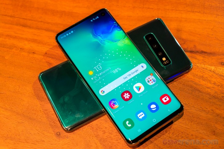
We all know, however, that there are issues with a phone that's all display - maintaining key components that have traditionally occupied the space around the shiny bits in a world where that space is no longer available.
We say key components, but the earpiece can be made thinner, the ambient light sensor can be placed underneath the display, the notification LED is already tiny and that's if it's not removed entirely, which has been happening more and more recently. Sadly, that's also the case on the S10.
So, it's really just the selfie camera. It could only be made so much smaller, but we're not giving up on selfies for that bezelless dream, no! Working around that conundrum has been an exercise in design and engineering that's given us rear displays, sliders, motorized cameras, and the most basic, but questionable in its attractiveness, solution - the display notch.
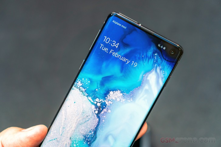
This whole lengthy preamble was needed to introduce the notch's mortal enemy - the punch hole. This year's Galaxies have punch hole style selfie cameras, and regardless of where you stand on the notch-vs-hole debate, the selfie camera cutout is going to be one of the Galaxy S10s' defining features.
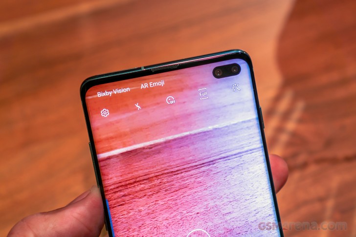
The displays go by the name Infinity-O - 'infinity' for lack of bezels, 'O' for the camera opening. A precision laser cutting process has meant that only as few as possible pixels needed to be sacrificed to fit the camera, though the collateral damage in terms of wasted display space is still there, whether it lights up or not.
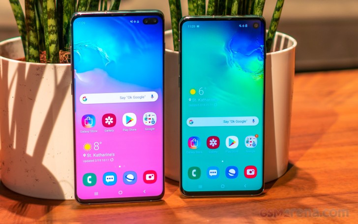
And this here is where the S10+ and S10 differ the most in principle, as opposed to just in scale. While both have the same 10MP f/1.9 primary selfie camera, the bigger phone has an extra 8MP one next to it. This should allow better depth detection and a slightly expanded FoV (90 degrees vs. 80 degrees of the regular one) at the expense of further sacrifices in usable display area. On the upside, the Plus version does have more display space to begin with.
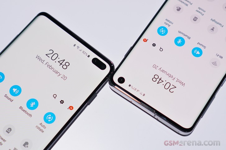
Where there are pixels, however, they light up and they light up bright - all the way to 1200nits Samsung says. With the nature of AMOLED panels, those levels are only achievable when only a small part of the screen needs to be light up to them, but seriously - no one needs their entire smartphone display glaring at them at 1200nits. It's for HDR viewing purposes that the panel needs to be able to crank up the brightness here and there, and for that it'll deliver.
It's not just Infinity-O, it's also 'Dynamic AMOLED'. Gone is the 'Super' now making way for 'Dynamic' in Samsung display PR talk to emphasize the HDR10+ capabilities of the screens - these are the first smartphones wiith HDR10+ support. We hardly need to be sweet-talked, though - we've come to expect nothing but the best displays from the company's top-tier phones and the ones on the Galaxy S10 models are precisely that. Of course, we'll need to take units into the lab for the exact numbers, but initial impressions are 'wow'.
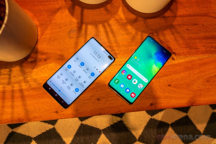
The displays are in a 19:9 aspect ratio, an evolution of Samsung's previous 18.5:9 with the extra 0.5 taking over the bezels. The resolution on these two is 3040x1440px for pixel densities above 500ppi no matter if you opt for the Galaxy S10+'s 6.4 inches or you go for the smaller 6.1-inch Galaxy S10.
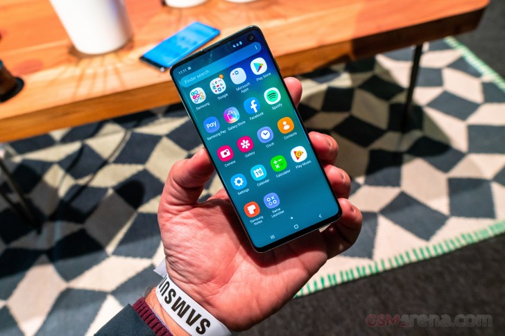
Once we're on the topic of size, the Galaxy S10+ fits in mostly the same footprint as the S9+ before it - it's half a mm shorter and 0.3mm wider, which is the definition of negligible. The 0.7mm reduction in thickness is easier to feel and so is the drop in weight from 189g to 175g. That's a rather spectacular feat given the increase in battery capacity from 3,500mAh to 4,100mAh.
The smaller Galaxy S10 model is also lighter than its predecessor, though the 6-gram drop to 157g makes far less of a difference. It too is 0.7 thinner than the last year model, but it's got a marginally larger footprint - at 149.9x70.4mm it's 2.2mm taller and 1.7mm wider. It does, however, also have a larger 6.1-inch display vs. the S9's 5.8-inch one.
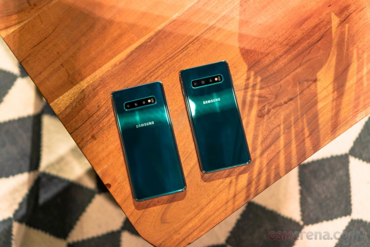
These displays are covered in Gorilla Glass 6, as are the backs of the Galaxy S10 and the mainstream Galaxy S10+ versions. The colors on offer will be Prism Green, Prism White, Prism Black, and Prism Blue for the regular S10 and S10+ and then a couple of ceramic-backed options for the Performance edition of the S10+ - the 8GB/512GB and the (ridiculous) 12GB/1TB S10+ variants will be offered in Ceramic Black and Ceramic White.
We only got to see the Prisms at this point and the White has a pearlescent effect to it, while the Black leaves a particularly cool sense of depth and three-dimensionality. It's close to impossible to show these in photos, sadly, particularly in artificial lighting, so you'll have to take our word for it at this point.
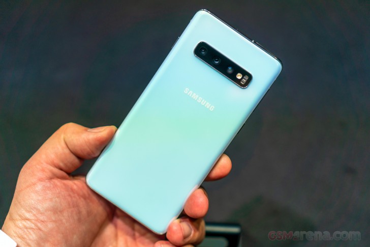
Regardless of color and finish, all the Galaxy S10 versions from 'e' to '5G' are IP68 dust and water resistant.
Aside from the environmental sealing, another thing that's remained a staple of the Galaxy S-series is the headphone jack. Some call it a 'legacy' connector, but we'll reiterate our support for the 3.5mm stereo jack. Stereo speakers are also nice, and the Galaxy S10 and S10+ have them - the earpiece may have been reengineered to minimize the top bezel, but it still doubles as one channel in the stereo pair. Along those lines we should also mention the that the microSD box is checked as well.
Not entirely sure how to go about this, so we'll just spit it out - the Galaxy S10 and S10+ have the same wired charging speeds as the Galaxy S5 from 5 years ago. It's not strictly slow, it's just nowhere as fast as others on the market. On a positive note, the phones can do fast wireless charging, and they can wirelessly charge other devices - it seems like all thought went into wireless and wired charging was left hanging.
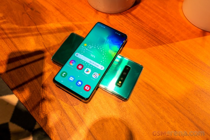
The control layout has remained largely unchanged also, with the power button on the right, and the volume rocker and the Bixby button (sigh) on the left. We say unchanged, but that's not entirely true - the power button has gone high up towards the top of the body, and it's not necessarily a welcome change - too high, we protest. It's barely okay on the smaller phone, but on the S10+ it's so far up that it's not accessible even for people with bigger hands.
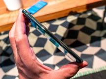
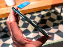
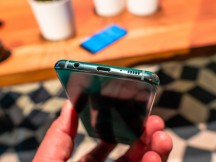
Power button way too high • Bixby is still here • USB-C and 3.5mm jack
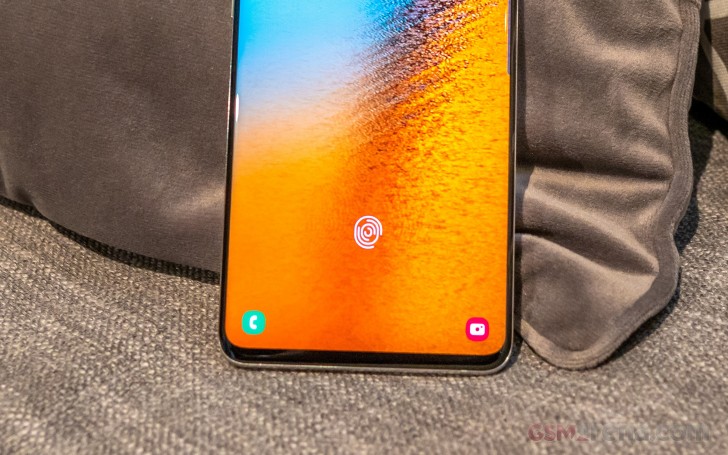
Speaking of controls, where's the fingerprint reader? Ah, underneath the display, where else. The revolution's happened and Samsung's finally switched to an under-display fingerprint reader, and it's of the ultrasonic type - as far as we know that means tough luck for (most?) screen protectors, but also improved security - tradeoffs, tradeoffs everywhere. We tried it a few times and it does work, but not quite up to the standard of conventional sensors. The enrollment process is pretty lengthy, which would be okay if it would work reliably after that, but it's more of a 50/50 success rate. It is always-on though, so you don't need to wake up the phone first, which is nice.
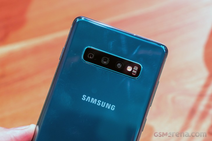
Not having to find a spot for biometrics on the back has allowed for a cleaner arrangement, one that resembles the Note8's. The entire triple-camera assembly, plus the usual flash and heart rate monitor are behind a single glass piece, all black regardless of color scheme. The Note9's O_o look is no more.
Reader comments
- Kobe
- 07 Dec 2024
- EB0
Wow mine is also broken and I got a lot of stuff on it too I want to retrieve back I currently gave it to fix in a shop best you can do is the same go to a shop where they fix phone's screen and you will have fix looking good brand new face in a...
- Anonymous
- 02 Dec 2024
- XBB
Hi,My S10 5G screen got damaged and I need to replace it cause, I have lots of information I need to retrieve. Any help on how I can get the screen replaced? Have really tried and I couldn't get it though. Any credible information would duly be ...
- Anonymous
- 17 Oct 2024
- y6V
I dont think you can buy a brand new of this because its already discontinued. You can get it refurbished though..