Samsung Galaxy S20 review
Design
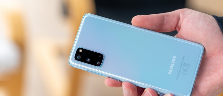
Refinement has pretty much been the name of the game in camp Samsung, as far back as the Galaxy S8. That flagship, in a broad sense, introduced the curvy design and footprint the Korean giant has been refining and experimenting with over the last few years. With only a few notable deviations, here and there, of course. The Galaxy S20 is not one of them, though. There is no major redesign to speak of here, apart perhaps from the new bigger camera bump. And out of the entire family, that is the least pronounced on the entry-level S20. All the other changes to the familiar body shape and overall silhouette are minor and aren't really debuting on the S20.
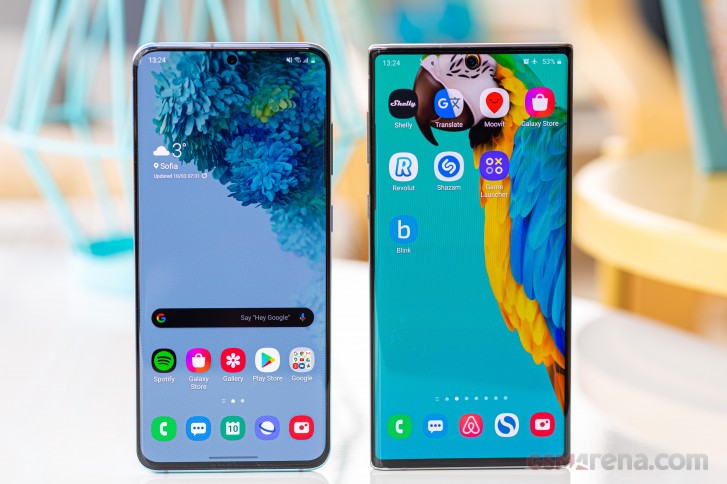 Left: Samsung Galaxy S20 • Right: Samsung Galaxy Note10
Quickly looking back at the Galaxy S10 and S9, that precedes it, we can easily spot a steady vertical expansion of the display, accompanied by a reduction in the top and bottom chins, or bezels, if you prefer that term.
With the S20, the panel looks almost pushed-up flush with the top of the device. Combined with the center-positioned and narrower punch hole for the selfie camera and the overall taller 20:9 aspect ratio, it all makes for a slicker, more futuristic, and somehow more symmetric look.
Having less empty space on the bottom chin can be troublesome from an ergonomic standpoint, since it means less space for thumb-resting and more heavy-lifting for the palm rejection algorithms. However, we didn't find that to be much of a concern on the Galaxy S20, in large part owing to Samsung's increased attention to UI placement, introduced with OneUI 2.0.
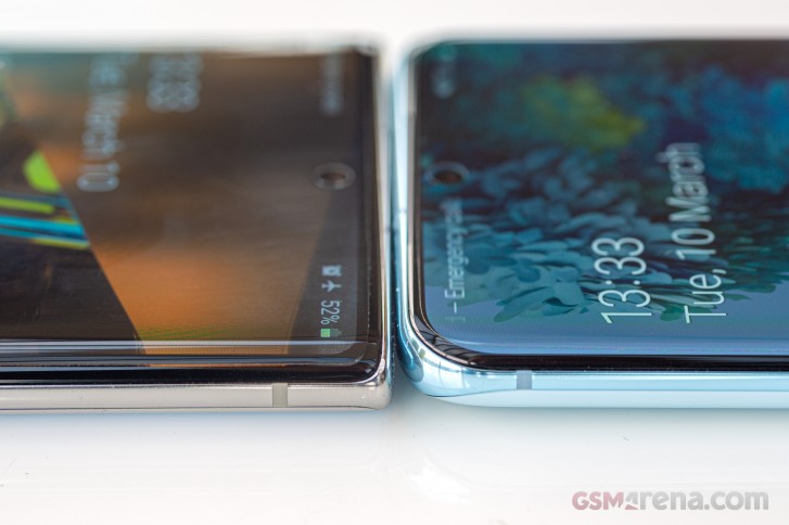 Left: Samsung Galaxy Note10 • Right: Samsung Galaxy S20
While still on the topic of the front and its ergonomics, we feel like we need to bring-up another subtle but important tweak Samsung implemented. Namely, a slight decrease in both the intensity and the surface area of the curved display part, compared to previous Galaxy S generations. While that might sound counter-intuitive at first, since it makes the effect of the curved display a lot less striking, it goes a long way in improving actual handling and swiping over said curved areas. These are no longer at a weird angle and often burrowed within your palm. Which, in turn, makes for less accidental touches and inputs.
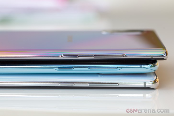 Top: Samsung Galaxy Note10+ • Middle: Samsung Galaxy S20 • Bottom: Samsung Galaxy S10+
On the flip side, both literally and as a juxtaposition of this reduced "flamboyance" of the curved display, for lack of a better word, the S20 has a slightly tweaked back glass and metal frame. This is yet another change that is hard to catch without actually looking at a few of Samsung's recent devices side by side, but the short version is that the S20 line uses the new curvier and thinner approach, as seen on the Galaxy Note10.
The change is two-fold. For one, compared to the S10m the exposed part of the metal frame on the S20 is noticeably thinner. This is most apparent in the area where the power button and volume rocker are housed since that part of the bezel had to be widened a bit. All that extra space on the sides gets taken up by a wider and more aggressive curve on the back glass.
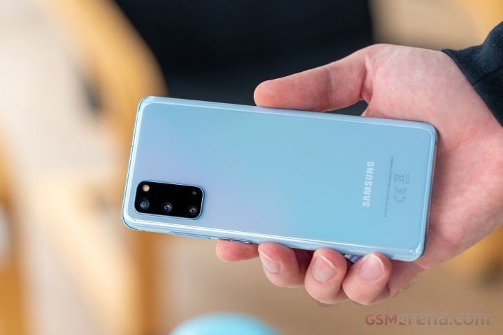
Thankfully, this doesn't have any major effect on handling. That is to say, Gorilla Glass is just as slippery and prone to smudges. The curvature, itself, doesn't really help with grip from a flat surface, but once in hand, it fits very snug.
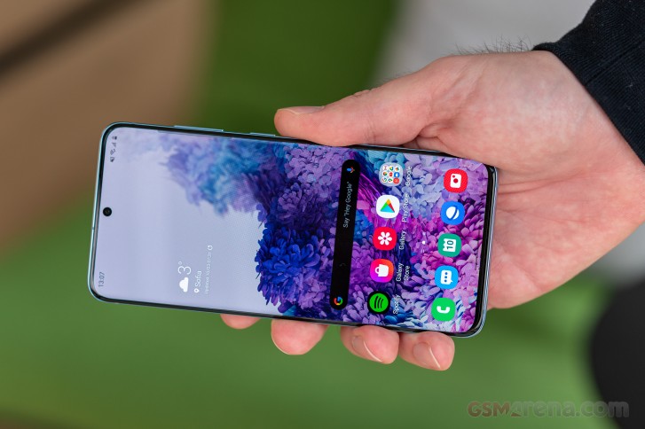
Speaking of dimensions, the Galaxy S20 might trick the eye into seeing a thinner profile, but at 7.9mm thick, it is not that different from most of its siblings. The same goes for weight, with the S20 tipping the scale at 163 grams. For reference, the Samsung Galaxy Note10 weighs in at 168 grams and has almost identical dimensions to the Galaxy S20 - 151 x 71.8 x 7.9 mm on the Note10 and 151.7 x 69.1 x 7.9 mm for the S20.
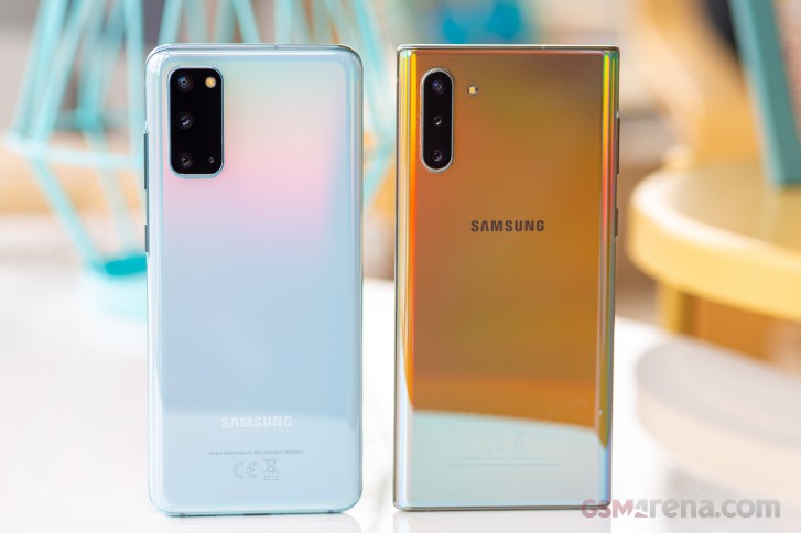 Left: Samsung Galaxy S20 • Right: Samsung Galaxy Note10
As far as weight goes, we really can't complain, seeing how the S20 packs 4,000 mAh worth of battery, alongside pretty-much all the flagship internals of its siblings, minus a 5G antenna setup. Just a couple of years ago, the Galaxy S9 had to be both thicker at 8.5mm and weigh the same to just cram 3,000 mAh. Granted, it had a noticeably smaller footprint at 147.7 x 68.7 x 8.5 mm.
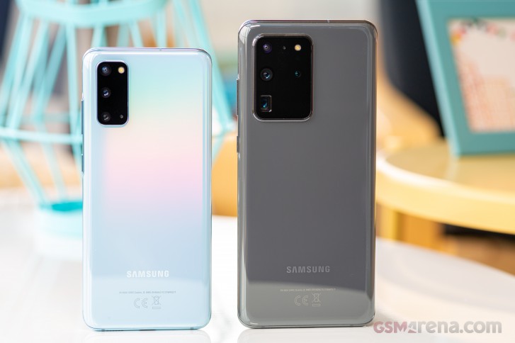 Left: Samsung Galaxy S20 • Right: Samsung Galaxy S20 Ultra
This leads us to a broader point about the Galaxy S20 and phones in general. They are getting bigger and bigger and specifically taller, in most cases. Like we already mentioned, the S20 is pretty much identical in size to the Note10. And while the jump from an S10 (149.9 x 70.4 x 7.8 mm, 157 grams) to the new S20 might not be extreme, people on a two-year update cycle, hopping-over from a Galaxy S9 (147.7 x 68.7 x 8.5 mm, 163 grams), will feel an extra bulge in their pockets.
What we are getting at here is that the Galaxy S20 is only a "compact" flagship in the context of its two siblings and the current state of the industry and 2020 trends.
You can consider that the S20 is a true flagship that fits pretty-much everything its bigger sibling S20+ has in a smaller body, without skimping on important details. From a simply exterior standpoint, beyond the identical design, you also get the same IP68 dust/water resistance rating. The same stereo speaker setup. And on the inside, things like the big battery, we already mentioned, 15W Qi fast charging, and FM radio, NFC, and a full array of sensors. All things that could have easily been compromised on in the name of shrinking the S20 further. And speaking of feature parity across the S20 family, that's just scratching the surface.
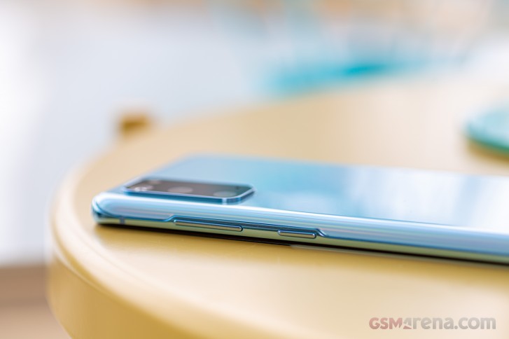
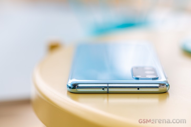
Before we move on to tests, a few quick words on controls are in order. Nothing major has changed in this department. The power button and volume rocker on the right-hand side and an empty bezel on the opposite end. Bottom-firing speaker on the bottom, which is accompanied by the amplified earpiece to achieve stereo output. Next to that - a Type-c connector and behind it - a fully-featured, fast USB 3.2 connection. On the top bezel - your typical dual Nano-SIM card tray, with one of the slots doubling as a caddy for a microSD card.
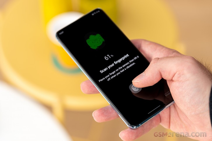
The under-display fingerprint reader is the same as on the Note 10 and the S10 before that. It's made by Qualcomm and still uses ultrasonic technology, instead of the faster optical alternative which the competitors use. Its accuracy is far from stellar, and we think it doesn't deliver a user experience fitting for a flagship phone.
Last and probably least, since we are sure it is going to come up, there is no status LED on the Galaxy S20. Instead, Samsung expects users to rely on ambient display.
Reader comments
- Anon
- 04 Feb 2025
- nEc
I bought a S20 plus 5 and I can’t reset it I entered wrong pins several times and it locked how can I unlock it it’s has box by voice activated
- Xahurul
- 24 Nov 2024
- xjH
Stil well now.faster My s20 5g,
- Anonymous
- 29 Sep 2024
- gwy
same problem in my phone 😥