Samsung Galaxy S20+ long-term review

Three OneUIs and a couple of Androids
The Galaxy S20+ launched in the spring of 2020, running Android 10 with Samsung's in-house OneUI on top, that one in version 2.1 at the time. It got a OneUI 2.5 update along the way, a bit after that release debuted on the Note20s, and is now running a fresh OneUI 3 on top of the latest Android 11.

Samsung's user interface has never had people quite in complete agreement, but recent releases have managed to soften the language we're hearing from usually vocal haters. Constructive criticism is how we'd like to call our stance on OneUI 2.1 in the Galaxy S20 Ultra long-term review, and if we're to rant about something, it's not because we're not positively inclined in general.
Picking up the S20+ on OneUI 2.1, prior to the 2.5 rollout, and having reached v3 recently, we went through all three stages. We've been on OneUI 3 for close to a month now, and that resulted in the mini-review you might have seen on the homepage. Head over there to see what's new.

What hasn't changed from the years of TouchWIz (LagWiz in Samsung-hater speak) is the vast amount of settings you have at your disposal for things big and small. You could say that this leaves too much decision-making in the hands of the end-user as opposed to delivering them a truly optimized and streamlined interface.
On the other hand, wouldn't you rather have the option to tweak stuff to your liking, even if not everything comes out of the box in a perfect state? It's not like we haven't seen complaints of the my-way-or-the-highway approach of... other makers. To each their own, perhaps.
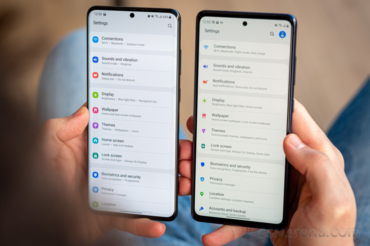
The enormous amount of settings is, believe it or not, a thing that Samsung engineers are aware of. With the latest version of OneUI you get tangible improvements in the ways you can tweak stuff. It's still a long menu alright, but the subcategories are now neatly listed, and legibility is greatly improved by a simple dot separator and an extra interval - what were they thinking with those commas from past versions, right?

This here reviewer still prefers to work the settings menu through the search field, and there are other subtle touches here. Once again, a more legible search history and the introduction of hashtags for settings with a common goal but a different menu location help with finding your way around.
Realistically, though, how often you go into the settings menu after the first week of using a phone, much less 5 months into it? That may be too zen of an angle to look at things and somewhat at odds with a reviewer's job description, but it's a long-term review, and in the long term, you already have your phone set up the way you want it to be after the first few weeks.
Adopting that vantage point, the bulk of our complaints about OneUI's default oddities can be dismissed. Stuff like the missing Night and Live focus modes in the camera's mode selector (which you can add and position yourself) or the notification icons on the lockscreen as opposed to the standard cards (which you can switch to), or the unlock animation that slows you down, or the lack of sorting in the app drawer, or most things you can think of.

If you're one to constantly switch phones and use them for any amount of time, you accumulate a number of favorite UI elements, means of interaction, and general ways things are done. Those are rarely all on the same phone, and you wonder what if you could have it all in one place. We do 'suffer' from that more than most people thanks to our line of work (it's a first-world problem, if there ever was one), and it's easy to focus on the things you don't like. It may not be perfect, but I like Samsung's way of doing UI - there, I said it.
Battery life
We'll probably never get tired of stating the obvious - battery life is a very subjective matter and will vary wildly depending on usage patterns. That's the general disclaimer of sorts.

In long-term reviews, we do normally try to give you an idea of the typical daily routine and provide you with Screen-On numbers or battery percentage left at the end of the day. However, in this particular case, a lot of circumstances combine to make that even harder than usual.
For starters, this reviewer has no hard set charging habits - it's not an 'I'm going to bed, I'm plugging in the phone' type of thing. Then there's the matter of an intense shortage of going places or doing things because such are the times, and to make things even less representative of 'real-world' usage, summing up the observations for this article coincided with the Christmas holiday season.
Anyway, what we're seeing are nowhere nearly impressive numbers for Screen-On time, but we'd argue that the phone simply doesn't see much use when you're at work or at home always having other, larger screens to stare at.
You could always use the more structured account that we gave you in the Galaxy S20 Ultra long-term review, with expectations slightly adjusted for the S20+'s smaller battery. The best that can be added here about the S20+'s battery life, based on anecdotal data, is that it's okay.
Unremarkable days would leave you with enough juice to make it to tomorrow and not worry that the phone won't be operational when you wake up. Meanwhile, intense days out in the sun with lots of pictures and constant use for finding your way around will kill the battery quicker than you'd like. Low-Battery Anxiety will be a thing if you don't have a power bank in your bag. Standard performance for a flagship, we'd say.
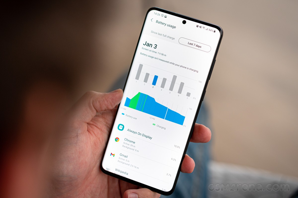
An annoyance we had with the S20+ when putting this review together was that OneUI introduced a certain amount of bugs, among them one related to the battery usage charts. Those only just showed up on publishing day, retroactively too. For the 10 or so days leading up to publishing day, we were getting empty charts on both the S20+ and the S20 Ultra. While the S20+ has now been fixed, the Ultra is still in this broken state, as is our updated S20 FE.
And this is not the only software bug we encountered. Samsung almost pulled off a Cyberpunk 2077-level release with this One UI 3.0 update. Almost.
Reader comments
- Anonymous
- 30 Dec 2024
- 7kK
Currently at battery health approx 80%, simply it doesnt last very long 😭, record just 1.5 min video it sucked up 6% of the battery... if your battery condition is pretty good or unused then, its def worth the price in 2024
- C
- 31 Oct 2024
- pJE
Been using the S20+ 5G since it released (4+ Years Ago) and my phone still works flawlessly, the battery wore down after 4 years so I paid £50-70~ for it to be replaced and the phone still works great. If you think you need a more powerful phone...
- Deepak india
- 04 Nov 2023
- gM$
Yes it's big problem 😭


