Samsung Galaxy S20 and S20+ hands-on review
Samsung Galaxy S20 and S20+ design
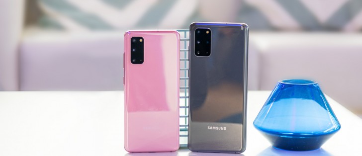
Circling back to our genealogical investigation, we can probably assume that the S20 is meant as an S10 successor. Size-wise, at least, that seems to be the closest parallel we can draw. And at 151.7 x 69.1 x 7.9 mm, 163 g it's only 2mm taller, 1mm narrower a 6g heavier than last year's Galaxy S10 (149.9 x 70.4 x 7.8 mm, 157g).
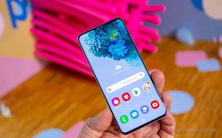
With its noticeable bump up to 4,000 mAh battery up from 3,400 mAh, the S20 is clearly pushing battery tech above and beyond.


Samsung Galaxy S20 hardware tour
One clear benefit from sticking to the same overall sloped side, glass sandwich design on Samsung's end is that ergonomics are already dialed-in pretty much perfectly. The S20, in particular, is a very well-balanced phone weight-wise and sits very comfortably in the hand. And perceptions have changed in the past year or so and it really feels like a compact smartphone when you hold it in hand after handling the S20+, for instance.

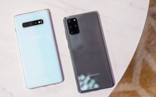
Left: Samsung Galaxy S20+, Right: Samsung Galaxy S10+
The S20+ indeed has grown in size and finding its counterpart in the S10 family is harder. Measuring 161.9 x 73.7 x 7.8mm and tipping the scale at 186 grams, it definitely has some extra heft to it than the vanilla S20. On a positive note, it is scaled up pretty proportionally, which, combined with the ergonomic design makes for a confident in-hand feel.
You do need hands on the larger side to be comfortable with one-handed operation on this one, though. Weight distribution is also a bit less even than on the S20. Nothing major to raise concern over, of course. As for the extra weight allowance, just like with the S20, the S20+ is battery-dense, packing nice, cool 4,500 mAh under the hood.
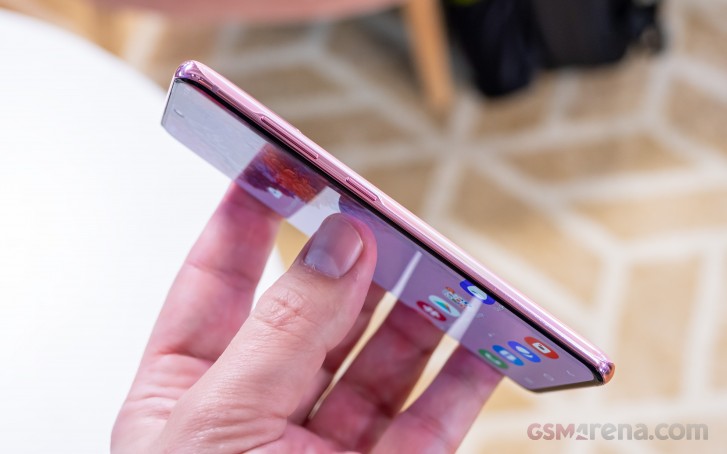
Speaking of the general and familiar design of the S20 and S20+, we can't help but note both the absence of a Bixby key and the traditional right-side placement of the power button. Admittedly, looking at Samsung's phone releases over the past few months, it's clear that left side power button placement has been ditched after Samsung experimented with it on the Note10 series.
Since we are already on the topic of controls, there are really no surprises to note. Volume and power on the right. SIM and microSD cart tray on the top, alongside a secondary microphone and a Type-C, plus speaker and primary mic on the bottom. That's actually one of a pair of speakers, since the entire S20 line has a stereo speaker setup.


Samsung Galaxy S20 from all angles
The design hasn't been changed in any significant way. The style of the thin metal frame is different to the ones on the S10 or the Note 10 bit it's not a difference worth commenting on. From the chromed surface to the colors, style wise, the S20 and S20+ are pretty much identical to the Samsung products of recent years.
On the back of the S20 and S20+, the new camera module design is kind of hard to ignore. Well, "new" is a bit of an exaggeration, actually, since we have already seen something similar on the Galaxy A71 and A51. And with the relatively fresh announcement of the Galaxy S10 Lite, we can't even say that the new spacious camera hump is entirely novel for the Galaxy S family either.
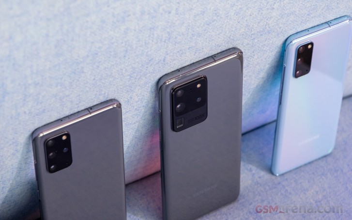
The one on the S20 is quite tall, compared to the other Samsung phones we just referenced. We can't really complain, though, since it kind of fits well with what is a pretty tall phone altogether. Plus, the vanilla S20 definitely has the least, "camera hump dysmorphia" of the three phones. For what it is worth, on the regular S20, at least, the hump doesn't bother us much visually. The lack of any text on it should also be noted, since, looking at the S20 Ultra, apparently it is not a given. It still contributes to a noticeable wobble when when the phone is placed on its back. A case is definitely the way around that, if it bothers you.
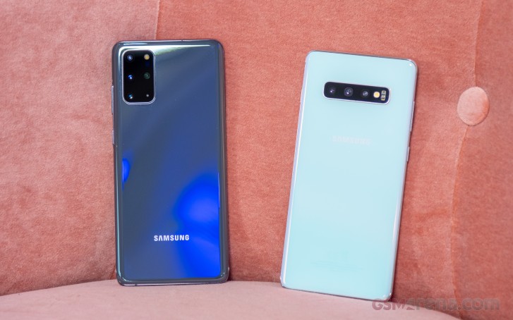
The S20+ gets a wider hump, which arguably makes it look more proportional. Another thing aiding it in the overall looks department is the presence of an extra sensor to fill in that empty, OCD-triggering spot on the S20. We originally thought that a wider hump would equal less desk wobble, but sadly, that didn't really pan out.
Camera
On to the cameras residing on this module. Starting off with the 12MP, f/2.2 ultrawide, things look deceptively straight-forward. The S10 lineup had 12MP main cameras and the S20 and S20 have those two. But the camera systems are not identical. As far as we managed to gather - the cameras on the new phones no longer have the variable dual aperture and have a larger pixel size which should translate into a bigger sensor (while still being 12MP).
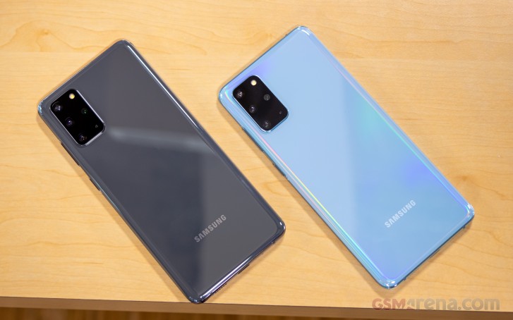
Now the main 12MP camera on the S20 and S20+ is fixed at an f/1.8 value, which is a nice middle ground inside the old f/1.5 - f/2.4 range. On the flip side, the Samsung S20 product manager promised us more advanced image stacking processing.
It is definitely a fact that recent advancements in computational photography have really pushed mobile photography to new heights, arguably more rapidly than advanced hardware solutions. Perhaps Samsung deemed its old dual aperture system too complex or no longer necessary, instead electing to cover ground with clever algorithms? We really can't say before we get to do a full review on the S20 line.
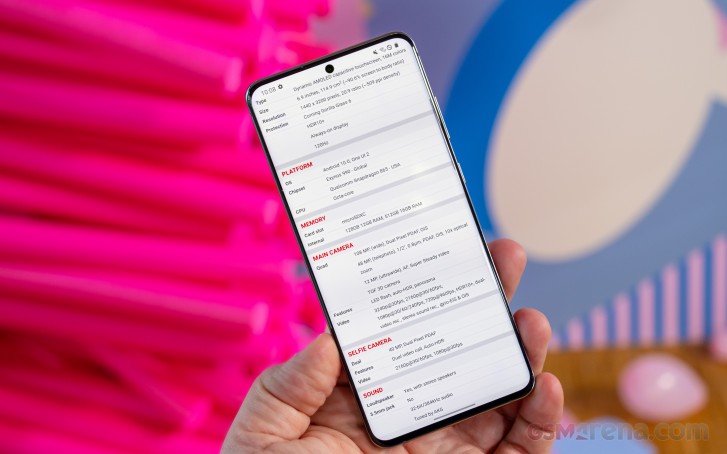
Last, but not least, there is the 64MP telephoto. Decently equipped, with an f/2.0 lens in front and OIS. It will be getting plenty of attention in S20 PR campaigns thanks to the new Hyper Optic Zoom and Super Resolution Zoom features, cumulatively named Space Zoom. On the S20 and S20+, which share most of their camera setup, these two features offer 3x and 30x hybrid optical zoom, respectively.
After trying out the new zoom for ourselves, some questions did arise, especially ones regarding these numbers. From what we managed to gather at the event, as well as some deduction based on specs sheets, this 64MP is likely not a true telephoto unit. Instead, what Samsung seems to be doing to get those 3x and 30x zoom figures is based on cropping. Plus, a bit of difference in the field of view between the main 12MP camera and this 64MP one, which helps to deliver the technically "optical" bit in the company's advertised Hybrid Optic Zoom. This setup is yet to be entirely confirmed, though. Plus, we aren't quite sure of any potential implications quite yet. But this is definitely another aspect of the new Galaxy flagship camera we intend to investigate thoroughly in the full review.
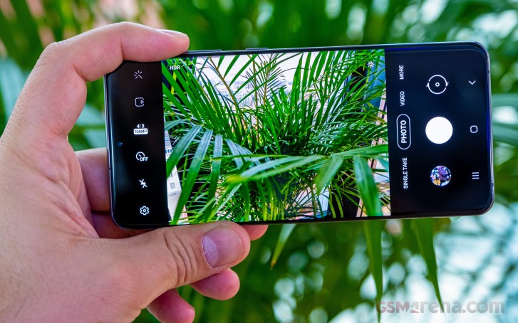
Oh, quick note about the S20+ and this one is actually quite easy to forget - it actually has one extra camera, on top of the trio found on the S20. It is a DepthVision module, with no quoted resolution, clearly aimed at providing bokeh and portrait assistance. Kind of an oddly small and insignificant thing to leave out of the vanilla model. Then again, at the end of the day, it is all the PR team needs to write "quad" and "triple" camera setup on the respective promotional material. So, this might just be the least annoying way to create market segmentation? We'll take it.
Just like its Ultra bigger brother, the S20 and S20+ can also capture 8K video. This definitely makes sense from a performance standpoint, seeing how all three share the same chipset and ISP. However, in the absence of Samsung's new 108MP sensor, the vanilla and plus models are only left with one option for their 8K capture - the 64MP telephoto camera. There is plenty of testing to be done on this end as well, come the full review.
In terms of new camera features, the S20 and S20+ do make a few promises for us to properly validate in the full review. Super Steady video mode, for one, should be improved. Then there is Night Hyperlapse - a new video mode that, like the name suggests, can produce clips with awesome light trails. AI Best Moment also sounds nice on paper. It is also pretty aptly named and is basically an algorithm that tries its best to snap and sort out the best moments it can, complete with as many smiles and non-blurry faces. It also takes into account things like colors and contrast in photos. It can even auto-apply filters for the best possible look. It mostly worked during our brief hands-on test.
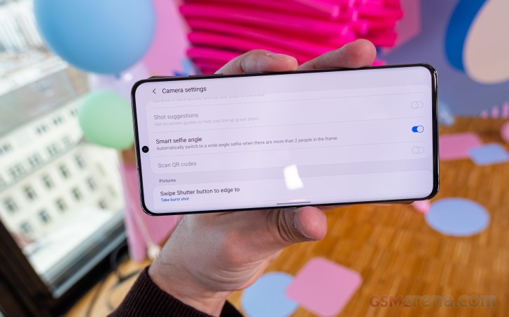
The selfie camera has a nifty new trick that should combat most of the backlash Samsung initially received from some of its more perceptive users when in decided to disable the wide mode on its selfies by default. Now, if the phone detects more people outside of its default cropped frame, it will automatically toggle wide mode, thanks to Smart selfie angle.
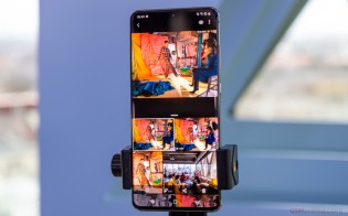
Single Take, however, sounds like the single most interesting (see what we did there) new camera software trick. Not unlike a certain app that has been gaining popularity on Apple's latest iPhones, Single Take captures videos and photos from all back cameras simultaneously. When you start recording, it takes anywhere from 2 videos as a minimum up to a maximum of 10 photos and 4 videos. Capture time is capped at 10s for a single take. The idea here, beyond simply showing off phone hardware prowess, is to then offer all of the angles and media to the user in a convenient interface for a more "interactive" picture of the moment. The best shots are picked based on moving subjects detection, face detection, perceivable sharpness and blurriness and so forth.
Reader comments
- Muzamil Sofi
- 14 Jan 2021
- GXm
Samsung s20 is very gud flagship phone No issue for drainage battery or other issue This is better phone I ve already used No problem
- Anastasia
- 29 Dec 2020
- XDX
How to put the memory card plz

