Samsung Galaxy S20 Ultra long-term review
Design
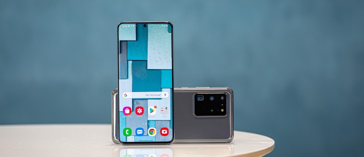
The Galaxy S20 Ultra is big, there are no two ways about that. It's not one of those smartphones that will just 'disappear' in your pocket, no matter how big said pocket happens to be. You'll always feel it's there, and the same goes for when it's in your hand. It's big (on all axes), it's heavy, and it's unashamedly both. It has a presence; it makes an impression, that's for sure.
Interestingly enough, it doesn't have any crazy color versions, at least not yet - those may come later in a bid to rejigger interest in it. As of now, you can pick between gray and black and white, and all of these hues are incredibly boring. Very fitting in a boring office space - sure. But also, not in any way evoking any excitement every time you happen to be glancing at the thing you just spent a big chunk of money to purchase.
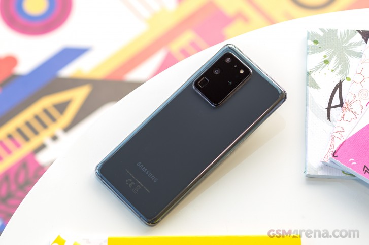
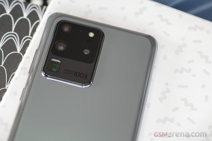
And this theme is continued with the huge and unsightly camera island at the back. To add insult to injury, the marketing department then decided it had to plaster the words "100X Space Zoom" onto the island. That makes it somehow even tackier than it already was based on just looks alone.
It appears Samsung could have done a better job designing the S20 Ultra. You may be fine with the bland colors, and unsightly camera bump, all of the above is subjective on our part, and we're not trying to hide that. Fun fact: because it's so huge, the phone barely wobbles when sat on a table.
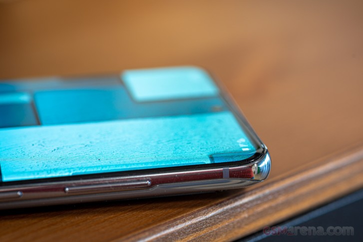
Otherwise, the S20 Ultra is the usual glass sandwich design, albeit with a weirdly shaped metal frame. If you look at the sides of the phone, the frame isn't centered, sitting neatly exactly in the middle between the two sheets of glass, instead it's much closer to the screen.
This probably has something to do with the fact that the display glass curves much less towards the sides than it used to on the phone's predecessors. Many people like this because many people misunderstand why the experience of using a Samsung phone with a more curved screen isn't ideal. It has nothing to do with the curves themselves, and everything to do with Samsung's software, which has always been - and continues to be - terribly bad at rejecting accidental touches from that area.
We're not knocking Samsung for no reason here - this year, along with the S20 Ultra, this reviewer has used the Huawei P40 Pro, the Xiaomi Mi 10 Pro, and the Oppo Find X2 - all with curved screens and almost no accidental touch issues. One would pop up every few days or so. On the S20 Ultra, on the other hand, it happened dozens of times each day.
The good news is that there is a solution to this - you can just use a case. We went for the one that's included in the box, and why we think you would be better off investing in one that feels less cheap to the touch, our point here still stands. It's crazy how bad Samsung, maker of most of the curved screens found on other phones, is at the accidental touch thing.
It seems like the company itself just couldn't find any other solution, than to make the curves lesser on the S20 family. And yes, that helps, but it's such a not-subtle solution, to a problem that a lot of competitors are fixing simply with smarter software. Or, in some cases, even more extreme ideas - the vivo NEX 3 has a 'waterfall' screen, for example, and yet you will not have any such problems on it, because the touch layer is simply deactivated on the 'waterfall' part. Despite the way it may seem just by looking at pictures of that display curvature, that phone is actually much nicer to use than the S20 Ultra, from this one perspective.
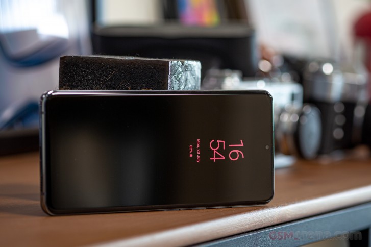
Anyway, enough ranting about age-old things that Samsung hasn't fixed. The S20 Ultra overall looks exactly as modern as a 2020 smartphone should, but its design is very 'safe'. There are no bells and whistles here, nothing incredibly out of the ordinary.
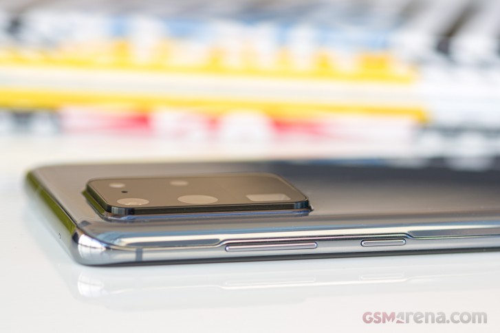
The Bixby key is gone (although Bixby itself lives on), the phone is as slippery as you'd expect given the materials used for its construction. It's obviously going to be very hard to use one-handed if you have small (or perhaps even average size) hands. We were happy with the extra screen real estate we were getting, as well as the extra battery capacity.
The design 'just works', on the front and sides at least, but it's really nothing revolutionary or that hasn't been done before, especially by Samsung. The centered hole-punch for the selfie camera makes this instantly recognizable as a recent Samsung device, as it's still the company churning out most of the handsets with such a design, and all of the AMOLEDs.
Reader comments
- ANDROIDIAN
- 07 Jun 2023
- Iby
👁 2nd dat ✔
- Mr iiq
- 09 Jan 2023
- uZa
Samsung Super class is Always good quality
- Anonymous
- 06 Oct 2022
- sr2
2.8

