Samsung Galaxy S20 Ultra long-term review
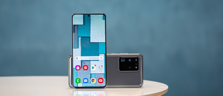
One UI 2.1 based on Android 10
If we were to describe One UI 2.1 as seen on the Galaxy S20 Ultra in one word, it would be: busy. It's a very busy interface, in two ways.
First off, it just contains a million different settings and options for everything. It's probably the Android skin that gives you by far the most of these, and if that's your cup of tea, you'll love it. Yes, it's great that you can tweak almost anything to your liking, but this strategy also means Samsung can just spend less time thinking of what the ideal mode of interaction is, for any given setting.
After all, hey, if the user doesn't like the default, that's changeable. Well, yes, but every time such a change is required that in itself represents added friction and that adds up which is anything but good user experience design. Good UX design stays out of your way as much as possible and doesn't force you to change things just to get them to a more usable baseline.
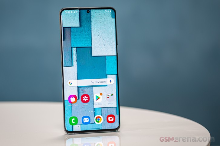
There are countless examples of this philosophy scattered throughout One UI 2.1. Why, for example, is the default setting to only show notification icons on the lock screen, and not the full notifications? Why isn't the unlocking animation turned off by default to create a speedier experience? Why aren't Night mode and Portrait mode present among the main camera modes but you have to dig them out from a chest of extra modes?


Notifications, Quick Settings, app switcher
The second meaning of "busy" in this UI is the design language itself. It just feels like it's not as clean, looks-wise, as a lot of its competitors in the Android realm (not to even bring iOS into the fold).
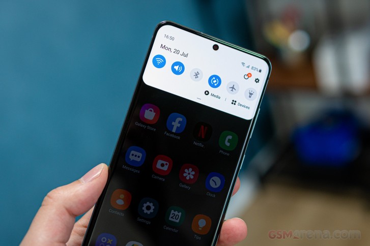
The icons are definitely less cartoony than they used to be in TouchWiz days, but something about their colorful oversized appearance still reminds us of a box of kid's candy.
And with all the focus on moving control elements towards the bottom of the screen for an easier reaching, we still find search fields occupying a space at the very top of the screen.
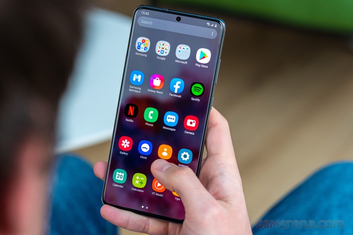
Samsung's launcher has an app drawer, which is great, but the app drawer is still scrolling horizontally, and that still breaks the interaction model. You swipe up to bring up the app drawer, you're then naturally inclined to keep swiping up to scroll through it. But no. Go sideways.
There are still folders in the app drawer and the default sorting still isn't by name. You know, like most other app drawers. Because of how most (but not all) Google apps are in the Google folder, if you are hunting for a specific app, setting the drawer to order by name may not be useful after all, because folders are always shown first.
Settings menu
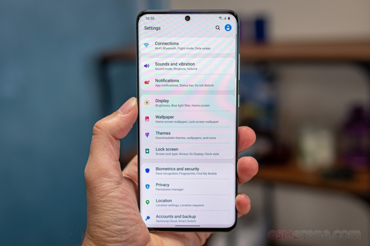
The Settings menu, if printed, would probably stretch across the equator, at least once if not twice. It's one of the most convoluted Settings menus you can find in the mobile world right now, but that's because of the sheer amount of stuff it has to house. We're exaggerating when we say there's literally an option in there for anything you can think to customize on the phone, but we're only exaggerating by very little. It feels like if you can think it, it's there, waiting for you to tinker.
The experience on the S20 Ultra will definitely be familiar to you if you're upgrading to it from another Samsung smartphone, regardless of whether it runs an older version of One UI or Samsung Experience that came before. And given Samsung's huge installed user base, this is very important. But as much as that feeling of familiarity is there in such a scenario, if you switch from almost any other smartphone, you may feel overwhelmed by all of the settings and nooks and crannies and knobs.
Dark Mode
Dark Mode is in there and it works well, just as it should. You can schedule it, but it doesn't force itself onto apps that don't have a dark mode. That would've been a nice feature to see, especially as it seems Facebook (for its main app) still hasn't gotten the memo about dark themes being a thing people like. And there are more apps like this, that would benefit from a forced inversion of their color scheme, to better fit in with the dark mode.
Updates
Samsung has been amazing with security updates recently, especially for its flagship line of devices. Case in point: we received the July security update before even Google rolled it out to its Pixels. And this was no oddball occurrence either, Samsung has pretty much figured out how to be incredibly timely with security patches, and for that we commend the company.
It's also gotten way better at big Android updates, and while these still take a few months to arrive on a flagship Galaxy, the amount of time that this takes after Google releases a new iteration has decreased with every passing year. So based on this, we're hopeful that the Galaxy S20 Ultra will be on Android 11 before the end of this year. Perhaps even weeks before, but that's just wishful thinking on our part. Still, the point is that while Samsung still isn't the fastest with big updates, it definitely isn't among the slowest anymore, and that's great to see.
Gesture navigation
The gesture navigation is one of the most frustrating aspects about living with the S20 Ultra unlike pretty much any other recent Samsung.
When you have an app open, around 7 times out of 10 the swipe-up-to-go-home gesture would invoke scrolling up first before the phone realizes you are trying to go to Home instead. So it would scroll up before it closes the app as intended. And the next time you go back into the app you are no longer at the same spot you left off. This is obviously worse with list-based UIs - you know, like Gmail, WhatsApp, Facebook Messenger, Messages, basically the most used apps on your phone. It's infuriating every single time it happens, and unlike on any other Samsung we've used, here this quirk (or rather, a bug that has gone unnoticed) happens dozens of times a day.
Reader comments
- ANDROIDIAN
- 07 Jun 2023
- Iby
👁 2nd dat ✔
- Mr iiq
- 09 Jan 2023
- uZa
Samsung Super class is Always good quality
- Anonymous
- 06 Oct 2022
- sr2
2.8


