Samsung Galaxy S21 Ultra long-term review

Updates
Samsung is now undoubtedly the best in the Android world when it comes to pushing out monthly security updates. Even better than Google because a lot of times it beats the search giant to the rollout - by only a day or two, but still, this is definitely something commendable. The S21 Ultra has always received each month's update during said month, and that's not something we can say for a lot of its competitors.
The monthly updates sometimes fix things that aren't related to security, and sometimes introduce new bugs, but nothing too big usually. Overall we'd rather have this than a strategy with an update every few months, because then if a bug is introduced it will take another few months for it to be fixed, and so on.
So far so good. When it comes to big Android updates, Samsung still isn't the fastest to roll those out, but it has steadily (if slowly) become better at it. It's definitely nowhere near the slowest companies, though, so for most people who want the peace of mind of knowing they'll be up to date in a reasonable time frame, Samsung is the way to go. Even more so now that the company is promising four years of security updates for its flagships, the S21 Ultra included, and three major Android updates.
That's still more than you can expect from most Android smartphones, and Samsung deserves praise for this commitment. In fact, we're really happy with the company's performance on updates in general, and if it were to get a bit faster rolling the major ones out, it would score a perfect 10 out of 10 here. As it is, it's more of a 9, or 8.5 - depending on how you'd want to weight the security update speed of release versus major Android versions.
One UI 3.1One UI has always been the most complex Android skin out there, and the latest version doesn't stray from that formula. As always, it's packed to the brim with features and millions of settings and options for seemingly everything you can think of - and a lot of things we'd wager no one outside of Samsung's coders has ever considered.

This is heaven for tinkerers, people who want every single aspect of their software experience to be tailored precisely to their taste. They will definitely enjoy spending a day or three going through every single setting and customizing it. If you're in the "I want it to just work" camp, you'll be mostly fine not doing any of that, with a few infuriating exceptions, where Samsung seemingly chose the default behavior at random (or in such a way that it conveniently favors its products and services).


Notification pane and Quick Settings
The two things that stood out to us (although these are by no means the only examples) are the fact that the "Side key" (read:power button) is by default set to launch Bixby if you long press it. You don't get the power off menu, like on every other Android smartphone out there. Hilariously, Samsung even recommends you just tell Bixby to turn off your phone.

Side key is set to Wake Bixby by default, we changed it
Sure, Samsung, sure - Bixby is clearly going to become a thing people love. Or care about. Soon. Definitely. Sarcasm aside, you can thankfully change that setting to what it should've been all along. It's an unnecessary step, and anti-user behavior for sure. Similarly, by default you can't see notifications on the lock screen - just app icons, like on the Always-on Display. Again, you can set this so that it works the way it should, but why wasn't it set up that way to begin with? Who knows.
Another quirk is the fact that the "end call" red button is exactly above the fingerprint sensor. If you're talking on the phone and the screen is locked and you unlock it with the fingerprint scanner, if you're not very careful to be quick in getting your finger out there, you'll also end the call. This only happened to us a few times, but it's funny. And unfortunately, there's no way to change this one.
Duplicate apps, launcher
One UI also still has the Galaxy Store, and Samsung's built-in apps use either this one or the Google Play Store to get updated, in a seemingly random arrangement. We've ranted before about how confusing it is for normal users to have two app stores on their phones, so we're not going to get into it again. Suffice to say that we're tired of Samsung's duplication play, and we hope the company gets tired of it too - sooner rather than later.
Speaking of Bixby, at least you now have an option to get Google's Discover feed to the left of your leftmost home screen. This has traditionally been where Samsung placed its Bixby Home feed, which then got renamed to Samsung Free, because sure, that makes even less sense. Now you have a choice between having nothing there, Samsung Free, or Google Discover. Do we have to tell you which one we picked? Obviously, it was Google's thing, since it has on occasion managed to present us with some useful stuff. The same can definitely not be said for Bixby.
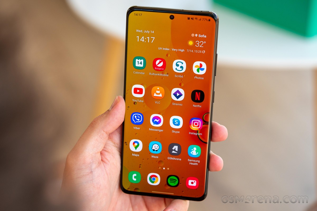
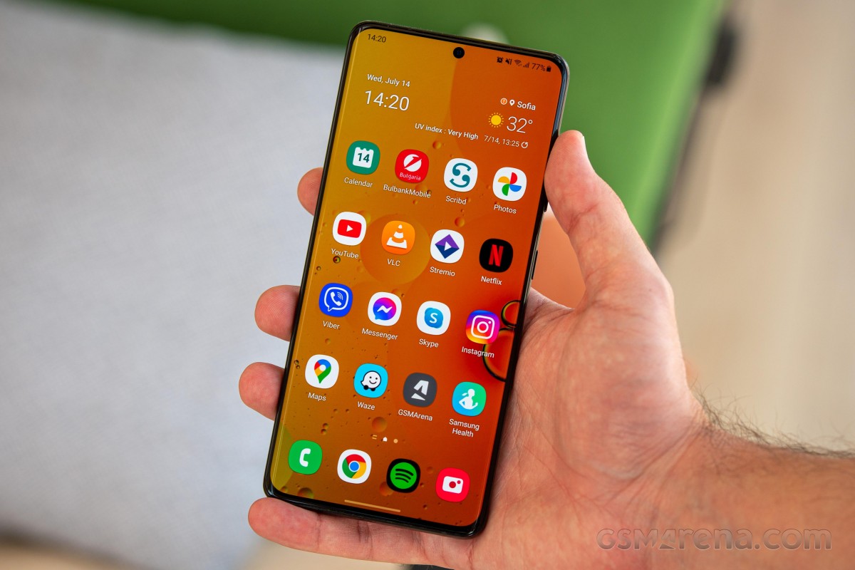
Otherwise, the built-in launcher is a standard Samsung affair, without any major improvements. But it works well enough, and we haven't encountered any bugs in it whatsoever. There are slight stutters from time to time, but the intended behavior doesn't change, so we don't count that as 'bugs'. If you're against app drawers for some reason, you can even get rid of that and have an iOS-like home screen with all your apps on it.
Recents, gestures
The Recent apps screen shows you a horizontally scrolling list of previously opened applications, and under that you get the icons of four recommended apps - ones the algorithm thinks you may be trying to quickly get to. In our use this has proven to be outstandingly accurate, 90% of the time one of those four apps was in fact the one we were trying to switch to. We really like this feature, therefore.
Samsung's gesture navigation system is basically a carbon copy of Google's, and this means that while it works very well in general, if you come across an app that has a slide-out navigation drawer, you're in for a lot of frustration trying not to trigger the Back action when swiping in from the side.


Recents screen, gesture settings
As we've mentioned before, we much prefer the way most Chinese companies have 'adapted' Google's mess, by allocating the triggering of slide-out drawers to the top 25% or 33% of the screen, with the rest being reserved for the Back gesture. This works amazingly well in practice, especially with the tall screens we have now and the way we hold our phones, we almost never end up doing the Back gesture in the top part of the display.
Dark mode, Settings
The S21 Ultra has a Dark mode, of course, but it's very barebones, in that it doesn't come with almost any customization options. You can schedule it and that's it. There are no blackness intensity settings like on ColorOS, and no way to force the dark theme onto apps that don't have one of their own (like on ColorOS and MIUI).
You can choose to "Apply Dark mode to Wallpaper", but this setting is confusingly not in the Dark mode section of the Display settings, but in the Wallpaper settings. It's not that it doesn't make sense to be there - it is, after all, a wallpaper setting - it's just that when other skins have something similar, it's always in the Dark mode settings, and we got used to that.


Dark mode settings, Apply Dark mode to Wallpaper option
Anyway, this concludes the amount of customization you can apply to the dark theme, and it's not much. That said, MIUI has this bug sometimes where some areas of Settings are randomly not adherent to the dark theme, there's none of that in One UI, everything works exactly as intended and bug-free. So it may be more bare bones, but at least it won't give you nasty surprises here and there.
Speaking of MIUI, we really like how its Wallpaper section in Settings lets you practically endlessly scroll through recommended wallpapers. These are pulled from the Themes app store, but you don't ever have to jump into the app in order to find a wallpaper you'd like. The same is not the case for One UI.
Here, if you want to grab a wallpaper from the store, the only way to do that is hit the Explore more wallpapers button - which opens the store app. It's an extra step and the store's UI is really cluttered (on all skins, not just this one), so it makes for a slightly less enticing user experience if you like to change-up wallpapers a lot and don't use another app for that purpose.
Overall, One UI's Settings menu is still far from the easiest to navigate, in fact it looks like it's the most cluttered, but it is hiding a bunch of functions and options no other skin has (or some things that have been copied over time but debuted on Samsung phones). So we'll give it credit for that. As we said at the beginning of this chapter, it's a tinkerer's dream UI, for sure.
And then you have stuff such as the integration with Microsoft's Link to Windows service, and Samsung's DeX desktop-like user experience, and the fact you can call and text on other Samsung devices by sharing your phone's mobile network connection with them automagically, and that you can continue where you left off in some apps on other Samsung devices... And then there is the feature called Bixby Routines - think of this as macros of the "if this then that" variety - which will probably forever remain the only useful thing that was ever adorned with the Bixby name.

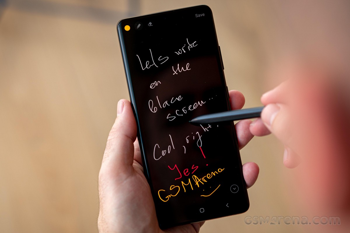
Oh, and the S21 Ultra also has S Pen support, although no stylus is provided in the box. Samsung will happily sell you one for an additional price, of course.
Just going into all of these would probably extend this long-term review to twice its already ample size, which is why we chose to stick to looking at only the basics that most people would end up using. A lot of Samsung's additions and flourishes, while they sound very nice (and a lot of times work flawlessly too), are decidedly niche. And that's part of the appeal of One UI.

Even though it's a mainstream Android skin, it has more niche stuff built into it than any of its competitors. And when you compare it to iOS, it becomes hilarious how far ahead Samsung is at this. You, as the consumer, just need to care about one of these niche features, and your only option then almost instantly becomes a Samsung, and that is an interesting strategy from the company to build some ecosystem lock-in but in a weird roundabout way. It's probably the smartest thing it could do, since it can't really lock you in by force - only Apple gets away with that level of Stockholm syndrome from its customers.
Reader comments
- Anonymous
- 08 Aug 2024
- r3b
It supports 45w charger too just that the phone has been optimized to charge with 24w so even if you use a charger with higher watts the charging speed would still be the same for safety purpose
- Mike Luis
- 23 Jun 2024
- K3P
The performance is amazing in 2024. It feels like a rocket!


