Samsung Galaxy S22+ review
Design
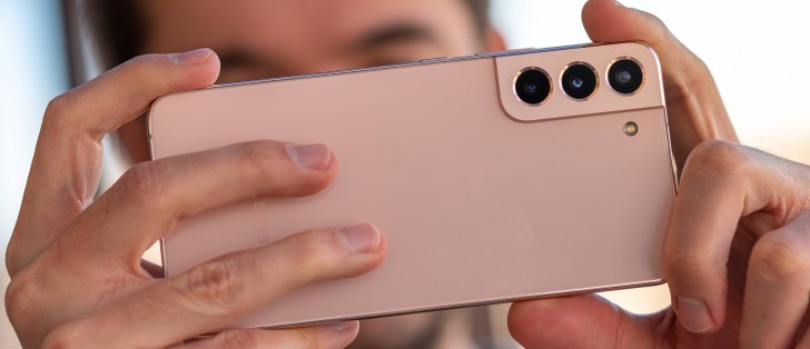
Samsung has a new design for the Galaxy S22 generation, shared between the vanilla S22 and the S22+. This is yet another area where the S22 Ultra deviates from the crowd in a very "Note" way with an entirely different outward aesthetic.
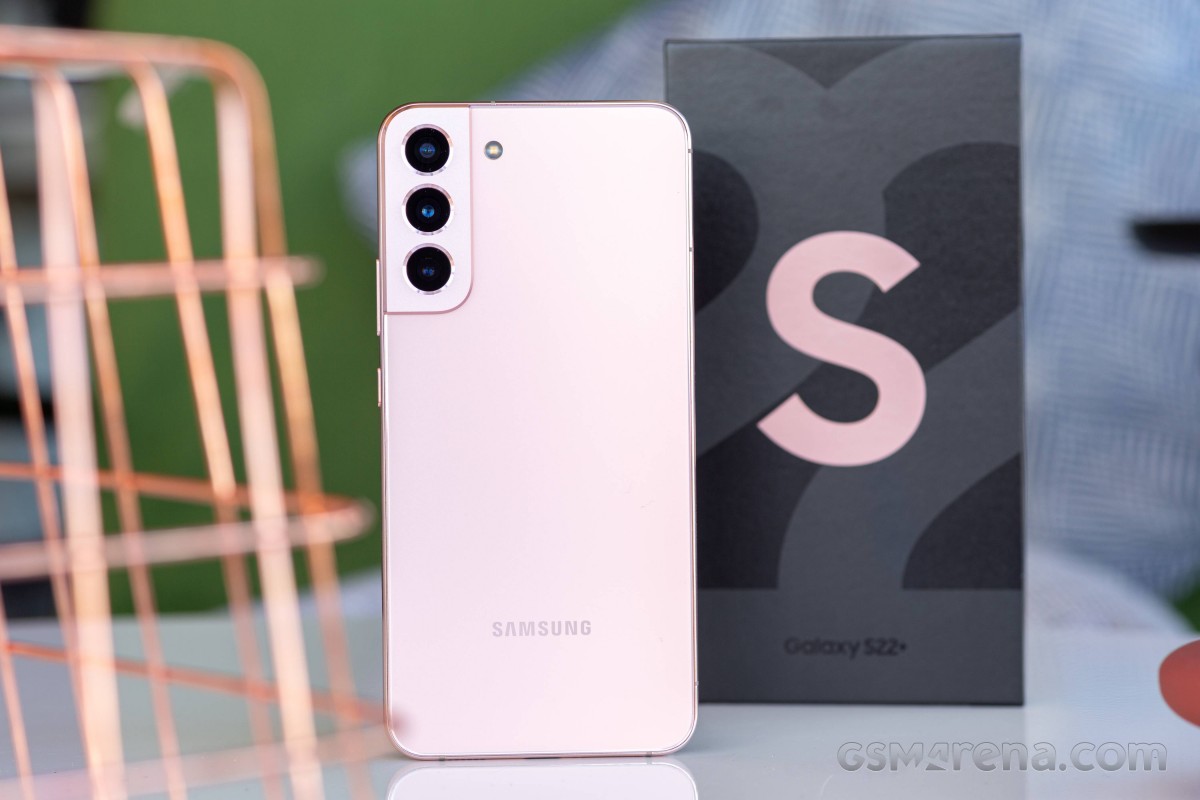
The first word that comes to mind when discussing the S22 design is honestly "flat". Samsung has leaned much more on a "minimalistic" aesthetic this time around. However, neither of these qualifiers feel quite right since the S22 is still rounded and curvy in a few key aspects, just not as curvy as the S21.
Some of the earlier design leaks and, indeed, most of Samsung's renders are a bit misleading in this regard. Before we actually saw the S22 and S22+ in person, some of us here at the office thought that their aluminum middle frame was entirely flat, akin to Apple's current iPhone look. That is not the case, though. Under the right angle, the frame does look deceptively flat, even in person. It is symmetrically and gently sloping along its central line - which is quite a departure from the S21 Series and their much more rounded backs.
While we like the look, the particular shape and finish of the frame are less than ideal for handling. The S22+ is quite slippery and, without any sharp edges or chamfers, it is rather difficult to hold on tightly. Plus, the particular finish Samsung chose for the aluminum frame is a grease magnet. Since Samsung apparently meant for the finish to be more on the matte side rather than glossy and reflective, even when greasy, the frame doesn't look too bad, but it does become even more slippery.
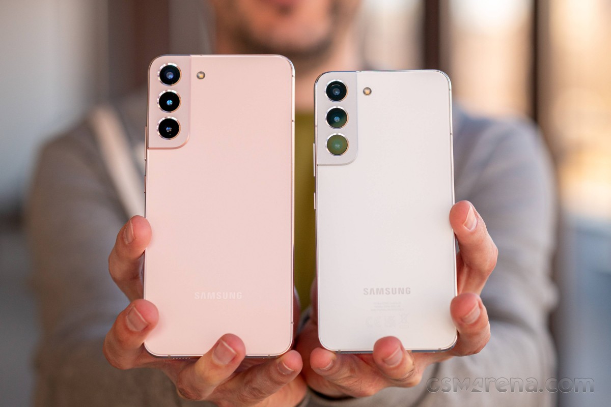 Left: Galaxy S22+ • Right: Galaxy S22
At least the backside of the S22+ doesn't suffer from the same issues. Its Corning Gorilla Glass Victus+ finish feels smooth and a bit silky and is much easier to keep clean. The occasional speck of dust does get drawn to the big flat area, but there is no substantial grease accumulation.
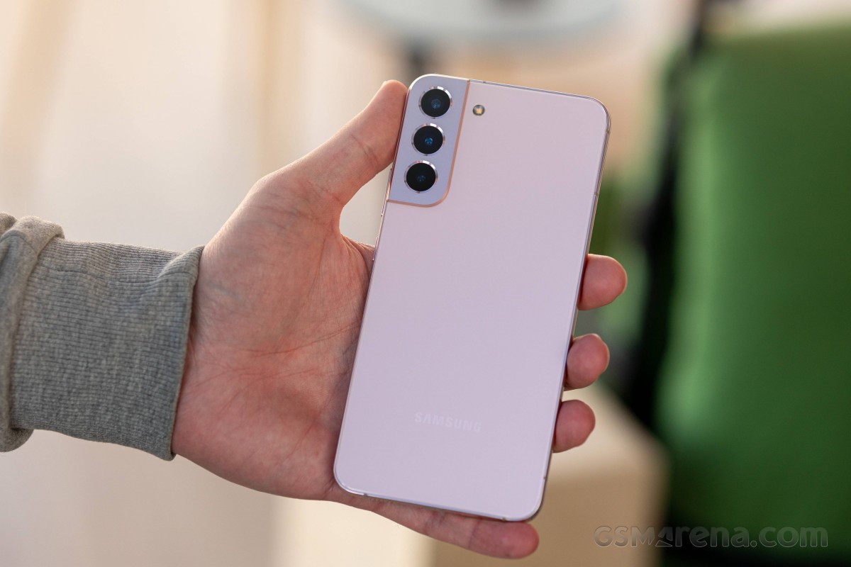
Compared to their predecessors, the back panel is arguably the biggest design change on the S22 and S22+. It is almost entirely flat - a stark departure from the deep curves on the S21 Galaxy devices.
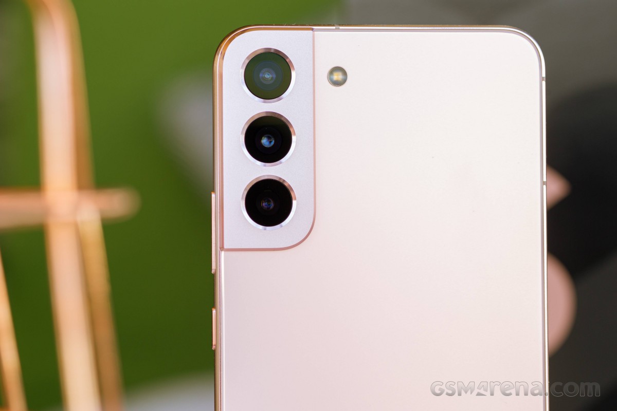
While familiar in overall shape, the camera island is nowhere near as prominent, mainly since the revised S22 design lacks the particular "wrap-around" aesthetic of the S21 family, which had the island sort of extending over the edge of the back and into the metal frame. The S22 and S22+ simply have the camera island end where the middle frame begins - an arguably less-recognizable look, but one that we personally find more appealing. Even so, the shape of the camera island is still plenty recognizable.
There is a whole slew of old and new colors for the S22+. The Phantom Black is still present, and so is the White option, now just a bit different and called Phantom White. You also get Green and Pink Gold. These are the so-called "basic" colors. Their middle frames and camera islands are color-matched with the back panel, except for Phantom White, which gets silver accents.
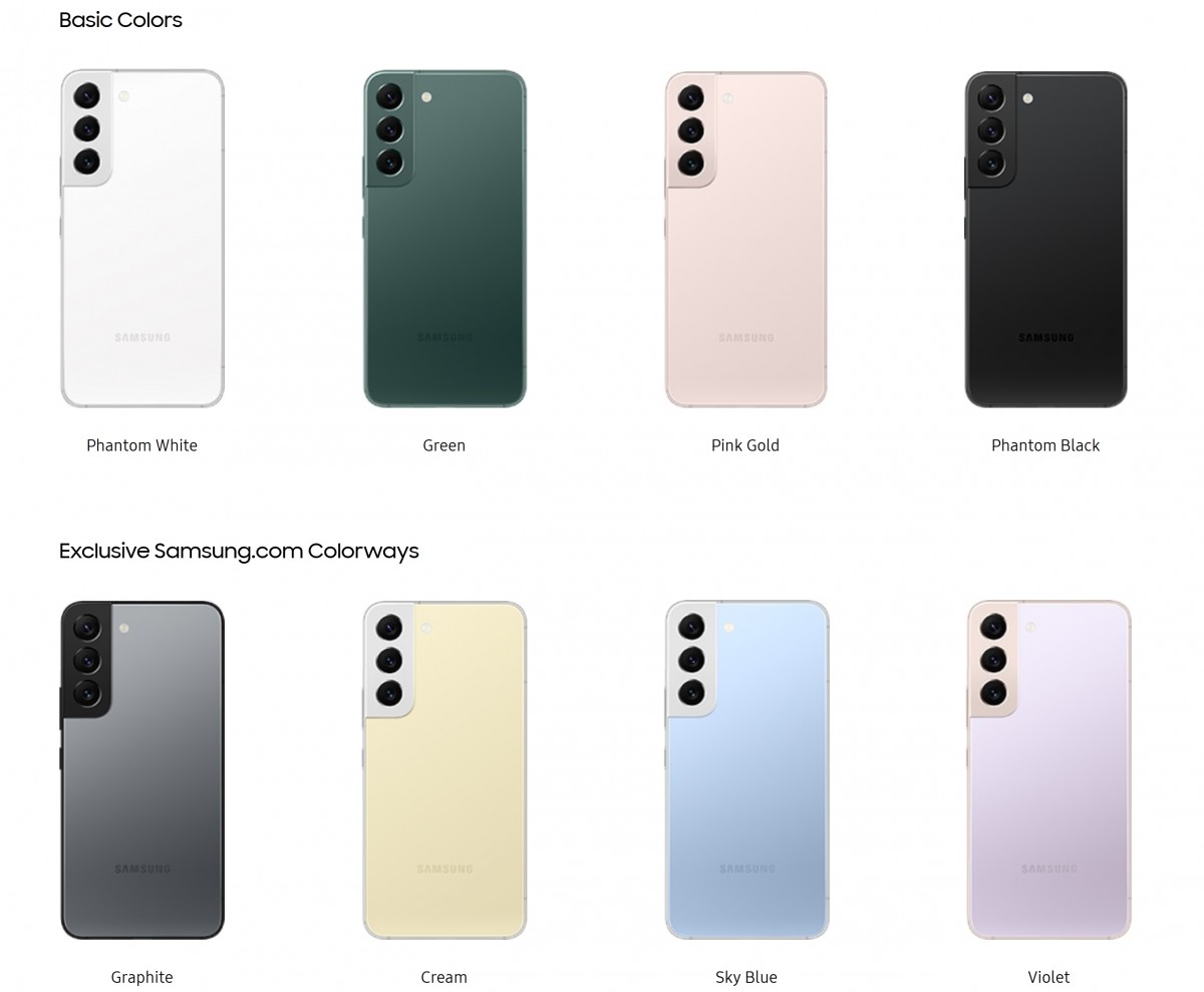
Then there are four other colors exclusive to Samsung.com and the Samsung Experience store - Graphite, Cream, Sky Blue and Violet. These have varying frames and color accents - Cream and Sky Blue get silver, whereas Graphite has black accents, and violet has them in soft gold. We haven't seen the latter in person, but we believe the secondary color is borrowed from the Pink Gold, which is the unit we have for review. Its colors, in particular, are soft and subtle. If you are not into that, Samsung clearly has bolder choices.
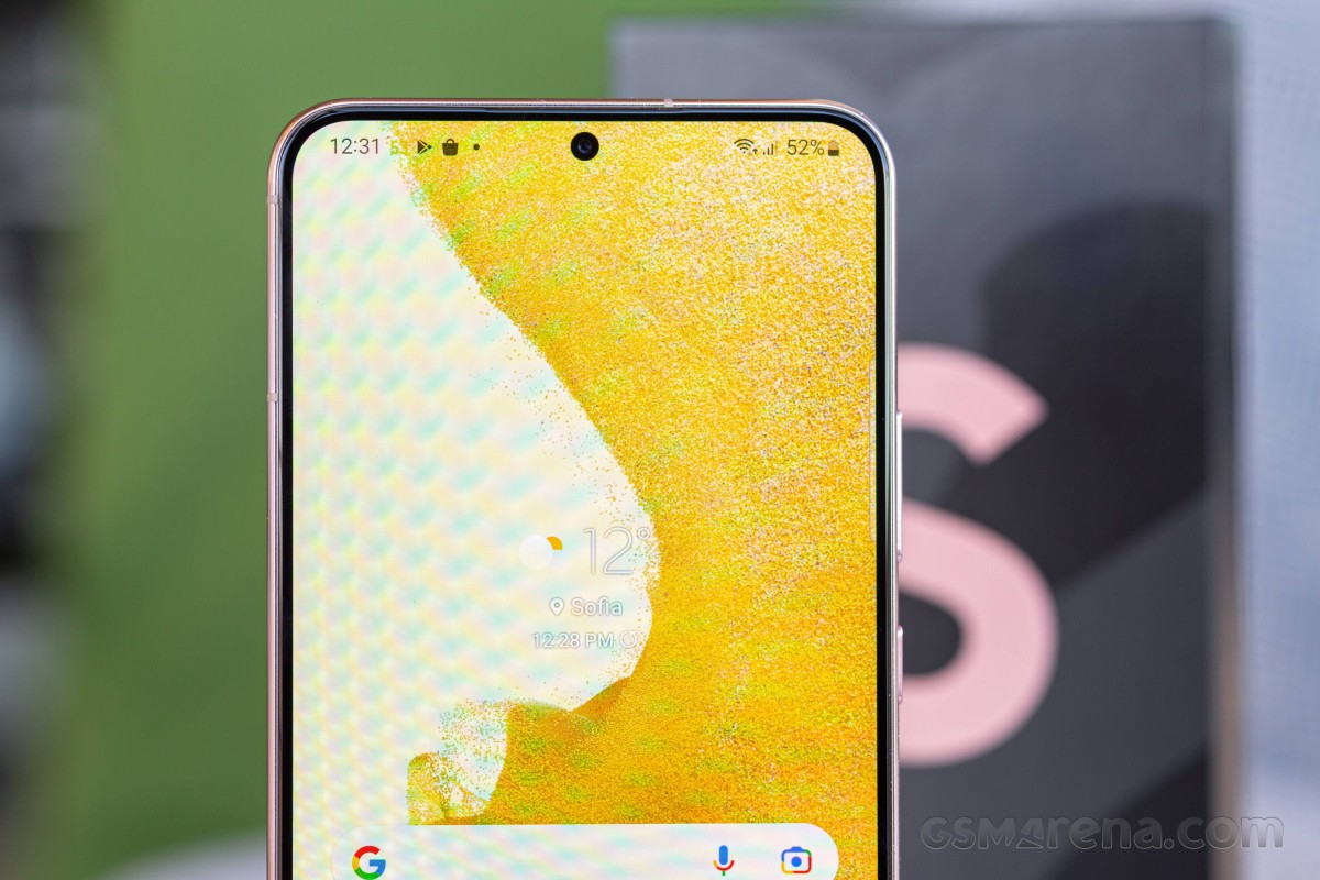
The front of the Galaxy S22+ and vanilla S22 is characteristically flat. We only phrase it in this way since a valid point can be made that the S21 design also had a flat display. Technically true, particularly the display part. However, the top glass itself on the S21+ and S21 has a distinctive curve around its edges - sometimes referred to as a 2.5D glass edge - that extends down into the side frame. This means the entire screen assembly, glass and all sticks out above the frame.
By contrast, the S22 design is even flatter since the glass front is much lower and sunken into the aluminum side frame. The two lie flush at basically the same height and meet at a right angle, which naturally makes the whole surface a lot "flatter".
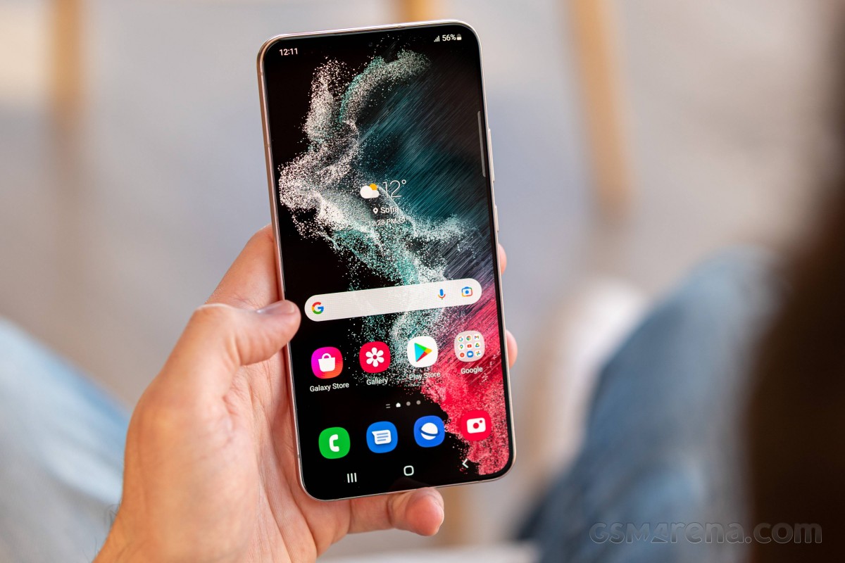
Other than that, the display bezels are just about as thick as the last generation. Impressively symmetrical all around the screen, though. The design is far from "bezel-less", but we don't see that as a bad thing at all. Having a few extra millimeters of buffer between the actual edge of your device and its display panel is a good thing in terms of protection as well as structural integrity. Getting a nice glass screen protector to stick to the front of a device without the need for fancy and janky liquid adhesive is also great. Plus, the whole fad with "endless displays" seems to have passed anyway.
Build quality and materials
Samsung's flagship Galaxy S devices have always offered great all-around, if not industry-leading, build quality. Last year the vanilla Galaxy S21 did experience quite a bit of backlash from the community after opting for a plastic back panel instead of glass. An unfortunate debacle that the Korean giant clearly took to heart since the entire S22 family has glass on both sides this year-the latest Corning Gorilla Glass Victus+ version, to be precise.
Unfortunately, we couldn't find any exact information on what makes this protective finish worthy of "+" over the regular Victus. Considering the size of Samsung's order to Corning for the S22 series, we are guessing any name was not off the table. But we digress. If there are some improvements over regular Victus, we expect them to be in shatter-resistance, which is already stellar. As for scratch resistance, like any other glass out there, a safe bet would be scratches at level 6 on the Mohs hardness scale and deeper grooves at level 7.
That being said, our S22+ unit did ship without a pre-applied screen protector, which is something Samsung used to do up until the S21. Hopefully, that means the display surface is more scratch-resistant this time around and is not just a cost-saving measure since there are official screen protectors up on Samsung.com.
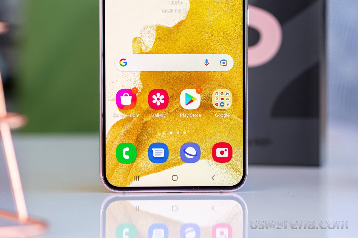
The S22+ is very well made and feels exceptionally sturdy, with absolutely zero flex, mostly thanks to its aluminum middle frame. Given that it has considerably grown in size compared to some previous Samsung designs, we can only assume that it is doing its structural job even better, holding together the glass "sandwich" of the entire assembly. Samsung actually has a name for its particular aluminum alloy blend - "Armor Aluminum" frame. If this name sounds familiar, it is because Samsung already used this particular aluminum on its latest foldables - the Z Fold3 5G and Z Flip3 5G, while advertising 10% better durability.
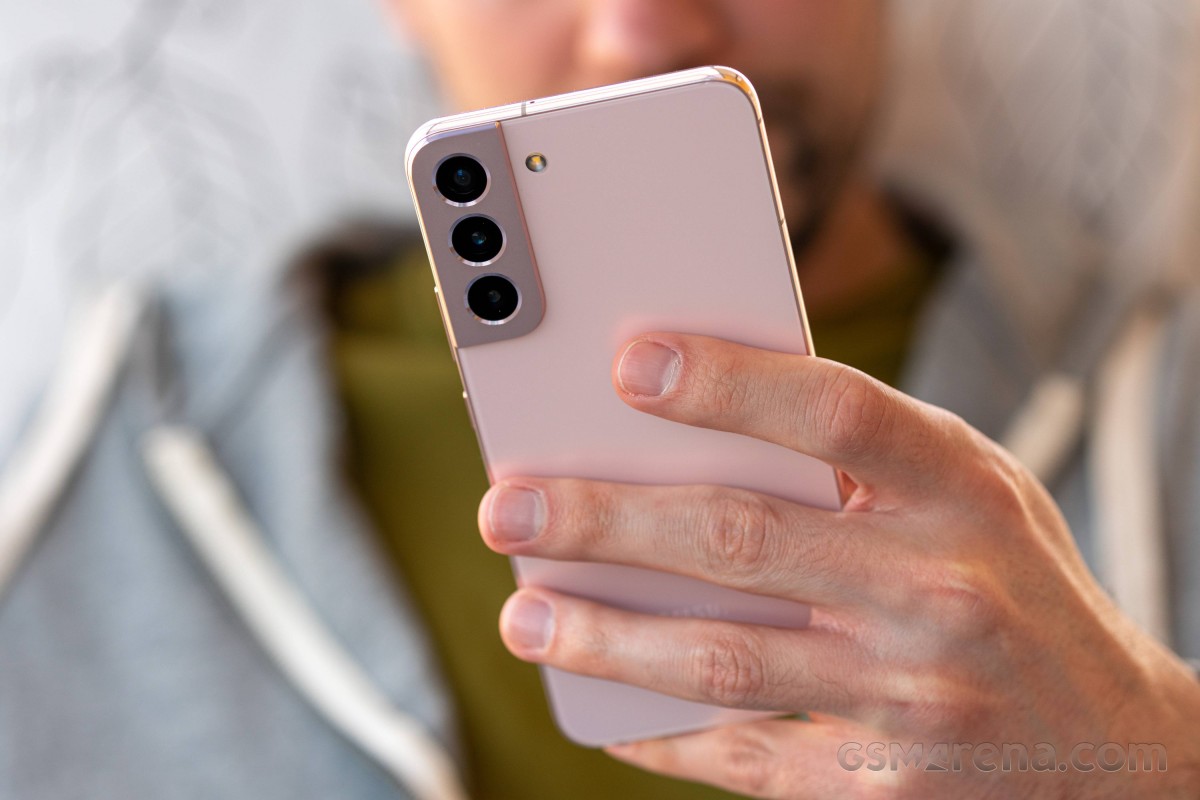
The S22+ feels very solid in hand. As we said, its rather slippery sides don't offer the most confident grip, but the phone itself still feels "dense", yet also well-balanced. Its center of mass is almost exactly in the middle. We have to commend Samsung on the excellent weight distribution that makes it much easier to handle with one hand.
The body on the S22+ has the standard IP68 ingress protection rating we have come to expect from Samsung flagships.
Samsung has been working hard on its environmental efforts in a number of ways, and some bits did make their way into the S22 family and especially its marketing. First up, there is the "Repurpose Ocean-Bound Plastics" initiative, which is basically Samsung recovering and recycling old fishing nets from the ocean.

As per this one sketch the company has provided, the material salvaged from the nets was used to manufacture the power button and volume rockers across the Galaxy S22 family. Actually, not even the entire parts, but the plastic key brackets of the buttons. Also, the inner cover for the S Pen on the S22 Ultra is made in the same way. This sounds laughably minuscule, but operating at the Galaxy S22 unit manufacturing scale, it still adds up, and Samsung deserves at least a pat on the back for the initiative.
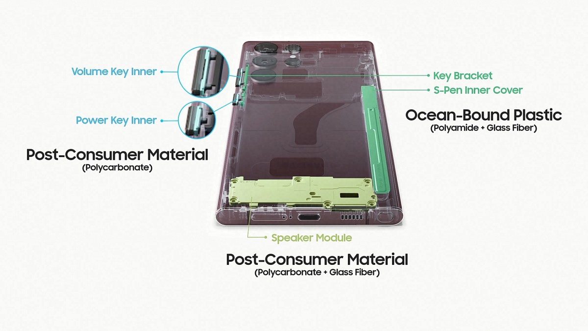
Plus, Samsung also claims that other bits of its power button and volume rocker and the speaker module are made from "post-consumer material". That's basically a fancy way of saying recycled material from discarded consumer goods. Again, it's not like the outer shell or the frame are recycled, but we still think some effort in this area is better than no effort.
Since recycling is actually at the relatively far end of the sustainability pyramid, so to say, Samsung also made an arguably much more significant software support commitment to go along with recycling efforts. All of its 2022 and 2021 flagship devices will be getting four OS updates and five years of patches.
Controls
The Galaxy S22+ sticks to a traditional and straightforward control setup. Starting from the basics, you get a volume rocker and power button on the right-hand side. These are well-positioned in terms of heights, and the buttons themselves feel great - clicky and responsive.
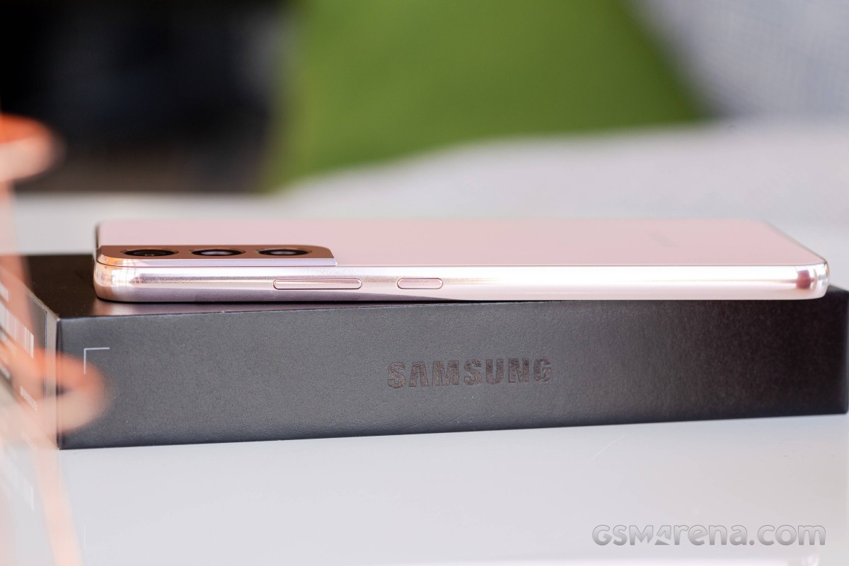
There is nothing on the left frame at all, save for three antenna lines.
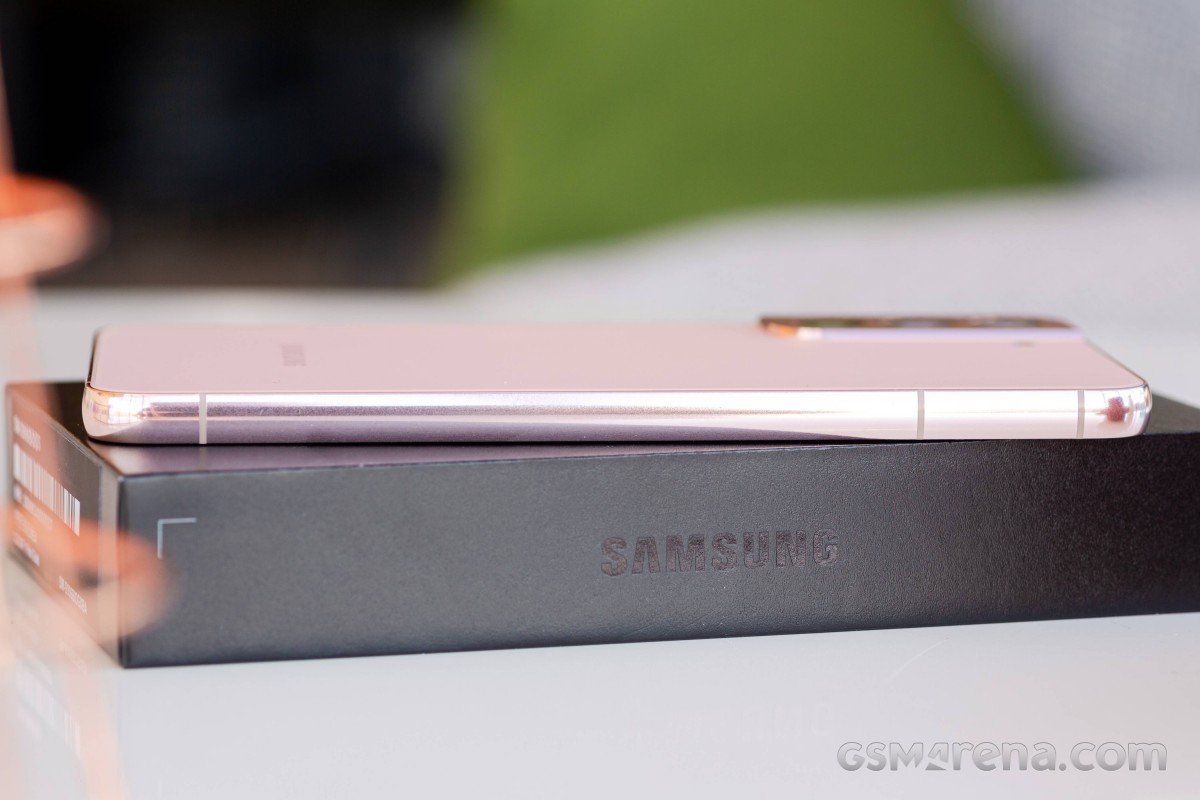
The same is mostly true for the top side, where there is just a single tiny hole for the secondary microphone alongside another antenna line.
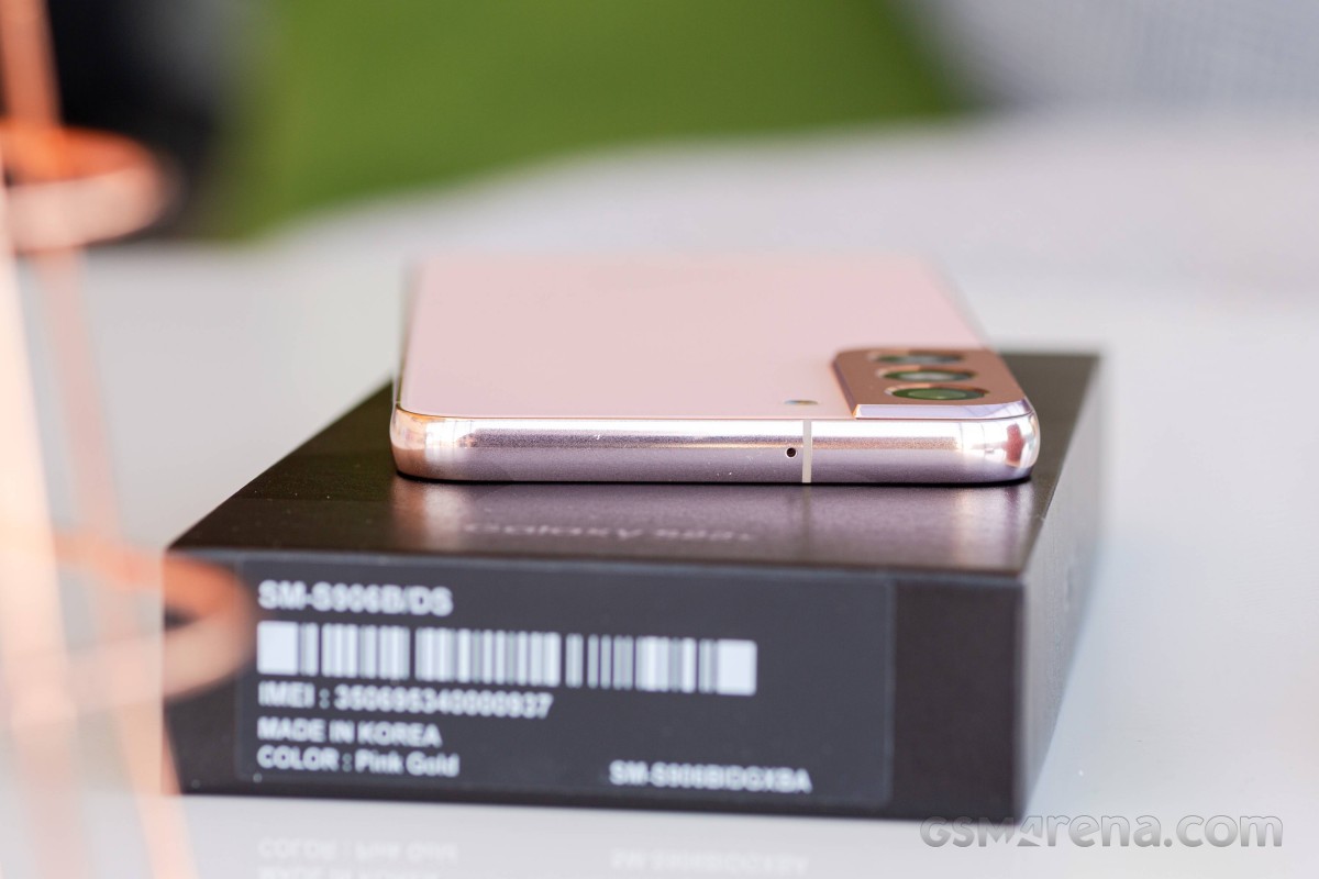
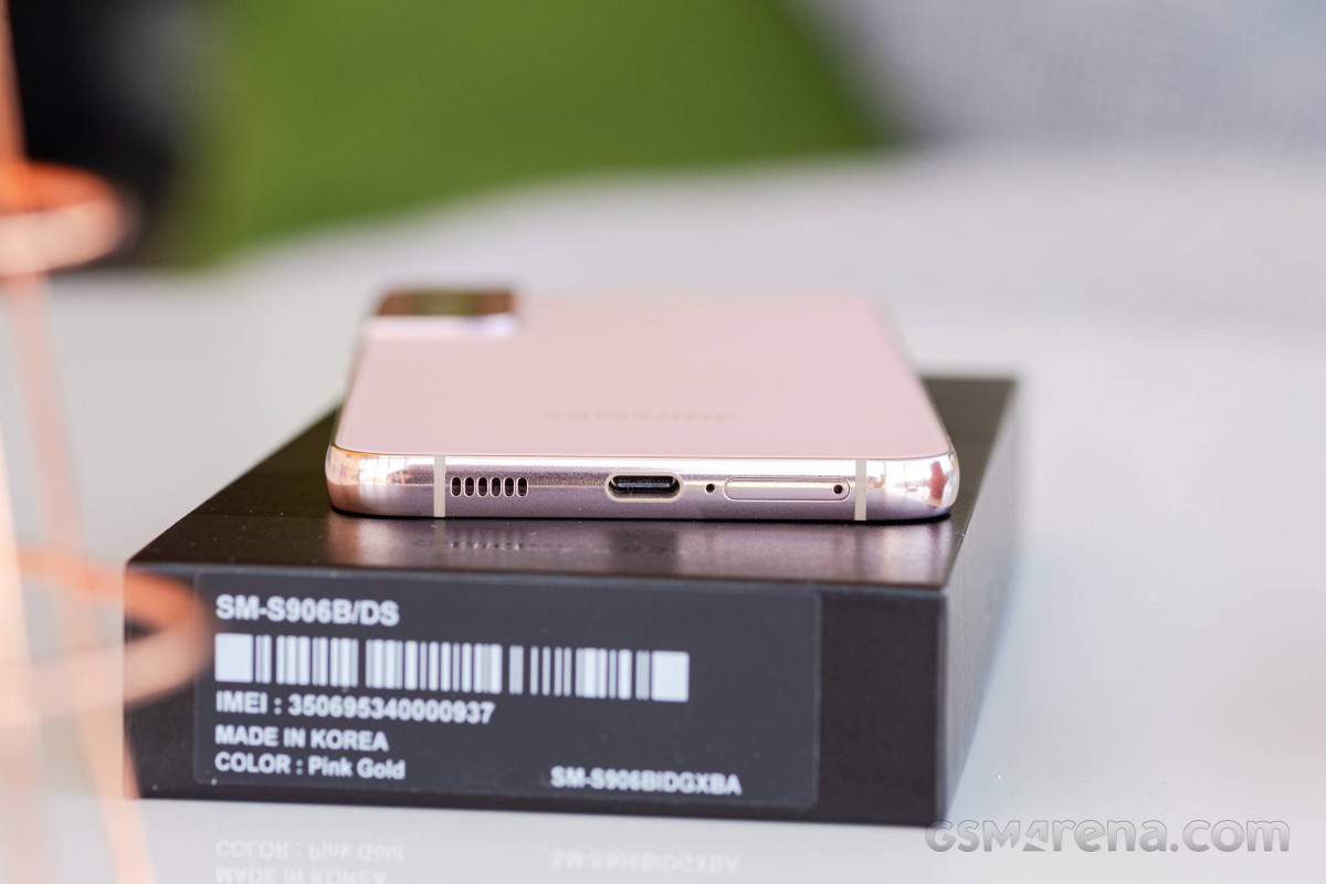
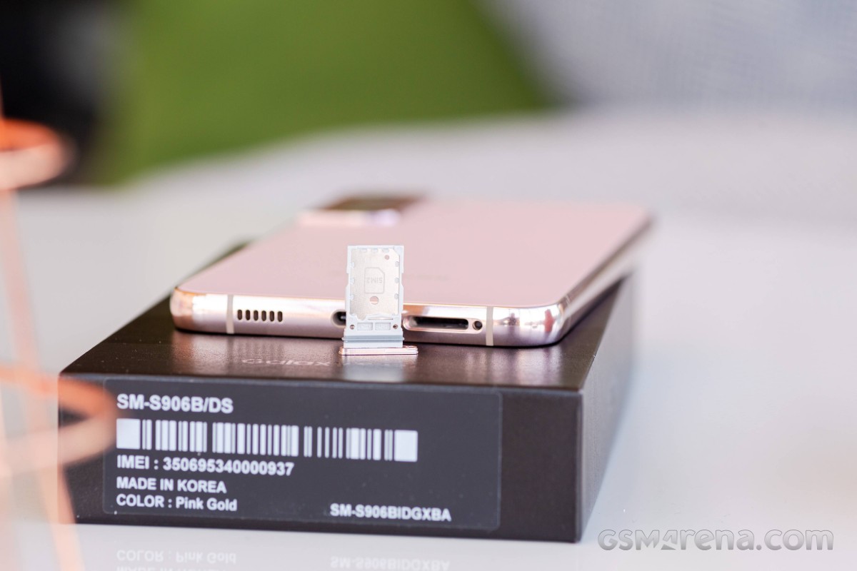
The bottom of the S22+ is a bit busier. The Type-C USB port has USB HOST support and can charge at up to 45W using Samsung's standard PD+PPS charging. Next to that - the main microphone and then the dual nanoSIM card tray. There is no expandable storage on the Galaxy S22, S22+ and S22 Ultra models, which is unfortunate. There is a bottom-firing speaker on this side of the S22+ too. It is part of a hybrid stereo setup with the earpiece.
Speaking of the earpiece, it is well hidden and practically invisible, with just a small slit, barely noticeable above the display on the front side. Despite its diminutive size, it still gets quite loud.

The selfie camera punch hole is quite small in typical Samsung flagship fashion. There are at least a couple of sensors hidden away near it as well under the display. Notably a STM STK33915 light sensor and a proximity sensor. These are invisible even when shining a light directly at the area, but that is hardly a surprise since Samsung has pretty much perfected under-display sensors.
Speaking of which, the S22+ uses an under display ultrasonic fingerprint reader - also a long-standing staple of Samsung flagships.
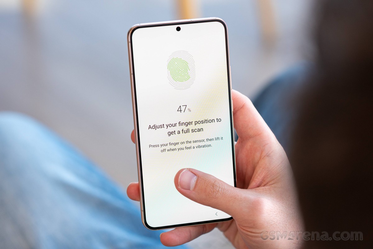
These sensors have also come a long way since their original inception. They have grown in size and otherwise improved their performance generation to generation. Still, we honestly can't say they are quite as speedy or reliable as modern optical units. The one inside the S22+ is about as good as ultrasonic tech gets. During our testing, it was very accurate and reasonably quick. Only long-term testing can tell if this behavior holds up, though.
Connectivity
We tend to skip the connectivity section on most modern phones, but the S22+ is loaded for bear. There are at least two distinct versions of the S22+, depending on whether you decide to count the mmWave version separately or not. That one is limited to the USA and is hence based on the Snapdragon 8 Gen. 1 chipset. This year pretty much every country outside of Europe is getting the Snapdragon. Our review unit is a European one, packing the Exynos 2200 chipset. That point is going to come up a bit later in the performance section. As far as network connectivity is concerned, you should know that both chipset variants of the S22+ support dual SIM and dual Standby SA/NSA/Sub6 5G, with a few differences in bands here and there. There is also integrated eSIM support, but you can't have three-way simultaneous standby. A single-SIM version of the S22+ exists on some markets as well, but it is not the norm. mmWave is a whole other variant that even weighs a bit more than its non mmWave sibling. Expect to only see it at supported carriers.
Samsung has a nice feature parity between the Snapdragon and Exynos models in terms of local connectivity. Both get dual-band Wi-Fi 6e, Bluetooth 5.2 with LE support and NFC. GPS capabilities are basically shared between the pair as well. Both have dual-band (L1+L5) GPS receivers and A-GPS, GLONASS, BDS, GALILEO support. The S22+ has Ultra Wide Band (UWB) support just like the Ultra, which is missing from the vanilla S22.
You also get a full set of sensors on the S22+, including accelerometer, gyro, proximity, compass and barometer. In terms of things that are missing, in case you were wondering, the S22+ lacks ANT support as well as Samsung's MST. Neither is a new omission, though. There is no notification LED nor a 3.5mm audio jack either. Hardly a surprise.
The Type-C USB port on the S22+ is advertised as supporting a USB 3.2 data connection. Unfortunately, with the current state of the USB specification, this means little in terms of actual max speed. We tried testing transfer speeds with an external Thunderbolt drive, as well as a PC with a Thunderbolt 3 port and a certified cable and never got even close to the 5Gbps spec of the 1x1 USB 3.2. Make of that what you will. On a more positive note, you can get both video and audio output over the Type-C port.
Reader comments
- Candied
- 25 Jan 2025
- XBK
My 12MP camera randomly stopped working one evening. The camera says "Warning: camera failed" anytime I open it. The 50MP camera works just fine though. Does anyone what's wrong with the camera and how I can fix it? I have already...
- Oldmanram
- 09 Aug 2024
- IcQ
The phone seems pretty solid, the one things that bugs me about all phones is the trend away from SD cards, I take a lot of photo's and have used the micro SD cards in most of of my old Samsungs. Just another way to get more $ out of us. Makes u...
- Anonymous
- 26 Jun 2024
- rAe
How to use both sim data