Samsung Galaxy S23 long-term review
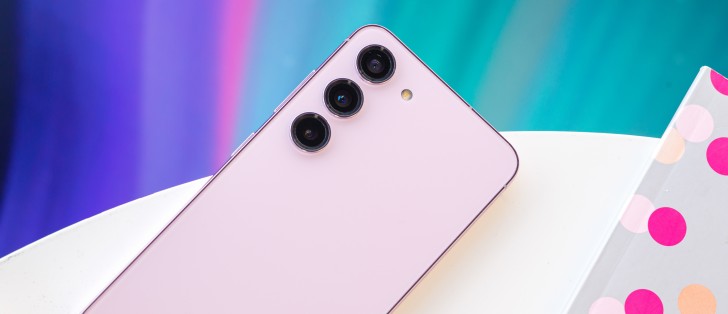
Design, handling
The first thing that stands out about the S23 is its size, in a sea of bigger phones everywhere. It's understated in its dimensions, if that makes sense, and people will notice - we got a bunch of "oh, it's smaller than mine" comments from multiple people who saw us with it. Interestingly, most of those people seemed positively impressed by the size.
And yet, when they bought their phones, they didn't go for a smaller one. It's a strange dynamic - most people seem to like the idea of smaller handsets, but when push comes to shove, when the rubber hits the road, when it's time to put their money where their mouth is, they still buy a mainstream sized device. And it all seems to come down to screen real estate.
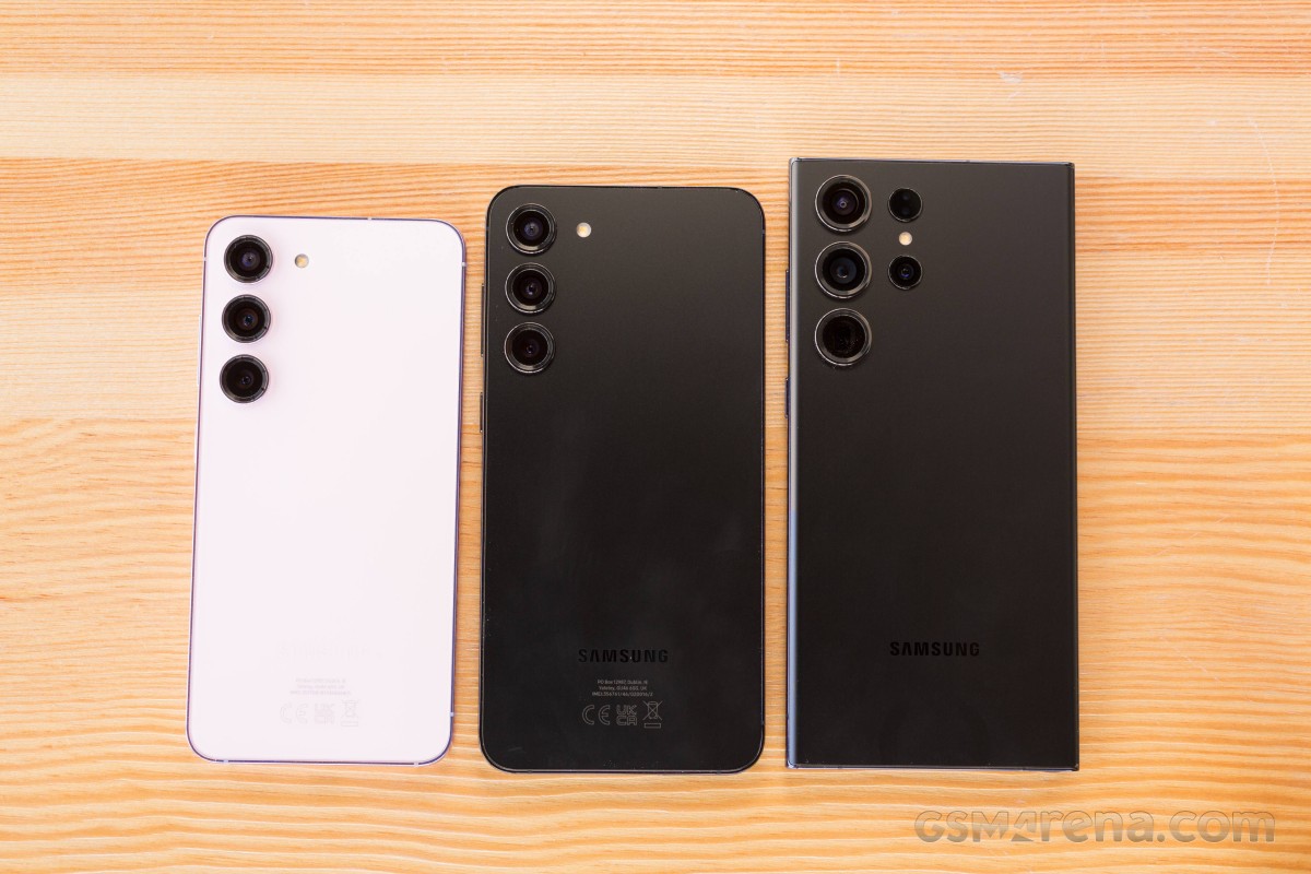
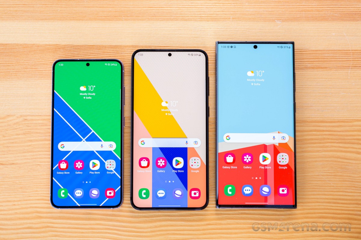
The S23 was very much appreciated for its size, until the screen came on. Then, the "oh, it's smaller" comments took a turn towards negative connotations. This wasn't all people, mind you, but it was most. So the majority clearly values screen size over the entire phone size enough to keep buying 'normal' handsets. This tells us that rollable display smartphones (whatever happened to those?) might be very successful if they ever do actually launch.
Now, from the rear, this is unmistakably a Samsung circa 2023. The Korean company has made the individual camera circles/islands a very recognizable feature on all its phones this year, from the cheapest to the most expensive. That's a good thing for brand recognition, definitely, but it might not be so great when it comes to actual model recognition.
People will instantly know you have a Samsung, but 99% of them will have no clue which one. It's an interesting strategy, but we're not sure where it's headed - the designs do look nice, but no one phone is standing out in any way. Plus, in a year or two there undoubtedly will be a lot of fatigue regarding these looks. We're not there yet, so let's see if any redesigns are coming.
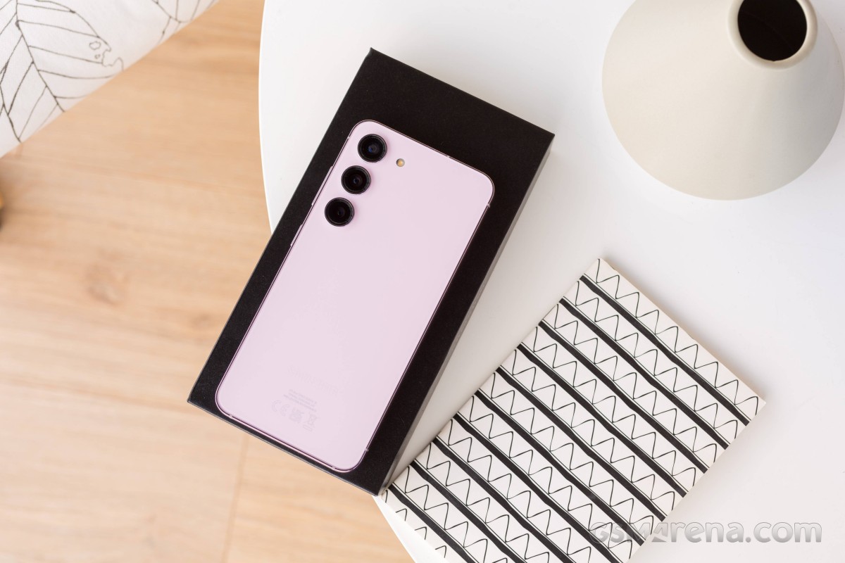
On our white review unit, the Samsung logo is very subdued, barely visible from some angles, which is an interesting touch and tells us the Korean company is very confident in the aforementioned ability of people to recognize it as a Samsung without the need for gaudy branding.
The back glass feels really nice and doesn't show any fingerprints at all, ever, which is a nice bonus. As always, that means it's incredibly slippery - for some physics (or chemistry? We're not experts) related reason, you can either have no fingerprints showing or a less slippery phone, but not both.
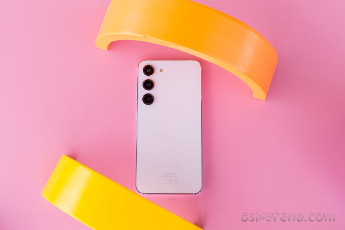
That being said, in terms of overall slipperiness, the S23 is saved by its glossy metal frame. This will have visible fingerprint marks on it from some angles, but it's also way less slippery than the back, so handling is actually very good. And of course, that's aided by the phone's size. It's much easier to hold this one than any mainstream sized device, and pulling down the notification panel also requires way less finger gymnastics - if you have bigger hands, none at all, in fact.
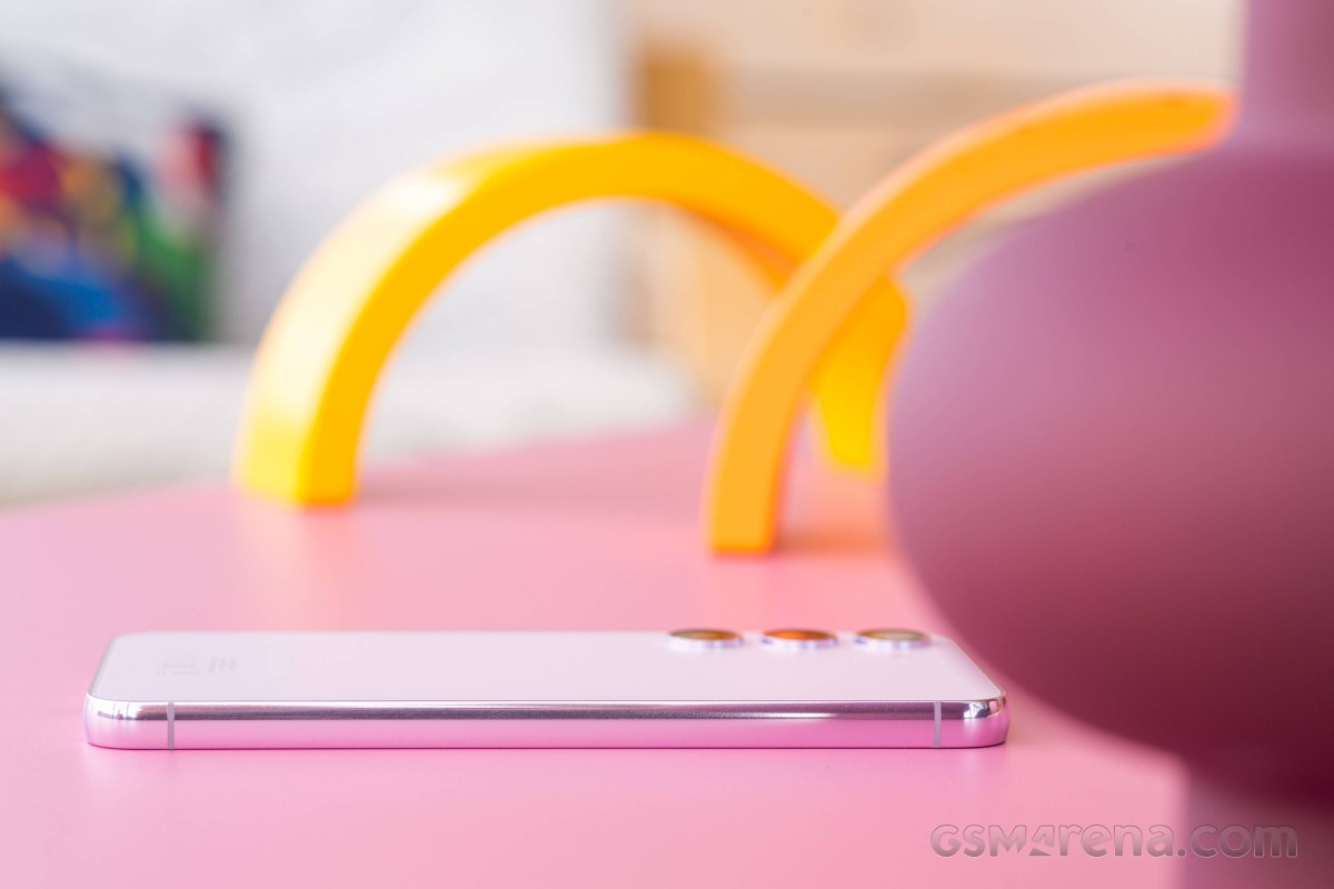
Speaking of hands, people with big ones and average ones will find this a joy to use, while those with smaller hands will consider it a breath of fresh air coming from a larger model. That's all expected thanks to the size, and reality does live up to said expectation.
On the other hand (excuse the unintentional pun), if you're used to the 'normal' sized phones of today, the S23 will never not feel small, and because it's smaller the default text size is smaller than what you are used to as well. You can make it bigger to compensate but then less things fit on the screen and it can look a bit off, as evidenced by all of our screenshots throughout this review.
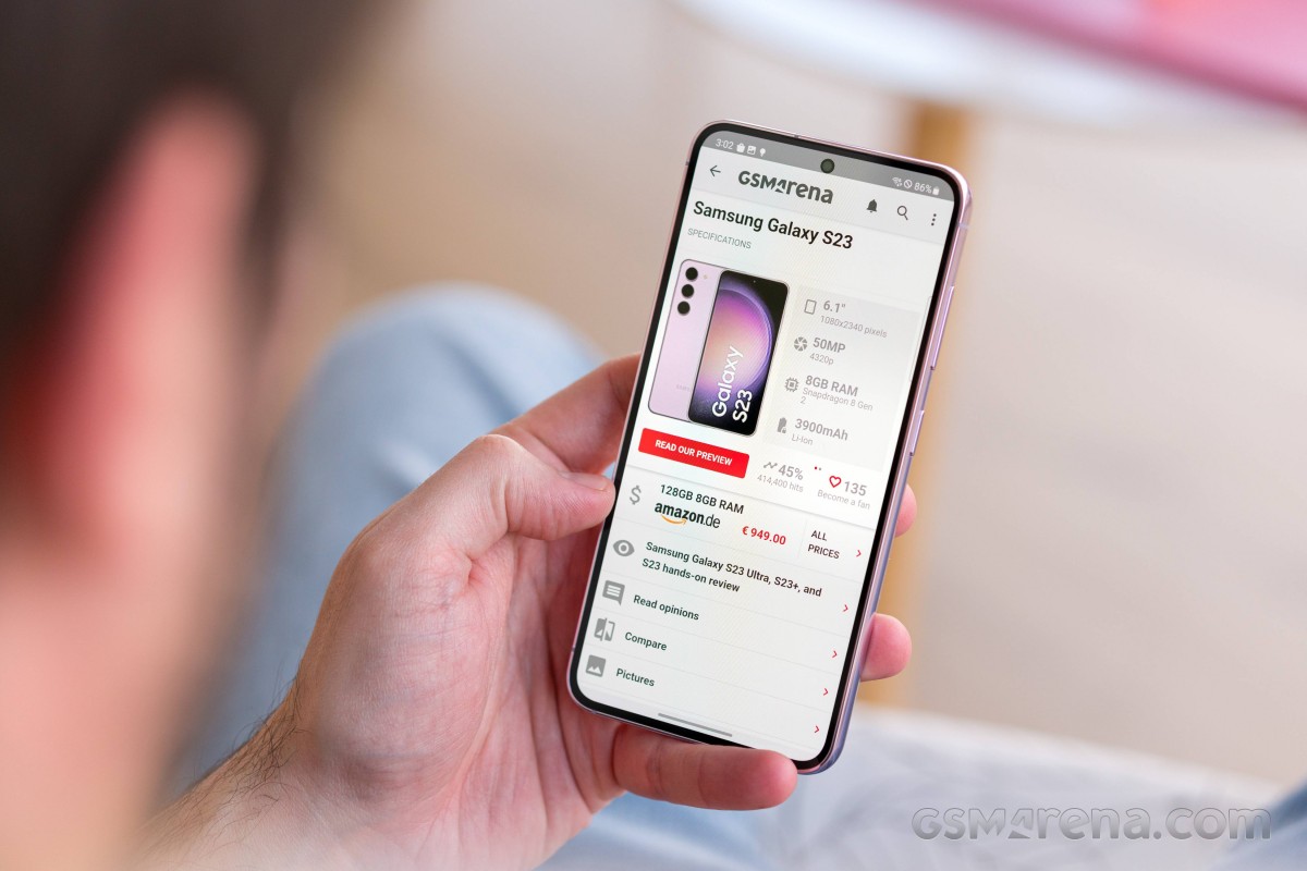
The size also makes it ever so slightly harder to accurately type, since the letters are all smaller and closer together. It's not as bad as on a Samsung Fold's outer screen, of course, but it's also more challenging than on a mainstream sized device, and we felt it would be important to mention.
The front is almost all screen, as you'd expect from a flagship. The top and side bezels seem identical (although they probably aren't), only the bottom one feels a tiny bit thicker, but not so much that it would be annoying. Basically, you'll only notice the difference if you go looking for it.
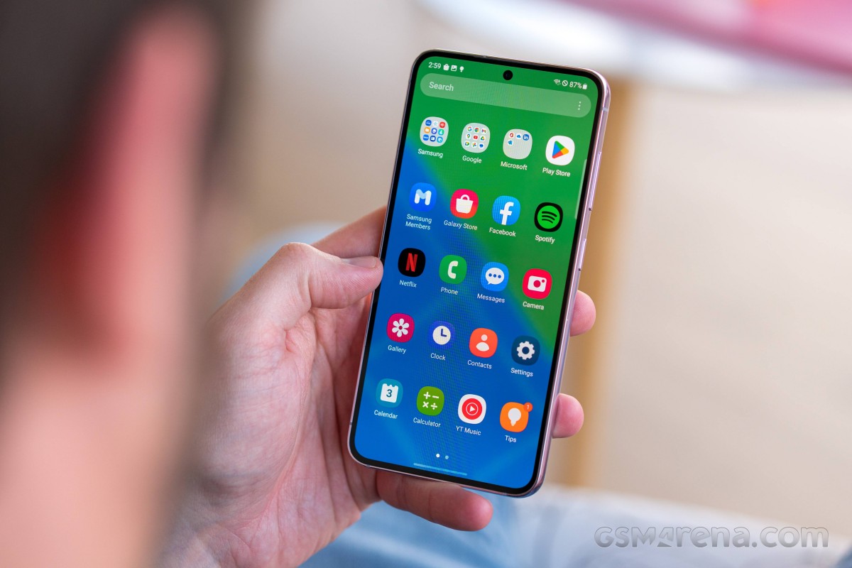
"Safe" is the word that best describes the S23's design overall. It's not offensive (unless you really hate shiny metal frames), it's sort of understated, it's solid, it works, but it won't wow anyone. This seems very intentional on Samsung's part, so we assume it has some data proving this strategy would work better for it than going all-in with designs that really stand out. Those would be much more hit or miss - a hit with some minority of people, but probably a miss with others, and that's a risk Samsung is clearly not willing to take.
We're not saying that's a bad thing, by the way - it's a conscious decision, and if you want more bombastic designs these days, you'll probably need to turn to 'gaming phones' or some of Samsung's Chinese competitors.
In case you were wondering, the box does not contain a charger or a case, and this continues to set Samsung apart from its Chinese competitors which generally do at least ship the former - and some even bundle a simple case, which you may or may not end up using, but in our view, it's a nice bonus to have when you're spending this much money.
Speakers
The S23 has dual speakers of course, and they're great. We never felt the need for more volume from them, and they are also high quality - with the usual caveat: "for a phone". You always need to keep in mind how tiny they are. But, again, for a phone, these are the best speakers we've ever heard on a device we've reviewed long-term.

On the volume front, note that we don't usually listen to things on the phone's speakers while in very crowded and noisy places - there you might need to bring the phone closer to your ear to hear everything. But with low and reasonable amounts of noise around, that won't be necessary. There's nothing more to say here - they're the best, full stop.
Vibration motor
The vibration motor inside the S23 is very good, although we still miss the older-style motors Samsung used to use a few years ago, which could be heard more than these new ones. We know some people absolutely hated those, so your mileage may vary. This one is a top notch late model, with '3D'-like vibrations, that you can definitely feel in your hand or pocket. In a purse? Not so much, which is where the 'could be heard more' motors would really have come in handy.
Samsung knows this so it's given you a setting to add a "vibration sound" to incoming calls - this plays through the speakers, and it's better than nothing, but not as good at making an impression as those older style vibration motors were. They are extinct at this point, however, so perhaps we should move on? For 2023, this is at the very top, quality-wise, on par with the best from Samsung's Android competitors.
There are adjustments you can make to vibration intensity, separately for calls, notifications, media, and system stuff - touch interactions, dialing keypad, charging, navigation gestures, camera feedback, and the Samsung keyboard. All of these can have vibrations turned off individually as well.
These are all very welcome, although we've maxed out almost all of them as you can see, since at lower levels we didn't quite feel there was enough 'oomph' to the vibrations, but of course you may see things differently, which is why it's great to have so many customization options available. Notably, the call vibration pattern can also be matched to your ringtone, which is a nice touch and on by default. And for notifications you can choose the style you want.
Reader comments
- Karl
- 01 Sep 2024
- E4q
Where is it?
- Lt
- 27 Aug 2024
- pdX
Everyone complaining about fingerprint reader. I am using cheap protective glass, and have registered both my thumbs two times each. And it is ok. Sometimes it gets unrecognised, but it is same with all the phones i had.
- Vardy
- 28 Jun 2024
- anJ
It's already there!


