Samsung Galaxy S5 vs. HTC One (M8): Leather and steel
Leather and steel
User interface
The two flagships run the latest Android version out of the gate (Android 4.4.2 KitKat), but it's the custom skins manufacturers put on Android that are actually more important. They are the ones that bring a lot of the exclusive functionality - think Multi Window or Zoe - while the 4.x releases of Android has been fairly uniform in terms of features.
TouchWiz and Sense (the latest versions of each) are quite popular, but just in case you're not familiar with them, here's a quick video refresher.
In terms of looks the two are near polar opposites but there's a fairly big cross section of matching features.
The lockscreens are different enough though. Samsung has been unusually restrained and by default the Galaxy S5 shows nothing more than the time and weather, and a camera shortcut. The fingerprint scanner on the Home key can be used to secure the lockscreen instead of the usual password or pattern protection.
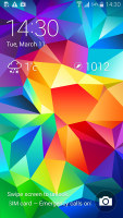
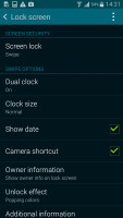
A simple lockscreen with optional fingerprint protection
HTC on the other hand have added double tap to wake and swipe up to wake and have kept the four shortcuts at the bottom of the screen from the early versions of Sense for Android. From here you can also launch BlinkFeed and Google Now. On the lockscreen you can double tap to lock the phone again, but this doesn't work anywhere else.
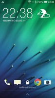
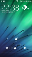
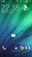
HTC's traditional Sense lockscreen
The ease of tap-to-wake is great, in fact we kept tapping other phones too, expecting them to act accordingly. The extra security afforded by the fingerprint scanner will speed things up for the more security conscious (it's quicker than entering a password).
Speaking of BlinkFeed, it's a magazine-like interface that shows a stream of news articles, along with updates from both social networks and apps on the device. This means BlinkFeed will show you drawings your kid made in Kid Mode, info from Fitbit workouts and so on.
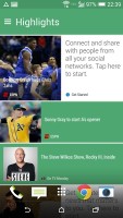

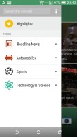
BlinkFeed keeps you up to date with news, social networks and apps
Samsung recently added a similar feature called My Magazine to the homescreen. This one pulls info purely from web sites and social networks, apps can't post notifications here.


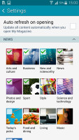
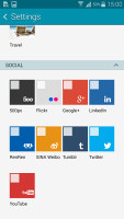
My Magazines is similar to BlinkFeed
Magazines aside, the homescreens are standard with shortcuts, folders and widgets. The app drawers are pretty standard too, except on the Samsung you scroll horizontally, while on the HTC it's vertical.
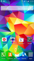
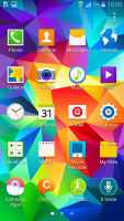
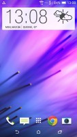
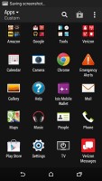
The homescreen and app drawers are fairly standard
The notification areas of both phones, however, are quite different. HTC uses the stock Android solution of notifications only with a button to bring up toggles (you can use a two-finger swipe for that too).
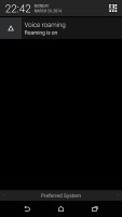
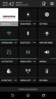
HTC's notification area is close to stock
Samsung shows a row of toggles in the notification area by default, followed by S Finder and Quick connect buttons, then comes a brightness slider (with an Auto check box) and only then the notifications.
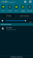
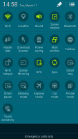
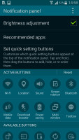
The TouchWiz notification area is much busier
This might sound too busy, but it all fits quite well on a 5.1" high-res screen. You can hide the brightness slider to free up some room, but not the S Finder and Quick connect buttons. The TouchWiz notification area can also show all toggles and has a larger number thereof overall. This includes things like NFC and Sync that can be quite useful. You can rearrange the toggles to bring the most frequently used ones forward.
Both companies couldn't resist fidgeting with the app switcher UI either. Samsung has stayed close to stock with a vertical list of app thumbnails and icons (the design is slightly different from AOSP) and has added a Task manager and Close all buttons.
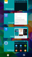
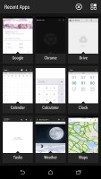
TouchWiz has a near-standard app switcher • a custom Sense switcher
HTC made the bigger change and displays apps in a 3 x 3 grid of app thumbnails. This switcher lets you swipe to dismiss apps, but you can't see the 10th most recent app. There are Task manager and Close all buttons here too.
Multi Window is a serious multitasking tool exclusive to Samsung's premium line of devices. It allows you to run two apps simultaneously, so you can run two chat sessions at the same time, or a web browser for reference while writing an email or editing a document.
While Multi Window is better suited for tablets, it can still be useful on the 5.1" 1080p screen of the Galaxy S5.
Multitaskers will get some benefits from Samsung's interface - the easier to access toggles and the ability to run two apps will save you seconds at a time, but those add up quickly over extended use of your phone.
The Galaxy S5 also has a leg up on the HTC One (M8) in terms of security thanks to its fingerprint scanner and the government-certified KNOX software that handles security on the phone. We already covered the lockscreen, but the Private mode can fingerprint-secure even individual files independently from the unlock routine used. This is great for keeping files private (work or personal files) while someone else is borrowing your phone.
If you work for one of the companies that let you bring your own device instead of a dedicated work phone, you'll feel a lot safer knowing private files are locked behind KNOX and a fingerprint scanner. This works equally well for sensitive company files you don't want your friends to just open when borrowing your device.
The two phones also have dedicated modes for in-car use or for kids to play with.
HTC is using the free Zoodles app that lets kids play games, draw, read books and even check email, without giving them access to the entire phone functionality. Then there's car mode, which gives you quick access to the music player, navigation, phone and voice commands.
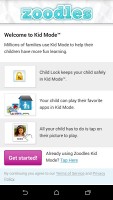
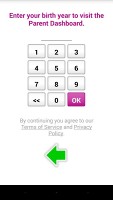
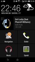
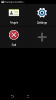
Kid mode on the HTC One (M8) • Car mode
Samsung has a Kids mode too, which uses a custom homescreen with custom apps that have colorful, cartoony interfaces. They keep files separate, i.e. the Kids mode gallery only shows photos taken in Kids mode, not the ones you shot with the default camera.

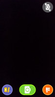
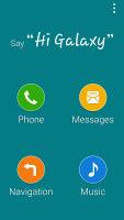
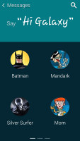
Kids mode on the Galaxy S5 • Car mode
The car more is quite similar to HTC's, except it's always listening - you have to say "Hi Galaxy" followed by your command (this feature is powered by S Voice). On the One (M8) you have to tap the Speak button.
The two phones have Do not disturb modes (it's called Blocking mode in TouchWiz). They can be scheduled or manually turned on and off, they block notifications and ringers except for messages and calls coming from pre-selected contacts.
Both phones feature extreme power saving modes. They disable most features, including turning off the data connection while the display is off, dimming the screen and showing a stripped down homescreen. They do this in order to last several hours per battery charge percentage point.
Winner: Samsung Galaxy S5. The extra security and privacy offered by the fingerprint scanner are great and we like having Multi Window even if it won't see too much use for many of the users.
Sense 6 on HTC One (M8) is beautiful and matches most of the TouchWiz features, but still has some catching up to do.
Reader comments
- kk
- 28 Dec 2019
- CGH
bad battery
- yogesh
- 29 Nov 2016
- 7wC
I want to what's the quality of main(secondary) camera of htc M8
- Glokings
- 09 Jan 2016
- UDy
The phone is very good, how much is it
