Samsung Galaxy S8 review: Essence distilled
Essence distilled
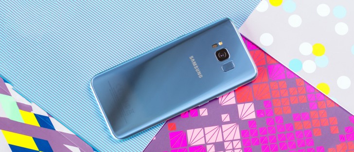
Bixby all the things
Samsung's new AI assistant is officially here and it's an integral part of the Galaxy S8 and S8+ experience. Judging by marketing highlights, you'll likely be seeing and hearing a lot about Bixby, even if you don't plan on getting either of the flagship pair.
We definitely get all the PR effort Samsung is putting in to get the hype train rolling. By all accounts, Bixby is a massive undertaking and a whole lot more than a simple spin on the company's outdated S Voice platform. Samsung wants Bixby to be a pervasive and persistent presence, like a digital butler that sees everything, hears everything and can help in every aspect of your daily life. If nothing else, the name sure fits the bill.
The Korean giant arguably succeeded on most of these points. You can pretty much call upon Bixby from every interface and if you ever find yourself stuck in an UI that doesn't offer any shorthand link to the AI, there is always the Bixby button. This, in itself, shows the level of commitment Samsung currently has to the platform. The company's vision for the future involves a seamlessly connected home, with all your electronics and appliances playing ball and Bixby near the center of it all.
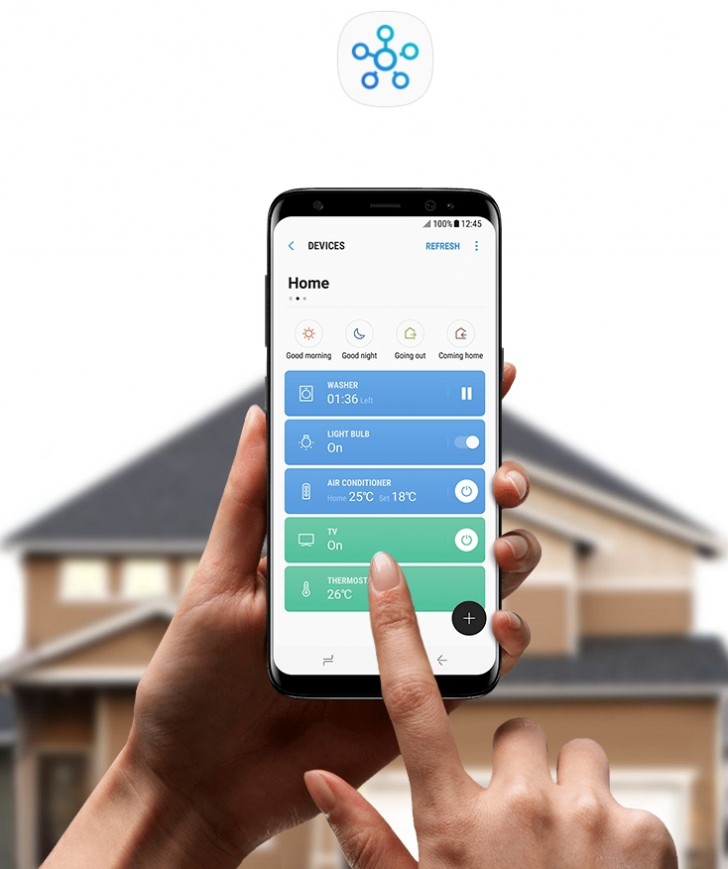
But even Samsung's optimistic predictions place that reality at least three years into the future. The real question is, what can Bixby do for you today, after you unbox your shiny new Galaxy S8?
Straight off the bat, we will note that Samsung is aware of the platform's early nature and is actually not pushing it down user's throats. In its current state, it is surprisingly easy to turn Bixby off and ignore it altogether, whether for good, or simply to postpone the jump into Samsung's new AI ambitions.
Actually, users outside of Korea won't be getting Bixby Voice at launch at all, so clearly, there is still some waiting to be done. But, we digress.
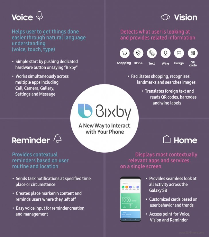
The easiest way to perceive Bixby is through its individual parts. First up is Home. In a lot of ways, it's similar to the older Google Now experience - a dedicated interface, with a feed of contextually relevant information. It can either be brought up by tapping the Bixby button three times, or by swiping right from the left edge of the screen. The latter home pane positioning can be toggled off or on, as per your liking.
Bixby Home definitely looks simple on the surface, but there is actually quite a bit of customizability hidden away under the hood. For one, cards can be hidden, pinned to the top or turned off. There is no apparent rearrangement option beyond that, but Samsung does offer a toggle for something it rather descriptively calls "Samsung Interactive and Customized Services for Hello Bixby" that makes the platform and thus the cards location and context aware.
As for the cards, themselves, they actually come courtesy of various apps which are installed on the phone. In a rather forward-looking fashion, Samsung has provided an API to enable displaying content from third-party developers. Even in this early stage, there are already a few notable applications that can talk to Bixby in this fashion, like Spotify, Twitter, Foursquare and Uber.
It is also worth noting that Bixby can put cards on your lockscreen as well. Of course, that all depends on whether you permit it to do so, again on a convenient per-app basis.


Bixby cards come courtesy of your apps
Reminder is a particularly convenient part of Bixby. It is basically a calendar and list keeping app, rolled into one. But the trick is, Reminder is location and context aware, as well.
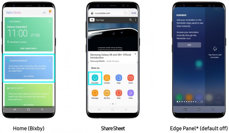
Once you enable the feature, it manifests itself as a separate app. In it, you can input content the old-school way.
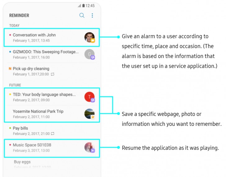
However, Reminder also appears on your share list, so you can share a web page, photo, a conversation or even a video file with the app and create a reminder based on that. Once the timing or location conditions for that reminder are met, you can just jump back in your content. Reminder even remembers where you left off your video or song.


Reminder offers time and location based conditions


Sharing content is a big revolution in terms of reminders
Bixby Vision is an interesting take on what has been one of the big goals of AR and computer vision enthusiasts for quite a few years now. If you've ever tried Google Goggles before, the concept here should already be familiar to you - point your camera at an object, recognize it and its properties and get relevant information.
This sounds like a perfectly easy end-goal, but the underlying implications are immensely complex and difficult to tackle. Samsung actually aimed for a fairly advanced implementation. Bixby can potentially recognize objects in one of the following categories: Shopping, Places, Text, Wine, Image and QR code. As you can imagine, it's a hit and miss situation and some categories work better than others.
Once Bixby Vision detects something it thinks it can recognize, it gives you suggestions as to what category it thinks it falls under. Bixby then relies on user input to take it the rest of the way. Detection often ends up cropping too much of the item, so you should take the time to adjust the windows for best results.
The image search is fairly straightforward and mainly looks for general shape and color matches, patterns and compositions. Text and QR also work well, as one would expect in 2017. Looking up shopping links and wine listings is a lot tougher and results from our tests were all over the place.


Adjusting the detection area definitely helps


Text in patented fonts seems to be a good idea • So do easily recognizable shapes • No party for us
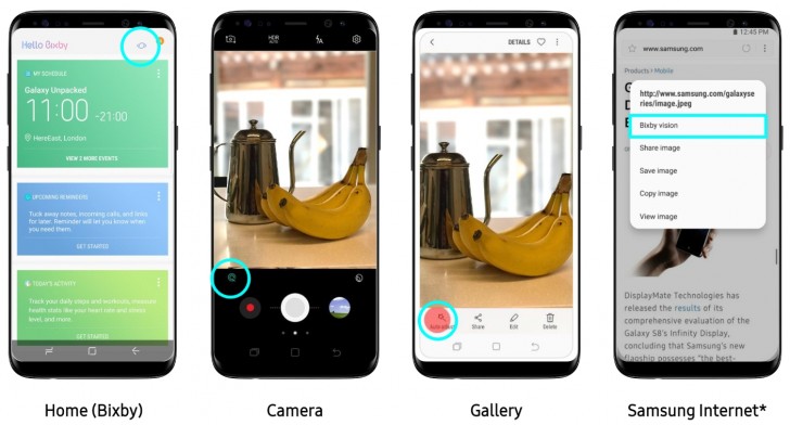
There are shortcuts to Vision scattered all around the interface. Naturally, you can enable it from the camera or Bixby Home, but there are also options for passing an image from the gallery or the web for analysis.
Finally, every self-respecting AI assistant needs a Voice. However, Samsung appears to be taking its time in giving Bixby one. Our review unit lacks the functionality altogether and so will non-Korean units at launch. At the announcement event, we did hear Bixby talk in a rather robotic and unpolished female voice, but we can't imagine that will stick.
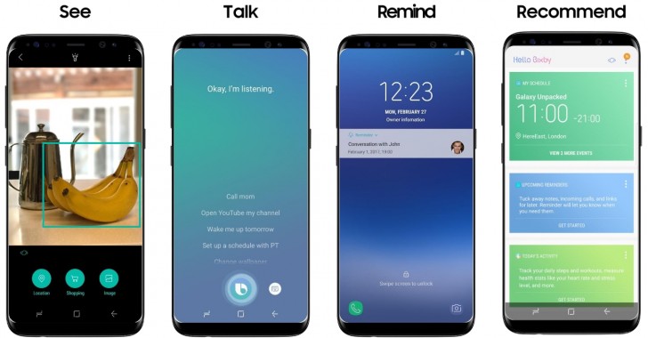
We do hope Bixby Voice learns English soon, since this is the omnipresent part of the assistant Samsung claims will be always at your side, to simplify day-to-day tasks. In the company's own words, Voice will allow you to do practically anything you can using a traditional touch control scheme. The idea is, you can just pick up a conversation and offload some tasks to Bixby whenever that makes sense, while you continue on going about your business using the S8 uninterrupted.
DeX
Having a full-featured desktop experience courtesy of your mobile device and a dock is far from a new concept. Most people nowadays associate it with Microsoft's ambitious Continuum platform. Still, other implementations do exist. In fact, Samsung fans might just remember that the company already had special docks and dock modes for some of its older handsets.
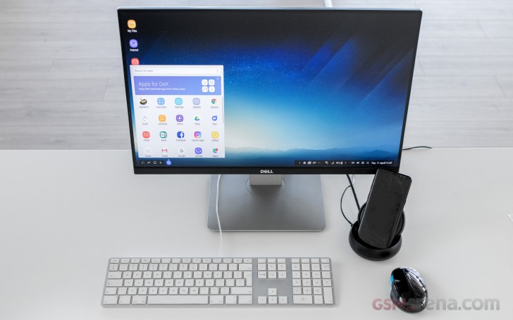
DeX is intended to take those efforts to a new level. If nothing else, the feature is definitely getting a lot more PR attention and end-user exposure, compared to past implementations. Still, marketing aside, the real question is, once again - What can DeX do for you right now and is it really the desktop replacement frequent travelers have been waiting for?
Sadly, the short answer is probably, no. We are getting there, but we still don't realistically see anybody throwing away their PC. That being said, there is a lot of added polish to DeX.
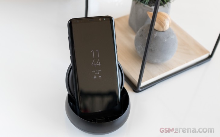
Starting with the dock itself, we can't help but compare it to the universal smart docking station all the way back from the Galaxy Note 2 era. Design-wise, the improvements are obvious - the swivel bracket mechanism and rounded aesthetic all fall in line with the S8 and S8+ unique appearance.
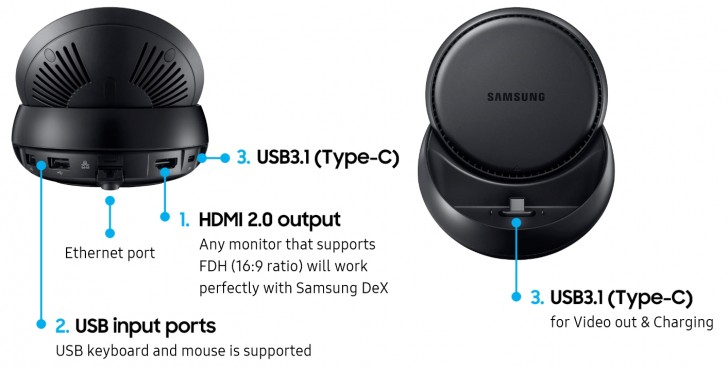
There have been some hardware improvements as well. Most notably, Samsung has leveraged the new USB Type-C interface on the phone to deliver a DisplayPort link, capable of outputting 4K, through the HDMI 2.0 port on the DeX. In comparison, the older multimedia dock was only limited to 1080p.
However, as previously mentioned, Samsung's DeX UI is only limited to 1080p. You can only take advantage of a 4K feed if you choose to mirror your device screen instead. Which, granted, is still not a bad deal for multimedia consumption.
But even if we are willing to let the slightly disappointing resolution cap slide, there are still other aspects of DeX that are less than fitting for its $150 price tag in our book. For instance, the pair of USB ports are only USB 2.0. We get that they are mostly meant for attaching a keyboard and mouse but using Bluetooth for those connections is a lot more convenient so why not 3.0? This would have allowed a faster data transfer to a thumb or hard drive. (The Type-C port on the DeX is needed to deliver power, so using it for data could only work with a complicated USB hub setup).
Speed limitations aside, we tried hooking up some 2.4 GHz peripherals to the DeX, like one of Logitech's universal dongles and it worked without any issue. Also, while on the topic of I/O, the undeniably convenient Ethernet port on the DeX is limited to 100 Mbps, so not a lot of future proofing there.
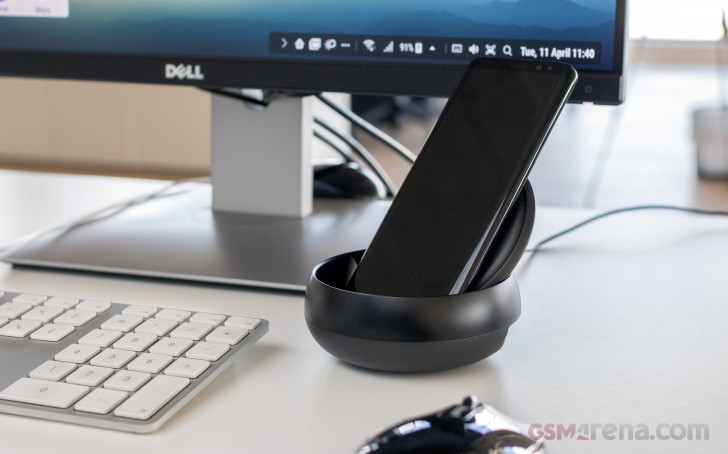
Just to round our hardware impressions up, the built-in fan seems like a nice addition to the DeX mix, albeit a slightly troubling one in terms of implications. But, we are happy to report we didn't see the fan moving at all during our time with DeX. Wireless charging would have been a nice bonus, but despite the shape similarity, DeX can only charge the handset the old-fashioned cable way.
As far as the actual DeX software experience goes, there are at least a few impressive aspects about it, but also mixed in fairly evenly with some annoying flaws and limitations.

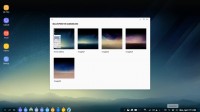
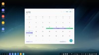
You can complement DeX with your wallpaper of choice
Jumping in and out of DeX is a really fluent procedure. You simply dock the phone and in a matter of seconds, the desktop is there - no restarting or lengthy load times. DeX also carries over your stack of recent apps most of the time. There is a slight chance that some active apps will get closed when you undock the phone, but that is to be expected. So are the scary-looking screen flashes, accompanying the process and all the resolution and UI readjustments that take place.
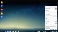
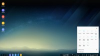
Access to notifications and quick toggles
Straight off the bat, we will note that your phone remains perfectly functioning as a communication tool while it's in DeX mode. You have access to your dialer and contacts and can still make and receive calls.

You also get all your notifications, neatly arranged in their own interface in the taskbar. The same goes for your quick toggles. Actionable notifications also work, so for example you can reply to messages. We tried Skype, Facebook Messenger and Hangouts and they all work like a charm. YouTube's actionable notifications also function as expected.

That's just the thing about DeX, it is, more or less, a desktop-style Android launcher that appears to leverage Nougat's freeform windows mode. That is why, you can expect most of your Android apps to work. Of course, there are still some compatibility issues here and there and Samsung has built upon the Android code with some degree of advanced functionality, but for the most part, DeX uses Google's standard interface scaling methods. If an app developer decides to properly implement those, you should have no problem using his or her apps with DeX.


Alto's adventure right after docking and after a dry start in DeX
That being said, some apps will still behave oddly in their current state. Others refuse to scale their interface entirely. For one, we noticed some games that were left open on the phone, required a manual reboot before starting to display normally on DeX. And even then, only titles with built-in support for more traditional input methods, other than touch or tilt, will even be usable in this setup.
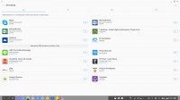
But, gaming isn't really the intended purpose for DeX. That would be productivity. And for the most part, Samsung has nailed things in this department. All of the default apps on the S8 scale and work seamlessly in DeX and Samsung even provides a convenient list of some third-party offers that are tested for a proper desktop experience.
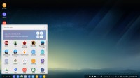
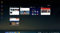
And even the interface itself is geared towards delivering a convincing desktop UI, while hiding the underlying Android fabric. On the left, the app drawer is designed to resemble a start menu, the same goes for the task switcher and the list of active applications after that. The taskbar on the right can get a bit busy with notifications, but Samsung has thrown in a desktop-style compact interface in there as well.
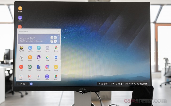
Overall, DeX has all the makings of a modern desktop UI. If your daily-driver is OSX or Windows 10, with its toast style notifications, DeX will make you feel right at home. The only thing we really miss from the otherwise excellent multi-window experience is any sort of window snapping.
It would make a lot of sense as well, since Samsung has already implemented some basic, but invaluable keyboard shortcuts, including Alt+Tab, Ctrl+C, Ctrl+V and Alt+F4, to name a few.
As one final point, we can't fail to mention that Samsung has made a few rather irritating decisions when it comes to office documents work on the Galaxy S8 and DeX. While Microsoft Word and Excel are part of the phone's default app package and scale wonderfully on to the DeX UI, you can't really use them on a monitor, out of the box.
In order to create a new file, edit or save it, in fact, anything other than open and view, an Office 365 subscription is required. We get that it's likely a licensing issue and Microsoft could, very well, be the one at blame here, not Samsung. However, you can freely create and edit all the documents you want once you undock the S8. Also, Old Blue is generous enough to provide users with two years of 100GB free OneDrive cloud storage, so why not throw a little office love in there as well?
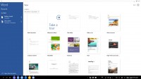
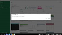
Microsoft Office works great, but requires a subscription
With all said and done, we do realize the potential in DeX. Samsung has partnered with some big names in the virtualization game, like Citrix, Amazon and VMWare, making some really interesting cloud-based business solutions already accessible. But beyond a few very specific niche markets, DeX is little more than a cool little gadget to play with from time to time - a technology showcase if you will. If that is enough to justify a $150 investment on top of an already extravagantly expensive handset, there is a lot of cool experimenting to be enjoyed. In any other case, you can feel free to "Move along" when it comes to this feature as this is still not the workspace revolution we have been waiting for.
Reader comments
- Dugz
- 23 Jan 2025
- PxY
Can't seem to find screen-shot in the Samsung S8, any help??
- Anonymous
- 18 Nov 2024
- CG1
What is the latest android version of s8
- Josyle
- 04 Oct 2024
- xjH
How much


