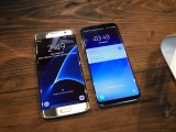
Samsung Galaxy S8 and S8+ hands-on: First encounter
First encounter
Design, display, hardware
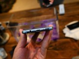
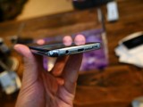
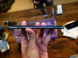
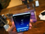
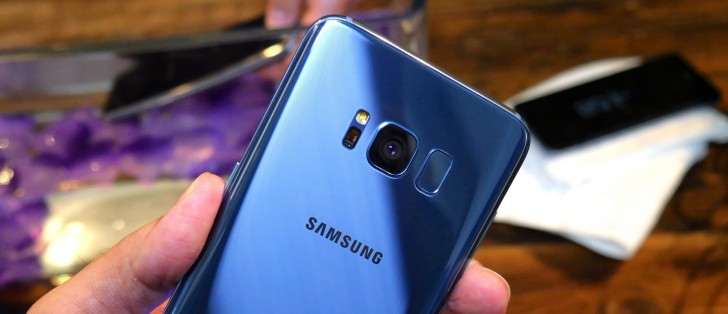
If there's one truly major change about the Galaxy S8 and S8+, it has to be design, and with it the display - inseparably intertwined these two. Bezels are so very last year, and in 2017 everyone is trimming every possible millimeter that's not display. Well, LG and Samsung are, at least.
Samsung's got one more on LG, though - its Super AMOLEDs are curved on the sides, and however LG is trying to present that as an impediment to handling, it's actually drawing people to the Samsung flagships. It's got to be a winning design if there's no flat-edged Galaxy S8 at all this year, right?
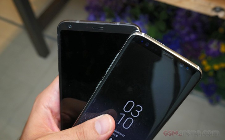
It's also the year of crazy display ratios, because that's what happens when you stretch a display to cover most of a phone's face, without actually making the phone that much larger. LG went with 18:9 on the G6 (which every 5th grader would tell you is 2:1), but Samsung has now one-upped them, or rather half-upped them - the S8 and S8+ come with even more bizarre 18.5:9 screens.
Resolution is 2,960x1440px on both and Samsung said in a press briefing that's half a million pixels more than your average QHD panel (2,560x1,440px). They're being modest though - 400 by 1,440 amounts to 576,000 pixels.
Display diagonals are 5.8 inches for the small vanilla S8, and 6.2 inches for its plus-sized brother. We tried to stress in our LG G6 review that diagonals are in no way directly comparable between different aspects, so let's dwell a little on the S8s'.
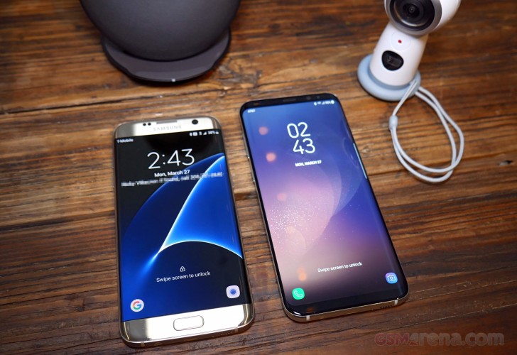
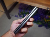
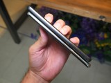
The small one, and you'll appreciate that it is indeed small when you read the numbers, should theoretically measure 132.5 x 64.4mm, while the 6.2-inch Plus should be 141.6 x 68.9mm. Compare that to the 16:9 5.5-inch Galaxy S7 edge and its calculated dimensions of 121.8 x 68.5mm - the 6.2-inch display of the Galaxy S8+ is barely any wider. In fact, the 5.8-inch S8's display is less than a millimeter wider than the 5.1-inch S7.
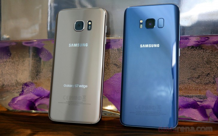
The displays on the S8 duo are obviously taller - to the tune of 2 full centimeters in the case of S8+ vs. S7 edge. The S8's panel is only some 11mm taller than the S7 edge's, but the phone itself isn't. You know what that means - so long, home button.
A staple of Samsung smartphone design, the home button has been there since the original Galaxy S, but is now falling victim to the trends of the day. There's no room for a whole physical button on a phone that's all about the display ('Infinity Display' Samsung has named it). Well, then, the home button goes on the display. There. Settled.
A pressure sensitive area in the lower part of the display acts as the home button now, even when the phone is asleep- there's an always-on icon that indicates where you need to press. A haptic feedback motor twitches when you do so, informing you that it knows it's been summoned. It's a really positive feeling, and doesn't come off as if you are compressing the phone.
Reader comments
- Anonymous
- 07 May 2017
- IVM
FYI the XZ Premium using the display panel to do the 4k shifting it is saving more energy to switch between FHD. The 960fps video is for creative user. The hi-res audio is for audiophile. The IMX400 is for Xperia XZ Premium and XZs not S8 or S8+.
- Anonymous
- 18 Apr 2017
- w9x
Previous generation phones used 28 nm process so needed larger batteries. S8 is built on 10nm process and is 30% power efficient. 3000mah batteries suffice.
