Samsung Galaxy S8 and S8+ hands-on: First encounter
First encounter

User interface
The Galaxy S8 and S8+ run on Android 7.0 Nougat complemented by a Samsung custom overlay on top that's become known as Grace UX. Introduced on the Note7, it was later brought to the A (2017) series (where it was bolted on top of Marshmallow), and now we see it on the S8.

A much sleeker UI, Grace UX replaces the tainted TouchWiz that some folks like to bash just for kicks now, based on early releases when the hardware wasn't powerful enough to support all the features Samsung crammed in it. Anyway, our experience with Grace has been positive and there's no reason to expect less than that from the S8 in the long run.


Lockscreen • App drawer • Folder view • Quick toggles
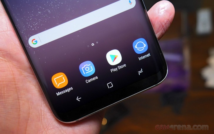
There are a few design tweaks for the new generation, naturally. Icons are even more rounded now to better match the display corners (or, rather, lack thereof). The app drawer is evoked with an upward swipe, Pixel-style.


Custom multi-window is more powerful than Nougat's native one • There's pop-up view too
The navigation buttons have gotten a fresh look, and whaddayaknow, Samsung's done the unthinkable and made them customizable - you can now have the back key on the left and the task switcher on the right like Google would have it.


Settings: Display (note the resolution) • Navi-bar • Security • Face recognition
Samsung Connect is a new service that gives you control over all your smart devices and appliances from within the same hub without having to juggle several different apps. Like any self-respecting such solution should, it allows you to set up automated sequences of actions so can execute a whole pre-determined routine in one go.
Bixby
Bixby is Samsung's all new personal assistant - apparently, you can't go without one if you are trying to push a high-end smartphone in today's market. At least this one has a name unlike Google's utterly impersonal 'Assistant'.
Samsung's mantra when making Bixby was that "whatever you can do with touch, you can do with voice". You can also mix and match types of input - whether it is talking, tapping or typing (they could have come up with a TTT trademark here, and we appreciate they didn't), Bixby will use contextual cues to figure out what you're trying to get at. For example, if you ask it to "call David", and have multiple Davids in the phonebook, it'll ask which one in particular.
You summon Bixby either with a trigger word or with that dedicated hardware button on the left - a simple press brings you a Bixby Home screen, similar to Google Now's. In there, you'll be greeted by a summary of your agenda, weather and upcoming reminders.
Press and hold is the action if you want to talk to the assistant. It can do simple tasks like adjust screen brightness or engage the blue light filter, even take a selfie - this command results in launching the camera app with the front facing cam active. If there's something that's not explicitly stated, it'll try to figure it out from the context, and ask questions to fill in the blanks.
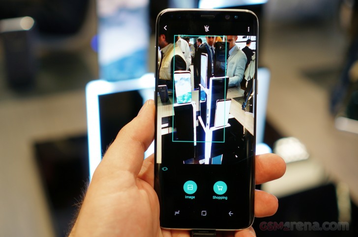
Bixby Vision uses the camera and can translate for you between 52 languages in real time. You can point it at landmarks around you and it'll provide information, you can scan QR codes and business cards, or point it at a product and it'll guide you in the right direction to get one. Basically, it's a lot like a better version of the Google Goggles app, with some Translate thrown in for good measure.

Bixby can also set reminders for you. Much like Google Now, those can be location based - say you run out of cat litter and set up a reminder to notify you when you're at the particular store. Also if you have a daily routine, where you call to check in with somebody at a set time, the phone can remind you in case you've missed the mark.
Camera samples
Not an awful lot of opportunities for picture taking, but we still took a few snaps. Mind you, the firmware on the devices these samples were shot with is likely not final, so don't judge them too harshly. That, plus the fact that the lighting is far from ideal in a couple of them.
Reader comments
- Anonymous
- 07 May 2017
- IVM
FYI the XZ Premium using the display panel to do the 4k shifting it is saving more energy to switch between FHD. The 960fps video is for creative user. The hi-res audio is for audiophile. The IMX400 is for Xperia XZ Premium and XZs not S8 or S8+.
- Anonymous
- 18 Apr 2017
- w9x
Previous generation phones used 28 nm process so needed larger batteries. S8 is built on 10nm process and is 30% power efficient. 3000mah batteries suffice.


