Samsung Galaxy S II ICS review: Sugar coated
Sugar coated
New(ish) interface, added functionality
The first change you encounter after the update to Android 4.0 Ice Cream Sandwich is the lockscreen. There are other changes that are less obvious, but this is a good thing - there's practically no learning curve.
Here's a video that shows two Samsun Galaxy S II phones side by side - one of them was updated to Ice Cream Sandwich, while the other was kept on Gingerbread.
The new lockscreen has been lifted from the Galaxy Note - you put your finger anywhere on the screen and a circle appears around it. All you have to do is move your finger out of that circle to unlock the phone.
We should note that Samsung put this lockscreen in the last Gingerbread ROM, but for most of its existence, the Galaxy S II used the old lockscreen.


The lock screen in Gingerbread • The new lockscreen
It was pretty much the same swipe gesture in TouchWiz on Gingerbread - but you had to push the entire lockscreen off the screen. The only change (aside from how it looks) is that now shorter swipes can be used to unlock the phone, which is a welcome improvement.
Another change you might spot after unlocking the phone is that the context menu for the homescreen is now a list instead of a grid of icons. The grid-style menu is gone and has been replaced by the list context menu throughout the interface.

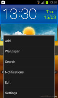
The old icon-based context menu • ICS uses a list, which is better at handling a large number of options
The task switcher is a more important change - it is now a vertically scrollable list of all the apps that are currently active. That's right - it's no longer a list of recent apps, but a list of running apps instead.
Better still, you can close apps by swiping them off the screen - left or right. You're not limited anymore to 6 apps like in the old switcher, the list will hold as many apps as the phone's RAM can handle.
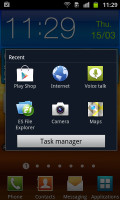

Old-school task switcher • ICS makes switching between apps a much better experience
This is how the standard ICS switcher works, but Samsung have added a button at the bottom of the screen, which leads you to the Task manager. Since you can close apps without it, it's no longer essential, but it still lets you close all apps with a single tap or check RAM usage (and clear RAM if you want).
This sideways swipe-to-dismiss gesture comes into use somewhere else too - the notifications. With it, you can dismiss any single notification, while leaving the rest in place. This is better than the Clear all button (which is still here, by the way), if you want to remove some notifications, but keep others to serve as reminder.


Old and new notification areas • Swipe to dismiss a notification
Another cool thing about the notification area is that now each notification has the icon of the app that put it there - this makes it very easy to spot notifications from a certain app.
Some of the widgets have changed - the Google widgets to be precise - and they now match the Ice Cream Sandwich visual style. Samsung's widgets look the same, so there's a bit of an awkward difference in looks.
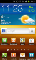

Note the new look of the Google search widget and how everything else is the same
We skipped over one cool feature of the unlock screen - you can use face unlock, instead of the usual screen. Now, it doesn't offer much protection but it is a very quick way to unlock your phone - it takes just a second to see you and unlock itself, it's probably not much quicker than swiping but can be handy if you're doing something else at the same time, like walking.
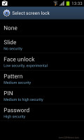


Picking a lock method • Setting up Face unlock
Ice Cream Sandwich comes with a Data usage monitor built in, which will replace apps from the Play Store for most people.
The Data usage monitor can track both mobile data and data over Wi-Fi. It has a simple UI that lets you pick a period over which to inspect each apps data usage and you can also set a warning threshold and a total data limit.

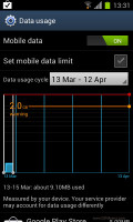
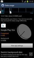
The built-in Data usage monitor
You can also set the date when the operator resets your data usage, but it's annoying that this option doesn't show up unless you've used the phone for a month.
Something else we noticed is that Android synced our Wi-Fi passwords we used before updating to Ice Cream Sandwich and then proceeded to sync the apps we had installed, which made the update process easy.
The ICS update also polishes some of the native apps, but changes are mostly cosmetic. The Music player, for example, received an option to get the lyrics for the song you're listening to. The Video player has a couple of new viewing modes (like thumbnail grid).

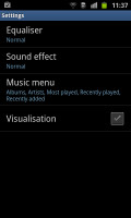

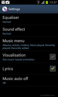
The Now playing screen looks the same, but we find new options in the Settings menu
One important change is the new Contacts app. It integrates with your SNS services and gives you a second tab for each contact's details with their photo and info grabbed from social networks.
You get to this tab by swiping sideways - a bit like you would in Windows Phone (Android has really grown into the sideways swipe thing too).


Viewing Dexter's details in the old phonebook • The new phonebook features SNS integration that's simpler to use
Then, the Favorites tab in the Phone app displays a grid of contact images (two in a row), instead of just a list.
That's about it for the new user interface, all we have left to cover is the web browser. We've dedicated a whole chapter to it - the changes are that big.
Reader comments
- jihad
- 14 Nov 2014
- 6mQ
hi i want to ask why i have eco in sound when i use it not in loud speaker
- SENGUT
- 04 Mar 2014
- uwg
my s2 mobile 100% then watching morning my s2 mobile charge 60% why broblem plz mail me rep
- yogesh tiwari
- 29 Oct 2013
- rK2
Galaxy s2 is amazing