Samsung I8190 Galaxy S III mini review: The Halfling
The Halfling
Nature UX in smaller form factor
The Samsung Galaxy S III mini comes with Android 4.1 Jelly Bean and the latest TouchWiz launcher, dubbed Nature UX. It's the premium combination that we saw on the Galaxy S III and the Galaxy Note II and it undoubtedly boosts the user experience compared to stock Android.
Here's how it handles on video:
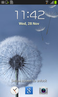
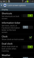
The lockscreen is a standard "tap and drag in any direction to unlock" affair and there're ripples accompanied by water-drop sound as you drag your finger. Samsung has provided three customizable shortcuts (down from five on the big S III) at the bottom of the screen - drag one up to activate the specific app. In case of missed calls or incoming messages for example you can drag to unlock the device and directly launch the call log or the messaging app.
The dock at the bottom of the homescreen fits five custom shortcuts or folders. The rightmost one always opens the app drawer as usual, but you can change the other four to any shortcut you like or even a folder full of shortcuts.
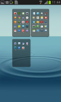
As usual, you can pinch to zoom out and easily manage homescreen panes - add, delete or just reorder them. You can have 7 panes at most, which are enough to fit plenty of content even if you use widgets that cover an entire pane.
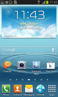

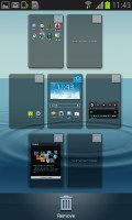
The Galaxy S III mini homescreen
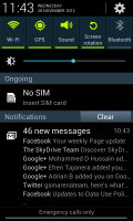
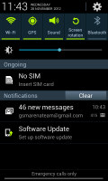
The notification area offers quick toggles for Wi-Fi, GPS, Silent mode, Screen rotation, Bluetooth and you can swipe to the side to get even more - Mobile data, Blocking mode, Power saving and Sync.
Below the toggles is the brightness slider (there's no automatic brightness toggle here, though). There are also a couple of other useful things here like the Settings shortcut in the upper right corner, the time/day-of-week/date display to its left and the carrier name at the bottom.
This being Jelly Bean, you get expandable notifications to get more info about them. You can expand and collapse them with a two-finger swipe and the top one is expanded by default (if the app that put up the notification supports it, of course).
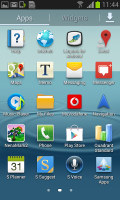
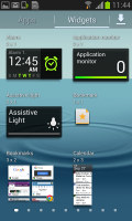
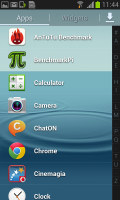
The app drawer houses both app shortcuts and widgets . Unlike stock Android, you cannot move between tabs by swiping through the pages - you have to explicitly hit the widgets tab. Some will find this more logical (scrolling past the available apps to find yourself in the widgets takes some getting used to).
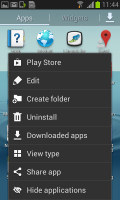
Using pinch-to-zoom reveals an overview of the pages and lets you rearrange them, but you can't create new ones. Hitting the menu key reveals some more options, including hiding apps or enabling tap-to-uninstall mode.
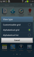
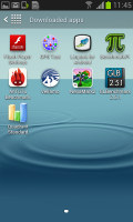
The app drawer has three view modes - Customizable grid (where you can freely rearrange icons), Alphabetical grid (if you think you can find apps quicker when they're ordered alphabetically) and Alphabetical list (this one makes shortcuts easy to hit, but isn't very space efficient). You can also view just the downloaded apps by hitting the Downloaded apps icon.
Jelly Bean comes with various widgets and Samsung have added even more. Some widgets are resizable too - a feature we've seen in some custom UIs is now available natively in Jelly Bean. Widgets automatically move out of the way when you're reorganizing the homescreen.
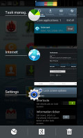
Once you get several apps running, you can use the task switcher to go back and forth between them. It's a Jelly Bean-style vertical list with a screenshot and a name for each app. Swiping an app sideways removes it from the list.
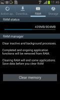
There are three buttons at the bottom of the list - one to bring out Samsung's home-brewed task manager, one to launch Google Now and a Kill all apps button. This is the quickest way to clear up both the list and some RAM.
Overall, the Nature UX dressing on top of Android 4.1 looks great and the Galaxy S III mini does pack most of the cool software tricks of its bigger brother. It's rare to see a compact device having most of the bells and whistles.
And despite the lack of a quad-core chipset, the Galaxy S III mini handles the heavy Samsung skin equally well. It didn't even experience that much difficulties with a heavy live wallpaper.
Reader comments
- gregory smith
- 06 Jun 2024
- vxy
Ive been using this phone since I was a wee lad, would recommend to anyone who needs a computer
- Unknown
- 07 Feb 2024
- 49$
Yes It has a hot spot
- Anonymous
- 12 Jul 2023
- MVE
it works
