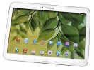
Samsung Galaxy Tab 3 10.1 review: Third time's the charm
Third time's the charm
Design and controls
The design takes after what is typical of today's Samsung mobile devices. Although the nature UX has gone through some changes since its debut on the Galaxy S III, the overall look in terms of hardware has remained the same. Here, you can see the Galaxy Tab 3 10.1 alongside (from bottom left) the Galaxy Tab 3 7.0, Galaxy S4, and Galaxy Tab 3 8.0.

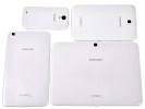
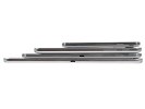
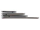
Samsung's design strategy is very similar across their recent mobile devices and tablets
The hyperglaze finish is largely the same since its inception, although it features a checkerboard texture that adds a bit of style. Unfortunately, it's not as noticeable on the white paintjob.
Above the display, you'll find the 3MP front-facing shooter alongside the ambient light sensor.
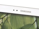
On the front there is the front-facing camera and ambient light sensor
As in other recent devices, the Samsung Galaxy Tab 3 10.1 allows users to control the display brightness without disabling automatic mode. Once you define an offset, your Galaxy Tab 3 10.1 screen will always be slightly brighter or dimmer than the automatically selected level.
Below the screen is the classic arrangement of physical hardware Home key, flanked by the capacitive Menu and Back keys. This layout has been in use since the early days of the Galaxy line and Samsung has stayed with its decision not to put the Android keys on-screen (as Google dictates), even on a screen this big.
This, by the way, makes Samsung tablets among the few Android-powered tablets with a hardware Home key, which puts it in the same bracket with no other than the Apple iPad. To be honest, we don't think this works particularly well on ten-inchers. Sure, this size is mostly meant for landscape use, and the layout of controls acknowledges that, but unwanted key presses are likely in portrait hold.
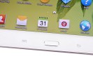
The familiar set of keys at the bottom
The sides of the Tab 3 10.1 are about as uneventful as it gets, with only a 3.5mm audio jack on the left and a speaker port on each side.
This speaker placement is far more logical than Galaxy tablets with speakers along the bottom, where you're more prone to muffle the sound. Still, it's not as good though as the front-facing speakers of the previous generation and the 10" Note.
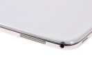
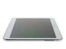
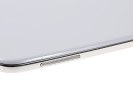
The sides only have 3.5mm audio jack and a pair of speakers and
The top of the Samsung Galaxy Tab 3 10.1 gets to see most of the action in terms of controls. You have a power/lock button on the far left, followed by a volume rocker, microSD card slot, IR-port, and microSIM card slot.
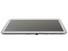
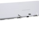
Most of the connectivity ports and buttons are located on the top
The bottom is also fairly uninhabited, save for the microUSB port used for charging and connectivity (USB Host is also supported), and a microphone pinhole.
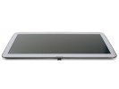
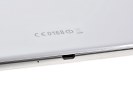
The USB port and microphone pinhole at the bottom
There's little of note at the back of the tablet. The 3MP camera lens is centrally placed at the top, slightly protruding so the Tab 3 10.1 rests on it when placed on a level surface, but its hardened glass is not too easy to scratch.
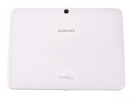
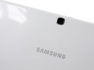
The back features the 5MP camera lens
In terms of handling, holding the device in one hand across the back is possible - but the hyperglaze finish doesn't provide much grip. Otherwise, the ample screen bezel means it can be comfortably used with two hands in landscape mode.
Display is nothing special
The Tab 3 10.1 has a standard LCD - Samsung has given up AMOLED in tablets for the time being, with the Galaxy Tab 7.7 remaining its only attempt so far. AMOLED screens are now reserved for the Note phablets, while tablets have to make do with regular LCDs. Nevertheless, the one in the Tab 3 10.1 gets the job done with a 1280 x 800 pixel resolution, which results in 149ppi and a 16:10 aspect ratio.
While the blacks aren't as dark as some other comparable devices, the whites are adequately bright, and the resulting contrast ratio is good for its class.
| Display test | 50% brightness | 100% brightness | ||||
| Black, cd/m2 | White, cd/m2 | Black, cd/m2 | White, cd/m2 | |||
| Samsung Galaxy Tab 3 10.1 | 0.29 | 266 | 906 | 0.56 | 515 | 917 |
| Samsung Galaxy Tab 3 8.0 | 0.29 | 266 | 912 | 0.47 | 464 | 989 |
| Google Nexus 10 | 0.26 | 223 | 859 | 0.50 | 443 | 878 |
| Sony Xperia Tablet Z | - | - | - | 0.53 | 531 | 996 |
| Sony Xperia Tablet S | 0.35 | 334 | 947 | 0.67 | 526 | 783 |
| Apple iPad mini | 0.25 | 208 | 838 | 0.51 | 458 | 812 |
| Apple iPad 3 | 0.21 | 167 | 809 | 0.6 | 477 | 779 |
| Apple iPad 4 | 0.21 | 163 | 797 | 0.63 | 476 | 762 |
| Samsung Galaxy Tab 7.7 | 0 | 200 | ∞ | 0 | 328 | ∞ |
| Asus Google Nexus 7 | 0.25 | 244 | 954 | 0.36 | 327 | 908 |
| Samsung Galaxy Note 10.1 | 0.27 | 223 | 832 | 0.49 | 406 | 821 |
| Samsung Galaxy Tab 10.1 | 0.31 | 257 | 826 | 0.55 | 502 | 915 |
| Samsung Galaxy Tab 7.0 Plus | 0.17 | 196 | 1141 | 0.34 | 424 | 1236 |
While the display quality is perfectly fine for this price range, we wished we could see a higher-resolution panel on this one. The display is clearly not one of the tablet's main selling points - it's the same resolution and display technology found on the Galaxy Tab 2 10.1 - however, the compromises made are easy to live with.
Here's a closer look at the display matrix:
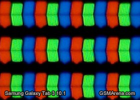
The Samsung Galaxy Tab 3 10.1 screen up close
Reader comments
- Anonymous
- 21 Dec 2022
- fsF
What wrong with GT-P5210 we can't update we can't install any app
- Dee
- 08 Mar 2020
- YU8
My device cannot read the sim card any suggestions plizzz
- sang
- 27 Aug 2014
- 7tZ
Horrible tab just strats giving problem with in 2 months and warrenty never covers as they give reason of physical damage & service center fake with people
