Samsung Galaxy Tab 3 7.0 preview: First look
First look
User interface
The Samsung Galaxy Tab 3 7.0 is shipping with Android 4.1.2 Jelly Bean. As usual it is skinned with Samsung's proprietary TouchWiz UI, which adds a considerable amount of customizations to the interface. It's a pity Samsung doesn't ship the slate with the newer 4.2.2 version of Jelly Bean, though.
Nevertheless, the latest version of TouchWiz is present and unlike previous iterations, this one tries to stay relatively close to stock Android.
Here's a short user interface video to get you quickly familiarized with the Galaxy Tab 3 7.0:
The lockscreen is a standard "tap and drag in any direction to unlock" deal with light flairs accompanied by sound as you drag your finger. Five customizable shortcuts are available at the bottom of the screen - drag one up to launch the app without going through the homescreen.
There are several options for the unlock screen. You can enable a news ticker at the bottom of the lockscreen, which is a great way to stay up to date on current events. The ticker can be expanded to view all news items.
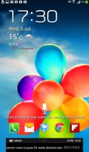
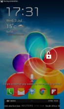
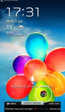
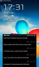
The lockscreen is chock-full of options
There are alternative unlock routines as well - Face unlock, Face and voice unlock, unlock by touching the screen and tilting the phone and starting the camera from the lockscreen by touching the screen and rotating the phone horizontally.
There are voice-based wakeup commands that can just start S Voice or launch a preselected app. You can also enable a second clock on the lockscreen, which shows up when you're roaming. Most of these features can be switched off too.
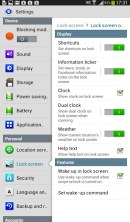
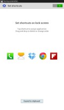
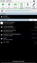
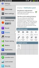
The lockscreen and notification settings
Once you make it past the lockscreen, you'll notice that the dock at the bottom of the screen now fits six shortcuts or folders. The rightmost one opens the app drawer as usual, but you can change the other five to any shortcut you like or even folders.
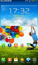
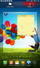
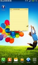
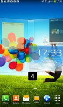
The homescreen holds widgets, app shortcuts, folders and has uo to 7 panes
At the top of the notification area there are five (eight in landscape mode) visible toggles that can quickly enable and disable radios. There are more than five toggles, of course; you can swipe horizontally to get to the others. Or you can tap the new button in the upper right that reveals a grid of all the shortcuts, 11 in total.
You can rearrange this grid (the top row toggles are always visible). Another nice trick is to long press on a toggle to go to the related settings (e.g. Wi-Fi settings).
Below the toggles is the display brightness slider, complete with an Auto toggle. You can disable this slider to have more room for notifications.
The notifications themselves have not changed - they can be expanded to reveal more info and collapsed to save space or dismissed with a sideways swipe. Sometimes they also have helpful buttons on them like "Call back" and "Send SMS" on a missed call notification.
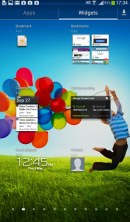
The homescreen looks mostly the same. Samsung has provided many of its own custom widgets like S Planner, S Memo, etc. There's the so called wrap around feature, which lets you scroll homescreens infinitely by always going from the last to the first one.
Naturally, the Galaxy Tab 3 7.0 homescreen auto-rotates, just like on most tablets, enabling landscape use of the entire interface. It reacts correspondingly when in landscape mode, even on the home and lockscreens, which is welcome.
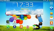
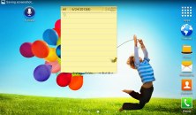
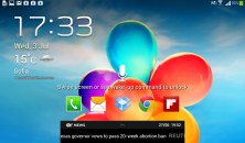
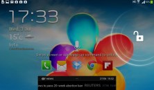
The user interface is optimized for landscape viewing
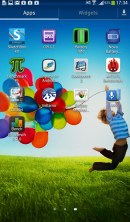
You can pinch zoom to get into the overview mode of all homescreen panes. There can be up to 7 and you can easily add, remove and rearrange panes from here. One pane is marked as "home", that's the one you go to when you press the Home button - any of the available homescreen panes can be set as default quite easily.
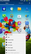
Pinch to zoom in the app drawer works the same as on a homescreen, giving you an overview of all panes as thumbnails. There's, by the way, a dedicated pane, where all your downloaded apps go.
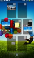
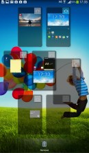
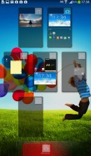
Adding, removing and switching homescreen panes
The App switcher interface is unchanged - there's a list of thumbnails of all the recent apps, apps can be swiped to dismiss and there are three buttons at the bottom, Task manager, Google Now and Kill all apps.
Sadly, Samsung's Multi-window feature isn't present on the Galaxy Tab 3 7.0. It wouldn't have made much sense at this resolution, so it's not a major drawback.
Once you get several apps running, you can use the task switcher to go back and forth between them. It's a vertical list with a screenshot and a name for each app; swiping an app sideways removes it from the list.
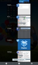
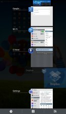
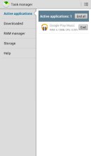
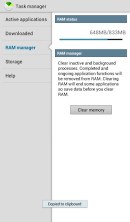
Managing running apps is easy • You can optimize the RAM usage
There are a few Samsung-made tweaks here - a button at the bottom of the list to bring out the home-brewed task manager, a button to end all apps at once and a shortcut to Google Now. By the way, you can also bring up Google Now by pressing and holding the Menu key.
We like what Samsung has done with the latest iteration of TouchWiz. The company has put together an impressive list of features and options, but that's not a bad thing - the default setup is good enough for regular users, while power users get to have it their way without the need for third party apps. However, there are also some features that are missing, when they really didn't have to. Some of them include the likes of homescreen silhouette previews when adding new widgets, as well as lockscreen unlocking effects.
The lack of the latest Android Jelly Bean version is also a noticeable lack of the Galaxy Tab 3 7.0, but isn't too much of an issue in our eyes.
Reader comments
- sheikh sadee
- 21 Aug 2020
- uNV
my SMT 211 android version4.1.2 is more slow internet connection please make it first
- Obasunny
- 22 Jan 2020
- ftK
Samsung don't seems to come up, causes and what to do?
- Anonymous
- 05 May 2019
- myM
2 versions, GSM sim slot, wifi only no sim slot.
