Samsung Galaxy Tab 7.0 Plus review: A game of sequels
A game of sequels
Phonebook
Contact management is fairly straightforward on the Samsung Galaxy Tab 7.0 Plus. Your contacts get automatically synced with your Google account unless you explicitly disable this.
The larger screen has allowed some modifications that reduce the needed clicks for some tasks and thus improve usability. Samsung also changed some plain Honeycomb icons with TouchWiz ones, but nothing beyond that.
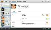
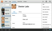
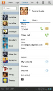
The Galaxy Tab 7.0 Plus contact manager
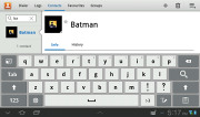
You get your contacts listed by either first or last name in the left part of the screen, while the details of the currently selected contact appear on the right. There is a handy search field on the top right corner as well as a shortcut for adding a new contact or deleting the selected one.
The advanced menu offers a few more options - edit contact, import/export, join with another contact, send or print a namecard, get friends via social services, etc.
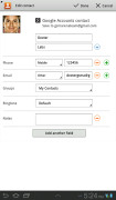
Editing a single contact is done via a popup window, where you the available fields organized in groups, with plus and minus signs on the right that let you remove or duplicate details.
There’s also an Add another field button at the bottom that lets you insert a field that hasn’t existed so far for the specific contact.
Custom field names aren’t available at this stage.
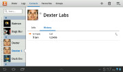
There is one more thing worth mentioning - for every contact you get two tabs - the standard Info one we already talked about and History. The latter shows all the latest activity with this contact (emails, messages, etc.).
Telephony has everything - does voice and video calls
The Samsung Galaxy Tab 7.0 Plus had great in-call quality and reception. Wherever you use a headset or the embedded earpiece the sound is crisp and loud.
The dialer and call log have been integrated into the phonebook, each with a separate tab. Smart Dial is available and works like a charm – it searches names and numbers simultaneously.
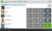
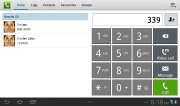
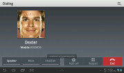
Smart dial works like a charm • the in-call screen
Voice dialing is also available – all you need to do is press the virtual button at the bottom at the top left corner of the homescreen and speak your command (e.g. "call Dexter" or "text Dexter").
Thanks to the proximity sensor, your screen will automatically turn off during a call. The available options during a call include taking a note, using the keypad, muting, holding the call or adding another call to this conversation.
The call log is the tab next to the dial pad. It displays all the dialed, received and missed calls in one list sorting your call history by contacts.
The only disappointment came when we ran our traditional loudspeaker test on the Galaxy Tab 7.0 Plus. The slate was well Below Average, suggesting that it would be smart to keep a close eye on it in noisier environments. You can find more about the test itself here.
| Speakerphone test | Voice, dB | Ringing | Overall score | |
| Samsung Galaxy Tab 7.0 Plus | 66.2 | 65.7 | 65.9 | |
| Samsung Galaxy Tab 10.1 3G | 66.2 | 66.0 | 70.9 | Average |
| Samsung I9100 Galaxy S II | 70.0 | 66.6 | 75.7 | Good |
| Motorola XOOM | 74.0 | 66.6 | 78.9 | Very Good |
| HTC Desire | 76.6 | 75.7 | 84.6 | Excellent |
Messaging
The messaging app layout is similar with the phonebook - on the left you get contacts, on the right are the conversations.
There’s an application-specific search that lets you quickly find a given message among all your stored SMS and MMS.
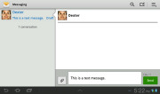
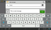
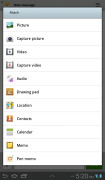
Texting Dexter on the Galaxy Tab 7.0 Plus
To add message recipients, just start typing the corresponding name or number and choose from the contacts offered.
When you add multimedia content to the message, it is automatically transformed into an MMS. You can either quickly add a photo or an audio file to go with the text or compose an MMS using all the available features (like multiple slides, slide timing, layout, etc.). The multiple slides are all shown inside the compose box.
Two email clients
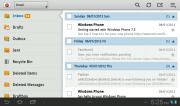
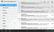
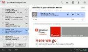
The Galaxy Tab 7.0 Plus comes with two optimized email applications out of the box – one for your Gmail and one to use with any POP3/IMAP account.
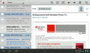
They both have a split-screen interface. Initially, your folders are listed on the left and the emails in the currently selected one appear on the right. Upon clicking on a single email the list of emails moves to the left tab while the body of the selected one pops up on the right.
Bulk actions are supported too, so you will easily manage mailboxes that get tons of messages.
You can set up the automatic email retrieval interval or you can disable that completely and check mail manually.
There’s also a handy setting that makes your client automatically download attachments only when you are connected over Wi-Fi.
It’s basically the same excellent treatment you get on Android smartphones with a few further optimizations permitted by the large screen and higher resolution.
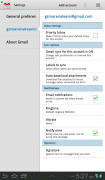
Digging into the settings menu
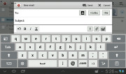
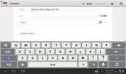
Writing emails is reasonably comfortable with the virtual QWERTY keyboard occupying about half of the screen. Now this is no match for a hardware keyboard, but you won’t notice any big difference when handling short emails.
In case the keyboard is too big for you, there is a dedicated virtual key on its top left, which will shrink it a bit. The keys become smaller and thinner, giving you even more working space. It's still comfy enough to type and we actually like this design better.

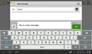
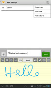
The big and small keyboards • handwriting is also supported
There’s auto correction and auto capitalization available and you can enable sounds on key presses. There’s haptic feedback too - the slate vibrates exactly where you've tapped.
Reader comments
- Anonymous
- 26 Apr 2021
- fmP
guide on how to update software.
- Starbwoy
- 01 Jul 2018
- 0wq
well the tablet is good but I need to know how to upgrade to lollipop or jelly bean
- arumugam
- 09 Mar 2016
- vIe
how to download the videos in 7.0 plus tab. what software is to be used.
