Samsung Galaxy Tab Pro 10.1 review: Pros and gones
Pros and gones
Magazine UI is your new homescreen
The Samsung Galaxy Tab Pro 10.1 runs Android 4.4 KitKat with the latest TouchWiz customizations that run deeper than ever before. The key changes are the new Magazine UI and the new multitasking options. Note that we're using a review unit from Samsung that has had the latest updates installed. There are slight differences between that and the Tab Pro 8.4 we reviewed earlier, so the retail version might differ slightly.
The Galaxy Tab Pro 10.1 brings four major changes to Android: the brand new Magazine UI for the homescreen, a completely redesigned notification area, an impressive new version of Samsung's proprietary multitasking feature called Multi Window, and updated system apps.
The new Modern and TouchWiz UIs on top of Android KitKat
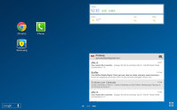
The slate has a very familiar lockscreen that accommodates multiple widgets. There is also the familiar app drawer that can stack your apps in folders or even hide apps that you don't use. So far so good. Now comes the interesting part.
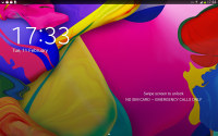
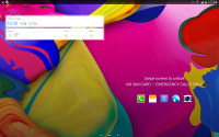
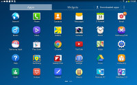
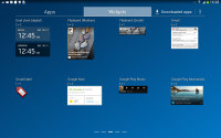
The lockscreen and the app drawer
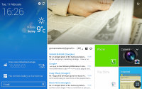
The homescreen interface has been overhauled since our last tour of the Galaxy Note 10.1 2014 Edition. Now, there are two type of homescreens: Magazine and TouchWiz. Having at least one Magazine pane is obligatory, while the TouchWiz panes are optional. Samsung is really dead set on making this work.
The Magazine UI is an evolved version of what we saw on the Galaxy Note 3 as My Magazine. Back then, it was little more than a clone of the once Samsung-exclusive Flipboard app for Android. Now it's a fully functional replacement for you homescreen that does way more than just feed you news and social updates.
A Magazine pane would hold up to six widgets, but those widgets always occupy the entire screen - there is no background or docked shortcuts, even the status bar is hidden. You have to tap the top of the screen to bring it back, which means basics like the time and signal strength are not always visible.
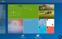
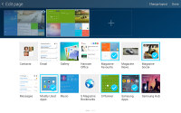
Magazine UI • Adding Magazine widgets
The Magazine's widgets are completely different from what you have seen so far on Android. They use flat looks a la Windows Phone, they can be easily resized and rearranged. A Change Layout button automatically cycles through preset layouts so you don't even have to tap and drag (but you can if you want to).
The available set of widgets is what really makes the Galaxy Tab Pro 10.1 and its Magazine UI so feature-rich. Note that only Samsung-made widgets go here, the widgets used on the TouchWiz homescreen panes are not available.
Anyway, the Magazine widgets are a mixture of various content aggregators (news, social services, multimedia), powerful mini versions of system apps and just nicely designed shortcuts.
The content aggregators support news from a lot of categories (business, design, movies, food, music, sports, politics, travel, tech, etc.) and social services (500px, Facebook, Twitter). You can choose the specific topics for each Magazine widget. Some widgets are scrollable so they hold more content even if it's not immediately obvious. You have to swipe at them to see if they'll scroll.
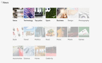
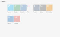
Choosing topics for a content aggregator
The aggregators aside, the rest of the widgets give you quick access to the most used apps: gallery, office, hubs, calendar, weather and multimedia players. Finally, you have two different widgets that hold your Favorite and Frequently used apps.
You can have up to three Magazine homescreen panes. We guess this is partly due to hardware limitations, because those Magazine widgets probably consume a lot of resources. Also, since only special widgets are allowed, you can't fill much more anyway.
You can have standard homescreens as well. You can add app shortcuts there plus the standard Android widgets.
Scrolling between the content-laden homescreens is still quick - first, you go through the Magazine panes and then through the TouchWiz ones. It's a looped scrolling process, so once you reach the last homescreen you'll go back to the first.
You can choose whichever homescreen you prefer to be the tablet's default one (this could be a Magazine or a TouchWiz homescreen).
The last two new elements of the user interface are the notification area and the task switcher.
The notification area has gained an additional Volume scrubber and Volume shortcut next to the brightness slider. All icons have been refreshed, too.
Those aside, the area hasn't changed all that much - you get a tiny S Search shortcut next to the clock and date, a row with scrollable toggles, a Settings shortcut and the actual expandable notifications.
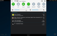
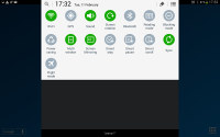
The new look of the notification area
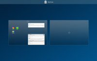
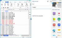
The task switching interface is intact, it just better utilizes the new resolution and doesn't occupy the entire screen. The powerful task manager is also onboard and allows you to kill apps, clean RAM, or uninstall downloaded apps.
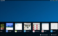
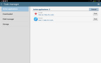
The task switcher and task manager
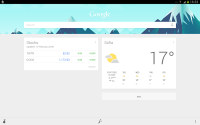
The Galaxy Tab Pro 10.1 tablet features a couple of virtual assistants, Google Now and Samsung's S Voice.
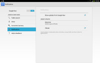
Google Now is more passive - it integrates with your Google account and can access your daily routine, internet searches, email, etc. It displays relevant information (e.g. the estimated time to drive to work), without waiting to be asked specifically.
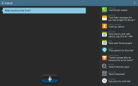
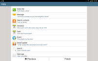
S Voice is more Siri-like. It can be used to dictate text, play music, open an app, change a setting, make a memo (including voice memo), add a reminder, schedule an event, set an alarm or timer, check the weather, do a search on the internet, look for local listings (e.g. nearby restaurants) and even answer questions.
Reader comments
- AnonD-64830
- 22 Aug 2015
- HKA
Can anyone reading this advise of any and all problems with this tablet such as freezing. A friend has these issues and battery charging takes far too long. All responses appreciated. Chers.
- mohamad ahmad
- 14 Oct 2014
- Mfx
I bought the tab pro 10.1 lte T525 2 weeks ago, the colour of the right quarter of the screen above the home button is usually different in both the landscape and portrait modes nearly in all applications except camera and games, sometimes it returns...
- Anonymous
- 30 Sep 2014
- nXw
After I bought the Tab Pro 10.1 I was at first a bit dissapointed on the benchmarks. Good but not excellent; Geeckbench 3 only 2510 and Antutu only 31989. Then I discovered that the setting CPU-savings was on. Switching this off meant a big change: ...

