Samsung Galaxy Tab Pro 8.4 review: The Professional
The Professional
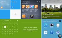
Magazine UI is your new homescreen
Samsung Galaxy Tab Pro 8.4 runs on the latest available Android 4.4.2 KitKat version, but Samsung's customizations run so deep, you'll barely recognize Google's platform underneath it all. Unlike previous slates or smartphones, the Galaxy Tab Pro 8.4 doesn't come only with TouchWiz UI, but also with a brand new Magazine UI for its homescreens.
The Magazine UI is an evolved version of what we saw on the Galaxy Note 3 as My Magazine. Back then it was little more than a clone of the once Samsung-exclusive Flipboard app for Android. Now it's a fully functional replacement for you homescreen that does way more than just feed you news and social updates.
The Galaxy Tab Pro 8.4 brings four major changes to Android - the brand new Magazine UI for your homescreen, a completely redesigned notification area, an impressive new version of multi-tasking the Samsung proprietary multitasking feature called Multi Window, and updated system apps. Another change that we had to get used to is the lack of a capacitive Menu key. That one has been replaced by Android's standard Task Switcher shortcut.
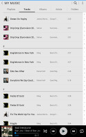
The new Modern and TouchWiz UIs on top of Android KitKat
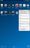
The slate has a very familiar lockscreen that supports multiple widgets. There is also the familiar app drawer that can stack your apps in folders or even hide apps that you don't use. So far so good. Now comes the interesting part.
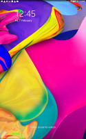
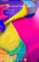
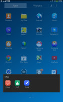
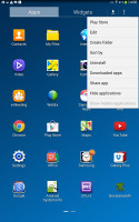
The lockscreen and the app drawer
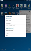
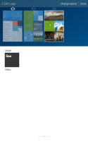
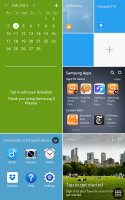
The homescreen interface has been completely changed since our last tour with the Galaxy Note 10.1 2014 Edition. Now, there are two type of homescreens - Magazine and TouchWiz. Having at least one Magazine pane is obligatory, while the TouchWiz panes are optional. Samsung is really dead set on making this work, but we don't really mind as it really looked better than the default screen.
A Magazine pane would hold up to six widgets, but those widgets always occupy the whole screen - there is no background or docked shortcuts as you are used to seeing on all other Androids.
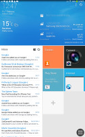
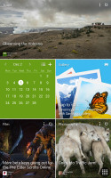
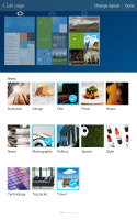
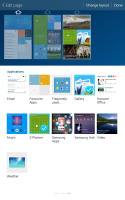
Magazine UI • Adding Magazine widgets
The Magazine's widgets are completely different from what you have seen so far on Android. They use flat looks ala Windows Phone, they can be easily resized, or they resize automatically in portrait and landscape orientation of the slate.
The available set of widgets is what really makes the Galaxy Tab Pro 8.4 and its Magazine UI so functional. The Magazine widgets are a mixture between various content aggregators (news, social services, multimedia), powerful mini versions of system apps and just nicely designed shortcuts.
The content aggregators support news from a lot of categories (business, design, movies, food, music, sports, politics, travel, tech, etc.) and social services (500px, Facebook, Twitter). You can choose the specific topics for each Magazine widget. The widgets are flappable just like the Flipboard UI and you don't need to leave your Magazine homescreen pane to check out several stories.

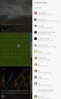
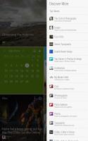
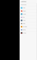
Choosing topics for a content aggregator
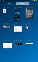
The aggregators aside, the rest of the widgets give you quick access to the most used apps - gallery, office, hubs, calendar, weather and multimedia players. Finally, you have two different widgets that hold your Favorite and Frequently used apps.
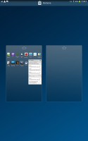
You can have up to three Magazine homescreen panes. We guess this is due to hardware limitation, because those Magazine widgets probably eat a lot of resources.
You can have standard homescreens as well. You can add app shortcuts there plus the standard Android widgets.
Scrolling between the content-laden homescreens is still quick - first, you go through the Magazine panes and then through the TouchWiz ones. It's a looped scrolling process, so once you reach the last homescreen you'll go back to the first.
You can choose whichever homescreen you prefer to be the tablet's default one.
The last two new elements of the user interface are the notification area and the task switcher.
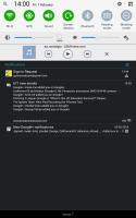
The notification area has gained an additional Volume scrubber and Volume shortcut next to the brightness slider. All icons have been refreshed, too.
Those aside, the area hasn't changed too much - you get a tiny S Search shortcut next to the clock and date, a row with scrollable toggles, a Settings shortcut and the actual expandable notifications.

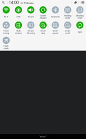
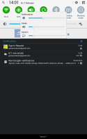
The new look of the notification area
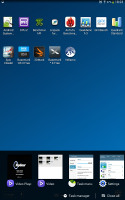
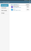
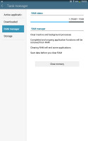
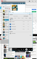
The task switching interface is intact, it just utilizes better the new resolution and doesn't occupy the whole screen. The powerful task manager is also onboard and allows you to kill apps, clean RAM, or uninstall downloaded apps.
Reader comments
- AnonD-614374
- 27 Nov 2016
- XMu
I have tabpro 8.4 gt-p6100 i wana buy tuch and lcd ???
- Tino
- 18 Jul 2016
- ICF
My Samsung Galaxy Tab Pro 8.4, is not taking a charge where or can this port be repaired. Can I use a wireless battery charger on this item
- AnonD-420479
- 23 Jul 2015
- Nqr
How can I use 3G USB modem with tab pro 8.4 wifi only
