Samsung Galaxy Z Flip3 long-term review
Updates, duplicates
If there's one area where Samsung has definitely risen above all of its competitors in the Android world, it's software updates. A few years ago, the South Korean company was among the worst at this, and now it's very clearly the best, even managing to release security patches before Google a few times per year. This 180-degree change has been exciting to witness, and we have to congratulate Samsung on what it's achieved.
Big software updates are also coming faster and faster every year, ever closer to when Google pushes them to its Pixels, security updates come every month for flagship tier devices, on the clock - sometimes the rollouts even begin in the previous month! But nothing is more impressive than Samsung's ever-expanding software update promise. The Flip3 will get four years of big Android updates and five years of security updates. That's outstanding, and the only other company in the same league on the Android side of the fence is Google. No one else even comes close.
This could be a huge deciding factor for purchase decisions, so let's just state things in an unequivocal fashion: if you want a foldable phone and care about updates, that phone should be a Samsung. Luckily, you have two different foldable form factors to pick from, and if the Flip3 has caught your fancy, you'll have peace of mind for many years to come.
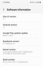
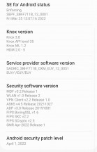
We can confirm through our use of the handset that Samsung isn't playing with updates - there are a lot of them, and most recently, our Flip3 made the jump to One UI 4.1 - the latest version of the manufacturer skin, which was launched alongside the Galaxy S22 family.
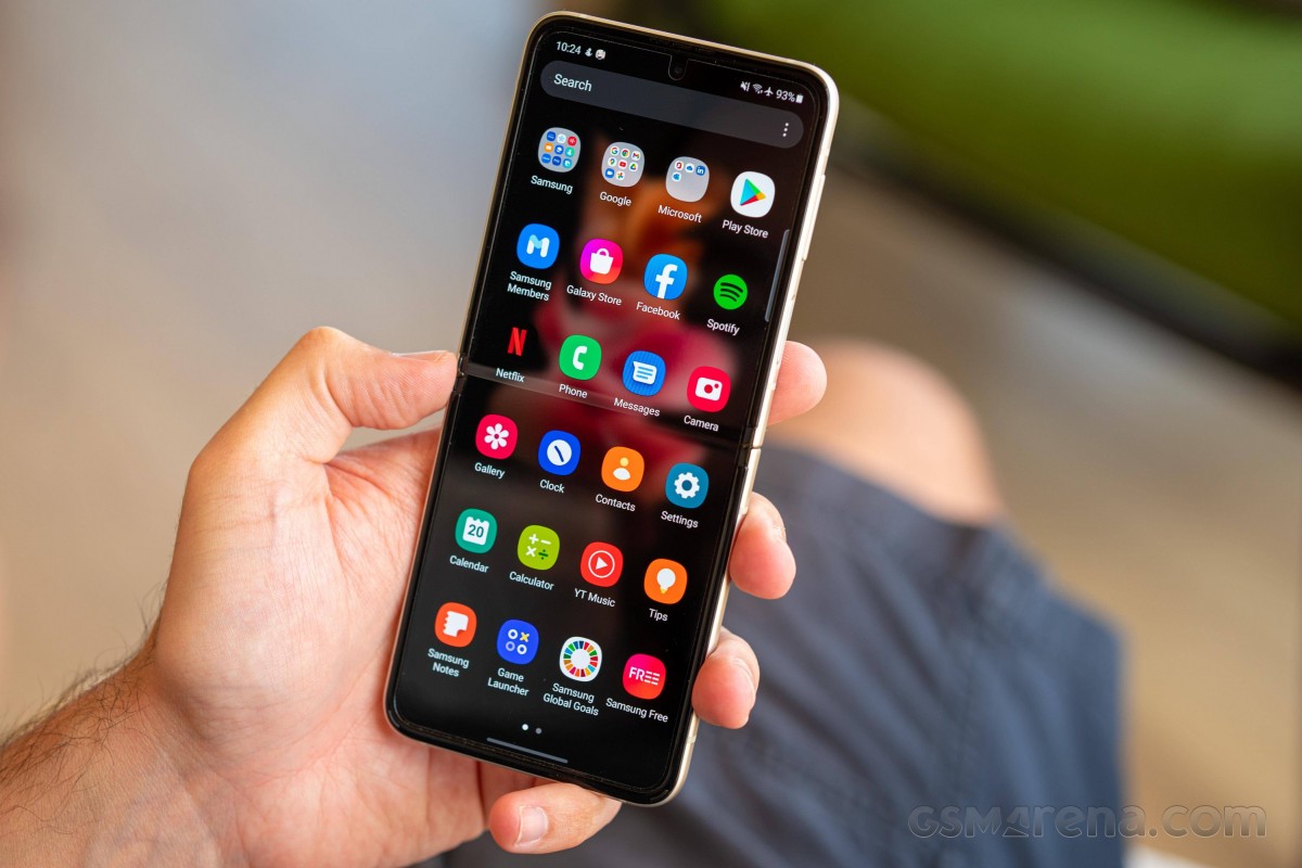
As the incrementation implies, One UI 4.1 is not a huge departure from One UI 4, which was the first version of the skin to be based on Android 12. And even if you're coming from One UI 3.x, you'll feel right at home, as the design language is very similar, and the user experience is too. That includes the fact that you get two app stores, the Google Play Store as well as the Galaxy Store, and while over the years we've gotten used to this state of things, it still doesn't make a lot of sense.
The duplication theme continues with a lot of apps made by Samsung to compete with Google's similar offerings, but a new twist introduced in the recent past means you actually get to pick and choose some Samsung apps to pre-install when you're setting up the phone for the first time. So if you're not a fan, you can safely uncheck those you don't need. That's a nice step forward, but generally speaking, Samsung's insistence on having its own app for everything can still create a lot of confusion with normal users. Then again, if they've had another Samsung device in the past, they surely know the drill, so we won't dwell on the app duplication subject any more.
Dark mode
Like all modern Android skins, One UI 4.1 delivers a Dark mode which you can manually select, or schedule to go on automatically, either between sunset and sunrise (based on your location), or with custom hours.
This standard implementation is falling behind what some other companies are doing - Oppo with its three different darkness choices, or a bunch of skins offering the possibility to force apps to a dark theme. None of that is present here, so while you do have a Dark mode (which should go without saying in 2022), it's not among the most customizable out there.
Things that aren't where (or how) they should be
Perhaps confusingly, the "apply Dark mode to wallpaper" toggle is only to be found in the Wallpaper section of Settings, and not in the Dark mode part. We can understand this decision, but perhaps this would have been one of those rare cases where redundancy would be preferable? We mean to have it in both parts of Settings, to ensure that users don't miss it.
Many other things are incredibly customizable, down to every little detail. Generally, you don't have to dive deep into Settings if you don't want to, because the defaults are sensibly set - with a few exceptions, of which one is only displaying app icons on the lock screen when a notification comes in. This isn't standard Android behavior, and to our knowledge, One UI is the only skin that has this as the default. It's easy to change to the 'normal' way everyone else is doing it, actually showing the full notification and not just the app's icon, but novices may not even be aware that this is a possibility.

Lock screen notification settings
Continuing the non-standard Android behavior idea, you may be used to long-pressing the power key to reach the power menu - the one that provides you with options such as shut down, restart, and the likes. Well, by default, you won't have that on the Flip3, instead Bixby will be activated. Because Bixby is still a thing in Samsungland, even though it's still inferior to the Google Assistant in many ways. But, a lot of money must have been spent to develop it, so here it is. If you want to power off your phone, you'll need to long press both the power button and the volume down button, which is obviously more convoluted than it should be, but thankfully there's a Side key setting that you can change to skip Bixby and have the phone do what you actually intended it to.

Side key settings (changed from the default)
Oh, and while most Android skins have a dedicated top-level Battery menu in Settings, Samsung has buried that in the Device care menu, requiring an extra tap to get to. We were baffled by this decision initially but have grown used to it by now.
We can kind of see the idea here - that Device care groups device-specific stuff such as battery, RAM and storage use, all under one umbrella - but then it also has "Device protection" in there, which is generally useless for anyone that doesn't sideload APKs from dubious sources. But maybe Samsung knows its customers better than we do and decided they're just the kind of people to do that and as such, need protection?
Themes, wallpapers, Dynamic Lock screen
There's a theme store on offer that includes wallpapers and such. That's great, and we appreciate the choice, but it seems like phone makers who have theme and wallpaper stores focus way less than they used to on the built-in ones. While we find that more understandable for themes, the small amount of wallpapers a new phone comes with in this day and age is a bit weird. It's much quicker to switch to a built-in wallpaper, after all, than go to the store, browse through a lot of options, then hit Download, and then hit Apply. Even if we discount the browsing part, that's still an extra step - may be Samsung's theme store should have an option to "Download and apply" to speed things up, but it doesn't.
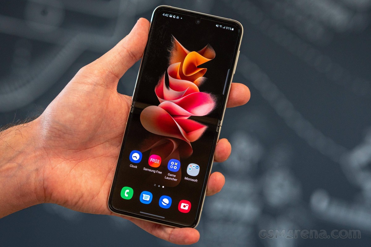
Once you apply a new wallpaper, the color palette picker shows up, because this is Android 12 with its built-in color grabbing from the wallpaper, but it's Android 12 on a Samsung device, and Samsung couldn't help make everything more customizable - and also more cumbersome at the same time.


Wallpaper settings, color palette picker
The way this system works on Pixels is that it's automatic, but here you have an extra step where you need to decide whether you like the automatic color palette based on the wallpaper, or would prefer a few alternatives. We're all for extra customizability, but this is the opposite of "it just works", isn't it? Anyway, at least Android 12's auto color extraction feature is present, even in this slightly tweaked form.
Speaking of wallpapers, the Dynamic Lock screen service is present on the Flip3 and lets you pick up to 5 categories of images, then serving you a different one each time you reach the lock screen. We've liked this feature ever since it was first unveiled by Huawei many years ago, but are still baffled as to why it only works for the lock screen.
This reviewer would very much prefer it to also work on the home screen, with a bit more customizability in how often the image should change. And yet, no manufacturer other than Google has so far thought to integrate something like that into its launcher? Strange.
Launcher and its quirks
The launcher itself has all the features you'd expect, and some you definitely wouldn't if you've never used a Samsung before - like the fact that the app drawer doesn't sort apps alphabetically by default or that it has folders in it by default, which don't adhere to the alphabetical sorting of the individual apps even after you set it to sort alphabetically. This has been a quirk of Samsung's launcher for years, alongside the horizontal scrolling, and it looks like the company has no intention to align itself with the rest of the industry in this regard.
Make of that what you wish - you can love this or hate it, or be anywhere in between. We just think the horizontal scrolling makes less sense than vertical scrolling would because the gesture you use to get into the app drawer is an upward swipe - and it feels much more natural (and quicker) to then immediately continue to swipe up for scrolling through the drawer, than switch to horizontal swipes. Then again, Samsung's launcher still has an option for an icon to be placed on the home screen to bring up the app drawer, so if you use that, you'll have less of an issue. Although it has to be said - that feels rather vintage in today's gesture-based world.
We're happy to see that you can choose to see the Google Discover feed to the left of your leftmost home screen as an alternative to Samsung Free - which is the latest name for something this reviewer has always found to be a useless, laggy mess. Your mileage may vary, of course, and in true Samsung fashion, you can pick either or none.
Recents, gestures
The Recent apps menu is the usual horizontally scrolling list of screenshots, but you get the option (on by default) to have four icons below it of apps that the phone thinks you might be trying to get to. This is based on your usage, of course, but we found the algorithm rather disappointing this time around, successfully predicting which app we intended to use about 30% of the time. That's way lower than it used to be, with our use of previous Samsung devices for long-term reviews, so we don't know what happened there - either our usage patterns have become more unpredictable somehow, or the algorithm isn't as good as it used to be.
Gesture navigation is, of course, present too and works well, although not as well as in other skins. For some reason, even now, years after Samsung's first implementation of this, we still find that we inadvertently manage to accidentally scroll down in some apps when we do the 'go home' gesture. This only ever happens on One UI, and it happens way less now than it used to a couple of years ago, but it's still a complete mystery why it would occur on this skin and no other. It's an annoyance you get used to for sure, but it's still there, and perhaps Samsung's developers should pay more attention to details such as this.
It's a small thing, but when you know it doesn't have to be like this (after using many other phones), it's a bit weird to have to deal with it. It only happens around 10% of the time now, down from 80-90% in the 'good old days, but we'd really like to see it go down to zero, as it is on literally all other Android skins.
Other features
One UI has Link to Windows integrated, trying to make things easier for owners of Samsung devices who also use Windows, and this has been a staple for a while now. There's also a Samsung-specific Continue apps on other devices feature that syncs data across Samsung products in real time but only works with a subset of apps like the Internet browser and the Notes app. We never bothered installing either of those (since they were optional installs offered to us when we set up the phone), but we hear the feature works as intended if you have more than one Samsung device in your life.
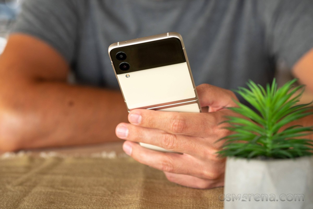
The adequately named Call & text on other devices is also there, and we did give this a shot on our Galaxy Watch4, taking calls on it even if it wasn't connected directly to the phone via Bluetooth - but it had to be connected to a Wi-Fi network of course. These are all nice to have features, although we're unsure of how many Samsung phone owners are even aware of their existence, let alone use them day by day. And that's one of the problems with the Korean company's approach of throwing everything but the kitchen sink into Settings and letting people pick and choose what they want to use - a lot of people may never actually know the full extent of what they can do, just because possibly useful things are buried among countless other features with doubtful appeal.


Link to Windows, Continue on other devices
This, however, has always been the company's user experience philosophy, and it's one that's as far removed from Apple's "we know what's best for you" as it can be. In the end, more choice is always better, Samsung seems to be saying, and it's all up to you to decide what to use and how. This is great if you need a very specific feature and know where to find it, but not so great if you always go with the defaults and never have the time to look through Settings for a few hours and see what you can find.
On the other hand, on Apple's side of the fence, if you really need a feature the company deemed unnecessary, you're generally completely out of luck, so as you can see, there are advantages and disadvantages to both approaches.
Reader comments
- Anonymous
- 13 Apr 2023
- XBx
The fold cannot be protected thus the screen gets damages and ink spills . It cost over £370 to replace the screen and its likely to happen again ..
- Linzi
- 02 Nov 2022
- gKa
Couldn't take screen shots after approx 8 months of owning the phone. Then massive dark line across the fold line. Wouldn't switch off. Then completely black screen, lost all my photos & everything else. Been sent to service provider &a...
- .
- 17 Oct 2022
- g%Q
Amazing phone but I Wouldn't Recommend it for people Who are clumsy this phone is pretty easy to Break its a huge upgrade from The flip 1 and 2 the battery life last for about the hole day I'd give it a 8/10 The back screen is pret...
