Samsung Galaxy Z Fold2 review
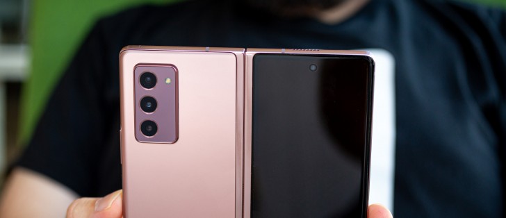
One UI 2.5 on top of Android 10
It comes as no surprise that the Galaxy Z Fold2 is running the latest version of Samsung's versatile and highly-polished One UI 2.5 Android flavor, on top of an Android 10 core. Samsung users and fans will feel right at home since the core experience is impressively consistent and familiar. The impressive part, being, that a lot of extra code is running behind the scenes to facilitate the unique Z Fold2 form factor and its dual-display setup. Plus, there are more than a few extra features and customizations that all fuse seamlessly with the rest of the OS. Impressive stuff!
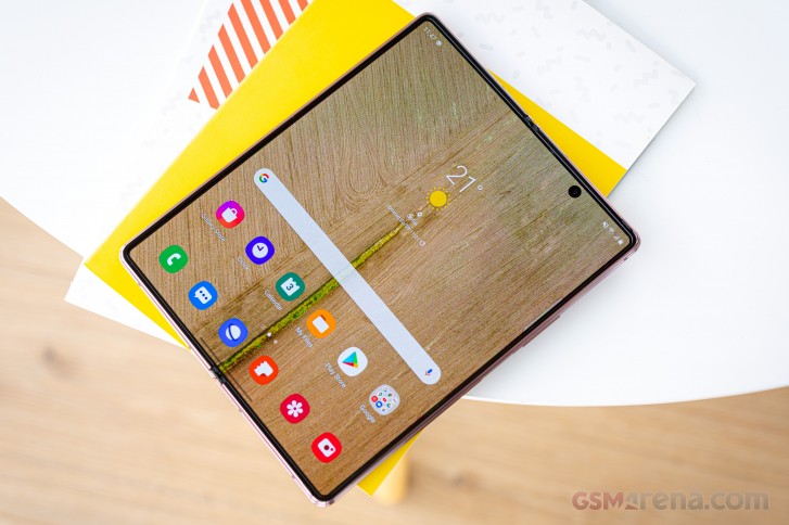
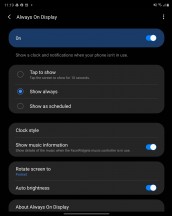
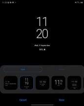
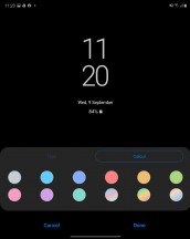
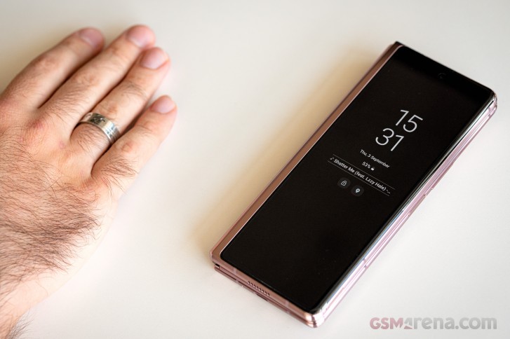
Taking things in their natural order, you are likely first to be greeted by the Samsung Always On display feature. It can also be not-so-always-on - now you can have it displayed only when you double-tap on the screen, in addition to being able to set up a daily schedule as before. You can, of course, keep it always on, too. You can choose different clock styles and font colors, (auto) brightness, and what notifications to be displayed.
The Always-On feature is a good example of one that works identically on both the inside and the cover display, depending on whether the Z Fold2 is open or not. Samsung has done an exceptionally good job of differentiating between the two displays for some features, where it makes sense, while naturally leaving shared settings for others all without breaking the general UX flow.
One good example is the way the Display smoothness option simply disappears when using the cover display, instead of being there and disabled, or not doing anything apparent until you open the phone. This kind of refinement deserves praise since it is no easy task to pull-off.
The lock screen, for instance, is also shared between the two displays in pretty much all of its aspects, including the clock style, widget selection, and notification logic. All except for the wallpaper selection, which can be done on an individual basis for the two panels. Admittedly, this is one feature that could benefit from being segmented in the future.

Lock screen: Cover display • Main display
The Home screen and App drawer, however, are superb examples of Samsung seamlessly separating-out customization for the two panels. While the options here may look deceptively identical, you get to set them independently while the Z Fold2 is open and while it is closed. This includes everything from the app grid, widget selection, and layout, and wallpapers. You can even have entirely different shortcuts on the two panels. Mighty convenient.


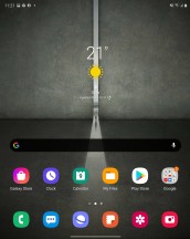
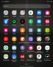
Cover home screen • Cover app drawer • Main home screen • Main app drawer
Like we said, aside from certain specific aspects, catering to the unique form factor of the Z Fold2, the One UI 2.5 shell we have here is familiar and a standard Samsung affair. You get all of the visual and functional polish, the small ergonomics and layout tweaks, everything the South Korean giant has painstakingly achieved through years of iterative work.
That means that the basics, like pull-down for a notification share and quick toggles, slide right for a Bixby feed and all of those familiar bits are all there. We won't be digging too much into them, since that's not the interesting bit the Z Fold2 has to offer.
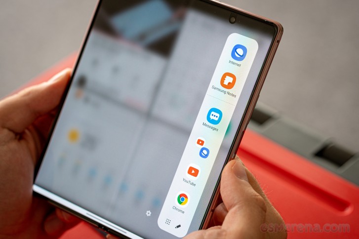
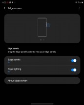
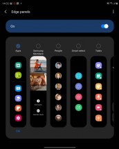
What we all want to see is the powerful multitasking, and a good place to start a tour of that is Samsung Edge screen. Another feature that should be familiar to existing Samsung users by now and one that typically makes great use of the company's fancy curved displays. However, it is surprisingly useful on the Z Fold2, as well, not so much with its Edge lighting features, which are still included, but rather for the default Apps panel - a perfect companion for quickly getting in and out of multi-tasking mode.
Using either the recent apps view or the Apps panel, you can start a multi-window session with a trivial side-by-side split. The Apps panel is convenient for a couple of reasons. One is the fact that you can either manually edit the shortcuts it houses, or, alternatively, let it surface your recently used apps. Then there is also the ability to save any particular multi-tasking configuration as a quick toggle. This includes the apps, their relative position, and window size. Both dual and the newer triple-split multi-tasking setups can be saved. It's a massive time-saver. Just set up a usage scenario you like and save it to the Apps panel for easier access later.
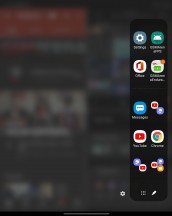
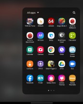
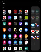
Launching apps and multi-window setups from the App panel
Back to the multi-tasking itself, the simpler dual-split can either be horizontal or vertical. You can also control the split one way or the other by simply dragging the middle bar. Dragging is also how you can quickly and easily get content from one window to the other. The list of supported content types has been expanding and will likely continue to do so. Text and picture dragging, likely the most-commonly used, is supported almost universally.
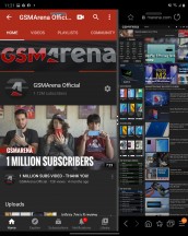
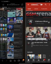
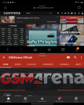
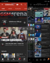
Controlling a basic two-way multi-tasking split
Clicking the dots on the middle bar provides a few options, including a quick way to swap the places of the two apps and another to change the orientation of the split. The third button saves this multi-tasking configuration as an entry in the App panel like we already mentioned.
Each app gets its own little oval control bar near the top, while in multi-window mode. It can either be used to grab and drag the app for repositioning or bright-up a few options with a click. These include the ability to go full-screen on the given app or collapse it further into a floating window.
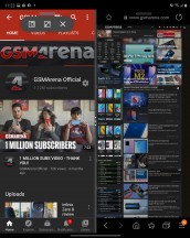
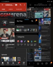
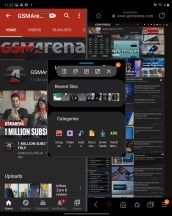
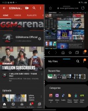
Manipulating individual apps in a multi-window configuration
Samsung refer to this floating window as Pop-up View. It's sort of the next-stage and another extension on the same free-form window manipulations used to achieve multi-window in the first place. This means that, again, some apps won't cooperate fully and some rare ones will outright refuse to go into this mode.
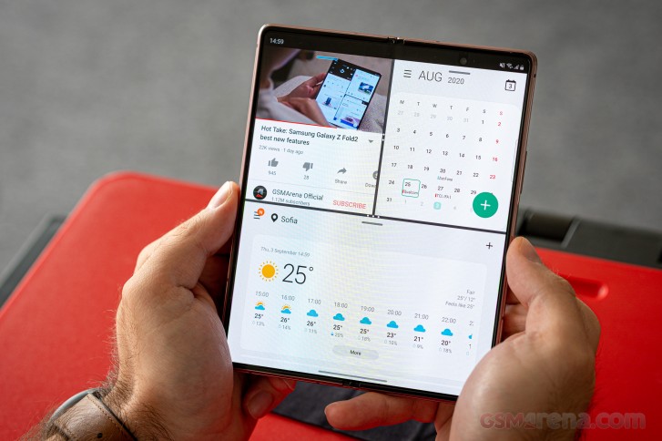
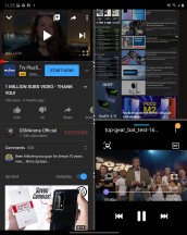
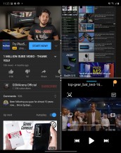
Moving on to the three-way multi-window split. It is a bit harder to initially set-up, but once you dial it in, set the proportions, placements and shuffle everything around, using the split controls, just the way you like it, you just save it for posterity, as a whole, in the Apps panel.
You can still drag content around in this setup and basically jump from app to app instantly. It is important to note that some apps won't, necessarily, be able to fully run, concurrently, while in this mode. Notable limitations include the ability to only have one video playing, both for convenience reasons and because of limitations in the Android video decoding pipeline. Some apps that do real-time updating might do it slower or put it on pause while in a small window and not in focus. It all depends on how they are coded, but, overall, most apps and a large chunk of Android are made to facilitate a single-app execution model first and foremost.
Never the less, you can even go beyond these three apps and rake multitasking even further with Pop-up View windows. You can pile up to five of these on top of a three-way split, making for a total of 8 "active" apps at the same time.
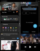
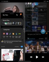
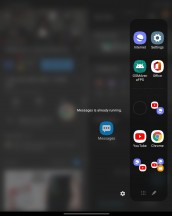
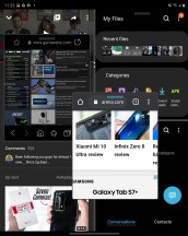
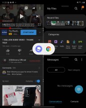
Taking multi-tasking to the next level
You can freely resize and drag these individual floating windows around and even set their transparency. Although, in most cases, that tends to add to the chaos, rather than reduce it. You can also collapse the windows into what is commonly known as a "chathead". If you collapse multiple apps in this way, they will end-up grouped in a folder-like manner, which help keep things tidy. There are other nuances and limitations to consider and discover, as well. For instance, certain apps refuse to run more than once, which is a thing Android developers can explicitly request in an app manifest for one reason or another.
Overall, Samsung went above and beyond in the multi-tasking features department. Perhaps even a bit too far in practical terms. Still, if you think there is a particular setup that will work great for your needs, chances are that the Z Fold2 can facilitate it, which is all that matters.
The new stable hinge design on the Z Fold2 and the free-standing abilities, it has unlocked, have been a huge advertising point for Samsung. These enable something the Korean giant refers to as Flex mode or Flex view, when talking from a software perspective. By default, the Z Fold2 enters said mode when its two halves are positioned at an angle between 75 degrees and 115 degrees. As per Samsung's website, that window can be adjusted to better suit personal needs, but, despite looking through most of the settings menus, including developer options, we couldn't find how to do that.
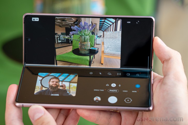
That's not the main point, though. Flex view is nifty on a conceptual level, but still rather limited, in terms of software support. The basic idea here is that the software should realize that you have the phone in a semi-open, laptop-like state and adjust the UI accordingly. This, in its current state, seems to involve, mostly, leaving all sorts of controls on the bottom half of the display, while the actual content remains on the top one.
The list of apps that currently follow that behavior on the Z Fold2 isn't huge and is mostly made-up of Samsung's own apps. The video player can do it and so can the Gallery app. Though the feature looks notably awkward on the latter since there are not too many controls to usually separate out into the bottom space while simply viewing images.
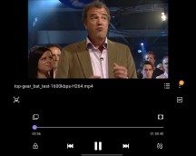
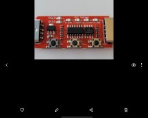
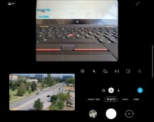
Flex view: Video player • Gallery • Camera
The camera app is the most notable example of Flex View working in a beneficial manner. The idea is that, again, you get to have your controls on the bottom half of the display and the viewfinder on top. This is definitely useful for taking both selfies and shorts with the main camera while the phone is sitting on a flat surface. It just feels more natural.
Unfortunately, due to the fact that the main camera array and the cover display are on different sides of the Z Fold2, there is no way to leverage Flex view mode to take a selfie with the main cameras.
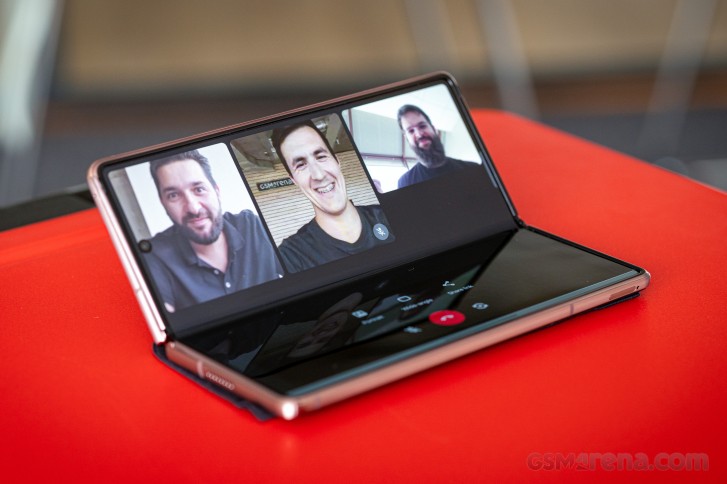
The one notable example of a third-party app currently working with Flex view and Flex Mode is Google Duo. Some other apps, like YouTube in landscape mode, kind of naturally get separated into a content section and the rest while the Z Fold2 is half-open. That, however, is purely coincidental and not the result of the app actually trying to adapt its UI.
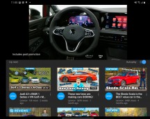
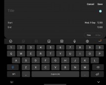
YouTube and most writing apps and IMs kind of naturally work with Flex Mode
The same logic applies to thinks like note-taking apps or IM's, which, in landscape mode, with an open on-screen keyboard, tend to naturally get separated out into a content section on the top and keyboard on the bottom. This is kind of useful, but not really, since, even with its massive size, the Z Fold2 is still kind of small and awkward to properly touch-type on.
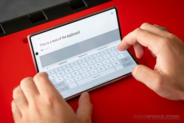
Flex View likely has a bright future ahead of it, since it basically builds upon code and API's already baked-into modern versions of Android, specifically designed to make apps more aware of the current state of foldable displays, allowing them to adapt their UI. This kind of behavior will likely become increasingly important among apps and their developers with the proliferation of foldable panels and different new form factors. Samsung is just a bit ahead of the curve in this respect. Makes sense, if you are going to champion a bold new form factor, you better be ready to do the same for its accompanying software backing.
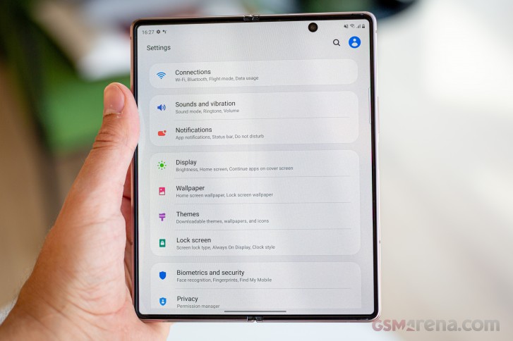
Speaking of apps adapting to displays and form factors, the Z Fold2 features a rather interesting Screen layout and zoom menu under Display settings. The second half of that is pretty self-explanatory. The other part of this menu is a toggle that basically tells the Z Fold2 to report its inner display as either a regular phone one, or adjust its profile and things like DPI settings, so that apps think it is a tablet.
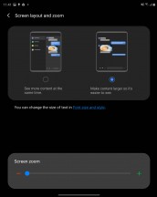
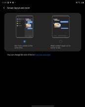
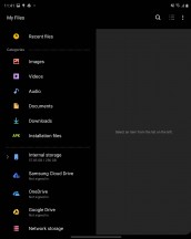
Screen layout and zoom options
The benefit of this is that certain apps do have a separate tablet UI variant. One that often can end-up making use of the massive internal display of the Z Fold2. Definitely an option worth exploring.
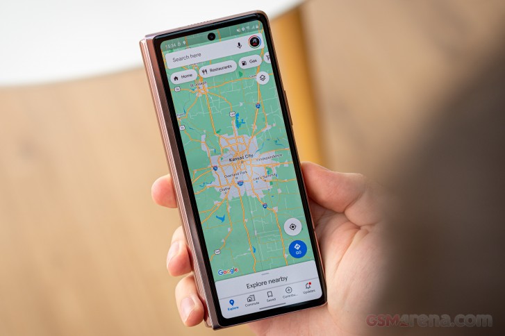
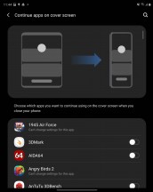
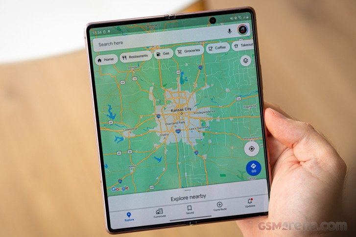
As sort of a logical extension to all of this automatic behavior, the Z Fold2 now has the option to Continue apps on cover screen. The name is nicely-descriptive. Even since the original Fold, Samsung made a point of being able to launch an app on the cover display then simply open the phone up and have the same app naturally transition to the bigger panel. Once again, some apps might not particularly like the process or cooperate with it.
Anyway, now you can set-up the reverse logic on a per-app basis, as well. This actually makes a lot of sense for some apps, like navigation, where you definitely want the bigger screen to set-up a route, but then should be perfectly fine actually getting directions from the cover display. That can happen organically, by simply closing the Z Fold2.
The Samsung keyboard is probably one of the most versatile Android keyboard solutions currently out there. It fits right at home on the Z Fold2, especially with its comprehensive and extensive support for customization and resizing. It even comes with three distinct modes, out of the box - regular, split and floating.

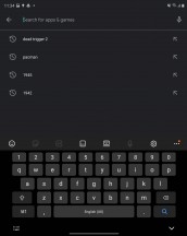
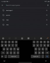
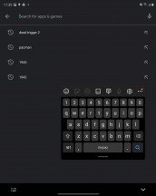
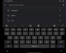
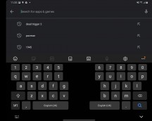
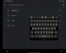
Samsung keyboard regular, split and floating modes
These work in both portrait and landscape orientation on both displays. Plus, you can have a different mode for the main display in landscape and portrait mode and a third one for the cover display. Now that's versatility!
And we haven't even scratched the surface of what is available here in terms of tweaking and customization. Dictionaries, multiple languages, custom symbols, autocomplete, swipe-typing, the list goes on and on.
Hopefully, we managed to mostly cover the important, custom parts of One Ui 2.5, on the Z Fold2, specifically meant to cater to its unique form factor and features. Overall, Samsung made the best of its pre-existing Fold experience and managed to successfully address, pretty-much every software complaint we had for the previous Galaxy Fold. Top marks all around!
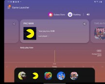
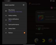
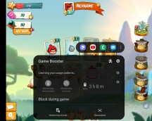
Everything else we didn't have time for is One UI through and through. There is the usual notification shade, Google's Digital Wellbeing services are here, there are even Samsung's Game Tools for uninterrupted gaming, among many others.
You can check any of our recent Samsung review for any other One UI particulars.
Reader comments
- Samsung galaxy fold
- 18 Feb 2024
- UD%
Samsung galaxy fold 2
- Adit garg
- 02 Jun 2022
- vGc
Hi I have fold 2 phone , this phone is ever worst phone I bought this mobile 15 days ago and it's screen is showing bubbles neither this phone has fallen nor damaged..but customer care stated to not take it back without paying money I was switch...
- MrSupercar55
- 18 May 2022
- MAg
Careful what you wish for, Einstein. You might just get it. You wished for the ability to use an S Pen on a Z Fold. Now the Z Fold 3 is here with the ability to do just that. It still embodies the disadvantages of every other Z Fold. Hideously expens...
