Samsung Galaxy Z Fold3 5G review
One UI 3.1.1 on top of Android 11
Samsung created a bit of a confusing situation with its One UI versioning with the Z Fold3 and Z Filp3. These phones were previously rumored to launch with One 3.5, which was then expected to trickle down to other devices. Turns out that was not the case, and Samsung's presentation during the Unpacked 2021 event didn't really help either, since it talked about One UI 3, with no extra digits attached. Turns out, the Z Fold3 and Z Filp3 get an exclusive One UI 3.1.1 launch version to begin with - .1 better than what the S21 family is currently running, which probably signifies the presence of certain features, exclusive to the form factor, like Flex mode.
As detailed in this official community forum thread in Korean, One UI 3.1.1 will not be coming to any other devices. There is no real mention of One UI 3.5 either. However, the company will bring some of the app improvements and other enhancements to current flagship devices through a software update. This update won't change the version number. So, it's still going to be One UI 3.1 but with everything One UI 3.1.1 has to offer. Everything relevant to non-foldables, that is, which we imagine resides mostly under the hood. All the while, One UI 4.0 is already on track for an upcoming beta run and will likely be the next major update within Samsung's device lineup. It will bring along Android 12.
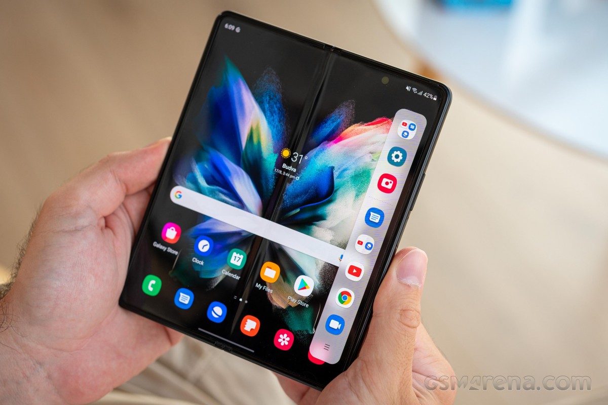
With these confusing details out of the way, it is important to note that there really aren't that many visible changes in One UI 3.1.1, compared to One UI 3.1 on other Samsung devices, nor, for that matter the One UI 3.1 running on the Z Fold2. A few small UI and UX tweaks here and there and some extra optimizations from third-party apps, which we will point out as we go.
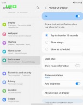
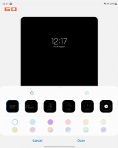
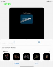
Taking things in their natural order, you are likely first to be greeted by the Samsung Always On display feature. It can also be not-so-always-on - now you can have it displayed only when you double-tap on the screen, in addition to being able to set up a daily schedule as before. You can, of course, keep it always on, too. You can choose different clock styles and font colors, (auto) brightness, and what notifications to be displayed.
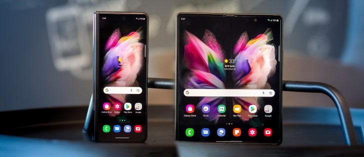
The Always-On feature is a good example of one that works identically on both the inside and the cover display, depending on whether the Z Fold2 is open or not. Samsung has done an exceptionally good job of differentiating between the two displays for some features, where it makes sense, while naturally leaving shared settings for others, all without breaking the general UX flow.
One good example is the fact that most of the display settings, including refresh rate, brightness and color are shared between the two screens.
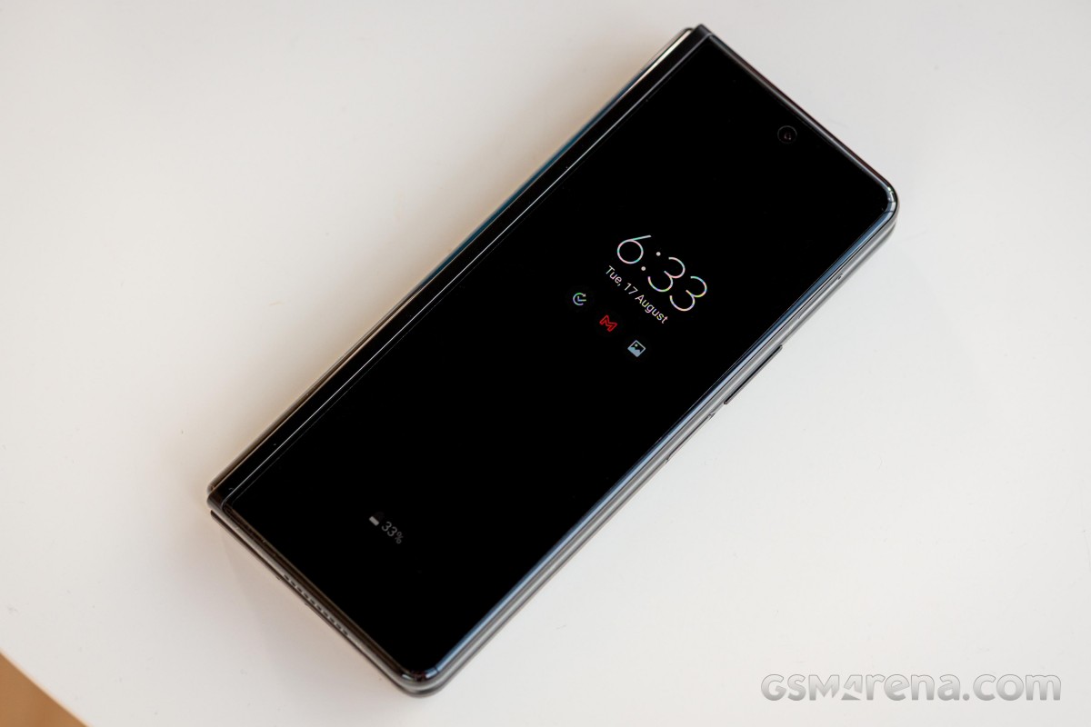
The lock screen, for instance, is also shared between the two displays in pretty much all of its aspects, including the clock style, widget selection, and notification logic. All except for the wallpaper selection, which can be done on an individual basis for the two panels. Admittedly, this is one feature that could benefit from being segmented in the future.

Lock screen: Cover display • Main display
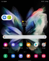
The Home screen and App drawer, however, are superb examples of Samsung seamlessly separating out customization for the two panels. While the options here may look deceptively identical, you get to set them independently while the Z Fold3 is open and while it is closed. This includes everything from the app grid, widget selection, and layout, and wallpapers. You can even have entirely different shortcuts on the two panels.


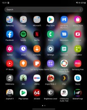
Cover home screen • Cover app drawer • Main home screen • Main app drawer
A lot of the overall visual polish in the Z Fold3 UI is actually a function of One UI itself and hasn't changed drastically in recent years, but rather has been going through a constant process of refinement. In that sense, many elements can be considered a "standard" Samsung affair. That means that the basics, like pull-down for a notification shade and quick toggles, slide right for a Bixby feed and all of those familiar bits are all there. We won't be digging too much into them since that's not the interesting bit the Z Fold3 has to offer.
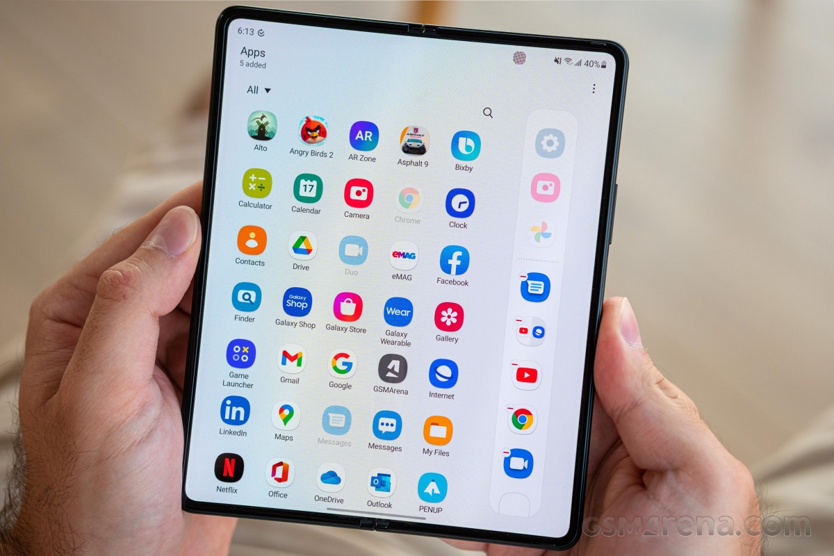
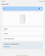
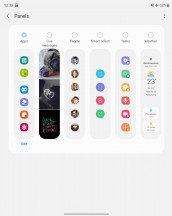
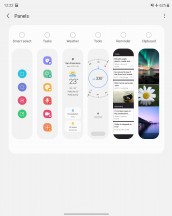
What we all want to see is the powerful multitasking, and a good place to start a tour of that is Samsung Edge screen. It is another feature that should be familiar to existing Samsung users. It is surprisingly useful on the Z Fold3 too, particularly the Apps panel - a perfect companion for quickly getting in and out of multi-tasking mode.
Using either the recent apps view or the Apps panel, you can start a multi-window session with a trivial side-by-side split. The Apps panel is convenient for a couple of reasons. One is the fact that you can either manually edit the shortcuts it houses or, alternatively, let it surface your recently used apps.
Then there is also the ability to save any particular multi-tasking configuration as a quick toggle. This includes the apps, their relative position, and window size. Both dual and the newer triple-split multi-tasking setups can be saved, and recent setups also get automatically suggested. It's a massive time-saver. Just set up a usage scenario you like and save it to the Apps panel for easier access later.
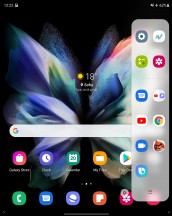
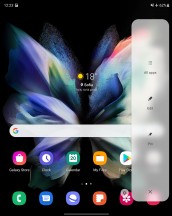
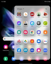
Launching apps and multi-window setups from the App panel
Before we move on to some actual multitasking, which hasn't really changed all that much from the older Z Fold2, there are a few improvements in the App panel currently exclusive to the Z Fold3. Though, our best guess is these are likely to get backported to the Z Fold2 as well. For one, you can now have a single row of icons in the panel, which wasn't previously possible.
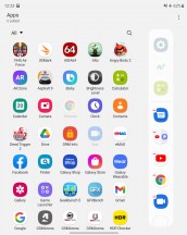
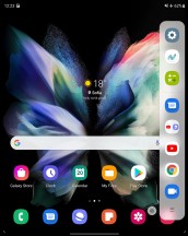
Single row of icons on App panel
This generally saves on some screen real estate, if you don't personally use too many combinations of apps. More interesting, however, is the ability to pin the App Panel. This essentially creates a taskbar, which remains constantly on-screen and does eat away some space. However, on the flip side, you get a much more desktop-like experience out of it, with the ability to quickly switch between apps and even sets of apps.
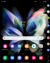
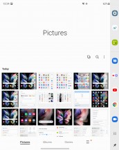
Pinned App panel offers a taskbar experience
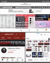
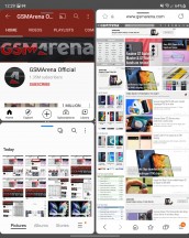
Back to the multi-tasking itself, the simpler dual-split can either be horizontal or vertical. You can also control the split one way or the other by simply dragging the middle bar. Dragging is also how you can quickly and easily get content from one window to the other. The list of supported content types has been expanding and will likely continue to do so. Text and picture dragging, likely the most commonly used, is supported almost universally.
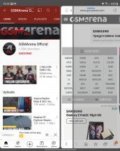
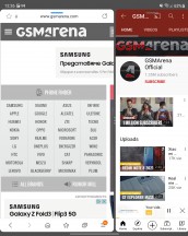
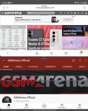
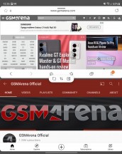
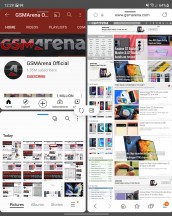
Controlling a basic two-way multi-tasking split
Clicking the dots on the middle bar provides a few options, including a quick way to swap the places of the two apps and another to change the orientation of the split. The third button saves this multi-tasking configuration as an entry in the App panel like we already mentioned.
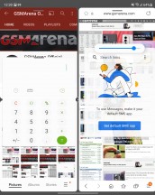
Each app gets its own little oval control bar near the top while in multi-window mode. It can either be used to grab and drag the app for repositioning or bring up a few options with a click. These include the ability to go full-screen on the given app or collapse it further into a floating window.

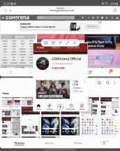
Manipulating individual apps in a multi-window configuration
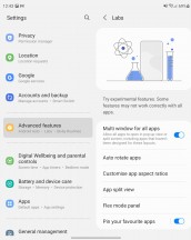
Samsung refer to this floating window as Pop-up View. Some apps won't cooperate fully, and some rare ones will outright refuse to go into this mode. To address that, however, One UI 3.1.1 does include a Labs tab inside the Advanced features menu, with a toggle switch that can force multi-window and pop-up view on any app, regardless of whether the developer included support or not, with typically pretty good success rate.
We'll get back to the other experimental features in a bit.
Moving on to the three-way multi-window split. It is a bit harder to initially set up, but once you dial it in, set the proportions, placements and shuffle everything around, using the split controls, just the way you like it, you just save it for posterity, as a whole, in the Apps panel.
You can still drag content around in this setup and basically jump from app to app instantly. It is important to note that some apps won't necessarily be able to run concurrently while in this mode. Notable limitations include the ability to only have one video playing, both for convenience reasons and because of limitations in the Android video decoding pipeline. Some apps that do real-time updating might do it slower or put it on pause while in a small window and not in focus. It all depends on how they are coded, but, overall, most apps and a large chunk of Android are made to facilitate a single-app execution model first and foremost.
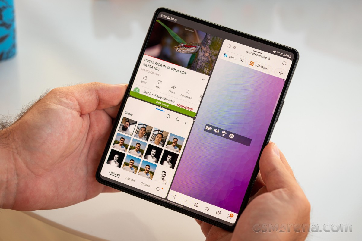
Nevertheless, you can even go beyond these three apps and rake multitasking even further with Pop-up View windows. You can pile up to five of these on top of a three-way split, making for a total of 8 "active" apps at the same time.
You can freely resize and drag these individual floating windows around and even set their transparency. Although, in most cases, that tends to add to the chaos, rather than reduce it. You can also collapse the windows into what is commonly known as a "chathead". If you collapse multiple apps in this way, they will end up grouped in a folder-like manner, which helps keep things tidy.
There are other nuances and limitations to consider and discover, as well. For instance, certain apps refuse to run more than once, which is a thing Android developers can explicitly request in an app manifest for one reason or another.
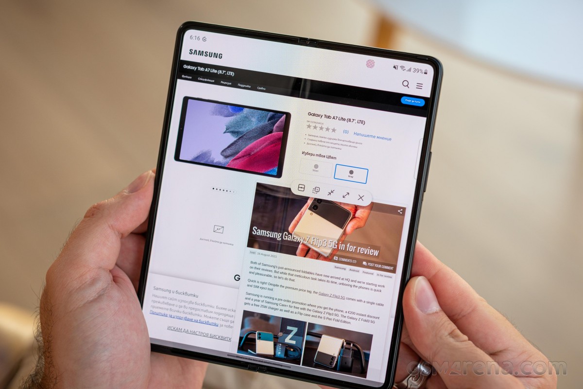
Overall, Samsung went above and beyond in the multi-tasking features department. Perhaps even a bit too far in practical terms. Still, if you think there is a particular setup that will work great for your needs, chances are that the Z Fold3 can facilitate it, which is all that matters.
If you still find yourself wanting more freedom and an even more PC-like experience, the Z Fold3 does include Samsung DeX support, both wired and wireless to a monitor or TV, as well as a Windows PC, with a specific client. However, one thing absent is the ability to trigger DeX on the display of the Z Fold3, without the need to attach an external one. This is a thing on some of Samsung's tablets and seems like a great fit here.
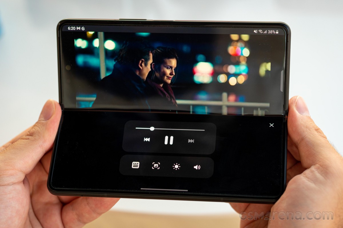
On to what Samsung calls Flex mode or Flex view. It is also not a new concept, but instead, one carried forward from the Z Fold2 and expanded upon. It was absent on the original Galaxy Fold due to the inability of its hinge to be stable at any given angle. On the Z Fold2 and now the Z Fold3, having the display folded between 75 degrees and 115 degrees triggers Flex view.
That essentially means that the phone is aware that it is in this particular physical state and lets the Android OS and any running app know. In this sense, Flex View is just a Samsung marketing term for triggering behavior already baked into modern versions of Android, specifically designed to make apps more aware of the current state of foldable displays, allowing them to adapt their UI.
Seeing how Samsung is effectively championing this particular foldable form factor, it makes sense that it also does a lot of the initial pushing and work with its own dev team and third-party app developers to make the first set of such form-factor-aware versions of apps a reality. The list of apps that currently follow that behavior on the Z Fold3 isn't huge and mostly consists of Samsung's own apps. The video player can do it, and so can the Gallery app. Both have their respective controls on the bottom and the content on the top. The Gallery app simply dedicates a "trackpad-like" touch area for navigating back and forward between images to the bottom half. A bit awkward and with limited usability, which honestly seems to often end up being the case with these early Flex View implementations.
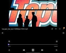
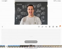
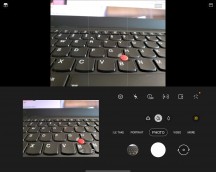
Flex view: Video player • Gallery • Camera
The camera app is the most notable example of Flex View working in a beneficial manner. The idea is that, again, you get to have your controls on the bottom half of the display and the viewfinder on top. This is definitely useful for taking both selfies and shorts with the main camera while the phone is sitting on a flat surface. It just feels more natural.
Unfortunately, due to the fact that the main camera array and the cover display are on different sides of the Z Fold2, there is no way to leverage Flex view mode to take a selfie with the main cameras.
Samsung has been working with third-party app developers as well. In fact, quite a few names were hinted at during the Unpacked 2021 presentation, but with few actual working demos. Google is definitely on board, and Google Duo has had a Flex View supported version ever since the Z Fold2. The YouTube app on the Z Fold3 has a dedicated Flex View playback UI variant. It doesn't really change the interface too much, but it's a start.
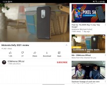
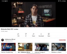
YouTube: regular UI • Flex View UI
Chrome also, sort of has particular behavior implemented for the Z Fold3, though technically not tied to Flex View. Opening a link in a new window on the main display of the Z Fold3, by default, opens another window in split-screen.
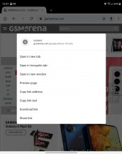
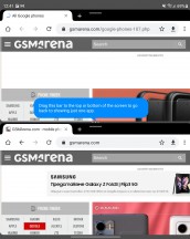
Chrome new window option on the Z Fold3
We did try to find some other examples of Flex View as well, trying apps like Spotify and TikTok, specifically mentioned during the Z Fold3 and Z Flip3 presentation. However, to our eye, both looked and behaved in a standard matter, perhaps just triggering a tablet UI, rather than a traditional phone one, which is not exactly the idea of Flex View.
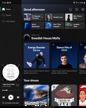
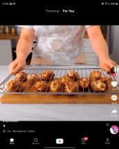
Spotify and TikTok don't really have Flex View support.
In an attempt to sort of "shoehorn" in at least some Flex View behavior, Samsung has also included a per-app Flex mode panel menu in the Labs part of the settings. It tries its best to "force" apps to work better in Flex View.
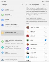
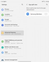
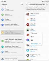
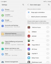
Force Flex View • Enable App split view • Customize aspect ratio and auto rotation
Our experience is that it manages to have some effect mostly in multimedia players, where the bottom half of the display ends up displaying a tweaked version of the Android multimedia controls that you might see living in a notification or on the lock screen of another phone.
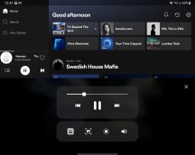
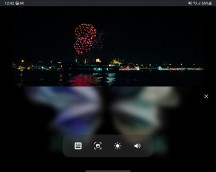
Flex mode panel forced on apps: Spotify • Plex
Other interesting Labs experimental features include the ability to enable something called App split view. The only app we found that even popped up on the list here was Samsung Members, and we couldn't figure out exactly how the toggle modified its UI or behavior. Maybe we are missing something.
On the flip side, the ability to set the aspect ratio and auto-rotation behavior on a per-app basis is a neat idea. Particularly for apps like Instagram, which is notorious for not scaling gracefully on odd screens. By default, on the Z Fold3, it still opens in 16:9 mode, with the bars on either side getting filled by a blurred version of your wallpaper. You can now force it to full screen, and it actually looks and works great. Of course, your mileage will vary with other apps, especially ones built for older Android versions and not updated in a while.



Forcing Instagram to fullscreen
Many apps, like note-taking apps or IM's do have a natural way of "working" in this half-opened state on the Z Fold3, though without really responding to Flex View mode since the content and keyboard tend to end up naturally separated.
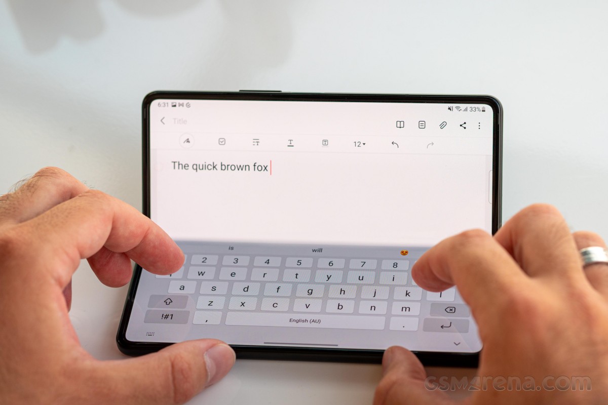
This is kind of useful, but not really, since, even with its massive size, the Z Fold3 is still kind of small and awkward to properly touch-type on.
Time for the uncomfortable truth about the current state and near future of Flex View and proper foldable mode APIs, already baked into Android - we are way too early in the adoption process, both in terms of hardware and software. Before the foldable form factor becomes properly popular, the best we can expect is limited efforts for futuristic UI transitions and morphing from interested major parties like Samsung and its partners.
In more ways than one, the foldable experience is still, very much an experimental, early-adopter one, with all of the drawbacks that brings about.
In lieu of proper and mass Flex View/Flex mode support, Samsung can and does, at least offer a nifty way to control whether to use the main display on the Z Fold3 in "Multi view" or "Standard view" mode, through the Screen layout and zoom settings menu.
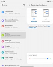
Screen layout and zoom setting
This is not a new concept and is also carried over from the Z Fold2, where it essentially forced third-party apps to render in their tablet UI variant, if available. It still has the exact same effect on the Z Fold3, but Samsung has also included a specific "tablet" UI variant for its settings menu, as well as some apps, like the messages and calendar, effectively expanding on the idea.
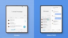
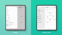
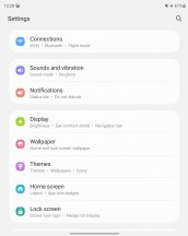
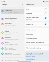
Apps reacting to screen layout toggle: Messages • Calendar • Setting menu
Definitely an option worth exploring.
Another great option, that really makes sense with the form factor and hardware at hand here, carried over from the Z Fold2, is called Continue apps on cover screen. The name is nicely descriptive. Even since the original Fold, Samsung made a point of being able to launch an app on the cover display then simply open the phone up and have the same app naturally transition to the bigger panel. Some apps might not be willing to fully cooperate and may require a restart, but things are getting better and better as more developers start implementing Android's resizable window classes.
Anyway, this option makes the reverse logic possible. This actually makes a lot of sense for some apps, like navigation, where you definitely want the bigger screen to set up a route, but then should be perfectly fine actually getting directions from the cover display. That can happen organically, by simply closing the Z Fold3.
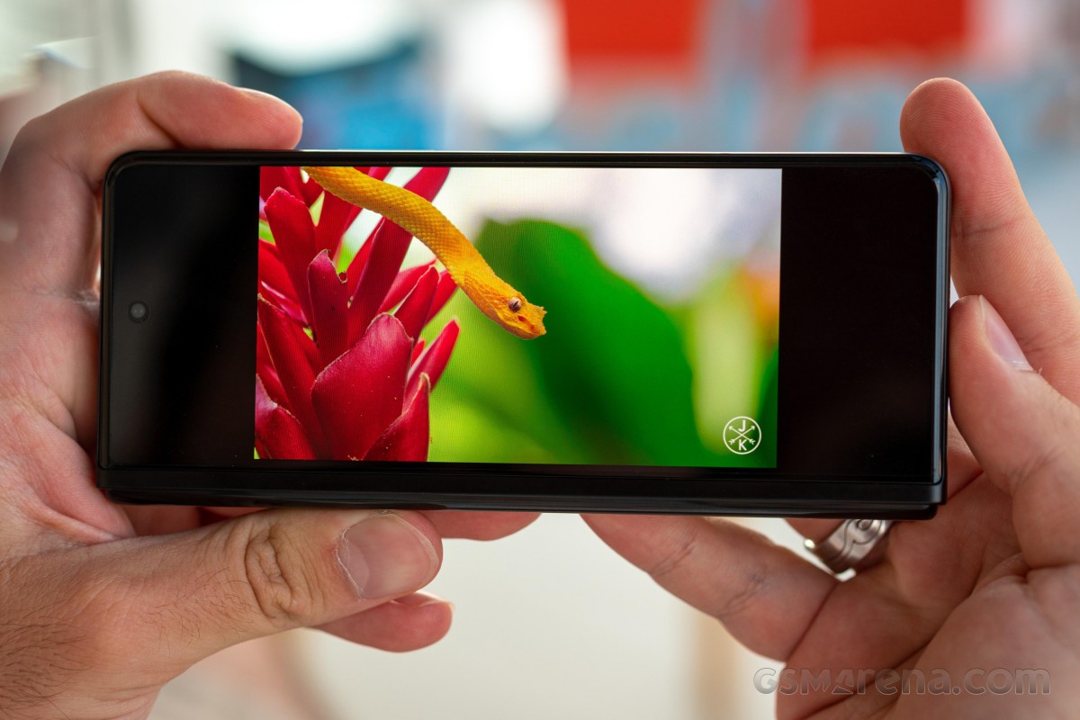
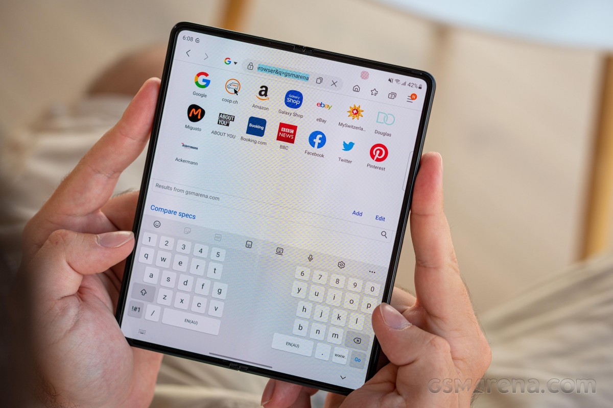
There is simply way too much to cover in terms of software on the Z Fold3, and we won't be able to get through nearly all of it. We would, however, like to give some well-deserved credit to Samsung keyboard - probably one of the most versatile Android keyboard solutions currently out there. It fits right at home on the Z Fold3, especially with its comprehensive and extensive support for customization and resizing. It even comes with three distinct modes, out of the box - regular, split and floating.

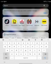
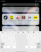
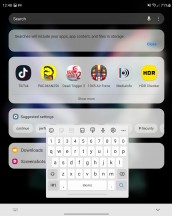
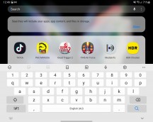
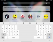
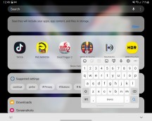
Samsung keyboard regular, split and floating modes
These work in both portrait and landscape orientation on both displays. Plus, you can have a different model for the main display in landscape and portrait mode and a third one for the cover display. Now that's versatility!
That being said, this is probably a good time to mention that typing on the extra-tall cover screen is quite difficult and feels very cramped.
And we haven't even scratched the surface of what is available here in terms of tweaking and customization. Dictionaries, multiple languages, custom symbols, autocomplete, swipe-typing, the list goes on and on.
Hopefully, we managed to mostly cover the important, custom parts of One UI 3.1.1, on the Z Fold3, specifically meant to cater to its unique form factor and features. Overall, Samsung made the best of its pre-existing Fold experience and somehow managed to bring in even more excellent improvements. Top marks all around!!!
S Pen on a foldable display
Samsung put in a lot of engineering work to get its signature S Pen working on the foldable display of the Z Fold3. We already went through all of the durability challenges in terms of the display itself and these do extend to the actual S Pen accessory. The Z Fold3 doesn't support previous generations of S Pen and in fact actively complains and tells you to stop when you bring one close to its display. There is a good reason for that. Even with the harder display on the Z Fold3, in order to prevent physical damage, Samsung constructed both of its new S Pen accessories with special soft tips and internal spring dampers to really minimize the pressure on the panel.
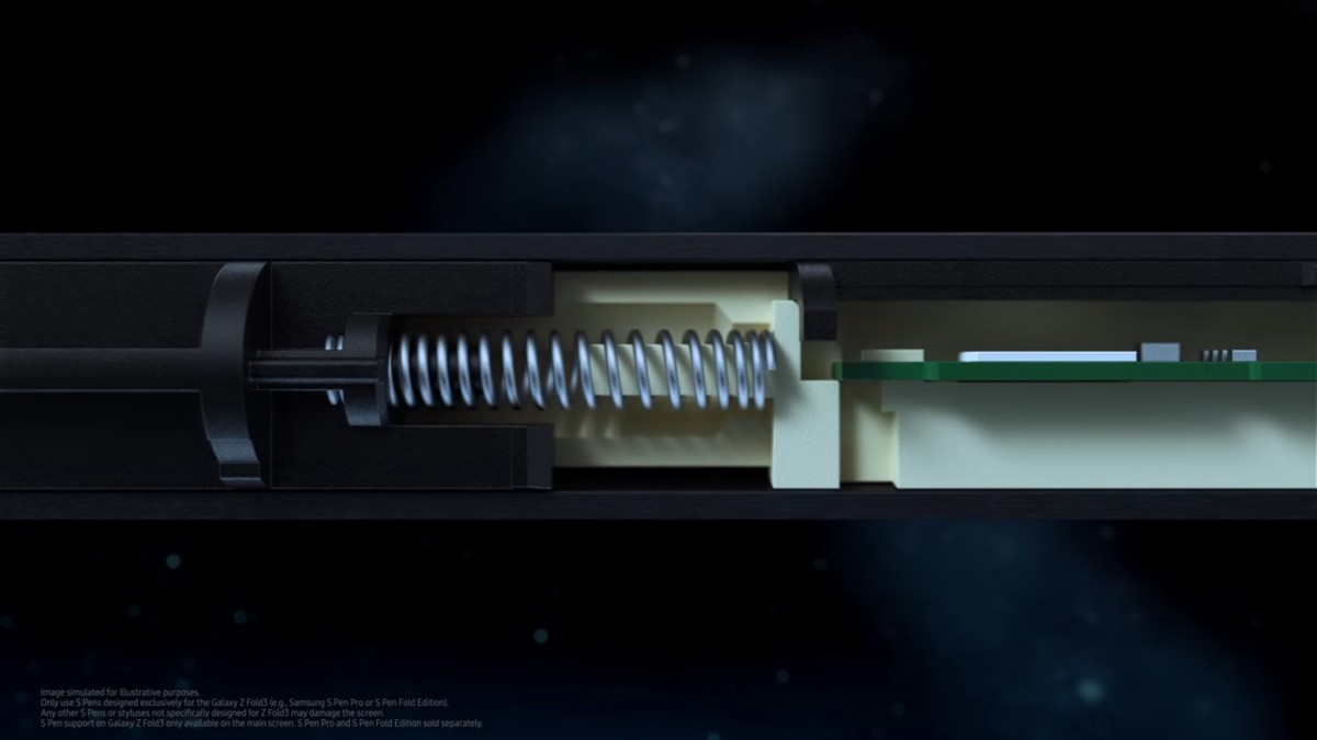
You probably already know, but in case you missed it, Samsung launched two new S Pen options alongside the Z Fold3 - the more basic S Pen Fold edition and the S Pen Pro. Neither is included with the regular retail package of the Z Fold3 though the S Pen edition one is part of pre-order bundles, alongside a matching case, with a place to slot said accessory.
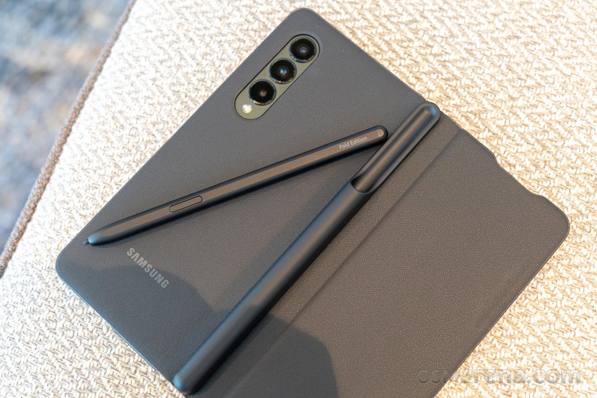
Let's go through the differences between the two models real-quick. Size is an obvious one. The S Pen Pro is bigger in every way and also heavier. It kind of has to be, given all of the extra hardware inside and additional functionality. Here is a handy comparison chart to reference.
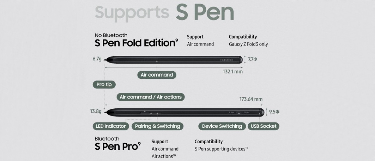
The big functional difference being Bluetooth, which allows the Pro model to have Samsung's Air actions. Those are the inputs you can do from afar, like using the button on the S Pen as a camera shutter or drawing in the air to trigger other actions. In order to pull that off, there is Bluetooth onboard, as well as a battery, which requires charging, hence - the USB Type-C port.
To the best of our knowledge, the S Pen Pro has no other way of charging, unlike the convenient wireless coil and capacitor system that has been a staple on the recent S Pen design for Samsung's Note line. On the plus side, the S Pen Pro does offer compatibility with other devices, besides the Z Fold3. Its switch disables the springs, among other things, in that particular use case.
Like its name suggests, the S Pen Fold Edition only works on the Z Fold3. It has a soft tip and spring dampening. It is also essentially passive and does not have a battery but does retain support for Samsung's Air command features. These are the features that get triggered by hovering the S Pen above the device's display - a situation in which its location can still be precisely tracked, and its onboard button suddenly starts to work.
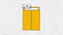
This might look like magic to anyone not familiar with older S Pen models before Samsung even added the additional, Bluetooth-powered Air actions. The way it functions and always has is through Wacom's patented electromagnetic resonance (EMR) technology. It is essentially a special electromagnetic grid under the display that can track the S Pen if it is close enough to get powered by the electromagnetic field it emits.
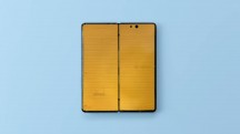
In case you needed yet another reason why the Z Fold3 is such an engineering marvel and such an expensive one, in order to get EMR working on a foldable, Samsung and Wacom essentially managed to put two separate EMR grids on either half of the phone and then connect them to the same controller and do all of the math necessary to enable precise tracking on the "dead" zone, on top of the hinge! Inspiring stuff, all so we can draw and take notes on a foldable device.
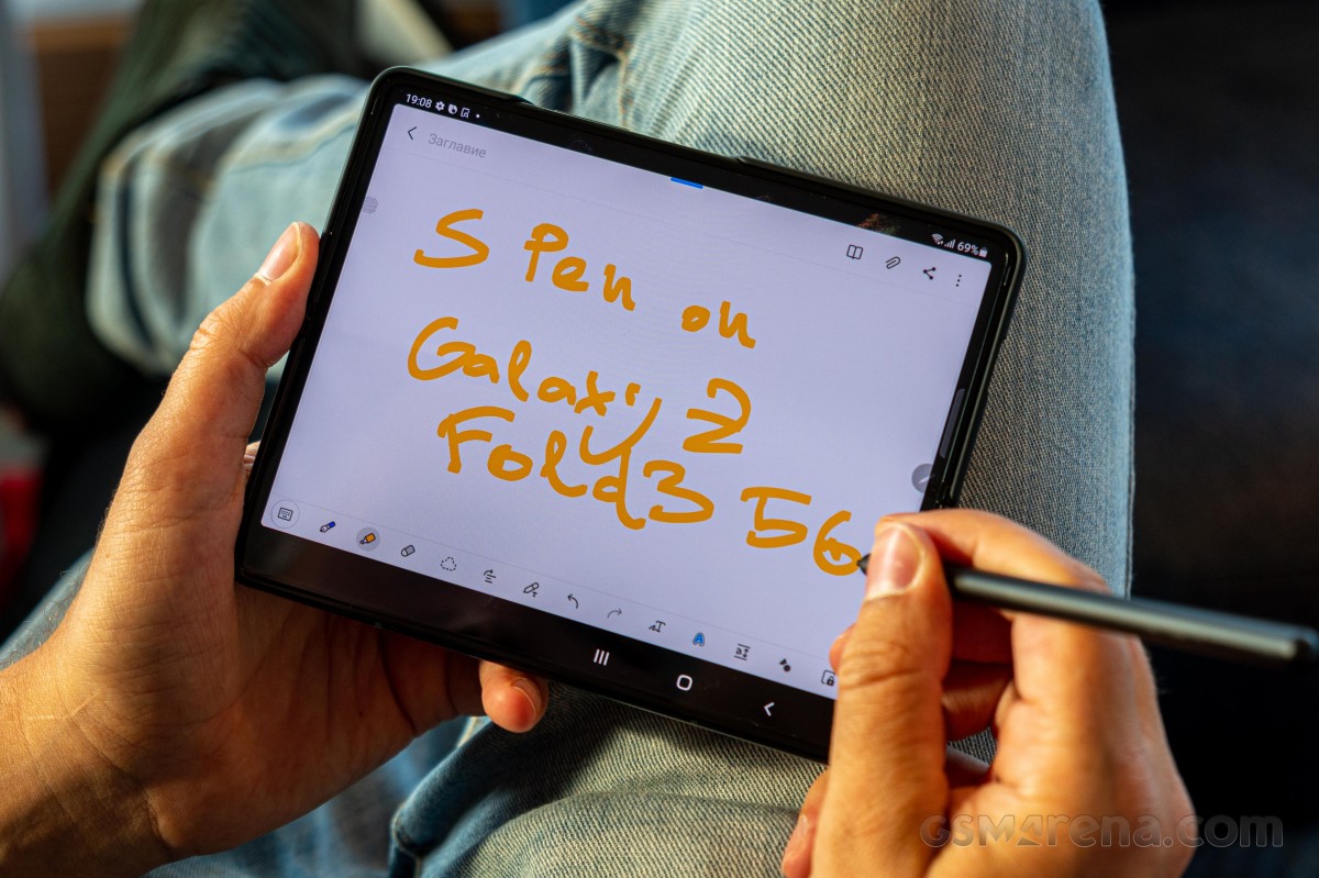
And, in practice, the system definitely works. Tracking is just as precise as we have come to expect out of Samsung's S Pen tech, and response time is also really impressive. You don't need to worry about the whole soft-tip and dampened setup feeling way too different either. Coming from daily-driving the last few generations of Galaxy Note devices, we can confidently say that everything feels and works just as great on the Z Fold3.
Reader comments
- Anonymous
- 24 Jan 2025
- XBF
Lol
- G
- 12 Feb 2024
- SrP
Why did my screen crack in the middel,2× and if i replace it again,i could just buy a new one,2 out of 15 friends have the same problem, i dont have kids, im a nurse and it did not fall, come one samsung,give me a brake!!! Started covid with this pho...
- Anonymous
- 26 Aug 2023
- pL2
It means your phone is carrier locked
