Samsung Galaxy Z Fold3 long-term review

Updates
We're up to One UI 4.1 these days, and as it presents itself on the Fold3, this is definitely, by far, the smoothest One UI yet. Scratch that - it's the smoothest Samsung skin yet. But the qualifier is equally important: as it presents itself on the Fold3. Don't take this section to mean you can buy a cheap A-series Samsung with One UI 4.1 and get the same smoothness - you won't. For now, it seems like the company has primarily focused its smoothness enhancement efforts on its most expensive devices, and if you have to prioritize, you might as well prioritize the people who are spending the most money purchasing your products, no?
Anyway, let's once again commend Samsung for how much it's improved its update game in recent years. From being among the worst about updates, it's now among the best, and possibly the best in the Android world.
You get four years of big Android updates and five years of security updates with a device such as the Fold3, and that's unmatched by any company not called Apple or Google.
But it's not just that promise - it's the yearly improvement in how fast these big updates are being sent out too. And, perhaps most importantly of all, it's the monthly cadence of security patches. While it's still not as fixed a release schedule for these as Google has (first Monday of the month), in 99.9% of months, you get the current month's update before the month is over. And a few times a year, you might even get next month's update this month. So, in short - if you care about updates, be they big ones or small security ones, and you want a foldable phone, you only really have two options right now, and they're both made by Samsung.
Quirks, duplicates
The Fold3's One UI 4.1 skin based on Android 12 comes with all the features you'd expect in this day and age and all of the quirks, too - this is still Samsung software, and as such, there are some weird things in there. Like the fact that by default, you don't see notifications on the lock screen, only app icons, as if it were the Always On Display.

Notification behavior on lock screen
Sure, you can change this behavior with a quick dive into Settings, since the name of the game for Samsung's Android skins has always been customizability, but should you have to go and fix a problem the company itself created? This isn't default Android behavior, after all, it's default Samsung behavior.
Speaking of things that aren't how Android generally does them, a long press on the power button is by default set to bring up Bixby, because Samsung still thinks more people would want to do that than see the power menu. So if you want to reboot or turn off the Fold3, you need to hit a key combo - and also know that you have to. Otherwise, it's a quick trip down to Google to figure out what to do. Thankfully, this is also easily switchable back to the Android default, but maybe the Bixby experiment should finally end at some point? The Google Assistant is so clearly better (and not just compared to Bixby, but it's arguably better than all other assistants) that it's not even funny.
Of course, you can use the Google Assistant on the Fold3 too, no one's stopping you; you just get Bixby too. And this is, of course, a theme. You have the Play Store, but there's also the Galaxy Store. Oh, and Samsung still has a lot of other apps that it would very much like you to use instead of Google's generally (but not always) superior options. One UI still feels like it's hosting a battle for your attention between Samsung apps and Google apps, and this is quite ridiculous if you think about it. There are even "Samsung" and "Google" folders in the app drawer, just to drive the point home.
Launcher
That brings us to the app drawer, which, aside from being weird by allowing folders, is also still not alphabetically sorted by default, so good luck quickly finding anything by scrolling. The scrolling itself is anachronistic since it's horizontal when every other Android device maker is doing it vertically, which to us makes more sense since there's continuity with the gesture to bring up the drawer - which is a swipe up. So it only feels natural then to keep scrolling in the same direction. Not to Samsung, though.
While Samsung's feed to the left of the leftmost home screen is still alive, and now called Samsung Free, you do thankfully get an option to switch to the Google Discover feed - but again, you have two options, one from Google, one from Samsung. You can also just turn off both of them for what it's worth. We like the Google Discover feed, and think Samsung Free is a pointless laggy mess, but you, of course, might disagree.


App drawer, home screen, and their settings
The most interesting feature of the launcher is its ability to either have different home screens on the two displays, or mimic the outer screen's icons on the inner one. And this is done in a very smart way, so if you set things up so that you don't have two separate home screen arrangements, when you open up the phone you'll basically always see two home screens next to each other. This works incredibly well due to the tall aspect ratio of the cover display and the square aspect ratio of the foldable screen.
This is how we used the phone during our time with it for this long-term review, but if you want to have different home screens on each display, you can do that too - and this is the flexibility we can definitely get behind. It works well and feels like there's much less wasted space on the inner display than what we saw in Oppo's Find N, for example, where you'd get the exact same amount of icons inside that you had outside, with huge spaces in between them.
You can also pick which apps to continue using on the cover screen when you close your phone, but in a very clunky way. The setting is off by default for all apps, so you're going to have to dive into Settings and set it to on for those you want to keep using in this way. But it's a binary choice - once you set an app to On, every single time you close the phone, if you were using it on the inner display, you'll then get it on the outer screen. The phone won't lock, as it thinks you want to keep using said app.
We'll be honest - Oppo's way of going about this in the Find N makes much more sense to us. There when you close the screen having been using an app on the inner display, you get two options - either do nothing and the phone locks, or swipe up on the outer screen to keep using the app. This is easy and incredibly intuitive compared to Samsung forcing you to think long and hard about which apps you want to always pop up on the outer screen when you're closing the phone vs. which apps you want to never do that.
Recent apps, gesture navigation, dark mode
The Recent apps display has, by default, recommended apps at the bottom, which an algorithm is presenting based on what the phone thinks you may be trying to get to. This is a very neat idea in theory, and it used to work incredibly well, but not so much anymore. We don't really know what's up with that - either our usage patterns have become very unpredictable, or the algorithm itself got rusty. We appreciate the fact that the app screenshots in this view scroll horizontally, and Samsung didn't feel the need to go its own way here - instead of doing this the way practically everyone else is (aside from Xiaomi on some devices).


Recents, Gesture navigation, Dark mode
Gesture navigation is present and works well, and that's all we can say about it. This has become a standard feature nowadays, and Samsung's implementation in One UI 4.1 doesn't necessarily stand out in any good or bad way. A dark mode is another feature you can definitely expect to get in this day and age, and so naturally, the Fold3 has one of those too. It's not incredibly customizable, at least compared to what we've seen in other Android skins, but it is perfectly adequate and does the job well. You can schedule it manually to turn on and off when you want it to or have it automagically come on at sunset and then go away at sunrise if that's more your thing.
Wallpapers
Since One UI 4.1 is based on Android 12, it has the system which can change your UI's colors based on your chosen wallpaper, and obviously, Samsung found a way to make this even more customizable by giving you a few color options you can pick from - one's the default, but if that doesn't float your boat, there are others to choose too.
Unlike on Pixels where the magic happens automatically, here you do actually get an additional step: pick your new wallpaper, and then select which colors you want applied.
While we're on the topic of wallpapers, let's just mention that Samsung's Galaxy Store has a huge range of them on offer for you if the built-in ones seem lacking, and the same goes for themes. We like the Dynamic Lock screen service, which basically shows you a different lock screen wallpaper every time you unlock the phone, allowing you to pick up to five categories of images and then magically shuffling them for you. This is great, but why not have a similar system for home screen wallpapers? We're still baffled as to why no Android device maker has anything like that on offer (with Google being the sole exception).
Multitasking, S Pen
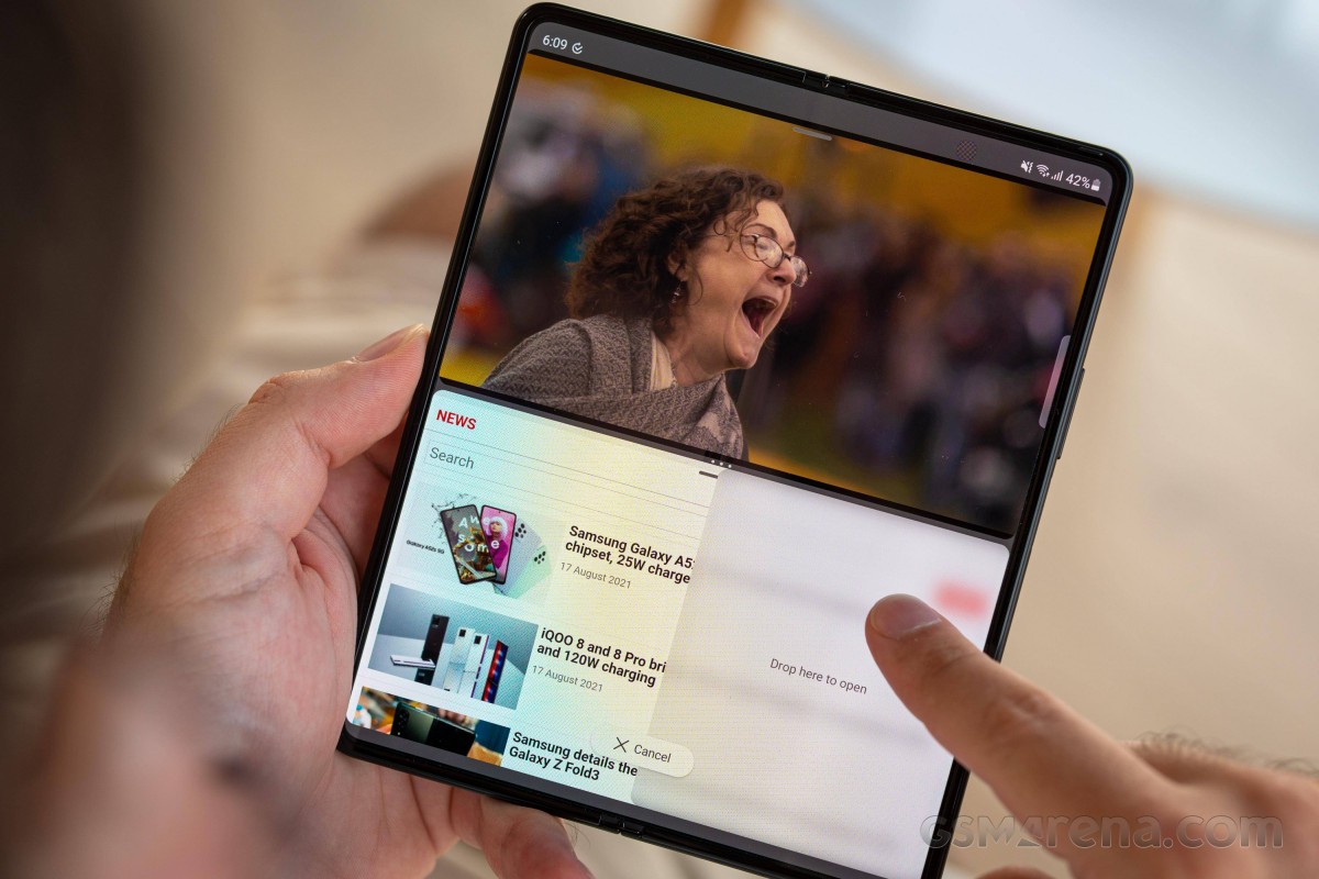
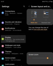
Since the Fold3 can be viewed as a small tablet when it's opened, split-screen multitasking becomes a much more important feature here than it is in a mainstream slab phone. But it's not just split-screen multitasking - the UI is split-screen too, and in pure Samsung fashion, while this is understandably the default, you can turn it off so that every part of the UI and every app behaves like it's on a weird huge square phone and not a small square tablet.
We kept the default "Multi view" on as we think you should too, it just takes advantage of the inner screen's aspect ratio in a much more logical way, presenting you with what we'd call categories to the left, and their contents to the right.
Now moving back to multitasking - you have the split-screen variety, of course, but also pop-up view, and you can even force these onto all apps (as some, by default, don't support both or either), through a Labs setting. To make multitasking even better, the Labs section also houses a way to go into Full screen mode while in split-screen view, thus hiding the status and navigation bars to allow more space for the apps' UIs.

Depending on your specific multitasking use case, this could come in very handy, or it might just add unneeded hassle, since to see the status bar, you'd then need to swipe down from the top, and if you use the navigation bar and not gestures, you'll have to swipe up from the bottom to make that visible every single time. Still, it's a good option to have, we reckon.
The Fold3 is the first foldable smartphone to support a stylus, the S Pen in this case, but unfortunately, we didn't have an S Pen to test during our time with the handset. And since long-term reviews are all about our personal experience using these devices, and we haven't used the Fold3 with an S Pen, we can't really say anything about what that's like. We would just add here that stylus use on smartphones is still a very niche thing, even if those who love using styluses on smartphones really love it.
Reader comments
- Sampath
- 18 Jul 2024
- IWT
Don't buy this phone because repair centre is not doing there repair free of charge In my phone I faced trouble in my back screen appeared one green line according to my knowledge it is common fault in Samsung phones but when I discuss with re...
- Shiwantha
- 18 Jul 2024
- IWT
I have one z fold 3 phone I bought it before 2 years suddenly yesterday it was appear green line on back screen I have heard Samsung company is doing free repair it so I discuss with repair centre but they told it can't apply for this phone I d...
- Wale
- 05 Jul 2024
- XBA
I can no longer make video recording on phone,it indicates "you can't make videos during calls" even though I'm not on calls.pls can you help


