Samsung Galaxy Z Fold4 review
Design, build quality, handling
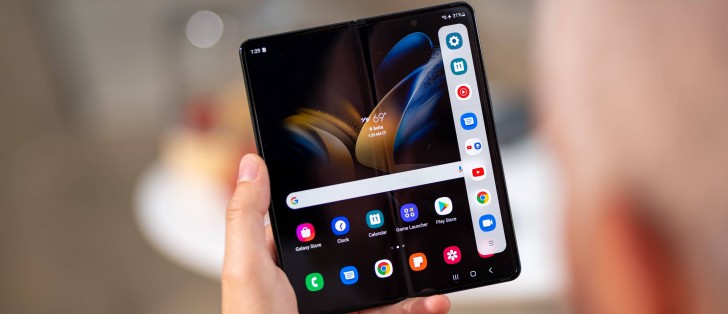
Large screen on the inside, smaller one out front, waterproofing, cameras facing every which way, S Pen support - with the foldable fundamentals dialed in, Samsung has been able to focus on minute details for this year's flagship release. Things like tweaking aspect ratios, minimizing bezels, shaving off a few grams off the total weight - perfecting rather than disrupting.
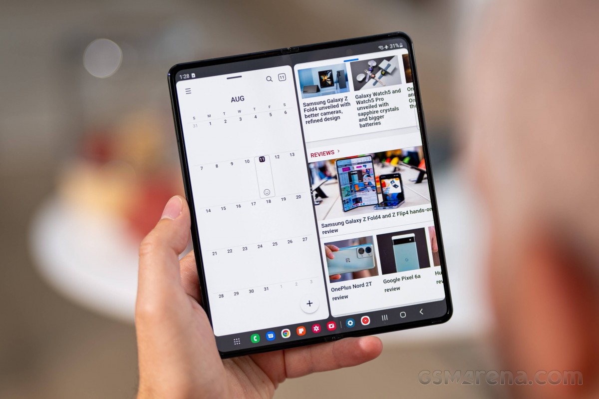
The inner screen remains at 7.6 inches in diagonal, but it takes a different path to arrive at that number compared to the old model. The new, more squarish, aspect of the screen may have some minor implications on its usability (positive ones, we'd say), but in its materials and composition, it shouldn't be all that different from the Fold3's.
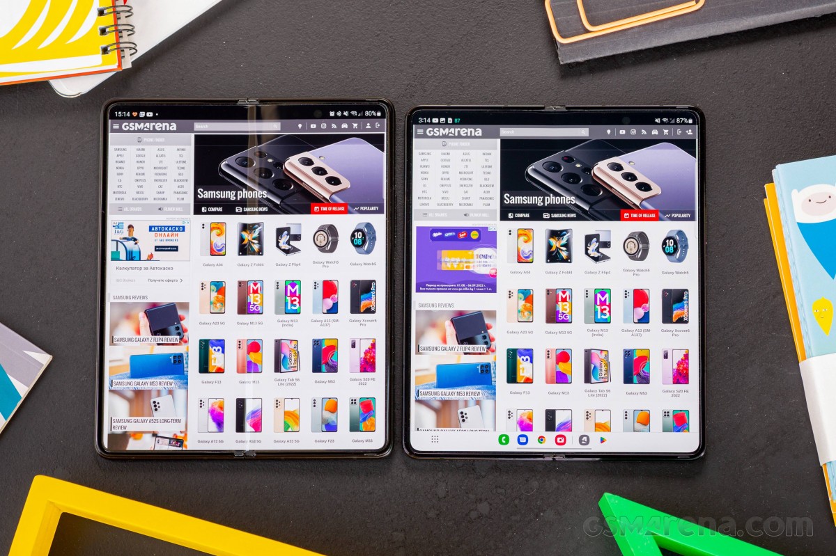 Galaxy Z Fold3 (left) next to the Z Fold4
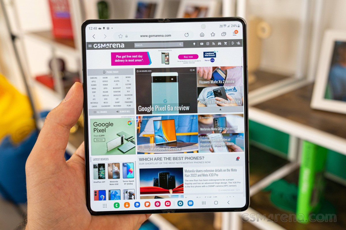
The flexible layer above the OLED pixels is still only sort of glass as far as our understanding goes, even though Samsung and the product's (most likely) supplier Schott call it UTG (Ultra-Thin Glass). It's a fascinating subject but the gist of it is that you could make glass bend if you make it thin enough (under 100µm, but 30µm is what's usually used on smartphones), but if you make it that thin you run into other issues, so you need additional treatment and... well, other layers.
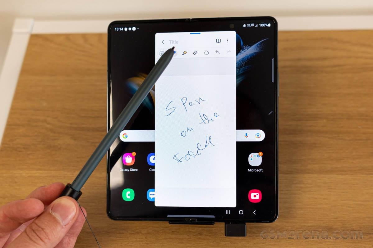
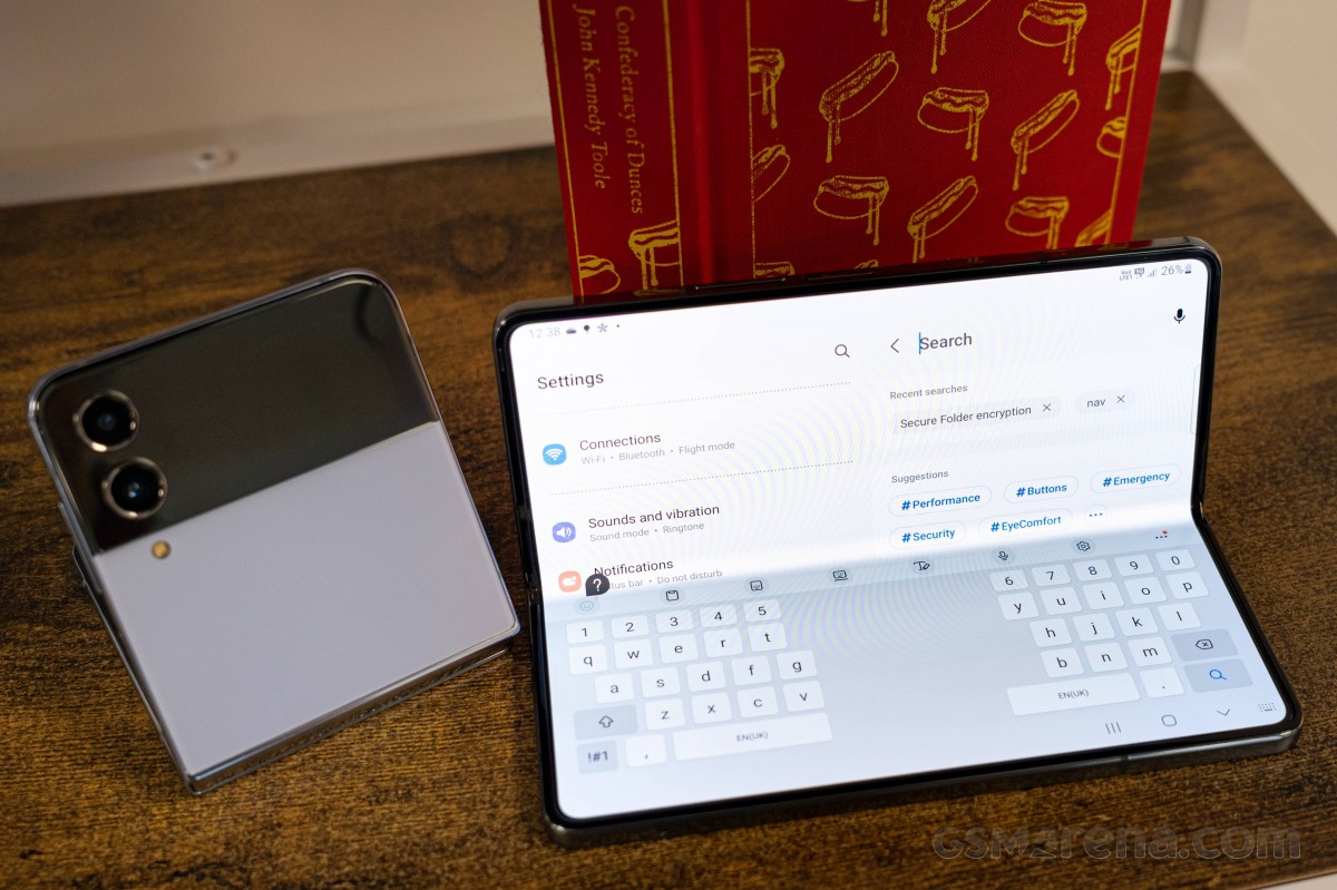
Untold structural layers aside, there's also Wacom's electromagnetic resonance grid in the sandwich that enables the S Pen functionality - a feat in itself on a foldable display. As was the case last year, you need a 'special' type of S Pen for use on the Fold because of its softer surface, and the phone will actively complain if you so much as bring one of the Galaxy Note or S22 Ultra styluses near its display (and also not register input, if you persist and poke it).
The S Pens that are compatible with the Fold are... well, the S Pen Fold Edition (which you can get bare, or as part of the Standing Cover with Pen case), and the S Pen Pro - all of these are sold separately. These specially designed styluses feature soft tips and internal dampers to ensure you won't scratch your Fold.
Because ultimately, the very top layer is plastic. In a way, it's a screen protector, but it's one of those protectors you shouldn't even think of removing - consider it an integral part of the display, even if some obscure youtuber or forum poster may say that their Fold is surviving without one just fine.
Plastic as it may be, it's a very nice-feeling protector, and it's nearly as smooth as real glass - not remotely as grippy to swipe on as early foldable screen implementations and somehow more premium than your garden variety plastic film found on other phones. Or at least we'd like to think that.
There are no weird cutouts to accumulate dust, and the protector reaches almost all the way to the bezels, so you won't be seeing a whole lot of its edges either.
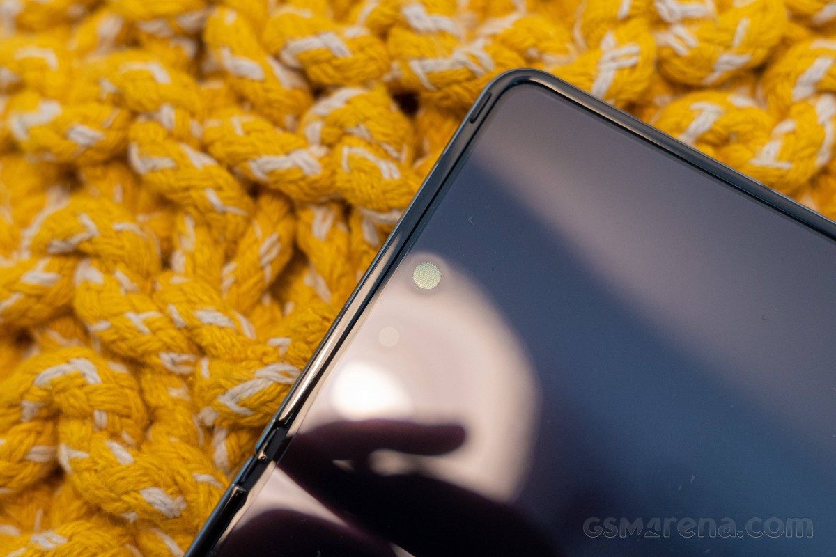
And since we're here, you won't be seeing a whole lot of the internal selfie camera under normal conditions either. The under-display unit is most visible with the screen off and less so with the OLED pixels on top of it illuminated, but it is at no point a real eyesore. You'll know it's there, and you'll see it if you look up close, but in general use, the combination of the hardware and your brain ignoring unimportant details will make this camera effectively disappear.
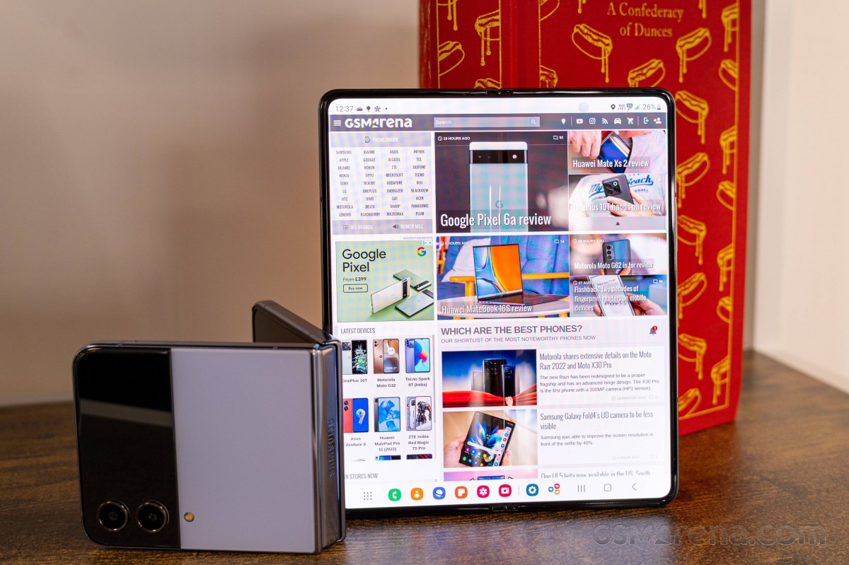
What's harder to ignore is the still present crease along the vertical axis of this panel. We may have been more willing to dismiss it in previous generations where the tech was still in its infancy, but this fourth-gen ultimate foldable should be held to a higher standard.
The arguments remain that you probably won't be swiping across the crease all that often, and you won't be looking at the display at odd angles, thus minimizing the crease's negative effect on your perception of premiumness. We get those.
But then you do swipe across it or tap smack in the middle to change something about the multi-window arrangement, and you do feel it. And it's also fairly visible when you're looking at mostly white content at an angle - visible in that you're getting bluish shifts along the line.
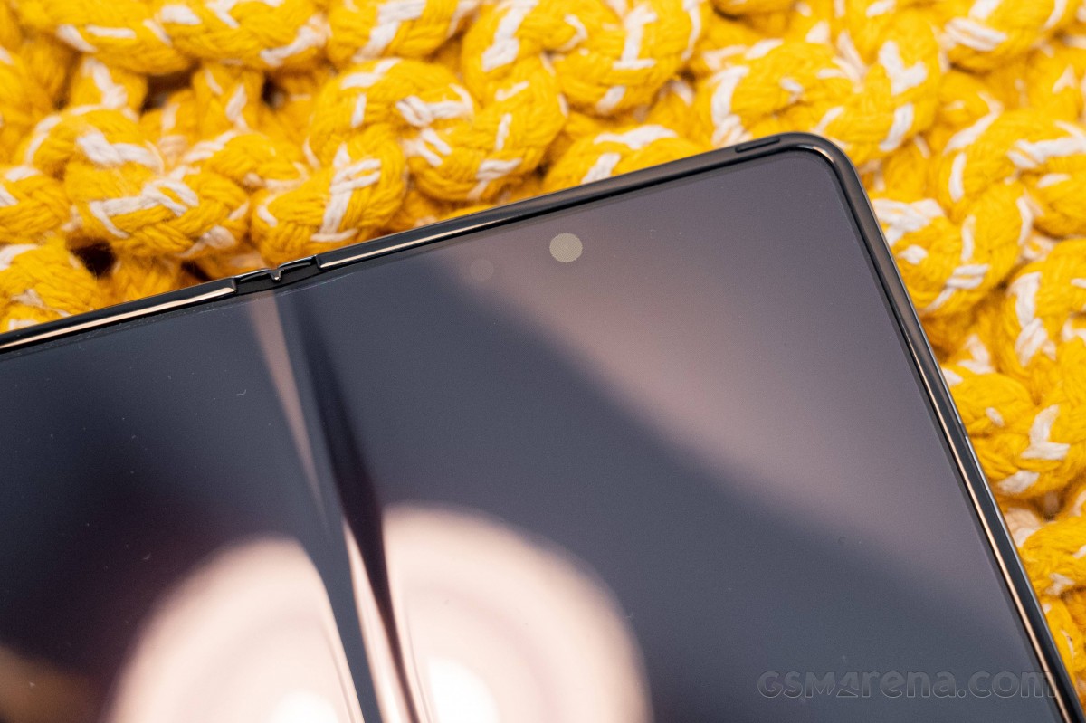
Samsung's foldables have stuck to this design while competitors have adopted different bending geometries allowing them to achieve smoother, flatter panels when unfolded. It has been postulated on the internet that the reason for this is the inability (at least for now) to provide waterproofing on those other designs, and indeed, the Flips and Folds are the only foldables with an IP rating (IPX8, no dust/dirt/sand, just water resistance). It seems like Samsung is taking the sensible side in this trade-off, but we'd just like to have both - waterproofing and no crease, please?
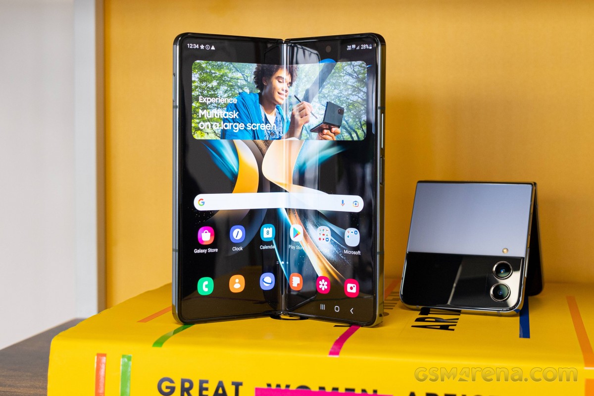
Intertwined with the crease situation is the gap situation, one of multiple unique aspects of the hinge design. The Z Fold4 still folds in on itself, leaving a wedge-shaped air gap between the two panels, a rather visible one. On the one hand, that ensures the display halves aren't touching, but it also allows for debris to get in there while the phone is closed - a state that should otherwise be considered the safest. Smacking the panel closed with an object big enough inside is a dreaded scenario, but that's not limited to the Fold. Otherwise, the raised frame around the entire perimeter does make sure that there's no contact between the display surfaces.
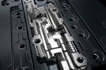
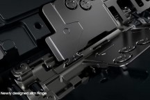
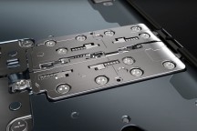
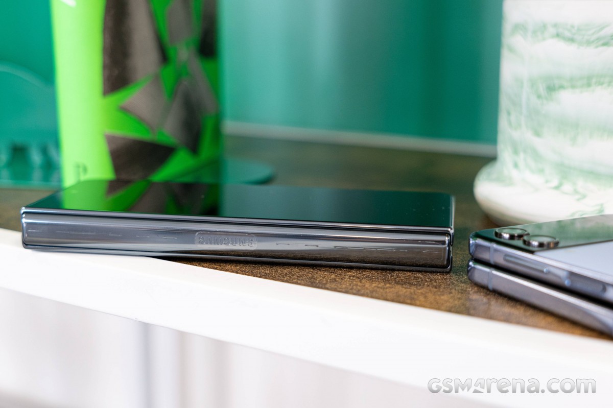
Speaking of that hinge, it's now a redesigned solution which throws away the gears in a push for slimness and weight reduction. But since the two halves still need to move in unison, Samsund developed a new way of ensuring that with a slide-y bit that interlocks with the hinge's rotating bits - and that's a reviewer with an engineering background writing this.
It's hard to talk about the durability of the design beyond the marketing speak, which Samsung themselves have toned down too - perhaps in a bid to normalize the fordable form factor, something like 'it's so good that we don't have to specifically state how good it is.
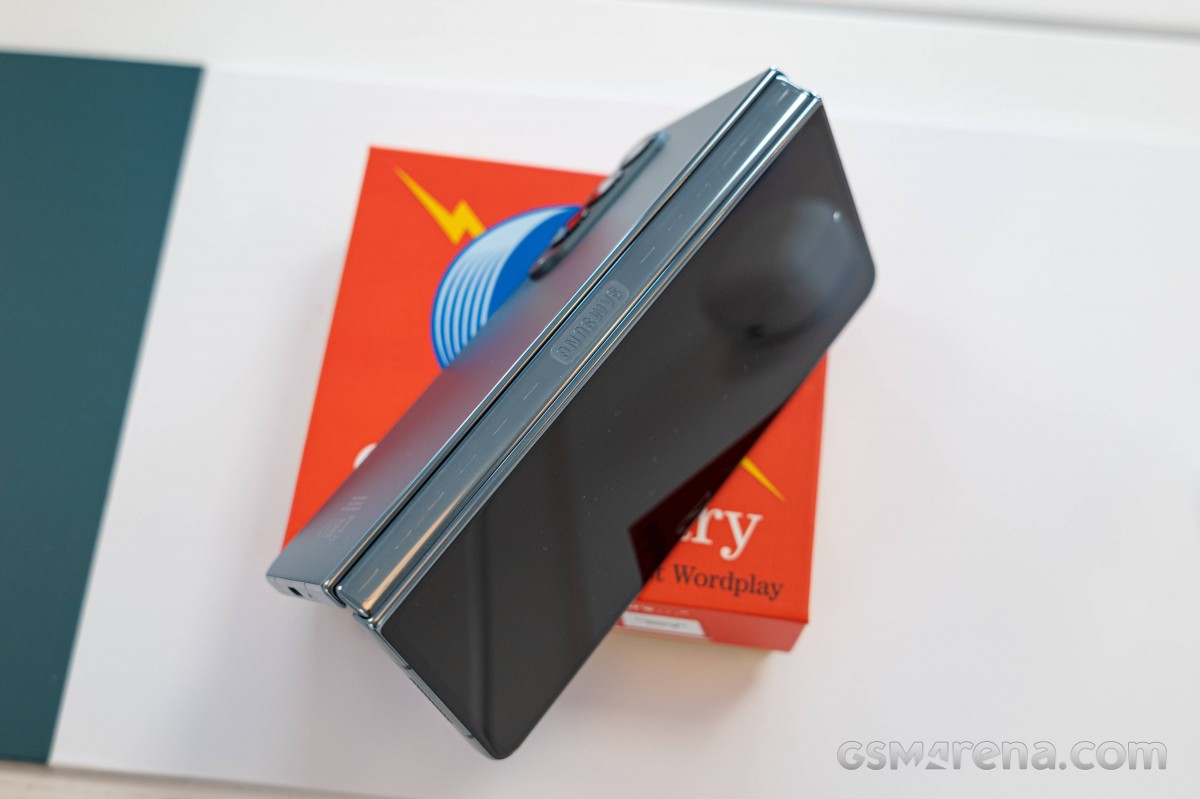
Another standout feature of Samsung's hinge implementation, which is here to stay despite the change in mechanism, is that it will happily remain at any angle between 75 and 115 degrees, enabling some use cases you can't get on other foldables, which mostly snap from closed state to open and back. We'd say that, all things considered, the crease is a sensible price to pay for all the good things you're getting in return.
The Fold4 is built using Armor Aluminum, just like the Fold3, but it's not like we know (or expect to know) what that means on an atomic level. Samsung did say last year with the launch of the Flip3 and Fold3 that its material is 10% stronger than what they had used previously, so there's that.
In more conventional terms (if still similarly outlandish when you think about it), the outer panels of the phone are made of Gorilla Glass Victus+, a Samsung exclusive formulation of Corning's latest protective glass.
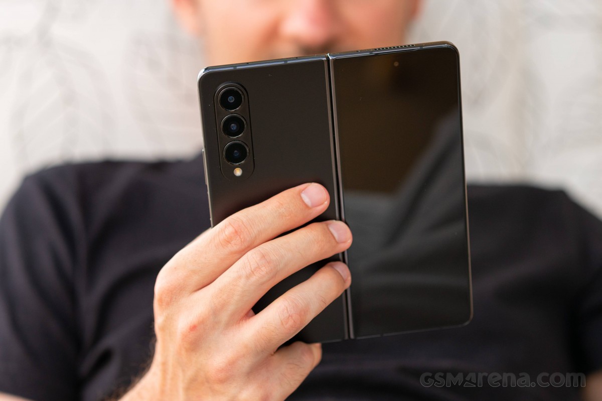
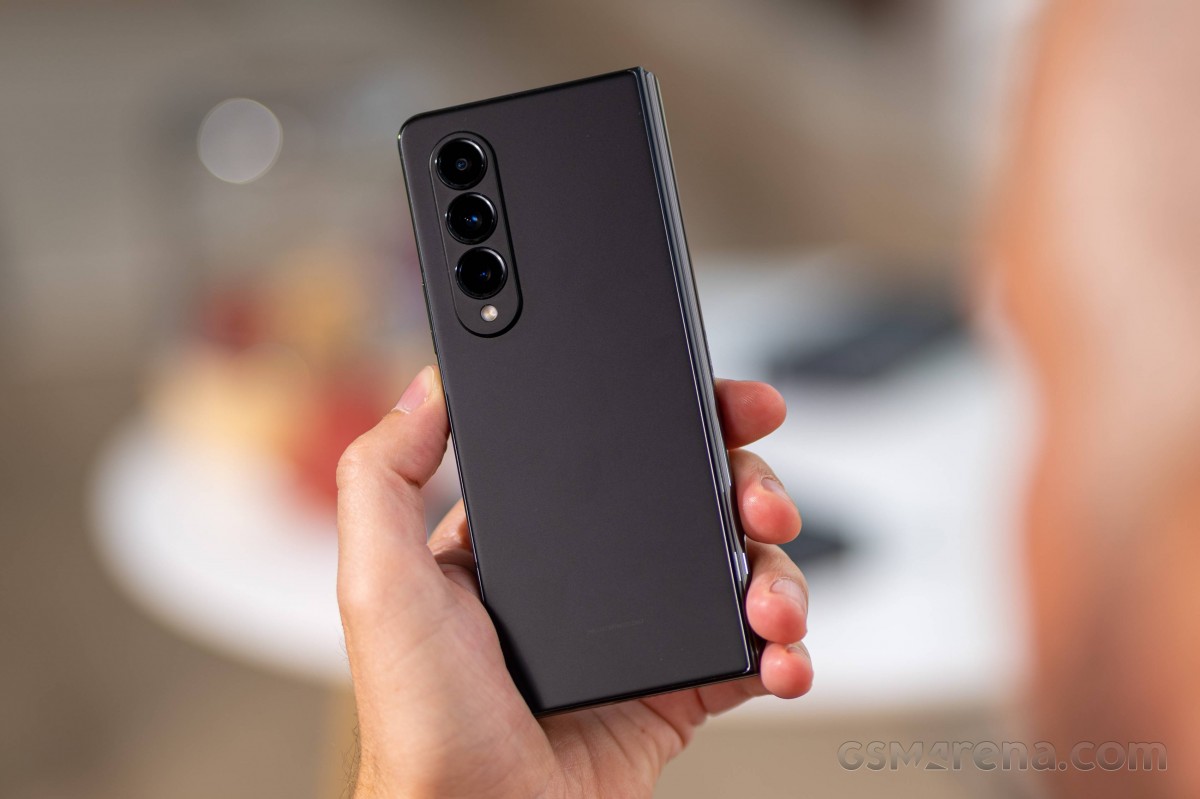
The back panel has a satin finish and one of those intermediate efforts, where it still kind of picks up fingerprints, but not a lot, and it's easy to clean. It's also neither particularly grippy, nor the slipperiest around. A rather successful balance, we'd say.
Balancing is what the phone does when placed on its back, too. The visually unchanged camera assembly does make it prone to rocking from side to side if you try to type on it under those circumstances.
The cover screen of the Fold4 also got a change of aspect, moving away from the 25:9 (that's nearly 3:1, if you hadn't thought it that way) to a more manageable 23.1:9, while maintaining the diagonal. What you're getting is a slightly shorter panel with marginally larger area. Most importantly, though, there's a 3mm increase in width - a much needed development, particularly from a keyboard typing perspective.
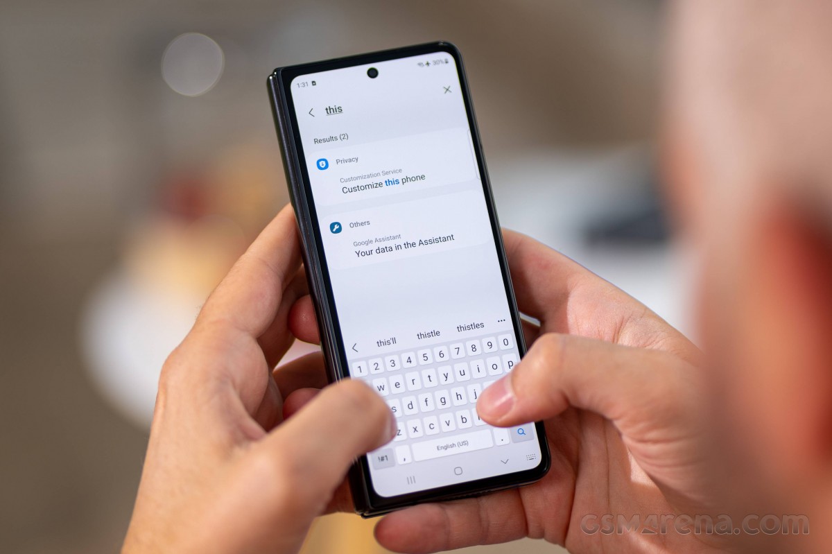
Alongside the change in proportions, Samsung also managed to chisel the bezels, making for an even more refined end result.
It takes more than a passing glance to spot these changes, however, especially if you don't fondle foldables frequently. The Fold4's cover screen still is unusually tall and has a punch-hole selfie camera, and that's about all the immediately noticeable things about it.
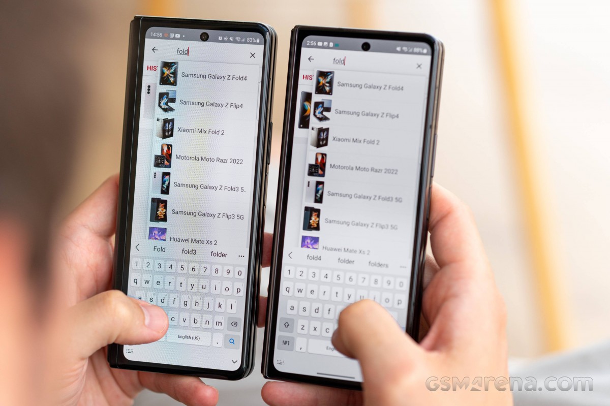 Galaxy Z Fold3 (left) next to the Z Fold4
If you're coming from the Fold3, however, there will be a rather tangible difference in the feel of the frame. The Armor Aluminum rails are noticeably flatter this year, a trend we're seeing with recent Samsungs. While we'd argue that it's the nicer looking and feeling design, there were some folks around the office who found the new design harder to pry open than the curvier frame of the Fold3.
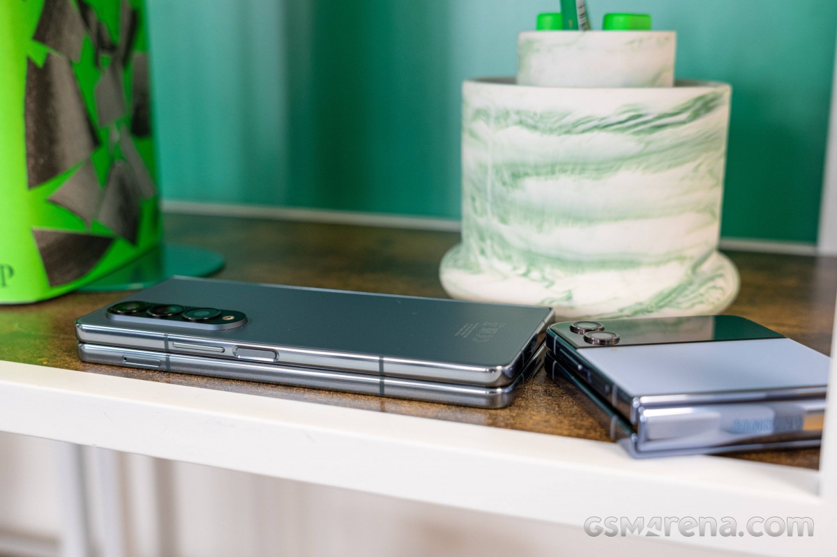
The shape of the frame is changed, but the location of the bits on it has remained the same. The power button on the right/rear half is placed just right for operating with either the left index finger or the right thumb. The capacitive fingerprint reader inside it doesn't discriminate and unlocks quickly and reliably with either digit - obviously, in table mode, your left index finger has no business there, but in the folded state, all is great.
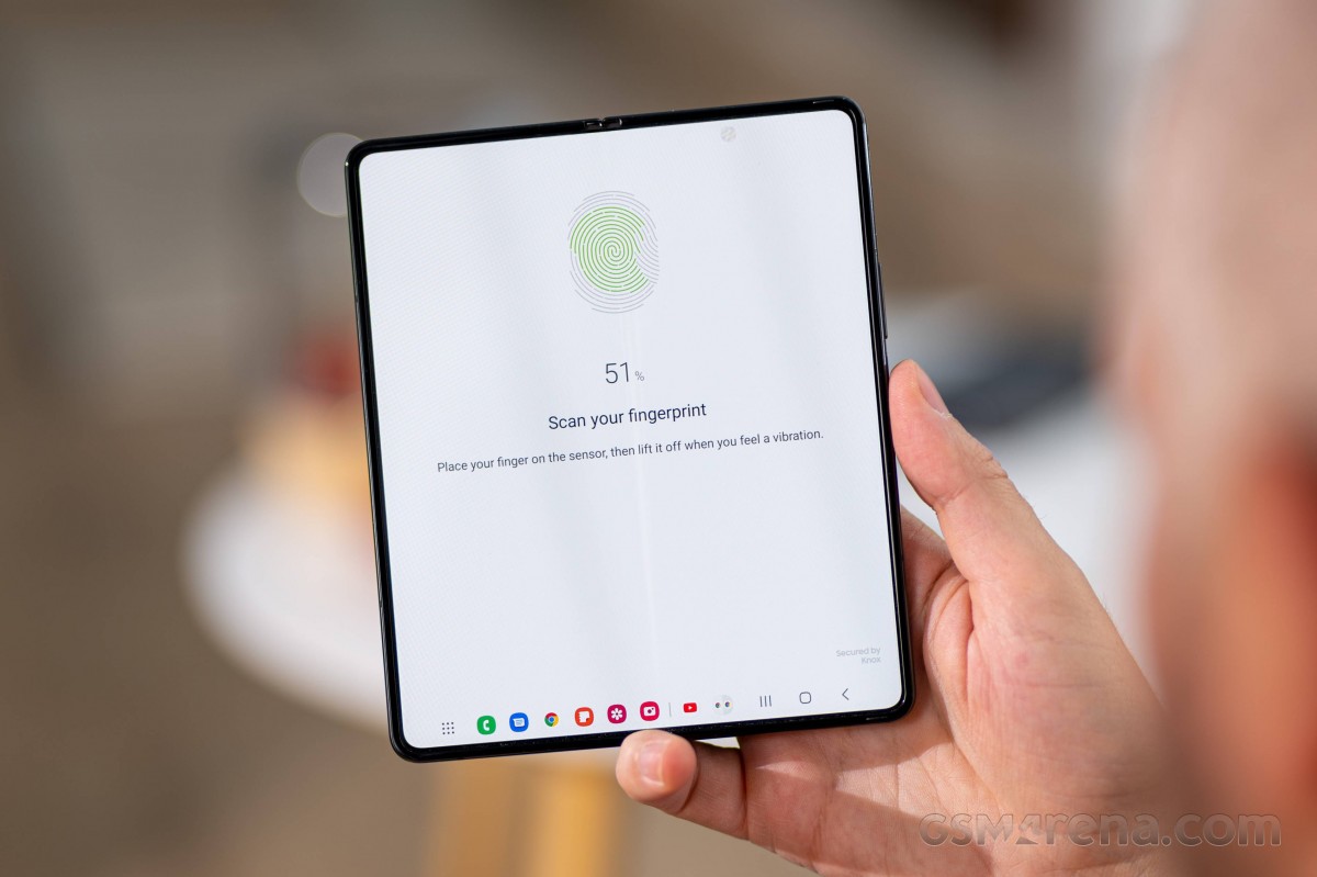
The volume rocker is right above that power button and clicks as positively as on any other high-end Samsung, while the SIM slot is on the opposite half (dual nano SIM, no microSD option).
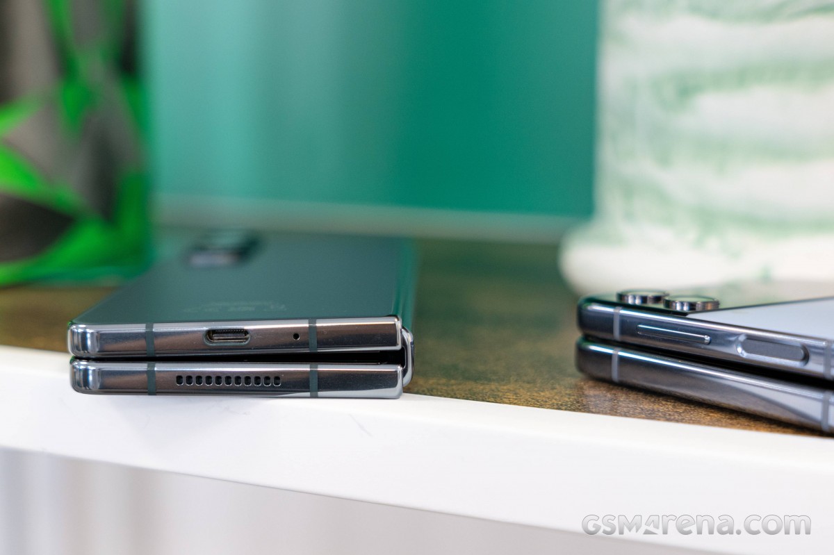
Both speakers are in the left/top portion of the Fold, a single mic is on the bottom while a total of three appear to be on the top. The USB-C port is in the center of the right/rear section, on the bottom.
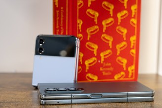
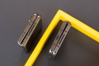
Volume rocker above the power button, SIM slot at the opposite end • Top and bottom
The Fold4 measures 155.1x67.1x14.2-15.8 mm in its folded state - precisely as wide as the old model, 3mm shorter and 0.2mm thinner. The change in height is negligible, the reduction in thickness is hard to see or feel, while the extra screen on the front while maintaining the same width is much appreciated. You're unlikely to feel the 8 grams of weight savings, though the 263g number does sound a little better than 271g.
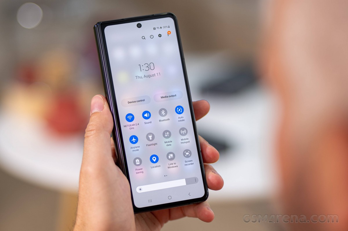
In the Fold4's tablet state, the numbers are 155.1x130.1x6.3mm, making the new device 2mm wider than the old one. Perhaps Samsung could continue this aspect evolution and culminate in a perfect square, with a 2:1 cover screen to complete the picture.
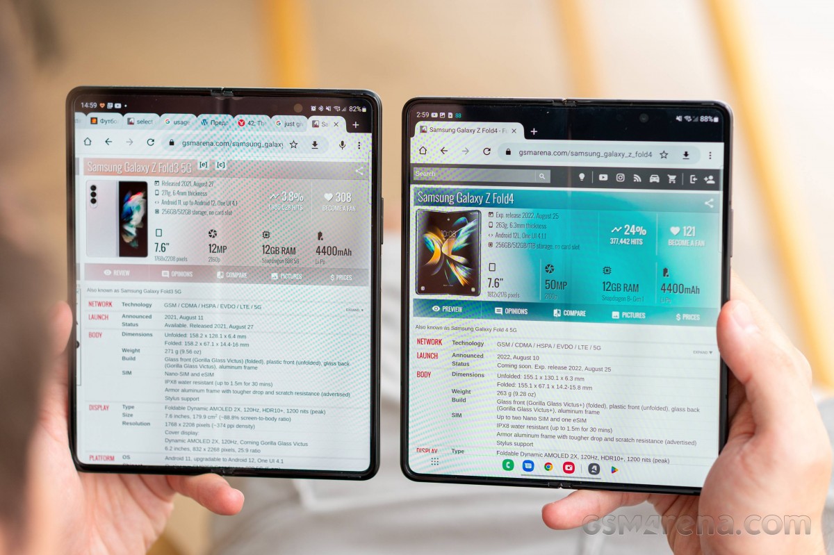 Galaxy Z Fold3 (left) next to the Z Fold4
Reader comments
- Cooe
- 11 Mar 2024
- Ib8
"The fine print starts with the fact that the main camera on the Fold4 is based on the Samsung GN3 sensor, whereas the S22s have an GN5 at the core. Both sensors have a 1/1.56" optical format, 50million 1.0µm pixels, and a Tetrapixel filter...
- Cooe
- 11 Mar 2024
- Ib8
"The cover screen of the Fold4 also got a change of aspect, moving away from the 25:9 (that's nearly 3:1, if you hadn't thought it that way) to a more manageable 23.1:9, while maintaining the diagonal." This is wrong!!! The F...
- Cooe
- 11 Mar 2024
- Ib8
"The flexible layer above the OLED pixels is still only sort of glass as far as our understanding goes, even though Samsung and the product's (most likely) supplier Schott call it UTG (Ultra-Thin Glass)." 🤦😑 Schott and soon Cornin...
