Samsung Galaxy Z Fold4 review
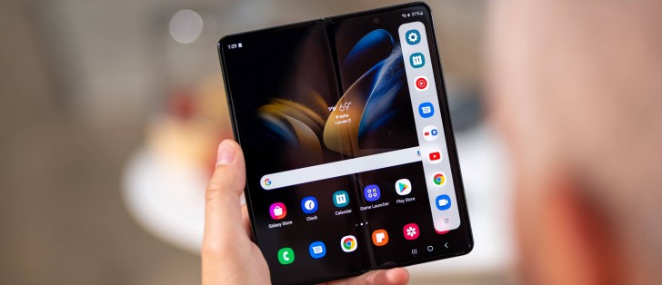
Android 12L, One UI 4.1.1, powerful multitasking options
The Galaxy Z Fold4 runs Android 12 with Samsung's One UI 4 on top, and both the core and the overlay are in unusual incarnations. The OS is 12L - the tablet- and foldable-specific version Google introduced earlier this year on Samsung's third-gen bendy phones. One UI, meanwhile, is 4.1.1 - the extra .1 is to set it apart from the mainstream flat Galaxy builds.
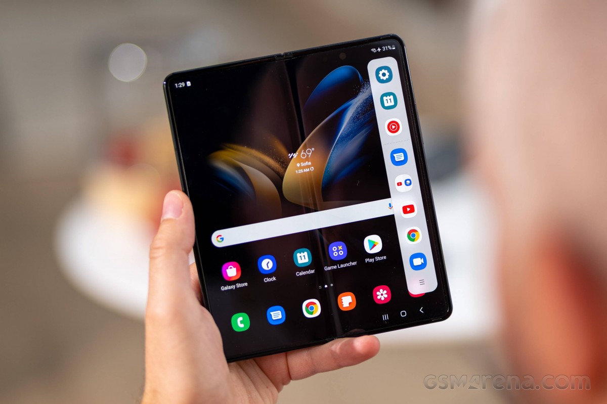
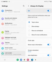
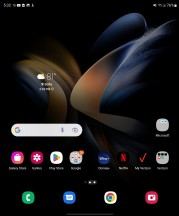
Even though most of the software experience is unchanged from the Fold3, there's a lot to unpack, so let's take things in their natural order. We'll start with the Always On display, for one, because it's the first thing you normally see before unlocking the Fold, but also to illustrate a point.
It's a good example of a feature that works identically on both the inside and the cover display, depending on whether the Z Fold4 is open or not. That applies to most of the display settings, including refresh rate, brightness and color. That's a common theme - Samsung has done an exceptionally good job of differentiating between the two displays for some features, where it makes sense, while naturally leaving shared settings for others, all without breaking the general UX flow.
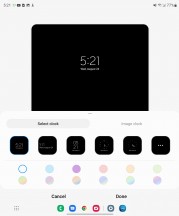
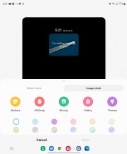
The lock screen is also shared between the two displays in pretty much all of its aspects, including the clock style, widget selection, and notification logic. All except for the wallpaper selection, which can be done on an individual basis for the two panels. This is one area where we feel that maybe some segmentation wouldn't hurt, though.

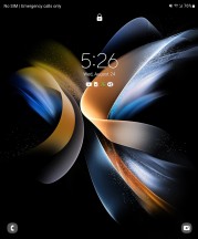
Lock screen: Cover display • Main display
The Home screen and App drawer, however, are superb examples of Samsung seamlessly separating out customization for the two panels. While the options here may look deceptively identical, you get to set them independently while the Z Fold4 is open and while it is closed. This includes everything from the app grid, widget selection, layout, and wallpapers. You can even have entirely different shortcuts on the two panels.


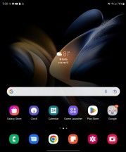
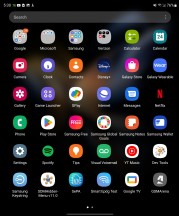
Cover home screen • Cover app drawer • Main home screen • Main app drawer
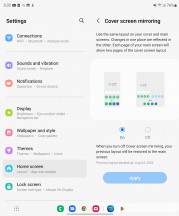
However, should you prefer to have the layout the same between the two, it's as easy as enabling the Screen mirroring feature. That will sync changes between the two UIs, and thanks to the internal display being essentially two cover screens side by side, you'll basically always see two outer home screens next to each other on the inner screen. The feature is available on the Fold3 in its current state, but we'd swear it wasn't there when it launched.
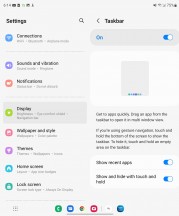
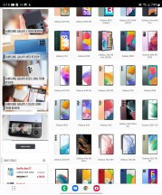
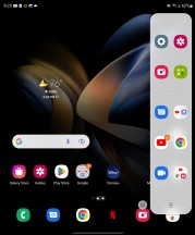
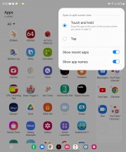
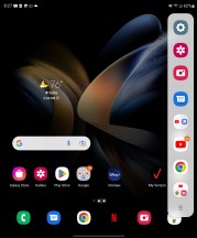
And if we label this a new feature, let's also mention something else here, that you may have spotted in a few of the screenshots above - the Taskbar. Apparently, one of the L bits from Android 12L and implemented on the Fold4 but not the Fold3 (yet?), it's a bar that shows a minimized view of the dock icons when you're away from the homescreen. You can also have it display recently used apps, and you can drag apps from there to the screen to launch them in multi-window mode. There's also a shortcut to the app drawer in the left corner too.
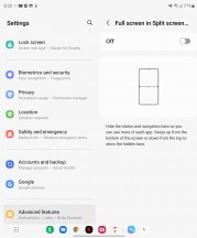
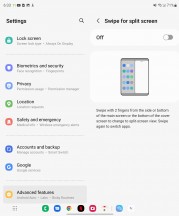
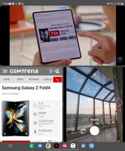
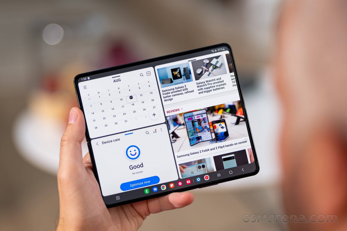
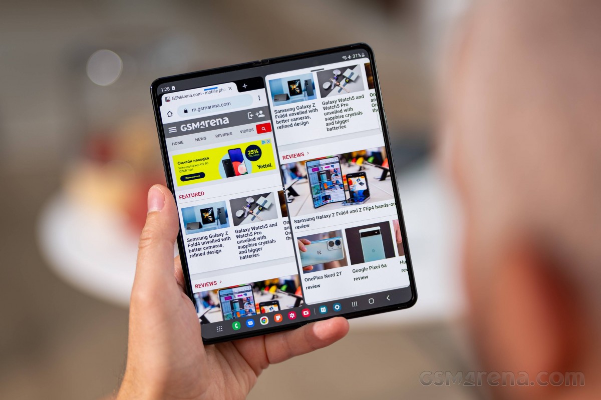
Who said multi-window? One of the Fold4's main attractions, the ability to have several apps displayed simultaneously in a number of configurations, is unrivaled on other foldables. For example, the simpler dual-split can either be horizontal or vertical, and no other phone seems to be allowing a top-and-bottom view.
You can control the split one way or the other by simply dragging the middle bar. Dragging is also how you can quickly and easily get content from one window to the other. The list of supported content types has been expanding and will likely continue to do so. Text and picture dragging, likely the most commonly used, is supported almost universally.
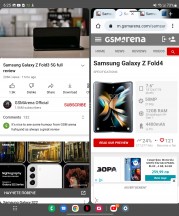
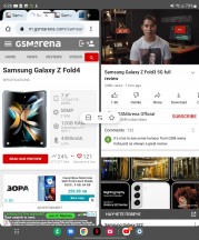
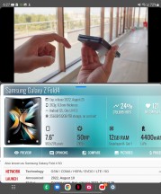
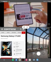
Controlling a basic two-way multi-tasking split
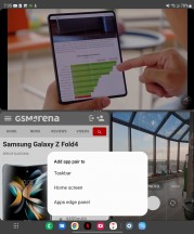
Clicking the dots on the middle bar provides a few options, including a quick way to swap the places of the two apps and another to change the orientation of the split. The third button saves this multi-tasking configuration as an entry in the App panel (more on that later), home screen, or taskbar.
Each app gets its own little oval control bar near the top while in multi-window mode. It can either be used to grab and drag the app for repositioning or bring up a few options with a click. These include the ability to go full-screen on the given app or collapse it further into a floating window.
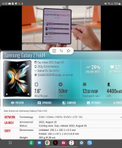
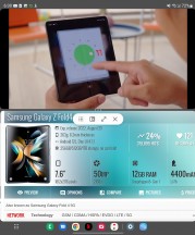
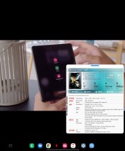
Manipulating individual apps in a multi-window configuration
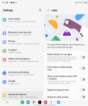
Samsung refers to this floating window as Pop-up View. Some apps won't cooperate fully, and some rare ones will outright refuse to go into this mode. To address that, however, One UI does include a Labs tab inside the Advanced features menu, with a toggle switch that can force multi-window and pop-up view on any app, regardless of whether the developer included support or not, with typically a pretty good success rate.
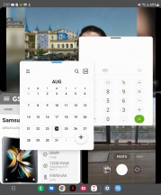
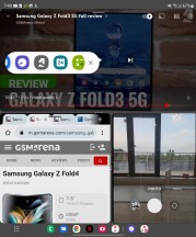
There's also a three-way multi-window split. It is a bit harder to initially set up, but once you dial it in just the way you like it, you just save it for later use in the taskbar or one of the other two spots mentioned above.
You can still drag content around in this setup and basically jump from app to app instantly. It is important to note that some apps won't necessarily be able to run concurrently while in this mode. Notable limitations include the ability to only have one video playing, both for convenience reasons and because of limitations in the Android video decoding pipeline. Some apps that do real-time updating might do it slower or put it on pause while in a small window and not in focus. It all depends on how they are coded, but overall most apps and a large chunk of Android are made to facilitate a single-app execution model first and foremost.
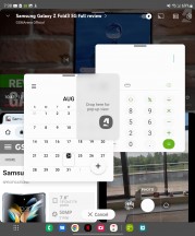
Nevertheless, you can even go beyond these three apps and rake multitasking even further with Pop-up View windows. You can pile up to five of these on top of a three-way split, making for a total of 8 "active" apps at the same time.
You can freely resize and drag these individual floating windows around and even set their transparency, although in most cases, that tends to add to the chaos rather than reduce it. You can also collapse the windows into what is commonly known as a "chathead". If you collapse multiple apps in this way, they will end up grouped in a folder-like manner, which helps keep things tidy.
There are other nuances and limitations to consider and discover, as well. For instance, certain apps refuse to run more than once, which is a thing Android developers can explicitly request in an app manifest for one reason or another.
Overall, Samsung went above and beyond in the multi-tasking features department. Perhaps even a bit too far in practical terms. Still, if you think there is a particular setup that will work great for your needs, chances are that the Z Fold3 can facilitate it, which is all that matters.
If you still find yourself wanting more freedom and an even more PC-like experience, the Z Fold4 does include Samsung DeX support, both wired and wireless to a monitor or TV, as well as a Windows PC, with a specific client.
On to what Samsung calls Flex mode or Flex view, a UI concept introduced on the Fold2 once the hinge could be kept stable at intermediate angles between 75 and 115 degrees. The phone is aware that it is in this physical state and lets the Android OS and any running app know. In this sense, Flex View is just a Samsung marketing term for triggering behavior already baked into modern versions of Android, specifically designed to make apps more aware of the current state of foldable displays, allowing them to adapt their UI.
The video player can do it, and so can the Gallery app. Both have their respective controls on the bottom and the content on the top. The Gallery app simply dedicates a trackpad-like touch area for navigating back and forward between images to the bottom half. A bit awkward and with limited usability, which honestly seems to often end up being the case with Flex View implementations.
The camera app is the most notable example of Flex View working in a beneficial manner. The idea is that, again, you get to have your controls on the bottom half of the display and the viewfinder on top. This is definitely useful for taking both selfies and shorts with the main camera while the phone is sitting on a flat surface. It just feels more natural.
Unfortunately, due to the fact that the main camera array and the cover display are on different sides of the Z Fold4, there is no way to leverage Flex view mode to take a selfie with the main cameras (while looking at a viewfinder). Some third-party apps are also on board, like YouTube, though it's not like its Flex view implementation is particularly for anything other than a stand replacement.
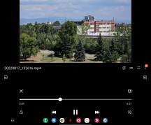
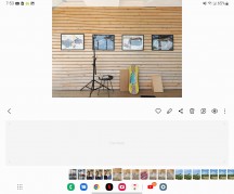
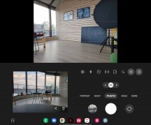
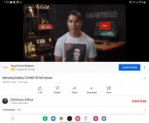
Flex view: Video player • Gallery • Camera • YouTube
For all the Fold-specific bits, a lot of the overall visual polish in the Fold's UI is actually a function of One UI itself and its ongoing refinement over the years. In that sense, many elements can be considered a "standard" Samsung affair, and you can read about those in any remotely recent Samsung smartphone review.
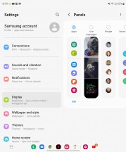
One of those bits does still relate to the whole productivity theme, so we'll say a few words about it as well - Edge panels, and specifically the Apps panel, which is the only one enabled by default (hardly an accident).
The Apps panel is convenient for a number of reasons. It holds a set of app shortcuts in two groups - ones you add there yourself and ones that it picks from your recent usage, though you can disable the latter. If you have 8 or fewer icons in the Apps panel, it will shrink to a single row saving you some screen estate.
There is also the ability to save any particular multi-tasking configuration as a shortcut there. This includes the apps, their relative position, and window size. Both dual and the newer triple-split multi-tasking setups can be saved, and recent setups also get automatically suggested.
What's gone missing is the Apps panel's pinning functionality, now deprecated by the Taskbar we mentioned before.
Performance and benchmarks
The Galaxy Z Fold4 is equipped with the Snapdragon 8+ Gen 1 - Qualcomm's latest. There's no regional divide with the Samsung foldables like there is with the regular flagships, so there's no Exynos version.
The SD 8+ Gen 1 is a familiar beast, and we've seen it in a number of phones already. Samsung's Flip4 and Fold4 are the first foldables to feature it that we get to test, however, so it's still interesting how the form factor affects the numbers.
Galaxy Fold4s come in three storage configurations - our review sample is the base 256GB variant, and there are also 512GB and 1TB options. RAM is always 12GB.
The Fold4 posted predictably great results for CPU performance in both single-core and multi-core GeekBench - it's among the highest multi-core figures we've seen, too (though, obviously, not by any meaningful margin). For what it's worth, the Fold is always slightly ahead of the Flip.
Naturally, the Snapdragon 888-powered Oppo Find N is noticeably lower down the chart, and the similarly equipped Mate Xs 2 is even further below, underdelivering for its hardware. It remains to be seen where the Xiaomi Mix Fold 2 will rank - mostly for academic arguments.
GeekBench 5 (single-core)
Higher is better
-
Galaxy Z Fold4
1337 -
Xiaomi 12S Ultra
1324 -
OnePlus 10T (High performance mode)
1321 -
Galaxy Z Fold4 (cover display)
1316 -
Asus Zenfone 9 (High Performance)
1313 -
Galaxy Z Flip4
1270 -
Galaxy S22 Ultra (1440p)
1180 -
Xiaomi 12 Pro
1169 -
Galaxy Z Fold3 5G
1095 -
Galaxy Z Fold3 5G (cover display)
1095 -
Oppo Find X5 Pro
1002 -
Oppo Find N
985 -
Oppo Find N (cover display)
985 -
Huawei Mate X2
956 -
Huawei Mate X2 (cover display)
956 -
Huawei Mate Xs 2
900 -
Huawei Mate Xs 2 (Unfolded)
884
GeekBench 5 (multi-core)
Higher is better
-
Asus Zenfone 9 (High Performance)
4338 -
Xiaomi 12S Ultra
4300 -
Galaxy Z Fold4 (cover display)
4028 -
Galaxy Z Fold4
3981 -
Galaxy Z Flip4
3913 -
OnePlus 10T (High performance mode)
3907 -
Xiaomi 12 Pro
3682 -
Galaxy S22 Ultra (1440p)
3657 -
Oppo Find N
3478 -
Oppo Find N (cover display)
3478 -
Oppo Find X5 Pro
3433 -
Huawei Mate X2
3389 -
Huawei Mate X2 (cover display)
3389 -
Galaxy Z Fold3 5G
3239 -
Galaxy Z Fold3 5G (cover display)
3239 -
Huawei Mate Xs 2 (Unfolded)
3131 -
Huawei Mate Xs 2
3079
In Antutu, the Fold's superiority over the Flip is even more pronounced, and the same goes for its advantage over the Find N and the Mate Xs 2. The Fold4's result is nearly exactly the same as what we got out of our Exynos S22 Ultra too. Other implementations of the SD 8+ Gen 1 do have a slight edge.
AnTuTu 9
Higher is better
-
Asus Zenfone 9 (High Performance)
1083092 -
Xiaomi 12S Ultra
1039412 -
OnePlus 10T (High performance mode)
1016958 -
Oppo Find X5 Pro
1012896 -
Xiaomi 12 Pro
985226 -
Galaxy S22 Ultra (1440p)
968359 -
Galaxy Z Fold4
964530 -
Galaxy Z Fold4 (cover display)
958817 -
Oppo Find N
822513 -
Galaxy Z Flip4
800001 -
Oppo Find N (cover display)
799386 -
Galaxy Z Fold3 5G
752218 -
Galaxy Z Fold3 5G (cover display)
724906 -
Huawei Mate X2 (cover display)
661044 -
Huawei Mate Xs 2
658825 -
Huawei Mate Xs 2 (Unfolded)
641608
In graphics benchmarks, the Fold4 naturally posts very different scores depending on whether you're carrying out the test on the big display or on the cover screen. How relevant the cover screen results are for anything or anyone is debatable - it's not the most convenient setup for gaming - but here they are as well.
GFX Aztek ES 3.1 High (onscreen)
Higher is better
-
Galaxy Z Fold4 (cover display)
78 -
Asus Zenfone 9 (High Performance)
67 -
Galaxy Z Flip4
60 -
OnePlus 10T (High performance mode)
60 -
Oppo Find N (cover display)
50 -
Galaxy Z Fold3 5G (cover display)
49 -
Galaxy Z Fold4
43 -
Xiaomi 12S Ultra
38 -
Huawei Mate X2 (cover display)
36 -
Xiaomi 12 Pro
36 -
Oppo Find X5 Pro
35 -
Huawei Mate Xs 2
34 -
Oppo Find N
32 -
Galaxy S22 Ultra (1440p)
30 -
Galaxy Z Fold3 5G
25 -
Huawei Mate X2
20 -
Huawei Mate Xs 2 (Unfolded)
19
GFX Aztek Vulkan High (onscreen)
Higher is better
-
Galaxy Z Fold4 (cover display)
72 -
Asus Zenfone 9 (High Performance)
69 -
Galaxy Z Flip4
62 -
OnePlus 10T (High performance mode)
60 -
Oppo Find N (cover display)
45 -
Galaxy Z Fold4
42 -
Xiaomi 12S Ultra
39 -
Xiaomi 12 Pro
37 -
Oppo Find X5 Pro
36 -
Galaxy Z Fold3 5G (cover display)
34 -
Huawei Mate Xs 2
34 -
Oppo Find N
33 -
Galaxy S22 Ultra (1440p)
29 -
Huawei Mate Xs 2 (Unfolded)
21 -
Huawei Mate X2 (cover display)
19 -
Galaxy Z Fold3 5G
18 -
Huawei Mate X2
12
GFX Car Chase ES 3.1 (onscreen)
Higher is better
-
Galaxy Z Fold4 (cover display)
98 -
Asus Zenfone 9 (High Performance)
89 -
Galaxy Z Flip4
74 -
Galaxy Z Fold3 5G (cover display)
60 -
Oppo Find N (cover display)
60 -
OnePlus 10T (High performance mode)
60 -
Galaxy Z Fold4
59 -
Huawei Mate Xs 2
51 -
Oppo Find N
51 -
Xiaomi 12S Ultra
51 -
Huawei Mate X2 (cover display)
46 -
Xiaomi 12 Pro
46 -
Oppo Find X5 Pro
44 -
Galaxy Z Fold3 5G
38 -
Galaxy S22 Ultra (1440p)
37 -
Huawei Mate X2
29 -
Huawei Mate Xs 2 (Unfolded)
28
In the offscreen runs, the Fold4 proves to be a capable performer as well, posting scores up there with the best. With the phone folded, the results were again consistently slightly lower than when it's unfolded.
GFX Aztek ES 3.1 High (offscreen 1440p)
Higher is better
-
Xiaomi 12S Ultra
46 -
Galaxy Z Flip4
46 -
OnePlus 10T (High performance mode)
46 -
Asus Zenfone 9 (High Performance)
46 -
Galaxy Z Fold4
45 -
Galaxy Z Fold4 (cover display)
42 -
Xiaomi 12 Pro
41 -
Oppo Find X5 Pro
40 -
Oppo Find N
31 -
Oppo Find N (cover display)
31 -
Galaxy S22 Ultra (1440p)
31 -
Huawei Mate X2
29 -
Huawei Mate X2 (cover display)
29 -
Huawei Mate Xs 2 (Unfolded)
28 -
Huawei Mate Xs 2
28 -
Galaxy Z Fold3 5G
20 -
Galaxy Z Fold3 5G (cover display)
17
GFX Aztek Vulkan High (offscreen 1440p)
Higher is better
-
Asus Zenfone 9 (High Performance)
52 -
Xiaomi 12S Ultra
51 -
OnePlus 10T (High performance mode)
51 -
Galaxy Z Fold4
50 -
Xiaomi 12 Pro
45 -
Galaxy Z Flip4
45 -
Oppo Find X5 Pro
44 -
Galaxy Z Fold4 (cover display)
43 -
Galaxy S22 Ultra (1440p)
35 -
Huawei Mate Xs 2 (Unfolded)
31 -
Huawei Mate Xs 2
31 -
Huawei Mate X2
31 -
Oppo Find N
30 -
Huawei Mate X2 (cover display)
29 -
Oppo Find N (cover display)
29 -
Galaxy Z Fold3 5G
19 -
Galaxy Z Fold3 5G (cover display)
19
GFX Car Chase ES 3.1 (offscreen 1080p)
Higher is better
-
Xiaomi 12S Ultra
104 -
Asus Zenfone 9 (High Performance)
104 -
OnePlus 10T (High performance mode)
103 -
Galaxy Z Fold4
102 -
Xiaomi 12 Pro
96 -
Oppo Find X5 Pro
94 -
Galaxy Z Fold4 (cover display)
92 -
Galaxy Z Flip4
83 -
Galaxy S22 Ultra (1440p)
76 -
Oppo Find N (cover display)
75 -
Oppo Find N
73 -
Huawei Mate Xs 2 (Unfolded)
72 -
Huawei Mate Xs 2
71 -
Huawei Mate X2
61 -
Huawei Mate X2 (cover display)
56 -
Galaxy Z Fold3 5G
55 -
Galaxy Z Fold3 5G (cover display)
55
3DMark Wild Life Vulkan 1.1 (offscreen 1440p)
Higher is better
-
Xiaomi 12S Ultra
10533 -
Asus Zenfone 9 (High Performance)
10469 -
Galaxy Z Fold4 (cover display)
10398 -
Galaxy Z Fold4
10382 -
Oppo Find X5 Pro
9758 -
Xiaomi 12 Pro
9664 -
Galaxy Z Flip4
8460 -
Galaxy S22 Ultra (1440p)
7437 -
Oppo Find N (cover display)
5931 -
Oppo Find N
5928 -
Huawei Mate Xs 2 (Unfolded)
5830 -
Huawei Mate Xs 2
5814 -
Huawei Mate X2 (cover display)
5751 -
Huawei Mate X2
5693 -
Galaxy Z Fold3 5G
5635 -
Galaxy Z Fold3 5G (cover display)
5563
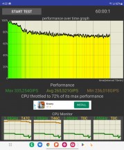
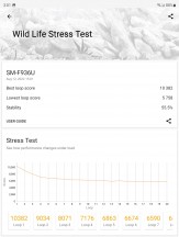
Similarly, we observed improved stability in sustained load benchmarks when we ran them on the big screen compared to the cover screen runs. The differences weren't huge but were consistent, and consistency is good. The CPU throttling test on the outer screen showed a pretty gradual performance ramp down and leveled off around the mid-70s, which isn't half-bad for these high-end chips in a body that, we imagine, can't be thermally constrained. The GPU is less of a stable performer, getting a 55% stability rating in 3D Mark Wild life stress test, though that is mostly par for the course in the flagship class.
Reader comments
- Cooe
- 11 Mar 2024
- Ib8
"The fine print starts with the fact that the main camera on the Fold4 is based on the Samsung GN3 sensor, whereas the S22s have an GN5 at the core. Both sensors have a 1/1.56" optical format, 50million 1.0µm pixels, and a Tetrapixel filter...
- Cooe
- 11 Mar 2024
- Ib8
"The cover screen of the Fold4 also got a change of aspect, moving away from the 25:9 (that's nearly 3:1, if you hadn't thought it that way) to a more manageable 23.1:9, while maintaining the diagonal." This is wrong!!! The F...
- Cooe
- 11 Mar 2024
- Ib8
"The flexible layer above the OLED pixels is still only sort of glass as far as our understanding goes, even though Samsung and the product's (most likely) supplier Schott call it UTG (Ultra-Thin Glass)." 🤦😑 Schott and soon Cornin...
