Samsung Gear S2 review: Shifting gears around
Shifting gears around
A powerful custom Tizen OS
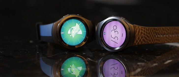
The Samsung Galaxy Gear S2 relies on Tizen OS to run the show. Frankly, that's not really surprising, considering the company relied on its mobile OS for previous smartwatch products, but that wasn't always the case. As you might remember, the Korean giant underwent some serious soul-searching with its wearables, oscillating between Android Wear and custom solutions. In any case, Tizen is currently the OEM's development path of choice, but we wouldn't be at all surprised if custom Android Wear ROMs for the Gear S2 start popping up online at some point.
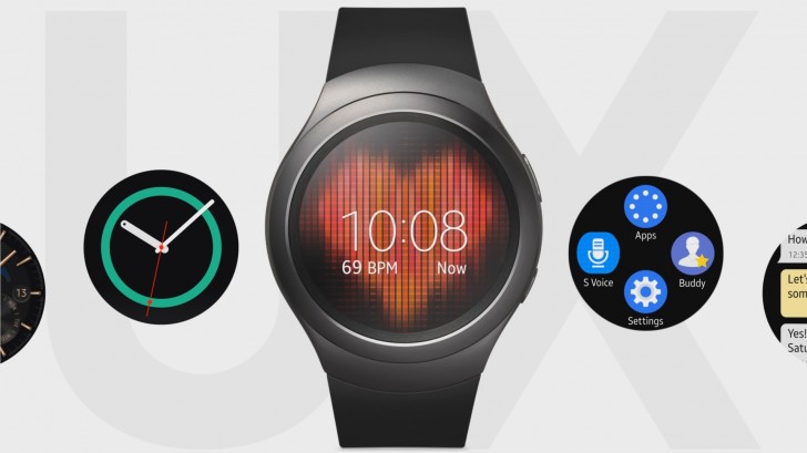
Overall, this custom approach falls in line with Samsung's other recent wearables and while it does sacrifice on compatibility and misses out some on the ever-growing Android Wear ecosystem, it does also have its major advantages. What we weren't expecting, however, is how streamlined and efficient it is. Not to mention - fast, really fast.
So fast in fact, you would be forgiven to think the Gear S2 is more powerful than its spec sheet suggests. Combined with the physical interaction with the rotating bezel, the sensation you get from interacting with the watch is truly futuristic. In fact, we often found ourselves playing with the wheel for no apparent reason, it is just immensely satisfying. No matter how fast you push it, the interface just keeps up, no lag, no frame drops, just smooth animation all around.
On top of that, the Gear S2 user interface looks the part. It's as if Samsung's first circular smartwatch has given them the creative freedom to start over, unfazed by previous failures. Everything is clean, well-spaced and properly organized throughout the user interface.
The circular design is blended seamlessly everywhere, from the menus and icons, all the way to every interface and even the scroll bars. It just seems natural and meant to be, which is a definite plus for the custom solution, as opposed to Android Wear that despite all the visual improvements, still has some oddly cropped interfaces on a round device. There aren't any hidden menus, save for a few tap-and-hold affairs here and there.
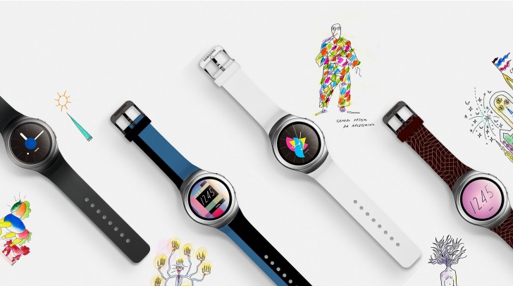
The watchface interface is one such area. Whichever watchface you pick, it's going to look nice. An added feature we adore is the ability to stylize the watchface. You can add date, world clock, heart rate, battery status, steps and more. Those appear as little actionable widget-style controls in certain areas of a watchface and bring up their own interface when pressed - quite convenient.
Samsung has made sure to spice things up a bit in terms of this added watchface functionality, including some skins that measure your heart-rate periodically or remind you visually when you have been sitting for too long, with a growing blob on the dial.
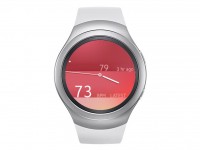

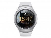
Watchfaces have lots of added functionality and in-depth customizability
In terms of looks, you can pretty much change everything you see, from dials to clock hands. This is available both from the watch and the companion app. The latter is a lot easier, although doing it on the watch itself is arguably more fun, simply because you get to cycle through option with the dial.
And if you would rather pick out a ready-made skin, Samsung is offering a plethora of those in its Galaxy App store. There, you can also download third-party offerings, which can show you stock prices, sports results and news, but more on that later.
And as long as we are on the topic of the companion app, we must note that Samsung has broken out of its restriction policy of the past and now allows non-Galaxy smartphones to connect to its smartwatch, as well. Naturally, the Gears S2 still prefers to play with a Galaxy phone, preferably a recent and higher-end one, but a TouchWiz-based environment is no longer mandatory, as long as you are running Android 4.4 or higher and have 1.56GB of free RAM. We tried out the Gear S2 with the recent HTC One A9 and had little issues activating and connecting, but the process did involve installing a few additional services and plugins off the Google Play store.
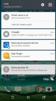
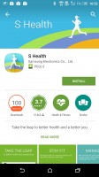
Setting things up on a non-Samsung device takes a few extra installs, but is relatively painless
It is also worth mentioning that the Gear app has a lot more going on under the hood than might meet the eye. It is actually a big framework of various API's, hooks and services that attach themselves to almost every core functionality of your device, so as to monitor and relay information to your wrist, be it notifications, calls or multimedia.
The Android Wear companion app is pretty much the same deal, so this shouldn't worry you, but whereas Google has already set a lot of the groundwork for its wearables inside Android itself, Samsung has a lot more code to implant for the Gear S2 to work. What this all means is that while the Gear S2 can be used with most any recent Android phone out there, your experience may vary greatly and compatibility issues are not unlikely. But, just like iOS compatibility for Android Wear, no one seems to be expecting or aiming for perfection.
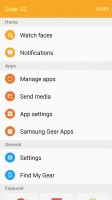
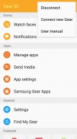
The Gear manager app offers a clean interface
There are also a few apparent things that change in the experience when the Gear S2 is coupled with a non-Samsung mate. The dedicated email app disappears from the watch, presumably because it relies in part on the presence of Samsung's own smartphone email client.
S Health and Maps continue to work autonomously, but also require their respective Android apps to be downloaded for additional functionality. Having S Health on your phone is particularly important for syncing all the tracking data and assuring various related features run on the watch, but thankfully, it is now available for download by anyone on the Google Play Store.
But despite all the aforementioned complexity of the Gear app, it is surprisingly well organized and straight-forward form a user standpoint, which is all that matters at the end of the day.
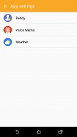
Besides the already mentioned watchface editor, the Gear app also offers a notification center for per-app control, as well as an easy way to manage the software running on the Gear S2 itself. You can reorganize the menu, install new apps from the Samsung store and even change available setting on the ones you already have installed.
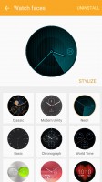
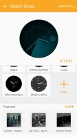
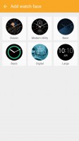
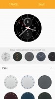
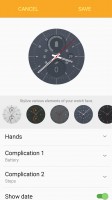
Stylizing watchfaces is a pleasant and in-depth experience
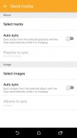
Transferring media to and from the Gear S2's 4GB onboard memory is also done through the Gear Manager and is quite straight-forward: select the media, upload it and it becomes available in Music or Gallery, respectively.
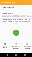
Last, but definitely not least, there is the Find My Gear option. It can track down your watch easily and make it light up and vibrate. This can naturally be done through Bluetooth or an internet connection. So, if your watch has an active Wi-Fi connection, it should be reachable as well.
Conveniently enough, Samsung has made sure that the Gear S2 seamlessly gets all the Wi-Fi profiles your phone has, making the whole system even more versatile. On the 3G model, finding the device is even more-powerful - it simply needs to be powered and within cell range.
In fact, most every function of the Gear S2 is accessible through Bluetooth, as well as over an internet connection. Searching for your phone via the wearable is just as easy and powerful as well. Besides merely ringing your phone, which shouldn't be an issue anyway, you can also get its GPS coordinates and display them on a map. Generating the interface does put some strain on the Gear S2 and naturally requires a working data connection, but once the content is loaded, scrolling and zooming (with the wheel, of course) is pretty smooth, just like the rest of the UI.
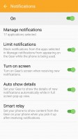
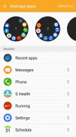
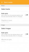
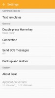
Notification, app and multimedia management is streamlined within the Gear app
Navigation and basic functionality
As already mentioned, the Gear S2 has no shortage of input controls and you can use most of them interchangeable across the user interface. This is quite convenient and drastically reduces the learning curve for new users.
The main starting point of the interface is, of course, the watchface. It lights up automatically when you bring the Gear S2 up and look at it. The detection works pretty well and is consistent, but you can also wake up the watch by tapping the screen or any other button. You also get a low-energy variant of the watchface, with only the arrows visible, just like on Android Wear and there is an option to keep them always on screen, but it does take a toll on the battery.
The Gear S2 also recognizes a cover gesture. It is quite convenient. If the watch is in your way at any time, just put your palm on the screen and it will go off.
A flick to the left or a turn of the bezel the same direction gets you to the notification pane. Tapping on a notification, depending on what it is, will give you an action to perform: Facebook Messenger will give you a thumbs up, while an email can be deleted. Swiping up will dismiss them.
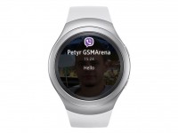
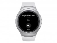
Actionable notifications are a nice touch
In our experience with the Gear S2, not all notification came through vibrating on the wrist and grabbing our attention. While this may be good for some occasion, you may want to set up notifications of choice as priority from Android's settings menu.
Going to the right gets you to the Gear S2 home screen panes. You can add, remove or edit any of them without affecting the performance of the watch.

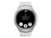
Screen panes and the options shade
Pull down from the top reveals a quick settings menu. There, the Gear S2 shows the battery level, whether Wi-Fi is turned on, as well as shortcut to the Music app, do not disturb mode and brightness settings. And the always on option as well.
In any other interface, besides the watchface, pulling down acts as a Back action, but you can always use the top or bottom physical buttons for that as well - the top one being a single step back and the bottom, acting more like a home button that just brings up the watchface.
The Gear S2 does have an app drawer, which, by default, is placed on the first panel to the right, along with a buddy interface for favorite contacts and shortcuts to Settings and S Voice. This, of course, can be rearranged to your liking or even removed altogether, but you might want to leave the app shortcut somewhere.
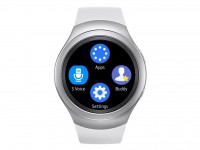
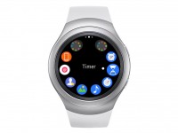
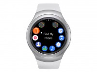
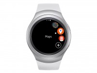
Default first pane and app drawer interface
The app drawer is where all your additional software resides. The custom Tizen OS might not be as rich as the sprawling Android Wear ecosystem, but there are still quite a few apps to download from the Samsung store and all the basics seem to be covered, but more on that later. The interface is beautifully designed and arranged in a circle. Scroll all the way to one side and the page switches. It is a nice and convenient system that works well and takes full advantage of both the form factor and the available controls.
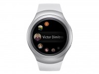
The Buddy list is simply a shorthand for your favorite contacts. From here you can quickly initiate a call or message somebody, the latter offering a choice of either some predefined messages, typing out something on the small touchscreen, sending a smiley or voice dictation.
The integrated S Voice functionality allows you to issue commands to Samsung's S Voice, as well as respond to messages across the interface. In our testing, the voice recognition fared decently. The microphone pinhole is between the two buttons and depending on how noisy the surrounding area is, you'll get mixed results. Our main gripe with it was not being able to easily set a wake-up word. The smartwatch was unhappy with the slight differences in the tone of our voice for some reason.
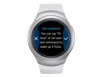

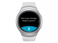
S Voice commands, complete with a wake-up word
Anyway, you can also type out a message with the Gear S2's keyboard. As hard as it might look to type on it, with a little patience, you can send an occasional emergency text. However, having the phone at hand for the task is a better idea. We recommend using Samsung's ready responses. Naturally, you can add custom ones of your own, too.
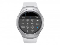
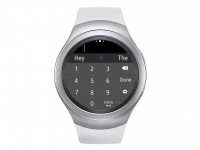
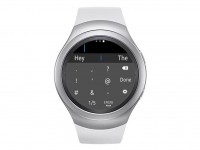
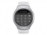
Typing on the Gear S2 is doable, but hardly preferable
Of course, you can always opt for a simpler on-the-fly response with pre-defined messages and emoticons. All of the aforementioned options are valid across the Gear S2, even when replying on third-party apps, like Viber.
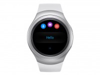
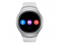
You get a selection of response choices
Fitness tracking, apps
As stylish as it is, the Gear S2 is also a great sidekick for the times you participate in any type of sports. The companion S Health app on the Gear S2 is excellently designed and gives you an easy overview of your daily activity. It tracks steps and runs, calories, heart rate as well as coffee and water intake (if you care enough to input those on every consumption). All the data is stored on the watch, but also synced across to the full S Health app on your phone if you have it installed (and you really should get it with this particular watch).
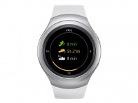
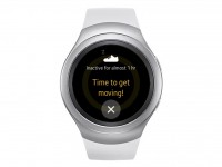
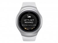
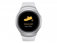
S Health integration is extensive and spread all throughout the Gear S2
We love how the Gear S2 reminds us in a friendly manner to move a bit after long periods of inactivity. It's motivating and, if you don't ignore it, it's potentially quite beneficial in the long run. Opening the S Health app greets you with an aggregated view of your runs, walks and duration of inactivity. Tap it and you get a breakdown of everything you've done throughout the day complete with an approximate calorie burn.
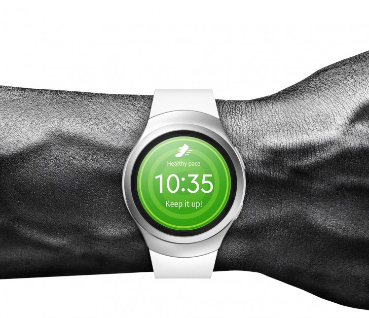
If you fancy running, the Gear S2 offers a handy assistant for that. You can start your running session and with the GPS guidance the smartwatch will tell you when to end the run, the distance you've reached and will draw your course on the map. The data is nicely synced with the full blown Android S Health app. In fact, the two are so tightly integrated that we often found ourselves wondering where each interface was coming from and who is actually doing the heavy lifting - the wearable or your phone. The level of integration is truly impressive.
As previously mentioned, the custom Tizen-based OS powering the Gear S2 actually allows a lot of freedom for integrating functionality. Besides the traditional application approach, smart and often actionable interfaces can be baked straight inside a watchface, made available in widget form for your own designs and can also reside as separate interactive panes inside the main menu. Naturally, Samsung has made sure to utilize all of these features and the same goes for a lot of its partners, which have developed third-party content in all forms as well.
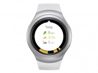
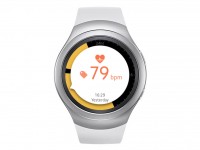
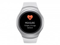
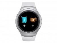
S Health integration is extensive and spread all throughout the Gear S2
Thus, despite having significantly less additional software than, let's say Android Wear or the Apple Watch, the Gear S2 does offer a nice variety. The aforementioned watchface widgets might not sound like much, but we found them to be quite powerful and convenient, especially since they are visible at first glance and most of them even offer additional info when tapped.
The default set includes basic things like battery, alarms, notifications and app shortcuts, but there are also things like steps, heart rate and water or caffeine counters, which clearly come courtesy of the S Health app.
If this "slot" system seems a little confining, there is always the option of creating an entirely custom watchface with some custom functionality, just like the default heart rate ones. A lot of Samsung partners have also gone down this road with their offers, like Nike, Twitter and LINE, which all offer custom watchfaces.


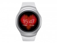
Watchfaces can have widget slots or offer entirely custom functionality
A lot of the aforementioned watchface widgets and the functions they offer also have another, more spacious place to reside within the Gear S2. Each pane in the main menu can also act like a widget, displaying information and offering shortcuts, but this time around, the entire screen can be utilized. Samsung's own S Health seems to be the main contributor to the core set of these interfaces with things like a 24-hour activity tracker, Heart rate, Recent workout, Steps and Water and Caffeine counters. These all offer a lot of info and shortcuts to different parts of the S Health app.
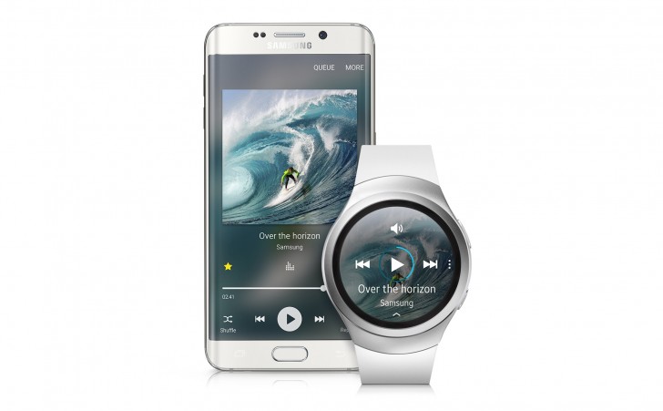
But the focus isn't only on activity and sports, by default, the Gear S2 also offers quick alarm and music player controls, complete with beautiful album art backgrounds, as well as a couple of schedule and calendar interfaces and a weather one. Naturally, developers can contribute to this list as well.
Last, but not least, the Gear S2 also supports more traditional apps. They are housed within the convenient menu structure we saw earlier and the watch does come with quite a few of them baked in. Phone, Email and Messages are among them. You can browse your call history and place a call to any entry on the list, favorite contact or even punch in a number, so the freedom is definitely there, but unlike its predecessor the Gear S2 can't be used for calls as it lacks a built-in speaker - a feature that a lot of people might actually miss.
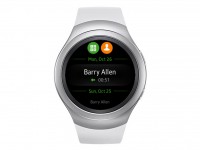
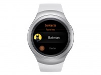
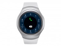
Feature-rich phone application
It is worth noting that Email relies on Samsung's default Android email app and consequently, can't function in the absence on a Samsung smartphone. Overall, while using the Gear S2 with a non-Samsung device is theoretically possible, it is a somewhat limited experience.
All other basic commodities that you would expect to see in an app drawer of any sort are also present. The wearable can manage alarms, timers, has a stopwatch, schedule and a weather app. Some of the more advanced features include a Maps application that is surprisingly convenient. Besides powering the positioning inside the Find My Phone interface, it also allows fast and fluent map searching, browsing, as well as receiving and handling locations. With only a few taps, you can also forward your current position to a favorite contact - quite convenient.
The Maps app also stores your recent searches and is powerful enough to give you location-based suggestions for transport, dining, entertainment and businesses, even complete with contact information which can be used to initiate a call on your mobile.
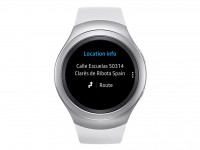
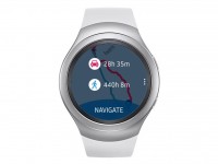
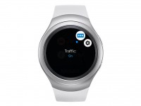
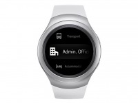
The Maps app is truly powerful
The Gear S2 can also take down voice memos through a dedicated app, but you can also make S Voice do that for you, whatever suits you best. As for multimedia, the watch has its own gallery with a convenient thumbnail layout, easy scrolling and even double-tap zooming.
Music control is also available and offers quite a bit of flexibility. The Music app can be used to control your phone's player, but a quick tap inside the menu also allows you to switch to the wearable's internal memory. Anything you have stored on the watch is now available and can be played back on a Bluetooth headset without your phone getting in the way.
As for additional apps, Samsung has a store set up for that. The ecosystem is growing, but can hardly compete with the likes of Android Wear or the Apple Watch. Still, we can't really point out anything important that is missing. There is even a Flappy Bird port, so you can really take the torture to the next level with the 1.2-inch screen.
A few major Samsung partners have also contributed apps to the Gear S2, like Volkswagen and Alipay. Sadly, due to lack of local support, we can't really say if the latter utilizes the onboard NFC, like Samsung Pay.
Reader comments
- jessie
- 22 Jun 2016
- 7Xq
Open this samsung S2 classic
- Monty
- 31 May 2016
- LC8
Does it work with a Sam. J2?
- AnonD-13031
- 15 Mar 2016
- Bw@
On the grape vine from Samsung, support for IOS will be ready at the official launch of IOS 9.3
