Samsung Gear S3 review: Stepping up a gear
Stepping up a gear
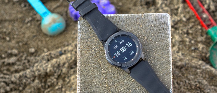
Unboxing
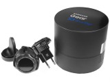
The Gear S3 definitely rides in style. The packaging is actually quite reminiscent of that of the Gear S2 and once again, it revolves around the round shape of the wearable. It is a two-piece cylinder that you could easily mistake for a perfume box or a similar luxury item.
The contents of the package are quite rich. Inside we find yet another two-piece circular assembly, but this time made of plastic and meant to organize and protect the internals. Inside the top part is the watch itself, and it's ready to go.
Just like its predecessor, the Gear S3 comes with two bands. It is the same design, but a smaller size, so you can pick the one that fits your wrist the best.
Last time, the second strap included both a buckle piece and a piece with holes, but this time around, you just get a longer buckle piece. That still gets the job done fine, but if you decide to swap it out after having used the watch for a period of time, the pair will likely be worn in unevenly. Plus, if something were to happen to your buckle, you definitely need to go out and buy a replacement. But, enough nitpicking.
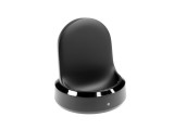
Inside the box, you also get a 5V 0.7 Ah wall charger with a standard microUSB connector, as well as the charging station. The Gear S3 doesn't have any exposed pins or ports. Instead, it recharges wirelessly when rested on its base.
The charger design is one of the many things Samsung decided to carry over from the S2, and it works and looks great. Unlike competitors like LG or Apple, who rely on you putting the watch flat onto the charger to juice up, the Gear S3 is actually held on by a magnet to an elevated surface a few inches above the ground. This allows you to see its display when on a nightstand and the software also facilitates such use cases.
Design and build quality
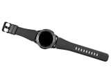
Looking back a year ago and especially beyond, we would have easily said that Samsung is persisting with its push towards round aesthetics, backed up by software, which is beautifully designed and integrated. This is definitely still true today, but now we feel that statements like "timeless design" and "stylish timepiece" almost fit it perfectly.
It seems the whole dispute over the appropriate styling for a smart wearable is more or less settled - and in a good way, at least by our opinion. Fewer and fewer makers are going for the gadgety look, and Samsung has really done its best to give an iconic, timeless design to a 21-century, high-tech accessory that's disposable by definition.
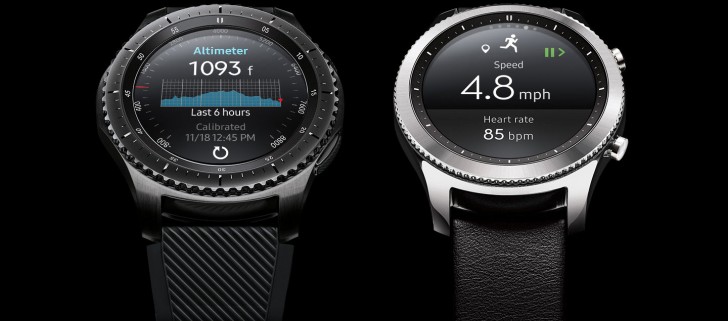
As we already mentioned, the Gear S3 comes in two varieties. There is still a Classic model, but it seems to be the basic one this time around. It appears last year Samsung only tip-toed around a more traditional watch design, while this time around they are finally ready to commit. The S2 and S3 Classic actually share a lot of design language.
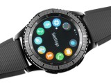
Right off the bat, you get the signature rotating bezel - a truly unique control element in the smartwatch realm. Turning it not only feels natural as an input control, but also offers a distinct and smooth mechanical action in itself - a small, but significant contribution to the overall authentic feel.
Both the Classic and Frontier have the signature wheel, the latter offering a more distinctly jagged edge and extra numbering, for a sportier timekeeping experience. Both also come in a slightly different color and brush finish than the rest of the watch body. That is just one of many concepts directly borrowed from the wristwatch industry for some extra authenticity.
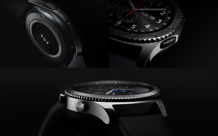
Samsung's dedication to adhering to proper watch maker design is evident by the drafting of Yvan Arpa for the product development. He played a prominent part in Hublot and the launch of the Big Bang line and then moved on to be the CEO of Romain Jerome and then Jacob&Co. We could guess that dealing with electronic wrist watches might be frowned upon in his line of work, but the results from this collaboration are definitely commendable.
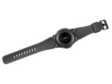
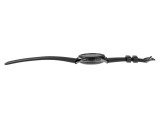
Back to the Gear S3 itself, the main body, which we briefly touched upon, is made from 316L brushed aluminum. That definitely has the toughness part covered, along with the Gorilla Glass SR+ protection for the display. But beyond materials, Samsung did a really great job in ergonomics. Compared to most other smartwatches, the Gear S3 is a large watch with its 46mm diameter. We imagine that might be too much for smaller wrists so definitely try it for size before committing, if possible.
At either 59 or 63 grams, the Gear S3 is hefty as well. However, this is arguably another plus for the "real watch feel." Proper weight distribution seems to be the key here. Plus, there aren't all that many "large" smartwatch options out there, so that's definitely its niche for the time being.
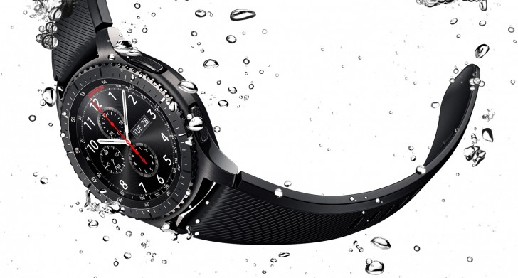
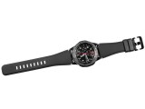
The Gear S3 uses a standard 22mm strap. So you could, theoretically, pick up any third-party option out there and mix and match to your heart's content. Then again, if you don't mind spending a bit more, Samsung also has an extensive collection of approved official and partner options up on offer.
Out of the box, the S3 Frontier is paired with a rubber strap, while leather remains reserved for the Classic. This does make a lot of stylistic sense and both feel really sturdy. Plus, with the rubber option, you do get a slightly wider profile, which fits better with the whole outdoorsy aesthetic.
Controls
Moving on to controls, we already mentioned the signature rotating wheel. Aside from that, the 1.3-inch Super AMOLED display is touch-enabled, and there is a pair of physical buttons on the side as well. For the most part, the Tizen-based UI is cleverly designed to incorporate all of the said controls and use them interchangeably. But more on that later.
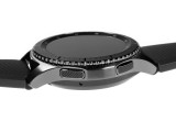
As for the buttons themselves, they are entirely different with the two Gear S3 flavors. The Classic gets big, protruding, round, piston-style buttons. On the Frontier, however, these have been swapped for quite low and flush, elongated buttons. They still have a textured finish on the top and plenty of key travel and tactile feedback to make using them a blast. Plus, we definitely get the concern that bigger buttons would have gotten in the way of some physical activities.
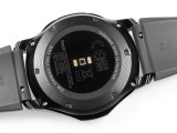
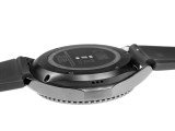
Other externally-visible elements on the watch include the heart rate sensor on the back, as well as a few discreetly positioned holes. On the left side, there is a trio of round ones for the speaker and on the opposing side, one for a microphone. A tiny extra hole, hidden away near the top band attachment is likely for a second noise-cancelling mic.
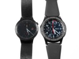
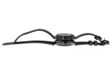
Samsung Gear S3 Frontier compared to the Huawei Watch
The speaker is well positioned so as not to be easily muffled and it offers plenty of volume for its size. Taking a phone call while driving, which is where we found ourselves enjoying the feature most, definitely works. On a highway, however, parts of the conversation can be lost easily, so don't count on it if you are not in a relatively quiet environment.
There is a lot more to be seen underneath the surface, so follow along in the next section, as we take a closer look at the device's internals.
Reader comments
- Kalbong Agila
- 18 Dec 2023
- xCB
I purchased my Gear 3 Frontier last Dec 2017. I changed the battery after 4 years. Dec 18, 2023 it still working perfectly, except of course for slightly faded color here and there.
- zaw chit thu
- 14 Mar 2018
- tZ4
This model gear s3 malaysia set come or not?because.i asking to samsung malaysia store.they say no have this..pls answer
- Anonymous
- 25 Nov 2017
- Sm7
s2 dont have ir.. camera in a watch? lol u cant be serious..
