Samsung I5700 Galaxy Spica review: Stars serving Eclairs
Stars serving Eclairs
Retail package: the bare minimum
The Galaxy Spica retail box has no more than the bare essentials: a charger, a software CD and a microUSB cable.
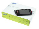
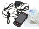
Samsung I5700 Galaxy Spica unpacked
In the box, you'll also find a one-piece headset which isn't your only option though since the Galaxy Spica is kind enough to offer a 3.5 mm jack. No memory card is enclosed though.
Samsung I5700 Galaxy Spica 360-degree spin
The Samsung Galaxy Spica is just a tad thicker than its predecessor, the Samsung I7500 Galaxy. However, standing at 115 x 57 x 13.2 mm this smartphone is no hassle to handle and carry around. It’s quite solid too – 124 g and a heavier feel in hand than you might’ve expected in an all-plastic phone.
Design and construction
The red accents on the Spica’s front bring some color to the Galaxy lineup. Those aside, the I5700 design didn’t stray far from the original Galaxy.
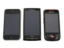
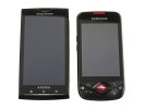
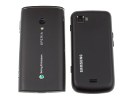
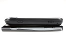
The Galaxy Spica: average size and recognizably Samsung
The Galaxy Spica is made of high quality plastics. The rubbery back is soft to touch and surprisingly tends to attract fingerprints more than the glossy frame up front. However, in either case fingerprints are rather hard to see and quite easy to clean.
Almost the whole front of the I5700 Galaxy Spica is taken by the 3.2” capacitive touchscreen of HVGA resolution. The original Galaxy came with an AMOLED display, the Spica has got a TFT unit. Still it’s got some nice image quality.
Of course, the Spica screen fails to match the wide viewing angles and great contrast of the I7500 Galaxy. Another surprise is that the Spica disappoints on sunlight legibility too.
Still, the display is bright and vibrant, with pleasing solid colors indoors. It’s a capacitive unit with silky smooth response. Most importantly, thanks to the latest version of Android, the Spica screen has true 16M color support and the color banding issues plaguing earlier Android phones do not affect it.
Above the display we find the centrally located earpiece. There are no ambient light and proximity sensors on the Galaxy Spica.
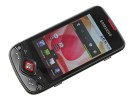
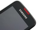
A 3.2" capacitive TFT touchscreen • the earpiece
Below the screen there are a handful of buttons. A D-pad with confirm button is surrounded by no less than six hardware keys. Typical for the early Androids, the Spica has actual Call and End keys, along with the standard foursome: Home, Menu, Back and Search buttons.
The front hardware buttons are generously sized and have a very pleasant click. Our only gripe is with the Home key, which is right at the very corner. It’s therefore hard to keep a solid hold of the phone when you need to press it.
A short press on the Search key will open the Quick Search Box while a longer press will start the Voice Search app. The Home key on the other hand will either bring you back to the homescreen (upon a single press) or will launch the task manager (if you press and hold).
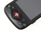
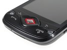
Early droids come with lots of buttons
The left-hand side of the phone hosts only a volume rocker.
On the right, you’ll find the lock key and the shutter button. The shutter key is disappointing. It doesn’t have a half-press, which almost makes it feel like there is no proper autofocus. There is of course, but we’re not fond of how the Spica handles shooting.
A press on the shutter key will lock focus (which can be quite slow really) and then you release to capture.
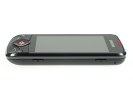
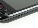
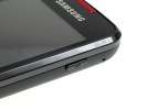
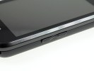
Shutter key and hold key on the right
The top has the microUSB port, a lanyard eyelet and a standard 3.5mm audio jack. The USB port (used for both data and charging) is covered, but the audio jack is left exposed.
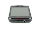
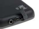
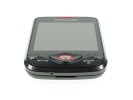
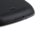
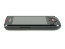
The 3.5mm audio jack and the microUSB port on top • The bare bottom
The all-plastic rear has a rubbery finish, which improves the grip and is nice to touch. The things to note there are the 3MP camera lens and a single loudspeaker grill. There’s no flash whatsoever on the Spica.
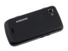

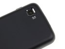
A flash probably seemed too much for the Spica’s 3MP snapper
The 3.2-megapixel autofocus camera lens is sunk and enclosed in frame which is the only means of protection against scratches. It is placed in the top left corner, so your support finger tends to occasionally smudge it all over. The loudspeaker grill has a small knob, so it doesn't get muffled on a flat surface.
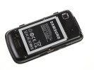
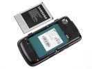
Under the rear cover, both the SIM compartment and the memory card slots are easily accessible on the sides and you don’t have to remove the battery to get to them. The Galaxy Spica supports microSD and microSDHC cards. It had no problems handling our reasonably full 16GB microSDHC card.
The battery is massive - 1500mAh are said to keep the Galaxy Lite up and running for up to 650 hours and allow up to 11.5 hours of talk time. In reality we had to charge the phone rather often – almost every day at some point when testing was getting too intense.
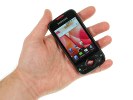
Overall, the Samsung I5700 Galaxy Spica handles nicely even if it's not the most compact of phones, and the hardware controls are quite comfortable. It sits well in the hand and feels sturdy. We have no reason to question the phone's long-term durability.
The capacitive screen is nicely responsive and the effective 16M color support does make a difference. Early Android adopters will know what we mean. The Éclair update hasn’t brought multi-touch support though.

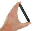
The Samsung I5700 Galaxy Spica held in hand
On the next page we’ll take a closer look at the I5700 Galaxy Lite user interface.
Reader comments
- AnonD-744806
- 15 Mar 2018
- f}m
Please tell me how to unlock the gt15700 say
- Anonymous
- 11 Dec 2012
- 3MR
there is already an update to 2.2.3 available since august 2012.. google for it.
- clive
- 16 Dec 2011
- f3R
just want to know where & how can I upgrade this phone to vision 2.1 .I have 1yr using this phone but bluetooth is not working course of its vision 1.5 .I will appreciate ur help
