Samsung I8000 Omnia II review: A surprising experience
A surprising experience
User interface
What we have on our hands here is the first Windows Mobile 6.5 device that has ever come to the office. Depending on when Micorsoft decide to release the new OS on the market, the Omnia II will ship with either 6.1 (with a guaranteed free upgrade) or it will come with 6.5 straight out of the factory (like our unit).
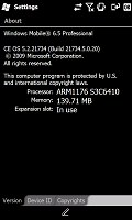
The Samsung I8000 Omnia II is the first Windows Mobile 6.5 device we have the chance of reviewing
So we guess if you are among the early adopters, you may or may not have the chance to enjoy 6.5 from Day 1. Still, Windows Mobile 6.5 is supposed to be made available in late September or October so there shouldn't be a long wait involved.
But back to our test Omnia II. If you just took a brief look at the device you probably wouldn't know that it is running Windows Mobile anyway. Samsung have installed the latest reincarnation of their proprietary TouchWiz UI on top and have done an amazing job of customizing all WinMo screens and options below it.
That's why we will first concentrate on the proprietary TouchWix interface. The scoop on the goodies brought by Windows Mobile 6.5 will follow closely afterwards.
Samsung Widget Plus
The changes made by TouchWiz this time around run so deep that if you don't turn the overlay off you will barely realize what kind of Windows device you are holding in your hands. Unlike the pre-release unit that we previewed back in the day, the underlying OS is nowhere to be seen this time (except for the telltale Start button up in the left corner).
If you are familiar with the TouchWiz UI you wouldn't be surprised to find that the Samsung i8000 Omnia II actually has three different homescreens. They can be alternated by finger sweeps going from one side to the other.
All three screens are there for the user to fill up with widgets. You can also assign different wallpapers to each homescreen to tell them apart more easily.
The widgets are numerous mini applications or shortcuts to different parts of the user interface, sitting in the tray on the left side until dragged to the screen.
The available widgets vary quite a lot - from digital clock, through a mini image browser and profile manager to the CNN news application. You can also download additional widgets via the - yeah you guessed that right - the Download Widget.
Even the shortcuts bar you will notce at the screen bottom down here is a widget itself.
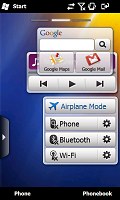

The TouchWiz UI with its widgets homescreen is well familiar now, but this time they are even more advanced
The customized Samsung "main menu" (that you open through either the Start button or the Cube key) is spread over several different screens that you can alternate between via sweep gestures. The total number of screens is limited to 10 but you can freely reorder icons around just like you would on an iPhone.
Speaking of which, this whole Main menu has a really flat iPhone-like structure, in unison with Samsung's recently released feature-phones. This approach gives you a simpler what-you-see-is-what you get interface but at the price of complicating the navigation a bit.
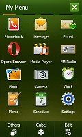
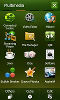
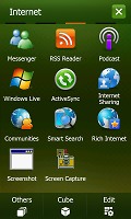
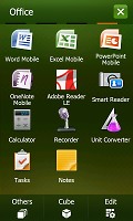
The four screens of the TouchWiz main menu
The colorful interface offers two sets of icons, with the default one being the better-looking in our opinion. You can of course also change the color scheme if you like.
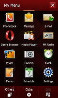
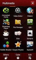
The alternative TouchWiz main menu icons
Touching the status icons top of the screen opens a set of large thumbable graphical buttons that give you quick access to the connectivity manager, the battery status detailed info and the system volume control. Of course toggling volume levels by pressing the volume rocker on the left but it doesn't hurt to have it here too.
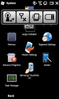
The large status icons are quite handy
Samsung have also preloaded the device with a nice and thumbable TaskSwitcher that obviously allows you to switch among applications and end some or all of them should you need so.
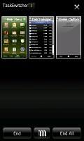
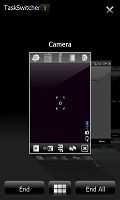
The task switcher offers two view modes
If we've got you interested, here's a short video demo of the TouchWiz UI running on top of WinMo 6.5 on our test Omnia II:
The Samsung i8000 Omnia II has another novel software feature, which is also a key element of the external design of the handset - it's the Cube that has inspired the big 3D key below the display.
The Samsung 3D Media gate
What is it with phone manufacturers and cubes? They seem to think this is the pinnacle of UI design on touchscreens and Samsung have unsurprisingly jumped on the bandwagon. Back in the day, the cube interface of the HTC Touch received pretty positive reviews (ours included) and they've been the fad ever since.
Unlike the original HTC cube however, the one on the i8000 Omnia II is mostly in charge of the multimedia features on the handset.
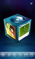
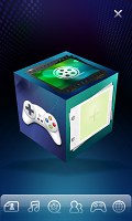
The Samsung 3D Media gate is an intuitive six-sided cube UI that you flick on screen for quick and easy access to six key features, such as Main menu, Camera, Photo album, Music player, Video player, Games or web browser.
The Cube rolls smoothly and usability is on a very good level indeed, reminding us of the responsiveness of the LG S-class user interface. But if you are not into flipping cubes, all the shortcuts to the content you're looking for are available as small icons at the bottom of the screen.
The music and video player have been nicely revamped. The browser button displays your bookmarks in an innovative "card-flipping" manner and starts the default web browser (whichever that is) once you have made a selection.
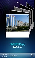

Each of the apps has a nicely revamped interface
The Favorite Contacts app allows you to place shortcuts to all your favorite numbers and make them easier and quicker to dial. To be honest though, launching the cube, flipping it to the favorite contacts side and touching a contact doesn't seem all that quick way to dial to us.
Strangely enough the motion-conrolled multimedia UI Motion Gate isn't present on the Omnia II. It was present on our pre-release unit and it was present with the 3D Media gate on every device we've seen with it so far. We guess it came time for them to part ways.
Bear in mind though that the actions of the Cube key and the back button are programmable so you can set them to activate any application or even scroll one way or the other instead of their intended purpose. You get two actions per key - one activated by a short press and the other triggered by a press-and-hold.
You can also choose whether the lock key should be the only one used to turn on the phone's display. The alternative option is to use any of the hardware keys for the purpose.
Reader comments
- AnonD-348524
- 05 Jan 2015
- veS
My phone samsung omnia ll GT-I8000 the phone off.how can open?
- AnonD-348524
- 05 Jan 2015
- veS
Samsung Omnia cant on.phone status off.how to open?
- vhin
- 24 Sep 2013
- vaN
how to open a phone off.because no signal and always airplane mode.and my contacts is not look.
