Samsung I8700 Omnia 7 review: A whole new galaxy
A whole new galaxy
User interface with Live tiles
We reviewed Windows Phone 7 just recently so, if you’re curious about the OS rather than a specific phone, you should check it out.
Update, October 7, 2011: The Windows Phone 7.5 update is out and it brings new functionality and resolves some of the issues that we've mentioned in this review. Check out our Windows Phone 7.5 review here.
The following software part of Windows Phone 7 reviews feels like a book you’ve read – that’s because all WP7 phones run the exact same software, with just a couple of preinstalled apps that make some difference. So don’t get surprised that we’ve reused some texts along the way. We want you to be sure that even when we reuse portions of the texts, we always take care to check our facts with the review unit thoroughly.
We’ll go over things again (and perhaps reuse some text) but we’ll do it from the perspective of the Samsung Omnia 7, which was used as a base for that review anyway.The first thing you notice in the Omnia 7 is that the Today screen is gone – and good riddance we say as the new homescreen is one of the most flexible homescreens we’ve seen. You’ll notice just how many useful things you can put on it as this review goes on. The iconic Start menu is gone too (and no more honeycombs either).
But first things first – in the WP7 review we talked about the excellent aesthetics of the new OS, but looking at it from the brilliant screen of the Omnia 7, it looks all the more appealing. Sure, most of it is black, but you can easily change the color combos.
For us switching to a lighted background took away from the experience. And if you’re not a fan of blue, there are plenty of other foreground colors to choose from.
Before we continue, we should make sure you understand one thing. Beauty is subjective but the Metro UI of the Windows Phone 7 is a real beauty. Despite the lack of shadows and 3D volume to the UI elements, the interface is in no way dull. You really have to see the videos in order to appreciate the smoothness, graphics and animations provided by the design team.
The Windows Phone Metro UI has two main parts that live side by side – the homescreen (referred to as “Start”) and the main menu. You can switch between the two by sideways swipes or using the arrow button.
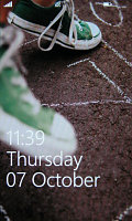
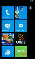
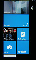
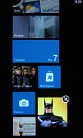
The lock screen • the homescreen • reorganizing the homescreen
The homescreen is a square grid of Live tiles. Live tiles fit the broad concept of “widget” but, unlike most widgets out there, they are very uniform with clear labels that indicate what each one of them does. They also show some quick info (e.g. number of messages, the date) but they are also the Windows Phone 7 equivalent of homescreen shortcuts.
The main menu is a traditional list – this is where all the hubs and installed apps are listed. A press and hold reveals a context menu, which lets you “pin” items to the homescreen (that is put their Live tile there) along with uninstall and also rate and review the app (if it’s an installed app).
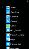
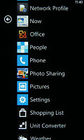
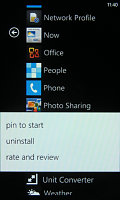
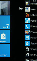
The main menu • pinning something to the homescreen • swiping halfway through
There are no folders in the main menu – so the more apps you install, the longer the list will get. This could make finding rarely used apps quite a challenge.
The interface is quite simple – sideways swipes navigate a sort of tabbed interface and there are on-screen soft keys. This will covers the most commonly used features, but for advanced features you can tap the “...” symbol.
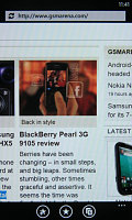
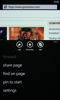
The on-screen soft keys • the extended “...” menu
It opens an extended context menu (and also reveals a label under each soft key, if the icon wasn’t descriptive enough). A press and hold on an item will reveal a menu to manipulate just one item.
What Windows Phone 7 has lost since the 6th iteration is multitasking. It handles a lot like a pre ver-4 iOS. The Start key (the one with the Windows logo) gets out of the app and brings up the homescreen. Alternatively, you can exit an app using the Back key. That gets you back to the app last used.
That last app will continue from exactly the same point from where you left it. Getting back into an app is done by tapping its live tile or shortcut in the menu or by using the back button, which returns to the previous screen (even if it was from a completely different app).
There’s no “recently used” type of list to make going back to the app you need easier – so you might have to search for it in the main menu or keep hitting back until you see it. So, no multitasking is not a complete loss, but not quite as comfortable as true multitasking OSes either.
Here's a video demo of the UI in action:
Reader comments
- Rico
- 02 May 2016
- uEB
Shit! My phone not work, I can't download app social media like what's up,line ,instagram,and BlackBerry massangger .the phone want me have ID in windows phone, I can't make it. Please help & tell me how download that apps . Replay me in : Rico...
- miloud
- 01 Apr 2013
- mcx
I am using Omnis 7 for nearly about 5months and until now I haven't succeeded to install applications.please,if u have any help,u can contact me on :miloudh_80@yahoo.fr/ I Begg u
- Akhil J Munjanattu
- 21 Aug 2012
- w7i
Without a doubt, its an amazing phone.. But still I have so many doubts about this phone 1. Is there ant other option to download the gallery to my computer other than Zune? 2. How can I use the zoom option while using video camera? If anyone k...