Samsung M8910 Pixon12 review: By the dozen
By the dozen
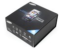
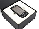
What's in the low-equipped box?
A high-end handset like the Samsung M8910 Pixon12 implies a retail box brimming with extra stuff. Well, not this time - and no surprise - if you followed the original Pixon. Just like its predecessor, the Pixon12 is bringing only the most essential things along.
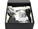
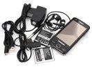
The contents of the retail package include the mandatory charger, a data cable and a two-piece handsfree that allows changing the headphones without losing the remote functionality. The headset remote ends on a 3.5 mm jack so you have quite a choice of alternatives to use with the phone.
Please don't gloom too much on that second battery up there on the shot. Our Pixon12 indeed arrived with 2 batteries, but it turned out it's just a strange mistake - the retail package of the Pixon12 will include only a single battery - the primary one.
What would've been really welcome is a memory card, as the Pixon12's 150 MB of inbuilt storage are but dwarfed by market leading devices like the N97 and the iPhone, or Samsung's own Omnia HD. Of course, that can be changed at any time and also - retail contents are usually market dependent so do expect differences. Some retailers even throw in bonus memory cards, so you never know.
The Pixon12 retail package comes with a nicely designed single stylus with no spare unit. The stylus is supposed to hang on the lanyard eyelet, as the phone has no compartment to accommodate it. It's pretty inconvenient so it's nice the Pixon12 interface pretty much limits the stylus use to handwriting, so we don't see much need for it to dangle off the handset and get in the way.
Samsung M8910 Pixon12 360-degree view
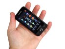
The Samsung M8910 Pixon12 is yet another touchscreen device and its design is hardly revolutionary - you know, a big screen on the front and a few buttons below. This form factor doesn't really lend itself to much variation anyway. What's more important, the Pixon12 isn't ashamed of its beginnings and almost exactly copies the original Pixon, especially the camera-centric rear.
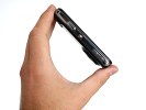
For a phone of such skill and prominence, the Pixon12 looks and feels quite a normal medium-sized set. At 108 x 53 x 13.8 mm and 120g of weight, the M8910 Pixon12 is almost the same size and weight as the original M8800 Pixon.
Design and construction
The Samsung M8910 Pixon12 front is quite sleek with black glass framing the display, while the surface around the controls mimics brushed aluminum to give the set an extra bit of class. Keeping fingerprints away and the secure grip on hardware buttons are an added gain.
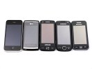
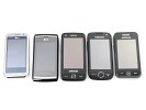
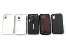
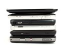
Celebrity lineup: LG Arena/iPhone 3GS, LG Viewty Smart, Samsung Pixon12, Samsung Jet, Samsung S5230
The 3.1-inch display of the Pixon12 beats the LG Arena screen size-wise, for a random reference, but falls short of the original Pixon and the Apple iPhone 3GS screens. At WVGA 480 x 800 pixels, the M8910 Pixon12 though is quite on the forefront of the market in terms of screen resolution.
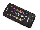
Vibrant and contrast-rich AMOLED display
The resistive screen of the Samsung Pixon12 is sensitive enough. It reacts to even the slightest touch almost as well as a capacitive screen, and you can use anything you want to interact with it - stylus, pencil, gloves, etc. It's far better than anything we've seen on a Windows Mobile device - it's rather close to the iPhone sensitivity.
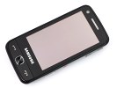
As big a screen as they could fit, beats the LG Arena's by 0.1"
It's not all daisies and sunshine though. In fact, sunshine does make the Pixon12 squint. Sunlight visibility is the same as the Samsung S8000 Jet and far from the best we've seen.
Yes, you will be able to see most of the Pixon12 screen on a bright sunny day, but it's far from perfect and users will be struggling under direct sunlight - especially with all them smudges on the display.
But still it's not a make or break thing. The Pixon12 screen legibility is way superior to Sony Ericsson Satio under direct sunlight.
There are three hardware controls below the display - Call and End keys obviously and the center button. Now, the center button does not launch some 3D cube or anything, it just handles the main menu. Pressing and holding it will start the new task manager courtesy of TouchWiz 2.0.
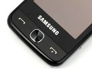
The buttons on the front are large and easy to hit
On the left side of the phone you get the microSD slot and the hardware Lock (Hold) key. On the right side are the volume rocker (zoom lever in camera mode), the tiny new knob that turns the camera on and off and the shutter key. All controls are easy to operate in both single and two-handed use scenarios. We're not sure though the dedicated camera on/off key is essential. The original Pixon had a similar knob launching the gallery - feels right, provided the camera can be switched on and off using the shutter key.
It's worth noting though the camera knob not only overrides the phone lock but will instantaneously turn the camera on regardless of what else is going on at the moment. It does make sense after all in a camera-centric device. Plus, we're talking some sweet start-up time here of less than three seconds. The downside is, the button can be accidentally pressed in your pocket.
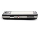
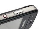
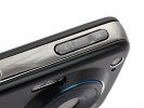
The right side hosts the volume rocker, camera button and shutter key
The Pixon12 top side houses the standard microUSB port with a protective cover. The phone charges off the microUSB port - just like most of its recent siblings - and is quite useful as you can leave the charger at home when traveling if you have a computer with you.
What's more, the lack of 3.5mm audio jack means the microUSB slot is used for connecting the headphones. Luckily, the supplied headset has a 3.5mm jack on the remote, so you can use your own headset.
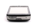
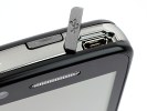
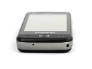
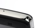
The microUSB slot and the battery cover latch • mouthpiece and lanyard eyelet at the bottom
Removing the brushed-metal battery cover is a breeze thanks to the release latch at the top. Below the cover hides the standard 1000 mAh Li-Ion battery, which probably is the same unit as the one used in the original Pixon.
We had quite a rendezvous with the Pixon12 and we dare say we kept it busy. Of course our reviewing routine is harder on a device's battery than average. We ended up charging it overnight on many occasions after a heavy day's use including scores of pictures (most of them flash-free), browsing over Wi-Fi and testing quite a lot of features.
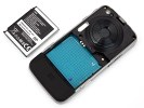
Our reviewing routine took its toll on the Pixon12 1000 mAh battery
As usual, the 12 megapixel wide camera lens is on the back of the device along with the xenon and Power LED flash. The camera has a lens cover but there's a protective glass on top of it, which of course is vulnerable to scratches and finger smudges. Its role is most probably to protect dust from accumulating beneath the lens cover, where it would be almost impossible to clean. However if the glass eventually gets scratched it will ruin your photos. In fact we lost quite a lot of otherwise good shots due to finger smudges we've made on the lens without knowing. The image quality deteriorates visibly even after a single fingerprint.
The back of the Samsung Pixon12 hosts a handy grip, which makes the phone perfectly stable in the hand while taking pictures, but adds some bulk along the way - much like the original Pixon. By the way, repeating the original Pixon styling at the back is absolutely reasonable. Cameraphone is its Number One job and the digicam styling makes a good point of that.
The lack of stereo speakers on the Pixon12 is a shame, as otherwise the device is a very capable portable media player.
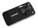
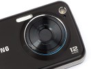
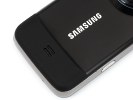
12 megapixel, Xenon and LED on the digicam-styled rear • the rubbery grip
So in spite of its size and weight the Pixon12 is a pretty handy cameraphone and fits the hand almost perfectly. Thanks to the convinient grip, it's great for doubling as a digicam and always ready for some quick snapping.
The chrome lining on the sides is pretty much all that sets the phone apart from the original Pixon but the upgrade still feels quite a bit more sophisticated. Technically, the Pixon12 screen is smaller but the WVGA resolution and AMOLED technology do raise it well above the original.
Reader comments
- Anton
- 13 Jan 2010
- ns8
People you forget that Motorola ZN5 has also variable aperture (2.8/5.6)
- Teddy
- 29 Nov 2009
- vGj
y do you say its not a smart fone? is it just the OS? please tell me what features are missing compared to smartphones...
- BLINK
- 20 Nov 2009
- t7G
they all paid SE for the patent
