Samsung One UI 3 mini review

One UI 3 - new design and feature changes
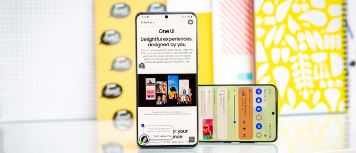
Samsung's One UI 3 is based on the latest Android 11, which was released almost 4 months ago. Samsung's UI for its Galaxy phone has never been stock so their Android 11 implementation comes with its own spin. One UI 3 not only comes with new features but with an updated UI design, too.
The UI basics are generally similar though you can spot the occasional change here or there. For example, the default lockscreen shortcuts - dialer and camera, are now monochrome - they used to match the respective apps' colors. Oddly enough, if you pick different apps, they will keep their colors - this seems like something to be addressed in One UI 3.1.
Among the functional changes on the lockscreen is the added wellbeing widget - you can now keep track of how much time you spend on your phone without even unlocking it. Meanwhile, the always-on display settings have been simplified.
Another notable change is that pulling the notification shade covers the entire screen underneath, even if there's just one notification card or none at all. Previously, the portion of the screen below the last notification would remain visible, if darkened.
Oh, and one more thing about the notification shade - the quick toggles can now be edited directly from the plus button at the end of the list instead of going into the menu.
Coming courtesy of Android 11, there is now Notification history, too. It's accessed from the Settings menu, so it's not immediately accessible, but it's there for those occasions when you dismissed a notification too quickly, and you can't seem to find what it was about.
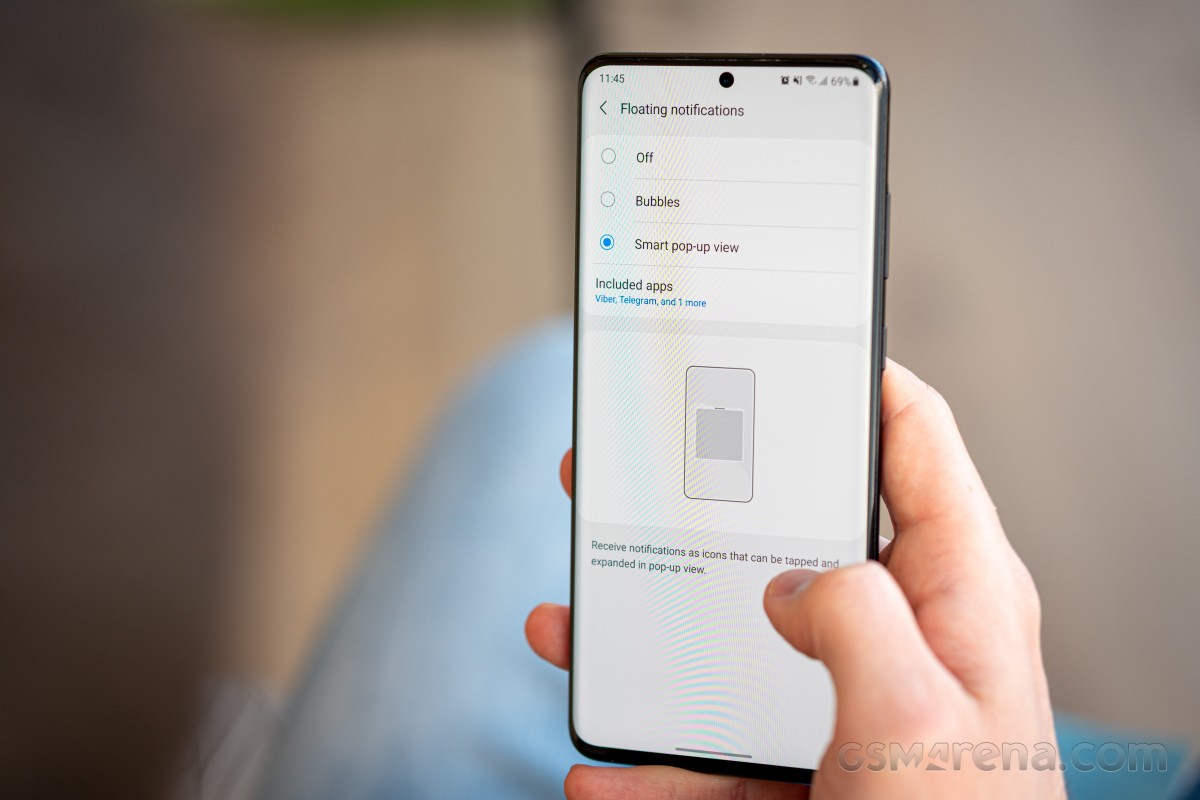
Meanwhile, under Android 11 and One UI 3 instant messenger apps should be able to offer one of three behaviors for sending you notifications. Under the 'Floating notifications' submenu, you can pick between 'Bubbles', 'Smart pop-up view', or simply 'off'.

Bubbles is a native Android 11 behavior that's an extension of the Conversations feature, another new development. You tap on an icon in the initial incoming notification and it turns into a conversation which you can then minimize to a bubble, or what was a 'chat head' - originally a Facebook Messenger's thing that at least this one reviewer here hates with a passion. It's perhaps for the better then that Messenger's Chat heads as you know them from Android 10 no longer work under Android 11 with OneUI 3. Bubbles, however, do mostly the same thing, so if you do enjoy this method of handling chats, the option is there for you.
Smart pop-up view is one of One UI's lesser-known proprietary features. Under Android 10, it used to add the chat head functionality to any application of your choosing. Tapping the hovering 'head' icon opened the app in a floating window, which you can further maximize to fullscreen or minimize it again to an icon. Sort of like Bubbles, only slightly different. Unfortunately, this appears not to be working under Android 11, even though the option for it remains in settings.
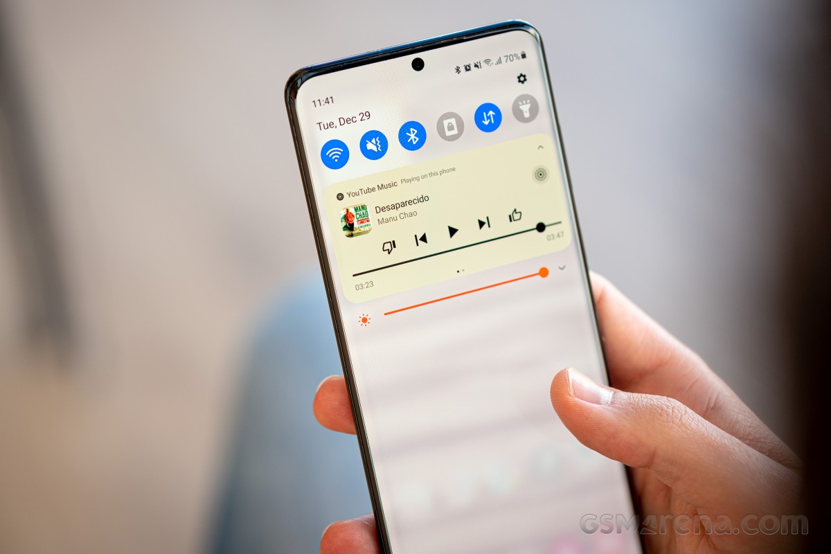
Introduced with Google's latest OS version, the new media controls have been implemented in One UI as well. You get a stack of the active audio playback apps right below the quick toggles and swiping to the side switches between the apps.
The Media screen was already available on One UI 2.5 pre-Android 11, and it offers similar functionality for picking the output device or using Samsung's Music share feature.

The volume control panel has gotten a makeover too, and now the four sliders are vertical instead of the horizontal ones of OneUIs past.
Yet another of the native Android 11 improvements that Samsung also includes in OneUI 3 is the ability to pin apps to the top of the sheet with Share options. It's one of those things that make you wonder how come it had to wait until v11 for us to get there.
We've been using third-party apps to rearrange the apps on the ShareTo screen since Android's native automatic sorting has always worked in its own mysterious ways and often got in the way more than it helped.
Things are much better now, but still, we'd like to be able to remove options too, because that list could sure use some decluttering, but baby steps is better than no steps at all.
One more thing that Google tweaked in this year's release is the permission handling, and Samsung's implemented it in One UI 3 as well. With this version, you will now see a new prompt for permissions every time an app requests it, letting you deny permission, allow it only while using the app, or just for this one time. If an app requires constant access to permission, you also get a fourth option that takes you to a setting page where you can provide it. The way this is done prevents the user from accidentally selecting this option while blazing through the permission dialogs.
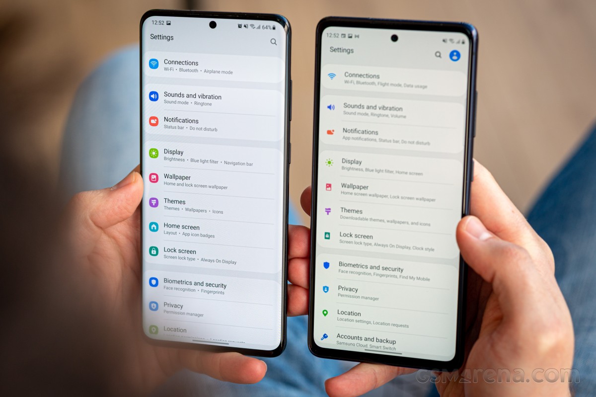
One very noticeable change that immediately caught our eyes was how subcategories are listed in the Settings menu. The dot separator and extra intervals make the text a lot more legible than the seemingly unseparated long strings of before.

We'd still normally use the search bar for finding settings, and there are changes in there too. Recent searches are now shown as bubbles as opposed to a list, and there's a newly added feature to search settings by hashtags - because hashtags were precisely what was missing from your settings menu. #sarcasm
The dialer comes with a bunch of cosmetic changes itself. You get to pick one of two layouts for the in-call screen. You can also set up a background image or video for that screen, though it's going to be all the same for all of your calls - you can't have a different one on a per-person basis.
Samsung advertises an improved camera experience on One UI 3 in key areas like AI-based zoom, auto exposure, and autofocus, but those are hard to quantify and outside the scope of this article.
What does belong here are the subtle touches to the Gallery app. You now get a filmstrip of tiny thumbnails on the bottom of the screen when looking at a photo. Additionally, swiping up on the photo will reveal a screen with a snapshot of a map of where the picture was taken, plus related 'Stories' and photos. The phototagging interface has been retouched, too, though we're ones that rely on Google Photos for organizational tasks of this sort.
A side effect of the reimagined interface is that the exposure details are now a further tap away. And even worse, you need to tap specifically on the arrow to the right of the path, the rest of the field is not actionable.
Another new addition is the Gallery's ability to keep the original files for images you edit on the phone - that way you see the final result in the Gallery, but you can always revert to the original shot.
Reader comments
- Anonymous
- 30 Aug 2023
- rKe
s20 ultra update 14
- Excel
- 27 Oct 2021
- XBA
hello, I'm using S20plus and I couldn't get to download and the install the new one 3 and android version 11
- Anonymous
- 21 Aug 2021
- QwU
Worst update☹☹☹☹


