Samsung P1000 Galaxy Tab review: An expanding universe
An expanding universe
User interface: Froyo XL
For the Galaxy Tab user interface, Samsung has used the latest reincarnation of the Android platform, 2.2 Froyo, but unlike their Android smartphones kept the customizations to a lower level. This means that you won’t be getting the full TouchWiz experience, though most of the important parts are here anyway.

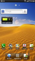
It’s more Froyo and less TouchWiz with the Galaxy Tab
The homescreen offers you up to nine panes to populate with widgets. You are free to rearrange them as you see fit and delete the ones you do not need to speed up the navigation. The easiest way to manage your homescreen is to pinch zoom out and than use the Samsung equivalent of HTC Helicopter view.


Pinch zoom out the homescreen and you are in editing mode
As usual Samsung has added a few widgets of its own to the standard Android selection, but this time there’s no separate entry for them when adding content to your homescreen. Anyway, with so many widgets (and even alternative homescreens) available from the Android market this is hardly considered as big a differentiating factor as it was before.
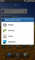
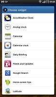
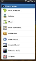
The set of widgets that comes with the Tab
Unlike the Galaxy S and the rest of the TouchWiz gang, the Samsung Tab has three buttons docked at the bottom of its homescreen and only the middle one remains visible when you open the menu. It’s the one used for alternating between your main menu and you homescreen.
The other two take you to the email and stock web browser by default but you are free to change them as you see fit.
The main menu consists of side-scrollable panes, much like the homescreen. You can add new pages manually, by dragging an app to a new screen while in edit mode. Unlike most Android smartphones however the Tab offers landscape mode here.
When the launcher is in edit mode, you can uninstall applications (only the ones that you installed) just by tapping their right corner.
The task switcher has been updated too and now features shortcuts to the eight (as opposed to six) most recently used apps. There is also a button that takes you to the Samsung home-brewed task manager, which turned out to be rather capable.
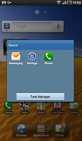


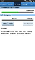
The task switcher and task manager of the Galaxy Tab
It allows you to close running apps or even uninstall them completely. You can also move an application to the SD card (as long as the app supports it). In contrast, this requires a 3rd party app on the Galaxy S even after the Froyo update.
Finally, the task manager also brings an app monitor widget, which if placed on you homescreen, will warn you if there are any running apps that might consume your battery.
The notification area has the usual Wi-Fi, Bluetooth, GPS and sound toggles, but this time also adds auto-rotation switch (which can disable the accelerometer-based rotation) and brightness slider. With all those a single swipe away, you will rarely need to enter the Settings menu on your Galaxy Tab.

The notification area now has a brightness slider
When you turn on Wi-Fi your Galaxy Tab automatically connects to any known network in the vicinity. If there are no known Wi-Fi networks, a pop-up appears that lets you pick a network. It doesn’t get much simpler than that really.
Unlike the Galaxy S, Samsung Galaxy Tab comes with the stock Android lock screen, where you need to swipe sideways and place the padlock icon over the green dot to unlock. There are cool alternative unlocking patterns too when you have a missed event – a message or a call. Not only do they indicate what events you have missed but they also take you straight to the call log/messaging app when you use them.
Also bear in mind that the Android market offers several apps that allow you to customize your unlock screen beyond recognition. You can change the image, the unlock pattern, the presence and location of the clock etc.
Some interesting touches by Samsung are to be noticed in the Galaxy Tab settings menu. This is the first Android-running device that we can think of to offer display settings such as saturation and contrast.
The performance of the Samsung P1000 Galaxy Tab was quite impressive. The ghosting (which as we told you is probably the hardware’s fault) aside, everything is as smooth and quick as you could hope for.
Now according to Samsung’s official information, the Galaxy Tab is supposed to have the same amount of RAM as the Galaxy S (512MB each). Yet the tablet has access to over 400MB of those in the task manager, while the smartphone gives you just over 300MB. So you can be sure that the Tab will have enough free operating memory at all times.
On a side note, that difference between the two will further fuel the rumors about the Galaxy S not having the full promised 512MB RAM inside.
We're now giving you a short video demonstrating the Galaxy Tab real life performance.
Finally, we ran the usual benchmarks on the Samsung P1000 Galaxy Tab and it did pretty well. As you can see the Tab’s performance is not much better than that of the Galaxy S running Froyo.
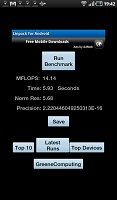
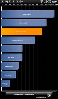
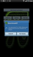
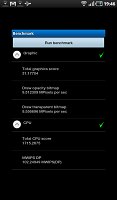
The Galaxy Tab benchmark results
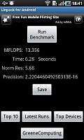
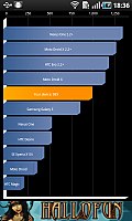
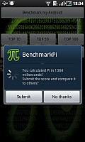
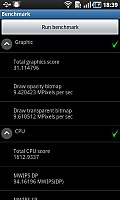
Samsung I9000 Galaxy S benchmark results (Android 2.2 Froyo)
Reader comments
- Anonymous
- 28 Dec 2022
- fuf
i cant download apps on my version 2.3.3
- Maxwell
- 13 Nov 2017
- Nu7
Please i cannot download app anymore even when i have free 15GB in my phone(Samsung anycall GALAXY, Model Number GT-P1000 with 2.3.4 Firmware Version)
- Dora The Explorer
- 22 Sep 2017
- vx6
try doing a factory reset. it works all the time :)
