Samsung S7220 Ultra b review: More than meets the eye
More than meets the eye
Samsung S7220 Ultra b 360-degree spin
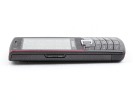
At 114 x 46.3 x 11.8 mm Samsung S7220 Ultra b is a pretty compact device that can easily be squeezed in most pockets. In addition, the mere 90 grams of weight will hardly be too much of a burden. As usual, our trademark 360-degree spin follows to give a better perspective of the handsets shape and size.
Design and construction
If you have checked our preview, you probably know already that the Samsung S7220 Ultra b did win our appreciation back then. The brushed metal frame around the display is certainly our favorite but the phone is quite a looker overall. Some might argue that the handset won't wow you at first glance and they may perhaps have a point.
In all honesty though, the phone looks a whole lot better when the top-notch screen is lit up. We got quite fond of the Samsung S7220 Ultra b looks and we need to give it to the designers. It's a neat - even conservative - candybar handset, yet so infused with personality.
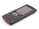
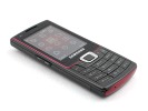
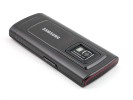
We grew fond of the design with time
The Samsung S7220 Ultra b is equipped with a 2.2" QVGA AMOLED display that takes about half of its front panel. As one might expect, the OLED technology and the sufficient pixel density add up to excellent picture quality.
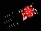
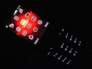
The display is stunning in the dark
We would have preferred a slightly larger display - a 2.4-incher wouldn't have hurt. The AMOLED display also has poor sunlight legibility, making it quite a challenge to operate with the phone in the bright sun. It's not i900 Omnia bad but still not quite what we would've liked to see.
Below the display is the S7220 Ultra b D-pad and the four main controls around it. The call and end buttons enclose the two softkeys in a quite unusual linear layout.
This might be part of the handset's distinct appeal but it does raise some usability issues. To begin with, the D-pad leaves mixed impressions. Sufficiently raised from its surroundings at the top and bottom, it has a very solid and reassuring Up and Down press.
Anyway, the S7220 Ultra b D-pad still handles a lot better than the context keys. They are too thin and squeezed between the D-pad and the call buttons. As a result, the flimsy press is one of our biggest grudges with the handset.
Furthermore the soft key location is not well thought of, as the labels on the screen are right over the Call and End keys instead of the relevant buttons. This really makes the first experience with the phone somewhat awkward.
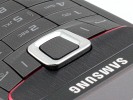
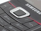
The part of the handset we liked the least - the soft keys are really uncomfortable
Luckily, the alphanumeric keypad is the exact opposite. With sufficiently large and terraced keys the numpad is really comfortable to type on and the press feedback is great.
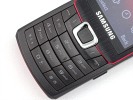
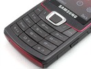
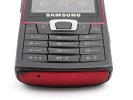
The keypad is a pleasure to use
The right side of Samsung S7220 Ultra b hosts the microUSB plug (with a protective cap) and the camera button, which also accommodates the basic Task Manager (application switch). That's the same solution we saw in the Emporio Armani phone.
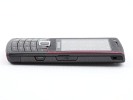
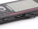
The camera key and the microUSB slot are on the right
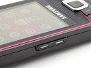
All we get on the left is the volume rocker. Typical Samsung, it can be used for scrolling listed submenus up and down. The keys on both sides of the handset are large and comfortable enough, posing little obstacles to usability.
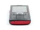
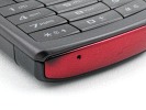
The bottom of the handset is pretty plain, featuring only the mouthpiece. It has the same color as the ornamental frame around the screen.
Reader comments
- cobra
- 12 Jan 2011
- w0Q
how 2 use the front camera?
- jap!
- 22 Nov 2010
- vx2
nice!
- p2seth
- 26 Jul 2009
- m{@
Where Audio quaity test?
