Samsung S8300 UltraTOUCH review: Touch, slide, shoot
Touch, slide, shoot
User interface
The UI is the latest incarnation of Samsung's heavily promoted TouchWiz interface. We wrote about it in the preview, but since we used a rather early prototype back then, you should know there are a few differences that will be mentioned along the text.
The interface is quite slow in general and while the capacitive touchscreen is sensitive enough, presses do not always register, meaning that sometimes pressing a menu icon brings no response or the response comes so late that you've already pressed the thing several times. It can be quite frustrating at times. We really expected more from such a high-end device, and this unresponsiveness really detracts from the overall user experience.
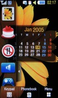
Now let's look at the differences. First off - there aren't three homescreens; instead, there's just one. But the available space for widgets is the same as the homescreen is scrollable.
The three homescreens solution had its advantages, largely because you need to be careful not to put your finger on a widget when you want to scroll as that will drag the widget instead. There's a scrollbar on the right side of the screen, which we found to be a better option.
Leaving the homescreen aside and the new graphics on the menu icons, the rest of the interface has changed little. You have a panel at the bottom of the display that shows three keys this time - keypad, phonebook, and a button to switch back and forth between the homescreen and menu. There are also some nice animations and transition effects throughout the menu, but they're not particularly smooth.
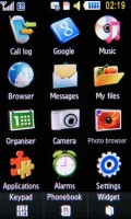
The main menu displays as a 4 x 3 grid of icons, while sub-menus appear as numbered lists. If you wish, you can use the keys on the keypad to select them. Share pix gave way to the Messages menu - which is a good move - but the Navigation menu was replaced with a Google menu (more on that later).
The Samsung S8300 UltraTOUCH has simple multitasking capabilities like the Pixon, but it doesn't have a dedicated key for launching the task switcher. Instead, you can set up the camera button to launch the camera, the task switcher or a menu that lets you choose what to do. If you go for that final option, the camera button goes straight to the task switcher if you're in a menu.
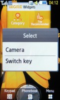
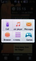
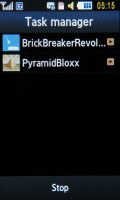
One button does two things • task switcher with no Java apps running • a couple of Java apps
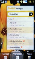
Widgets can be downloaded
For those of you who have not seen a recent touch phone here's a quick description of what a widget actually is. A widget is a small application that sits on the homescreen and has simple but useful functionality - one shows the time in two time zones, another weather conditions and so on. Even the operator logo is a widget and can be tucked away.
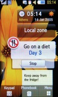
Some widgets are useful like the AccuWeather widget that shows you local weather conditions and a clock with two time zones. There are others like the 'Go on a diet' or 'Quit smoking' widgets that count the days you've been 'clean'.
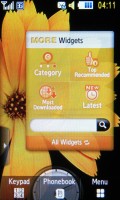
There are even widgets that are just a shortcut to an application, but there are also some widgets that help you set up the others. One brings up settings for both the offline widgets (clock) and online widgets (AccuWeather) and here you can set up the network connections for the online widgets. The other very helpful 'meta' widget helps you search for new widgets to download.
Selecting a widget to download launches the browser and directs it to a page with a short description of the widget and a screenshot. At the time of writing, there are very few widgets to download but this number should increase as the developer community grows.
Phonebook has its highs and lows
The S8300's phonebook holds up to 2000 contacts with multiple fields. You can assign a photo to each contact, or even a video if you so wish. On the downside, those pics can only be used as caller id and are not visible in the contacts list. You can view contacts from the phone memory, the SIM card, or both.
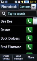
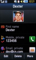
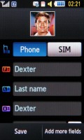
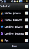
Contacts list • viewing and editing a contact
The phonebook is quite clever. There are fields for first and last name for the contact but there's an additional field for the name of the contact. That is you can have a 'Joseph Plumber' but you can have it appear just as 'Joe' in the contact list while still keeping the contact's full name on record.
Another useful feature to prevent duplicates is that the phone will display a warning if the number for the new contact you just entered is already in the phonebook.
The S8300's phonebook offers an alphabet scroll as usual, but there's an option to put the scroll either on the left or on the right. This helps usability as left-handed people have to reach across the screen with their thumb, covering most of it, and vice versa for right-handed people.
It's not all perfect, however. First off, the contact photos don't appear in the list. That does save some space but apparently not enough for a 'Send message' button. You have to either click the 'Send message' button under the list and then select the recipient you want, or view the details of the contact and then press the virtual receiver key for the selected number.
This brings up an icon bar that lets you make either a voice call, video call or send a message. If you click the virtual receiver key in the contact list however, it directly initiates a voice call. This leads to quite a few clicks to send a simple SMS from the phonebook, and the lack of consistency is a little confusing.
There's more - when searching for a contact by name, the contact at the bottom is not visible as it's hidden under a row of buttons. It's not that you can't get to that contact, but it's an annoying inconvenience.
Reader comments
- mahesh
- 31 Jan 2018
- rJP
I want this phone
- mawuli
- 04 Oct 2015
- fsT
i need whatsapp for my samsung-gt-s8300xbie1
- mirza
- 21 Apr 2012
- PAm
how can i reset its paswrd as i have f
