Sony Ericsson K800 review: Digicam in disguise
The eye of the tiger
The phone sports a 2-inch TFT display with 262 000 colors and a QVGA resolution of 240 x 320 pixels. The display is very good and offers vivid colors and wide viewing angle. It's a lot better than the one of K750 and compared to it, the K750 image is much rougher.
The mirror effect we already told you about is used to ensure the legibility of the display under direct sunlight and it manages very well but only if there are no fingerprints on it. The more fingerprints there are, the less legible the display is in the sun.
The phone is ringing
We got to admit that the sound quality during calls was fabulous and we were pleased with the reception at all times. When it comes to the ringing loudness K800 is a bit of an underdog. It might be just our test version but we have seen many louder phones. The vibration alert strength isn't that impressive also.
Otherwise, MP3 music played through the loudspeaker sounds really nice but of course lacks the low bass elements. But hey, who would want bass sound from a mobile phone! The important thing is that even at the maximum level of loudness the sound is clear and there are no unwanted noises or cracks to be heard.
Inside out
Generally, we are quite pleased with the speed of the menu navigation. In standby mode the upper two soft keys correspond to the Calls menu and the Main menu. The display also shows all the info about the current time and date, carrier name, network signal and battery status and the next time an alarm is set to go off. The stand-by display also shows the time and date of the next alarm that is due to go off. Now, an interesting thing in the K800 interface is that at some places the font size is awfully tiny. An example for that are all the fields available throughout the phone's menu that require a typing input from the user - such as the SMS composing field as well as the clock and date shown on the main display. Otherwise, the font size of the menus and submenu items is pretty OK. The current time can be shown on the display in the abovementioned tiny font size or you can choose to see the clock in large semi-transparent numbers which take up half the screen but blend with the chosen wallpaper very well. A good thing is that the clock is seen in the upper right angle of the screen even while browsing through the menu.
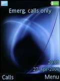
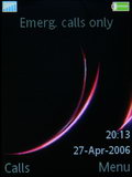
Standby screen: two different themes
Entering the main menu is pretty straightforward - you could do that by pressing either the joystick or the corresponding soft key. The menu itself is the same as in all current Sony Ericsson phones - a grid composed of 4 rows and 3 columns. The icons are pretty much the same as those used in K750, the only exception being the camera icon which is a new one, reminding us of a certain line of Sony digital cameras, designed to reflect the new camera orientated side of the phone. There is a slight difference regarding the menu icons between K800 and K790 - the K800 has a video call icon in the main menu instead of the FM radio that is present in the K790 menu as also seen in K750i.
As with any other current Sony Ericsson phone the phone's visual interface is totally customizable through themes. They change the overall looks of the interface including the main menu icons. Pitifully, the available preinstalled themes didn't change the icons.
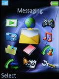
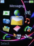
Main menu: two different themes
One of the new things that have been developed a lot is the Activity menu which has a dedicated shortcut key on the keypad. The Now running tab of the menu offers real multi-tasking. In K750 you could only run simultaneously one regular application and one Java application, for example. Now you can run two Java applications in the same time which allows for a lot more freedom and flexibility in everyday usage.
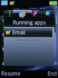
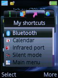
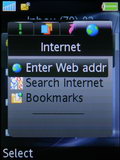
Activity menu: Running apps tab, My shortcuts tab, Internet tab
What about a thousand?
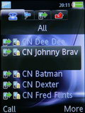
A usual thing when dealing with the Sony Ericsson phonebook is that the SIM contacts seem a bit redundant. It looks as if the purpose of the contact-storing capabilities of the SIM card is only ensuring portability across different phones and nothing more. In order to see your SIM stored contacts on K800 you have to dig down in the phonebook menu in order to find them. Don't get us wrong, it's not a bad solution especially when, as in the case of most Sony Ericsson phones, you have the option to auto save to the SIM card copies of the entries that you save in the phone's memory.
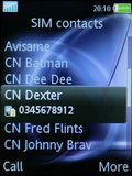
SIM contacts are hidden deep in the Contacts menu
The phonebook offers the creation of Groups but those are used for the purpose of mass communication only, they cannot be assigned common ringtones or pictures.
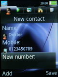
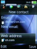
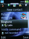
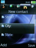
The total phonebook capacity is 1000 contacts, but you can have a total of 2500 numbers for those 1000 contacts. All those can be ordered either by first or last name. As usual the available fields include: 5 different phone numbers, 3 email addresses, 1 web address, a picture, a ringtone, a voice command used for voice dialing, position, company, company address, home address, a general note and a birthday date. A good thing is that the birthday date can be automatically transferred to the Calendar. Another positive change is that now you can see the entire information stored on a given contact without the need to enter the editing mode.
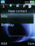
Again, we see the tiny font size here when we try to edit any field in the phonebook.
The Call records tabs are readily accessible from numerous places as usual. It stores the information of the last 30 call events no matter what they are. Nothing fancy here.
Reader comments
- Gtx one
- 12 Feb 2021
- tx3
A time, when once time of charge last for 2 or 3 days..


