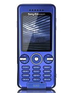
Sony Ericsson S302
- N
- Nour
- fvA
- 28 Aug 2008
This mobile has been released sure but GSMARENA says in the specification it has not been released yet.What a bad thing.
- E
- Eric's son
- N7a
- 25 Aug 2008
in terms of design,the s302 is continuing the candy bar series ,which started with the classics best sellers - k750,w800,w810,w700 etc ... but SLIMMER and very refined touch and unique colors as usual from sonyericsson.the midrange,compact candy bar phone series will always have its place in the mobile phone world, with new features and design as long as mobile phones will exist.
- E
- Eric's son
- N7a
- 25 Aug 2008
makulet, 25 Jul 2008this phone is nice.yeah a real lot better than nokia.but it... moretotally agreed with u !!!!!
- a
- ariess
- wr6
- 22 Aug 2008
SE you are best of design
- u
- uma
- ibh
- 17 Aug 2008
i love it so much.......
- ?
- Anonymous
- wga
- 11 Aug 2008
ha ha ha ha ha i love it
- n
- neverwashere
- PUx
- 07 Aug 2008
artorius, 06 Aug 2008this phone looks nice to me.. it's simple & compact.. but t... moreSE always launched another set of colors 3-4 months after the 1st set of colors is launched on release date. maybe you will get to see your white or brown. Red may be nice too!
- a
- artorius
- TSV
- 06 Aug 2008
this phone looks nice to me.. it's simple & compact.. but the colours are limited. is there any other colour other than grey & blue?? i'd like white or brown..:)
- m
- makulet
- vx4
- 25 Jul 2008
this phone is nice.yeah a real lot better than nokia.but it terms of durability? sony ericsson is the rock! mmmm...a mid-range phone like this is really good. they also got a new one the w302. i like it more though. :) it's simple. as a mid-range phone that really is for calls and texting that is surely a good choice. there are different kinds of people and we have different choices. whether you go on a high-end to a mid-range mobile phone, it doesn't matter. as long as it meets your needs,you sure really have the right one. :) just also note its quality and endurance. btw,i have my w810 for 4 years now and it's still working no problem at all.all parts weren't replaced since i bought it. it's all in the user...and the kind of phone.;)...sony ericsson is great in short.
- c
- charles
- ft}
- 20 Jul 2008
mikehulk, 15 Jul 2008For me its nice, looks very sharp and the specs are good.. ... morehi mike i think you wereso mistaken is it not?
- Z
- Zen
- pW4
- 18 Jul 2008
http://mobilearsenal.com/new/se_press_conference_s302_pictures.html
Anyone love the price? Smells like a best buy..
- ?
- Anonymous
- uS%
- 17 Jul 2008
the phone is not ugly.
its design is just old.
- m
- mikehulk
- PEG
- 15 Jul 2008
For me its nice, looks very sharp and the specs are good.. Sony really knows how to build a good phone. I still have this old w550i and still nice. Wish to have one soon.. especially this blue one..Nyek-nyek!..
- ?
- Anonymous
- uS%
- 12 Jul 2008
if this phone is ugly then what can you say more about nokia
- ?
- Anonymous
- keI
- 12 Jul 2008
Thiness : )
- ?
- Anonymous
- mFG
- 10 Jul 2008
standard?
- ?
- Anonymous
- PB4
- 10 Jul 2008
OLD SAYING SAYS:
Don't look from the outside look in the inside which means
Don't judge a book by it's cover
and
NOKIAS design SUCKS!
- ?
- Anonymous
- 2CJ
- 08 Jul 2008
that is such an ugly phone :D just like nokia samsung lg they all make the same old stuff. Really phones are pathetic, but none more than this attempt
- ?
- Anonymous
- 2At
- 04 Jul 2008
I thought S was for Snapshot..
But then here's a 2mp shooter with no autofocus and the design has been used for "ages" already.
Methinks S is for Sloppy for this one.
But I kinda like these recent releases:
C702 - ruggedized
G700 - UIQ for "everyone"
T303 - stylish low-end slider
- p
- patrick bateman
- P7N
- 01 Jul 2008
Same old ugly design, again and again and again. SE keeps rehashing the same look for years and you guys keep praising their design.
8.0??? What a joke.
