Sony Ericsson Vivaz review: Viv A-to-Z
Viv A-to-Z
Neat and stylish UI
Sony Ericsson Vivaz runs the Symbian OS 5th edition but you'd never tell by just looking at the homescreen. It's quite different from how other manufacturers see the touch-operated Symbian. In a nutshell, if you are familiar with the Satio, Vivaz won't be a surprise.
For starers, we've prepared a short video demo of the Vivaz user interface. It should give you a better idea of most of the changes introduced by Sony Ericsson.
The homescreen uses a tabbed interface but not like the "Vertical icon bar" often seen (though rarely used) in Nokia handsets. There are five tabs, which are in effect five alternative homescreen panes. You can assign a different function to every tab - favorite contacts, flow animation, camera album, shortcuts, static picture, Flash animation or the Twitter app.
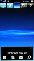

The S60 5th edition homescreen has grown tabs
There are five shortcuts on top of the display, one for each tab. Alternatively, horizontal finger sweeps can be used to navigate the tabs. The transition itself is visually pleasing with its smooth animations - even if you switch from the first to the last tab, things will roll across the screen with no lag at all.
There is no home tab this time, you can show or hide the status window with a hit on the End key. At the bottom of the screen you get the operator name, time and date (though time is also visible in the status row on top) and music controls. The music controls act as a shortcut to the music player and if there's a song playing it will display track info (with album art) and basic player controls. There are four additional shortcuts at the bottom - Dialer, Media, Messaging and Web search.
Let's take a closer look at those tabs. They are very similar to the XPERIA panels, but we might say they offer more functionality and style. The five tabs are actually slots that you can assign your choice of content. Well, almost - you are limited to one of the eight options.
The first one is the Favorite contacts option, which makes the homescreen tab show a selection of contacts. They are displayed in a list with contact photos if available, so nothing fancy. Tapping a contact, brings up a popup with three options - Call, Message, View in contacts.
The Album option shows a vertical list of all your photos and videos, sorted by date. It comes with kinetic scrolling and is the fastest way to view the latest photos. By the way, for some strange reason kinetic scrolling is not available anywhere else throughout the interface.
Next up is the Shortcuts option , which puts a list of eight shortcuts on your tab - be they shortcuts to applications or bookmarks.
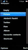
Then you have the option of setting a tab to show a single picture or a Flash animation, while the third option displays running water as an interactive (accelerometer-based) animation.
The final one is the Twitter option, which speaks for itself. It's a homescreen Twitter tab allowing you to read or post tweets on your profile. We wish there was a Facebook option as well, but who know, perhaps developers will be able to answer to that and add many more.
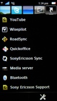

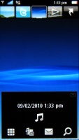

Shortcuts • Picture • Flow • Twitter tab
The Vivaz main menu is more standard - there's a choice between grid and list arrangement, and by default the shortcuts are arranged so that they resemble the typical Sony Ericsson menu. The icons will feel very familiar to experienced Sony Ericsson or Symbian users, depending on the theme you are currently using.
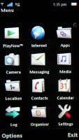
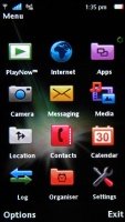
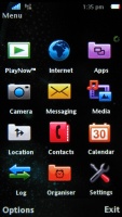
The main menu depending on the current theme
The rest however is S60 5th edition - the D-pad and soft-key based navigation translated into touchscreen. Lists still require a double tap to select and confirm, while icons take just a single tap. There's a shortcut to the task switcher or you can long-press the menu key.
Telephony still needs smart dialing
We didn't experience any problems with the in-call performance of Sony Ericsson Vivaz. Reception levels are good on both ends of a call, the earpiece is loud enough and there was no interference whatsoever.
The two things the phone lacks are Smart dialing and voice dialing. These two are included in other versions of Symbian and should have been available here.
Form the options menu you can find more settings like hold call, mute, lock screen and keys, switch to video call, new call, etc.
Thanks to the built-in accelerometer you can silence an incoming call on the phone by simply flipping it over.
Unfortunately, your screen doesn't switch off during a call, because the lack of a proximity sensor.
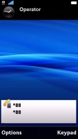
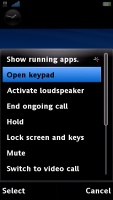
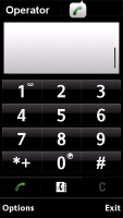
Making a call, call options, dial pad during a call
We also ran our traditional loudspeaker test on Vivaz. The handset didn't perform too well scored a Below average mark meaning we have seen (and heard) much better. You might want to keep a closer look on it when it's noisy around.
| Speakerphone test | Voice, dB | Ringing | Overall score | |
| Sony Ericsson Vivaz | 64.8 | 59.8 | 69.1 | Below Average |
| Acer neoTouch | 64,6 | 65,7 | 75,8 | Average |
| Nokia 5800 XpressMusic | 75.7 | 66.5 | 68.5 | Good |
| Sony Ericsson Satio | 71.8 | 66.1 | 78.2 | Good |
| Samsung M8910 Pixon12 | 75.7 | 72.8 | 77.3 | Very Good |
| HTC Touch HD | 77,7 | 73,7 | 76,7 | Excellent |
More info on our test can be found here.
Reader comments
- Cat EYes
- 09 Jan 2024
- f3h
I still use this smart phone in this year
- Ali
- 24 Aug 2014
- 3Xp
I am really sorry to say I got a bitter exprience with this soney ericsson vivaz phone. Its make me me worried always. For example, it download automaticly files and applications when i use internet. Its touch screen is very bad not working properly....
- pekka
- 09 Mar 2014
- U@u
Is it dual sim set or single
