Sony Ericsson W508 review: Above the fold
Above the fold
Design and construction (continued)
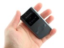
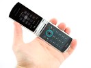
The front of the device is where this phone makes a play for a place in your pocket. It was clearly inspired by Sony Ericsson's Walkman former flagship, the W980, and houses three touch-operated controls for the music player, the external display and the camera.
The three keys are a play/pause key and skip forward and backward keys that also work for seeking. The icons on the keys are backlit. Here's also where the side lock slider comes into play - it locks the touch keys to prevent accidental presses.
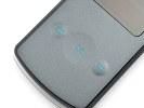

Touch-sensitive keys are always a nice parlor trick
The secondary display is a low-resolution monochrome one but offers plenty of information - time, battery charge, signal strength and network type, as well as song info during playback. Its legibility under sunlight is disappointing, partly because of the glossy plastic covering it - when the display is off, it almost blends in with it.
The camera is a 3.15 megapixels no-thrills fixed focus unit. There's also a small LED beside the cameras but that's mostly for assisting gesture control in the dark. It's so feeble it's next to useless as a video light (it's not supposed to work as a camera flash at all).
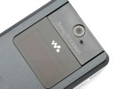
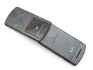
The LED is next to useless as a video light
The front plastic generally looks cheap with the color appearing to be printed on. There's a good reason for the latter - Sony Ericsson W508 can be quite colorful with a little help from the StyleUp covers available for it. Whether it's Sunny Orange, Forest Green, Architectural Purple, Mysterious Graffiti, Midnight Summer, Splashed Art, Radial Blue or Street Hip-hop, they all bring a little color to the generic sounding Metal Grey and Poetic White color schemes.
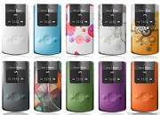
There's no shortage of color variations here
The back of the device is home to the Sony Ericsson and Walkman logos. The Sony Ericsson logo as usual is raised, making the device wobbly on an even surface. At the bottom is the single loudspeaker.
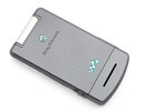
The Sony Ericsson logo and the Walkman badge of honor
Under the pry-to-open battery cover is a Li-Ion battery as well as the SIM and M2 card slots. The battery is quoted at 400 hours of standby. The M2 card slot supports capacities of up to 16GB. The back cover is made of thin plastic and because you have to force it in and out, frequent opening will certainly reduce its lifespan.
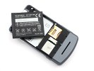
The battery is a BST-39 unit, same as the one on T707 and W910
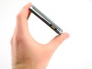
The Sony Ericsson W508 is a solid device with no creaks. The choice of a monochrome secondary display was a good one - it's not overloaded with features and it gives the handset a bit of an old school look.
The touch-sensitive keys are a nice touch as well, no pun intended. They don't break up the front panel making it easier for Sony Ericsson to splash on a lot of color, without having to go around physical buttons.
User interface: nothing new under the sun
The W508 interface is the regular Sony Ericsson feature phone UI and it is still used in most of their top handsets.
The standby screen is arranged in the usual manner with information on top indicating signal strength, currently used data carrier and battery status. At the bottom of the display just above the context keys are their labels.
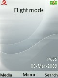
The well-known Sony Ericsson home screen
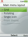
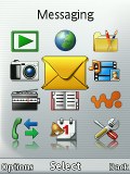
The options for the menu layout are the standard foursome - theme-dependent, 3 x 4 grid of icons, rotating view and single icon view. There's nothing that we haven't seen before. But if you're new to Sony Ericsson's latest devices, our in-depth review of Sony Ericsson C903 is a pretty up-to-date reference.
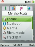
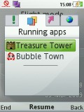
The well-known Activity menu offers quick access to a user-defined list of favorite features, web, recent events and, of course, the Running Apps tab that takes care of multitasking.
Flight mode can only work with a SIM card in the device and requires a restart.
The interface is visually appealing and snappy. Unlike the Sony Ericsson T707, the W508 features an inbuilt accelerometer so auto rotation is enabled in the Media Center.
The Sony Ericsson W508 supports Flash Lite themes, which change the color scheme and wallpaper. Our handset has 2 themes preinstalled: Clarity and Kaleidoscope black.
The nice thing about Flash themes is that they can be dynamic. We've seen various implementations with Sony Ericsson phones - for example the themes on the W508 change their color according to the time of day. We've also seen Sony Ericsson Flash themes that display new artwork on selected days such as international public holidays.
When the Kaleidoscope black theme is activated on the home screen a Walkman logo appears surrounded by many colorful patterns. Thanks to the accelerometer the logo rotates when the device is turned.
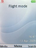
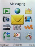
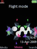
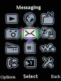
The two preinstalled themes: Clarity and Kaleidoscope black
As before, you can also use an application as a background instead of an actual image.
Reader comments
- sony ericsson
- 11 Dec 2014
- HjB
Sony ericsson
- chris
- 10 Dec 2011
- wv}
First time using sony ericsson cellphones. Nice and easy to use, customizable d-pad, and good storage on it for the price, however after a few months of owning this phone had noticed phone turning off randomly as others in previous comments have stat...
- Greenie
- 08 Feb 2011
- PSC
Without doubt this is the worst phone I have owned, - and its the first Sony Ericsson. Despit being in for upgrades, repairs (a 5 day one taking 6 weeks), checks and so on, it frequently says 'Inactive Sim' - even when sitting untouched on a table, i...
