Sony Ericsson W595 review: Music on the slide
Music on the slide
User interface shines
The W595 user interface is the same as on the W902 - user-friendly, quick and with a lot of available options and settings.
Just like the high-end Sony Ericsson W902, the W595 has the most advanced version of the UI. It is customizable with Flash Lite themes and hardly ever stays static. The interface offers an extensive set of options and settings. They are complemented by great speed, which further improves the user experience.
By the way, Sony Ericsson have set up a nice little interactive demo tool for you to explore the phone interface and features online.
The standby screen is arranged in the usual manner with information at the top indicating signal strength, currently used data carrier and battery status. At the bottom of the display just above the context keys are their labels.
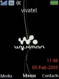
The well-known Sony Ericsson home screen
The wallpaper below is always on the move and really comes alive when the music player is on, making smooth transitions when playback starts or stops.
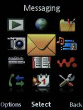
The options for the menu layout are the standard foursome - theme-dependent, 3 x 4 grid of icons, rotating view and single icon view.
The rotating view features three animated front icons on the display, the center one showing the active selection. The other two icons are half-hidden and are simply there to indicate what comes next. Five other menu icons can be seen in the dim background.
The icon view displays a single icon at a time and a vertical bar, which features tiny icons for the other main menu entries. Neither of those view modes works with shortcut keys. Only the Grid view allows quick numeric keypad access.
The well-known Activity menu offers quick access to a user-defined list of favorite features, web, recent events and, of course, the Running Apps tab that takes care of multitasking.
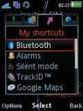
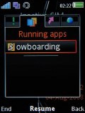
Activity menu is the same again
As with the Sony Ericsson W980, you can minimize the progress indicator when receiving a file over Bluetooth, but you can't do that when sending one.
Flight mode can only work with a SIM card in the device and requires a restart.
The interface is visually appealing and snappy. Auto rotation is enabled in the Media Center and is generally quite responsive. There's a barely noticeable lag before the rotation takes place, but we think that's to be preferred over an over-sensitive accelerometer that plays up all the time.
Traditional phonebook
The phonebook has space for 1000 contacts and 7000 numbers. You can choose to view contacts in the phone memory or on SIM, but not both. Either way, you can set up the phone to auto save to SIM all contacts that are being saved to the phone memory. You can also back up your contacts list on the memory card and restore it from there.
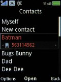
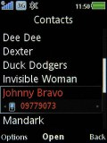

The Sony Ericsson W595 phonebook
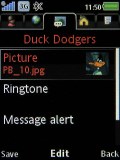
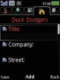
Editing a contact uses the tabbed interface used throughout the phone. There are five tabs that group related contact details. The first tab is for names and numbers, next up is web addresses such as e-mails and URLs. The third tab is for storing a picture, a custom ringtone, group, message tone and voice command, the fourth is for postal details and finally the fifth has fields for a note and a birthday (which you can add to the Calendar too).
The name of the contact is written in only one field, but you still have the option to order contacts by first or last name. The phone guesses which is which and does so quite well, even a "John von Smith" wouldn't be a problem. Naturally, you can search by gradual typing.
Reader comments
- Macbeth
- 10 Mar 2018
- 3ac
The W760 is STILL cheaper than the W595 in 2018! On eBay (the UK version), the cheapest W760 (unlocked) is £14.99 whilst the cheapest W595 (unlocked) is £24.99! (As of March 10, 2018)
- jack saravanaa
- 24 Sep 2012
- T6r
lokking very nice
- n - dhay
- 25 Feb 2012
- 3JD
hi.im just asking bout for w595 co'z the camera not to open.
